工作占据绝大部分时间,俨然成为当代人的生活常态。
冷峻不苟的黑色塑料转轮办公椅,整齐划一的洁白电脑桌,黑与白的搭色...这是我们对于“办公室”的刻板印象。
The fact that most of time is occupied by work has obviously become the normal life of contemporary people. For us, the stereotyped image to the office includes the rigid, meticulous office chair with black plastic wheels, uniform white computer desks, the palette of simply black and white colors.
如何能让工作着更有尊严和欲望在办公空间里度过每天至少 8 个小时的光阴,成为设计师思考空间的重点。
For the designer, the space design is focused on how to make employees spend at least 8 hours a day in the office space with more dignity and full of work enthusiasm.
"人闲桂花落,夜静春山空"这恰恰是《木空》设计师想要表达的理念诉求——将「木」赋予整个空间氛围,让「空」解释一禅一静的东方智慧,木头温润而极具生命感的,设计师希望用一种简单的方式在这城市的纷乱中觅得一方净土。
"Osmanthus falls by the side of the idle poet. The spring mount is empty in the quiet night."The poem is exactly the concept that the designer of "Empty Design in Wood" wants to express, in which he designs the whole space with the "wood" and allows the "empty" to explain the Oriental wisdom of "Zen and silence". Wood is a material with a warm feeling and full of life, so the designer hopes to find a pure land in the chaos of the city in a simple way.
现代人对空间的追求不只是舒适与美观,渐渐将对工作空间的思考转变对空间艺术的态度。设计师认为办公区域的设计最终不仅是一个功能齐全的工作与协作空间,更是灵感迸发的催化剂。
For the modern people, they not only demand for a comfortable and beautiful space, but also gradually transform their thinking on the working space into their attitude towards the spatial art. The designer believes that the office design leads not only to a fully functional space for work and collaboration, but also a catalyst for inspiration.
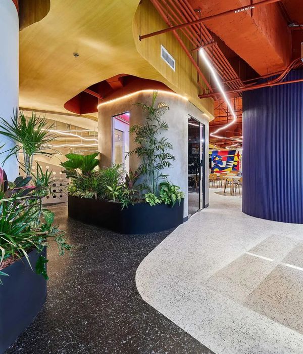
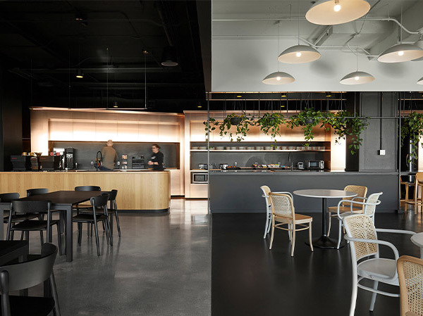
整个空间由 5 个极具趣味性的木盒子组成,设计师钟情于简练而富有层次的空间美感,垂直与水平空间划分与组合让公共区域、接待区、装置区域、办公区域互相围合,每个盒子被赋予各不相同的功能和使命。
The whole space consists of 5 highly interesting wooden boxes. The designer is in favor of concise and layered space aesthetics, in which the vertical and horizontal space divisions and combination make the public area, reception, installation and office area enclose each other, and each box is given with different functions and missions.
最里面一个入口进去相对私密的是 5 个相互间隔开来的办公区,设计师利用相近色明亮度和地台高低变化的方式分隔了 5 个空间,维持空间内通透与开敞的氛围。
From the innermost entrance, there are five relatively private offices separated from each other. The designer separated the 5 spaces by using the similar color brightness and the elevation difference of the platform, so as to maintain a transparent and open atmosphere inside the space.
设计师在此借用了柯布西耶在拉图雷特修道院里对于最小尺度的探讨,1300mm 的隔断高度正好可以阻挡人坐下时的视线,既可保证个人独立工作的时间,也能容纳同事间日常的工作交流。
The designer refers to the discussion of Corbusier on the minimum scale in his design of Convent of La Tourette. The partition height of 1300mm can just block the line of sight when people sit down, which can not only guarantee the independent work time, but also accommodate the daily work communication between colleagues.
空间中的一抹红跳脱于整体木色,是消防栓的位置,把原本无趣的实用性装置转化成装点空间的亮点,同时也给工作者带来振奋感,探索生活与工作中更多未知的可能。
A touch of red stands out of the space in the overall wood color, which is the location of the fire hydrant. The original boring practical device is turned into the highlight that decorates the space, but also to bring a sense of inspiration to employees, to explore more unknown possibilities in life and work.
设计师创造空间讲究“度”,过犹不及的分寸感。
冷峻木色与笔挺点面,简中求精得震撼人心。
灯光暗影,一桌一椅,创造出使人眷恋与温情的空间体验,探索自然美学生息不绝,在静谧清澈的木香中品味近在咫尺的诗与远方。
The designer creates a space focusing on the "degree", overdo and a proper limit. Rigid wood colors and vertical surfaces are refined and shocking. The shadow of lighting, one table and one chair create a space experience that makes people sentimentally attached and full of warmth, explore the natural aesthetics, and taste the poetry and distance close at hand in the quiet and clear wood fragrance.
当生活归于平淡和宁静,每一个人的内心却仍需保持热泪盈眶,没有虚张声势,没有繁华堆砌,只有灵魂的安宁、纯粹和饱满。
When life returns to quietness with nothing special, each of hearts still needs to keep tears in his eyes, no bravado, no bustling pile-up, only the peace of the soul, pure and full.
人们摒弃循规蹈矩,将安静而理性的态度落在这个办公空间,设计师营造的意境则融于工作场景的细枝末节,让每一个工作者能够在此挥洒着自由自在的书写方式。
I
Instead of following the rules, people leave a quiet and rational attitude in the office space. The artistic conception created by the designer is integrated into the details of the working scene, so that every employee can enjoy a free working attitude here.
项目名称 |
Empty Design in Wood
Project Name |
项目地点 | 中国·广州
Location | Guangzhou, China
设计机构 | 春计划工作室
Architect | Spring Studio
设计主创 | 吴家春
Chief designer | Edison Wu
项目摄影 | 欧阳云
Photographer | Ou Yangyun
商务联系
1862084817518620848175E—MALL |
项目面积 | 300
Area |300
设计时间 | 2017 年 12 月至 2018 年 5 月
Design Period | 2017.12-2018.5
春计划工作室
Empty Design in Wood
图纸呈现
立面图
轴测图
春计划工作室
Empty Design in Wood
公司介绍
吴家春
Wu Jiachun
/ 春计划工作室创始人 / 总设计师
春计划工作室/(Spring Studio)是集室内设计及陈设装修、产品设计、装置艺术和品牌策划于一体的综合型工作室,主要从事室内设计及相关工作。通过营造具备极具个性美学的空间,进一步完善和提升用户的生活体验,以设计传递生活的艺术价值。
Spring Studio is a multi-disciplined studio, including the interior design, decoration, product design, installation art and branding, which is focused on the interior design and relevant work. Creating a space with a strong aesthetic personality can further improve and enhance the user’s life experience, so as to convey the artistic value of life through design.
供稿/Spring Studio
春计划工作室
Gooobrand
品牌设计
{{item.text_origin}}

