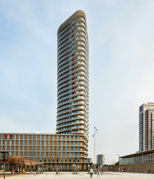
Multifunctional complex as mountain village Buitenplein department store & Up Mountain residential building Amstelveen The Up Mountain residential building, which rises upwards in a stepped form, is reminiscent of ice floes stacked on top of each other, or a mountain village built against a slope. Up Mountain is an appropriate name for this eye-catching structure that’s invigorating the city centre of Amstelveen.
The apartment building, which has an exceptionally light and flexible structure and large, retreating terraces, is the culmination of a new-build/transformation project carried out in three parts. The former department store on Buitenplein was already renovated in 2016, retaining the structure of the retail building and stripping the façades. In 2018, the adjoining car park was demolished and replaced by a new one with higher ceilings. The construction of the residential building on the car park signalled the completion of the transformation of this place in the city.
Lightweight building Client AM started developing and designing the residential building in 2017 when the renovated department store was almost operational and the new car park under construction. But the original plan of 5,000 m² didn’t turn out to be economically viable. It required more surface area, which would increase the volume of the building. However, the car park below the building wasn’t designed to cope with this extra weight, based on a traditional building method. Together with the client, Rijnboutt looked for ways of extending the car park within the possibilities. With structural engineers IMd a ‘lightweight’ building was designed in a way that is exceptional in contemporary housing construction.
As a central part of the design of Up Mountain on top of the car park, a steel main load-bearing structure was conceived around a concrete core. Also other lightweight products have been chosen for the building elements. For the houses a lightweight composite was chosen that has an appealing, high-quality finish that can hardly be distinguished from architectural concrete. Flexible building layout A maximum living quality has been sought in several ways. In the spatial structure, 45 flats have been inserted like boxes in a structure, varying in size from about 80 m² to almost 400 m². The residents were free to partition their homes according to their individual needs and to merge or split units. This responds to current and future needs for flexibility.
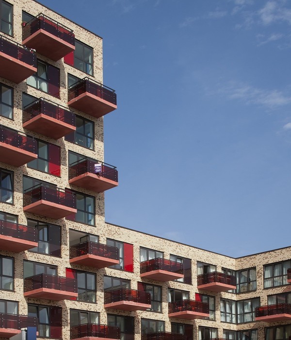
These adaptations have no effect on the shell, which is therefore destined to last a long time. The architects created a volume that rises in staggered formation, with a series of terraces facing the south that offer panoramic views over Amstelveen and the city park. In addition, the residential building has an atrium that opens onto all the flats and hurdles upward in harmony with the building’s projections, tapering towards the top with a glass roof. The atrium offers space for meeting and encourages social interaction.
Coherent in character The challenge was to create strong architectural coherence despite the fact that the building’s three parts – residential, department store and car park – have different functions and characters. That’s why the architecture is based on a common guiding theme: ‘warp and weft’, which refers to the weaving of longitudinal and transverse threads on a loom. With this, spatially interesting facades have been composed for the three building volumes, each with its own characteristics and material.
Three-dimensional perforated aluminum panels on a steel construction give the façades an attractive appearance. Adding liveability to the city Besides the engineering challenge, both social cohesion and liveability play a role in this project. The formerly monofunctional area between Buitenplein and Handelsplein was relatively quiet at night. The addition of the Up Mountain multifunctional complex with dwellings is attracting residents so now there’s activity during the day and in the evenings.
{{item.text_origin}}


