蓝孔雀烘焙坊 | 重塑工业遗址的社区记忆
- 项目名称:小雨爸比烘焙工坊
- 项目地点:杭州
- 项目类型:商业空间
- 业主单位:无
- 设计单位:水丁集设计
- 主创设计:张晓军
- 项目设计:叶,紫东
- 项目团队:吴静雷,倪旭辉,吴建波,历小景
- 室内摄影:ONCE STUDIO
- 项目面积:90㎡
- 主要材料:金属白板,艺术肌理涂料,砖
▲项目周边关系
社区的不断扩大和信息沟通的迅速,让社区逐渐模糊地理和定义边界。无论当代的社区是多么追求现代化和高效率,都不会改变我们对于一个社区最清晰最温暖的回忆——家门口的小店和小店里进出的人们,那是小时候常常买糖的小超市,一家稀松平常的包子铺,亦或是奶香扑鼻的面包房,以及一句随时都可能被邻家长辈发问的“吃饭了没?”
The continuous expansion of the community and the rapid communication of information have gradually blurred the boundaries of the community. No matter how modernized and efficient the contemporary community is, it will not change our clearest and warmest memories of a community, that is, the shop at the doorstep and the people who go in and out of the shop, whether they used to buy lollipops when they were young. A small supermarket; or an ordinary bun shop, or a bakery with a scent of milk, and a sentence that may be asked by the elders at any time, "Have you eaten?"
我们今天想要讨论的,是关于社区设计,再缩小一些范围,我们想聊的是一家烘焙店的设计,以及我们能为烘焙坊周边的居民做些什么。
What we want to discuss today is about community design, and to narrow down the scope, what we want to talk about is the design of a bakery and what we can do for the residents around the bakery.
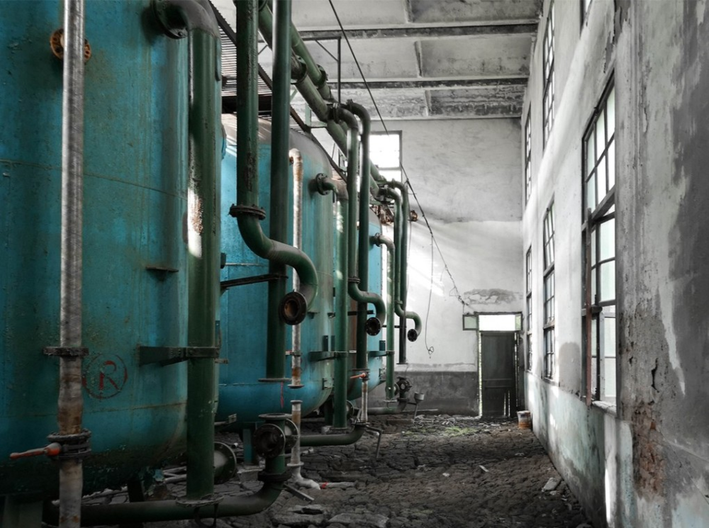
位于京杭大运河最南端的拱墅区是杭州传统工业区,聚集着杭钢、杭锅、蓝孔雀化纤厂等工业企业。杭州蓝孔雀化学纤维有限公司于1993年12月28日成立,是当时全国最大化纤企业之一,产品远销欧亚12个国家和地区。90年代,拱墅区由工业重地向城市生活功能转型。区内的高能耗、高排放企业相继关停转迁,蓝孔雀化纤厂原址逐渐荒废。而蓝孔雀作为曾经存在的痕迹,被保存在这一带居民每个人的记忆里。了解过去曾经发生过的事情 ,如实传达给下一代是我们应该有的责任。
Located at the southernmost end of the Beijing-Hangzhou Grand Canal, Gongshu District is a traditional industrial zone in Hangzhou, where industrial enterprises such as Hangzhou Iron and Steel, Hangzhou Boiler, and Lan Peacock Chemical Fiber Factory gather. Hangzhou Blue Peacock Chemical Fiber Co., Ltd. was established on December 28, 1993. It was one of the largest fiber companies in the country at that time. Its products are exported to 12 countries and regions in Europe and Asia. In the 1990s, Gongshu District transformed from an industrial center to an urban living function. High energy consumption and high emission enterprises in the zone have been shut down and relocated, and the original site of the Blue Peacock Chemical Fiber Factory has gradually been abandoned. The blue peacock, as a trace of its existence, is preserved in the memory of everyone in this area. It is our responsibility to understand what has happened in the past and to truthfully convey it to the next generation.
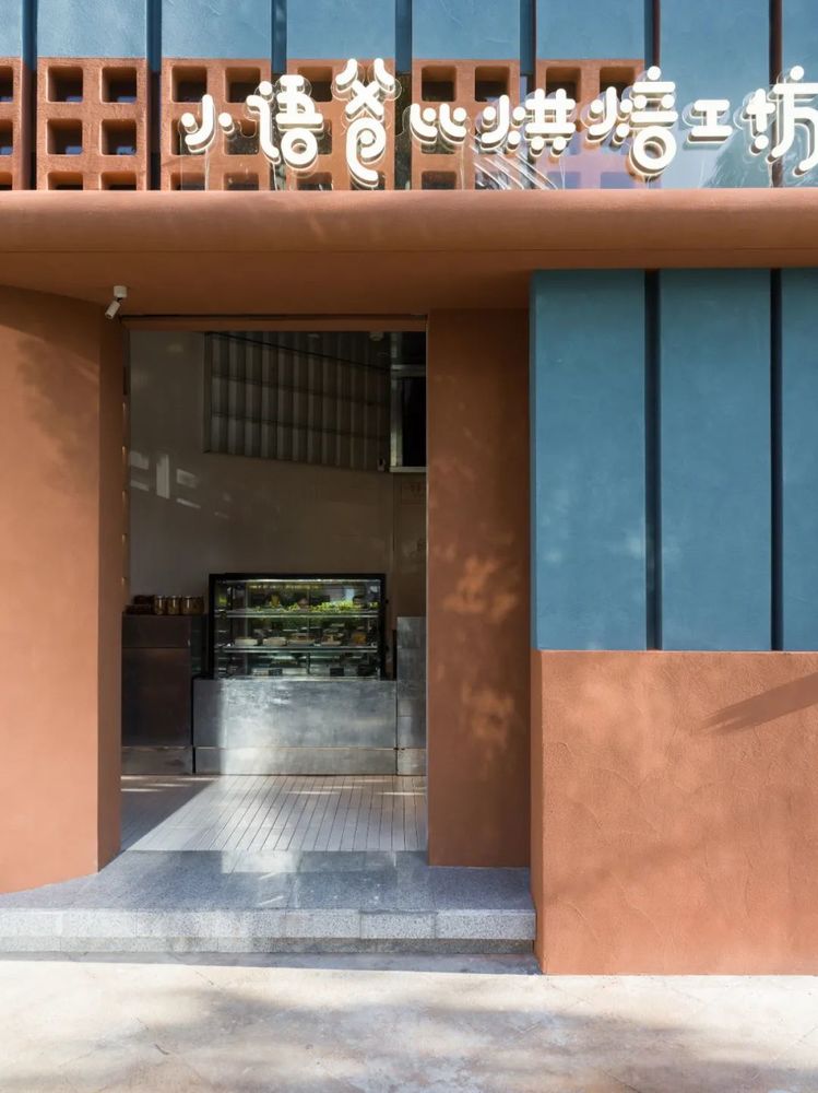
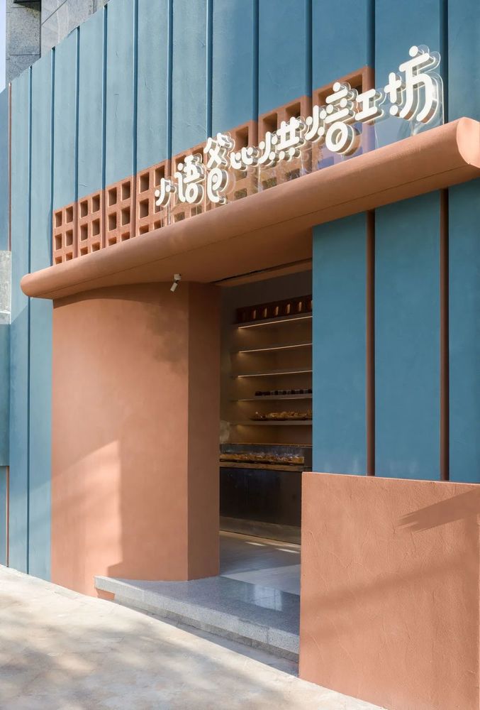
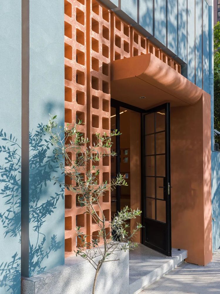
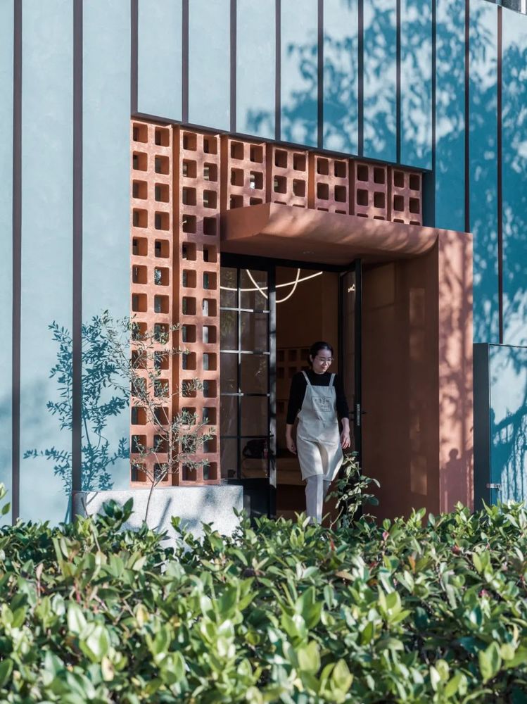
小语爸比烘焙工坊项目坐落于道路交叉口,店铺所在位置是人流的交汇处,目之所及的建筑皆为灰色或白色,保守且没有生机,我们确定店铺外立面的颜色为孔雀蓝,一方面是为呼应曾坐落在对面的蓝孔雀化纤厂,另一方面也是想为本社区带来一丝彩色。外立面我们采用了条状矩形沿着弧形店铺排开,仿长形面包条排列的形态,配合孔雀蓝的色彩,增强了品牌第一眼的审美辨识度。通过对原有空间的规划与整合,店铺在总体上被划分为4个区域:户外区域,店铺内的售卖区以及休息区,最后则是厨房部分。
The Xiaoyu Babie Bakery Project is located at a road intersection. The shop is located at the intersection of the flow of people. The buildings in sight are gray or white, conservative and lifeless. We determined that the color of the store’s facade is peacock Blue is the mainstay. On the one hand, it echoes the Lan Peacock Chemical Fiber Factory, which was once located on the opposite side. On the other hand, it also wants to bring a touch of colorful joy to the community. For the facade, we adopted strip rectangles arranged along the arc-shaped shop, imitating the arrangement of long bread sticks, and matched with the color of peacock blue, which enhanced the brand's first-sight aesthetic recognition. At the same time, we also think about sprinkling light and shadow into the store, so that people can enjoy a wonderful bread shopping journey in the mottled light and shadow. Through the planning and integration of the original space, the store is divided into 4 areas as a whole: outdoor area, sales area and rest area in the store, and finally the kitchen part.
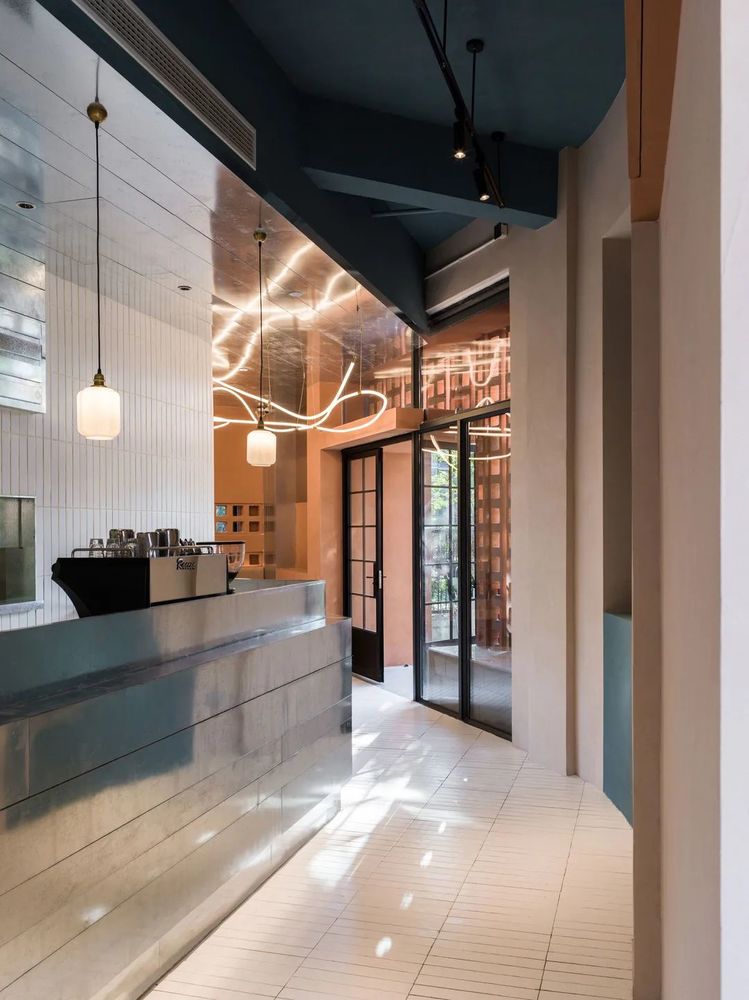
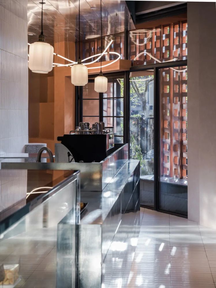
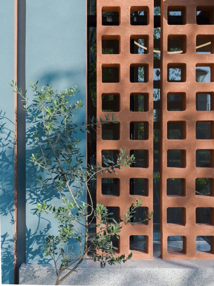
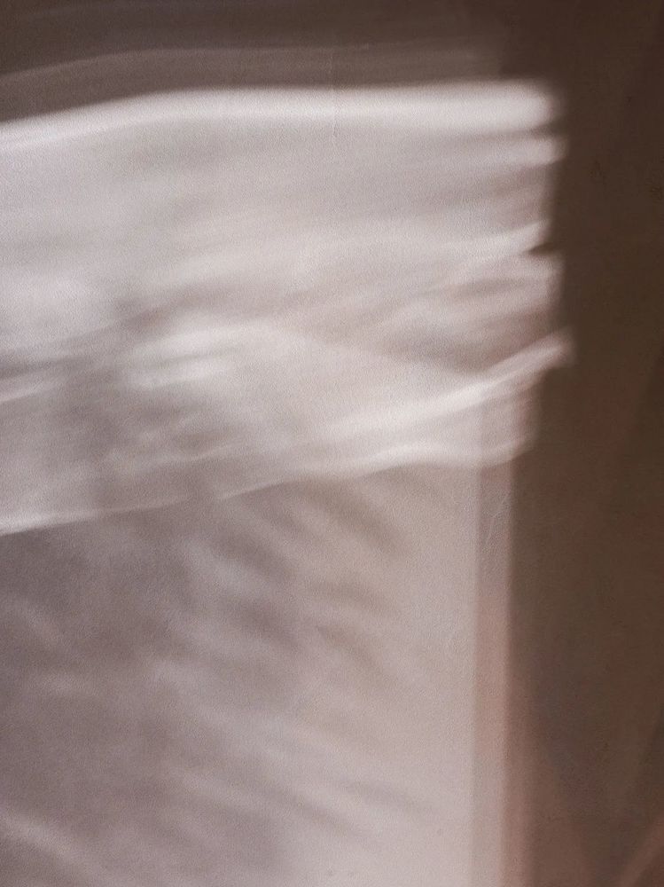
我们在思考用何种方式将光影洒入店铺时,采用了水泥砖,光影有了具象的形状,在空间里呈现小体块重复性的光影斑驳,顾客伴随着橙黄色的阳光享受美好的面包采购之旅。
When we were thinking about how to sprinkle light and shadow into the store, we used cement bricks to give the light and shadow a concrete shape, showing small repetitive light and shadow mottled in the space. Customers enjoy the delicious bread with the orange sunlight. Purchasing journey.
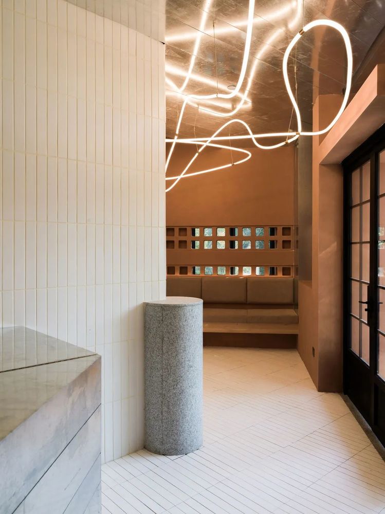
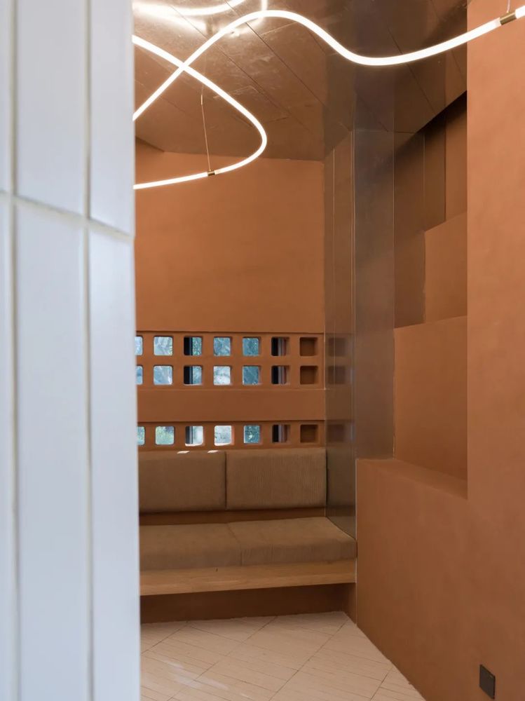
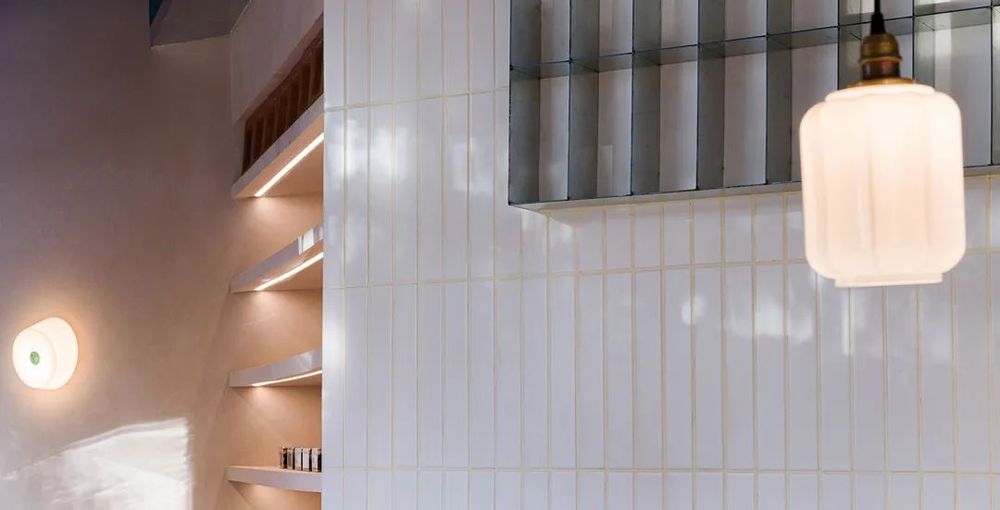
整体采用墙地一体的小体块的瓷砖打底,不锈钢板饰面用于柜子和局部吊顶,将空间显大的同时,更加方便使用打理。顶面延续的孔雀蓝,售卖区的鹿皮褐,以及休息区的介壳淡粉红艺术漆色彩的差异化使用,与镀锌板未来感银色的碰撞,打破常规,带来一种反差后的节奏感、层次感,搭配暖调灯光,完成了面包房公共区域核心色彩。休息区和产品陈列区的色彩上我们做了渐变,休息区的色彩更加浓烈和馥郁,摆配合灯芯绒质地的坐垫,柔和的灯带点缀在其后,舒适又开放,配合面包的独有香味,当人们坐在卡座上观看外部的绿色植物以及人来人往时,他们对外界的感知也会逐渐改变。
The whole is made of small tiles with integrated wall and ground, and the stainless steel plate is used for cabinets and partial ceilings, which enlarges the space and makes it more convenient to use and manage. The continuation of the peacock blue on the top surface, the deerskin brown in the sales area, and the pale pink artistic paint color of the shell in the rest area. The collision with the futuristic silver of the galvanized sheet, breaks the convention and brings a contrasting rhythm Sense and layering, with warm lighting, complete the core color of the public area of the bakery. We made gradients in the colors of the rest area and the product display area. The color of the rest area is more intense and rich. The cushions are matched with corduroy texture, and the soft light strips are dotted behind, which are comfortable and open, matching the unique flavor of bread. When people sit on the deck and watch the green plants and people coming and going, their perception of the outside world will gradually change.
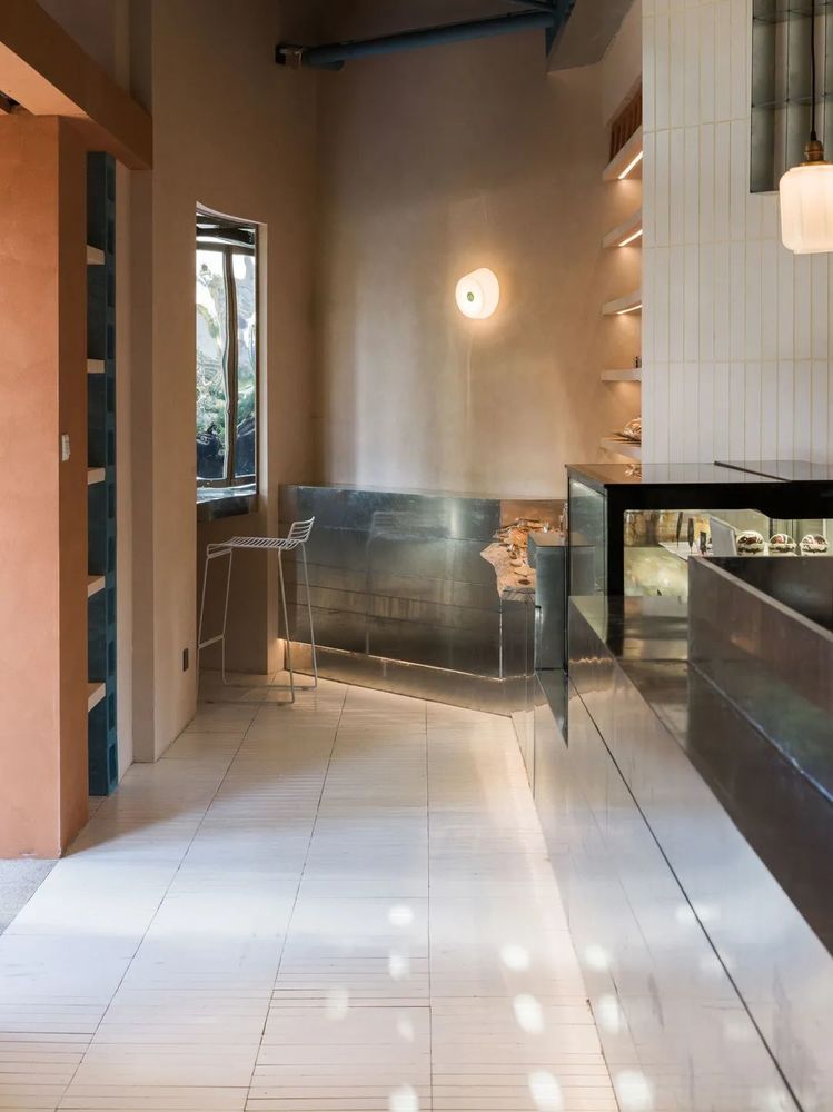
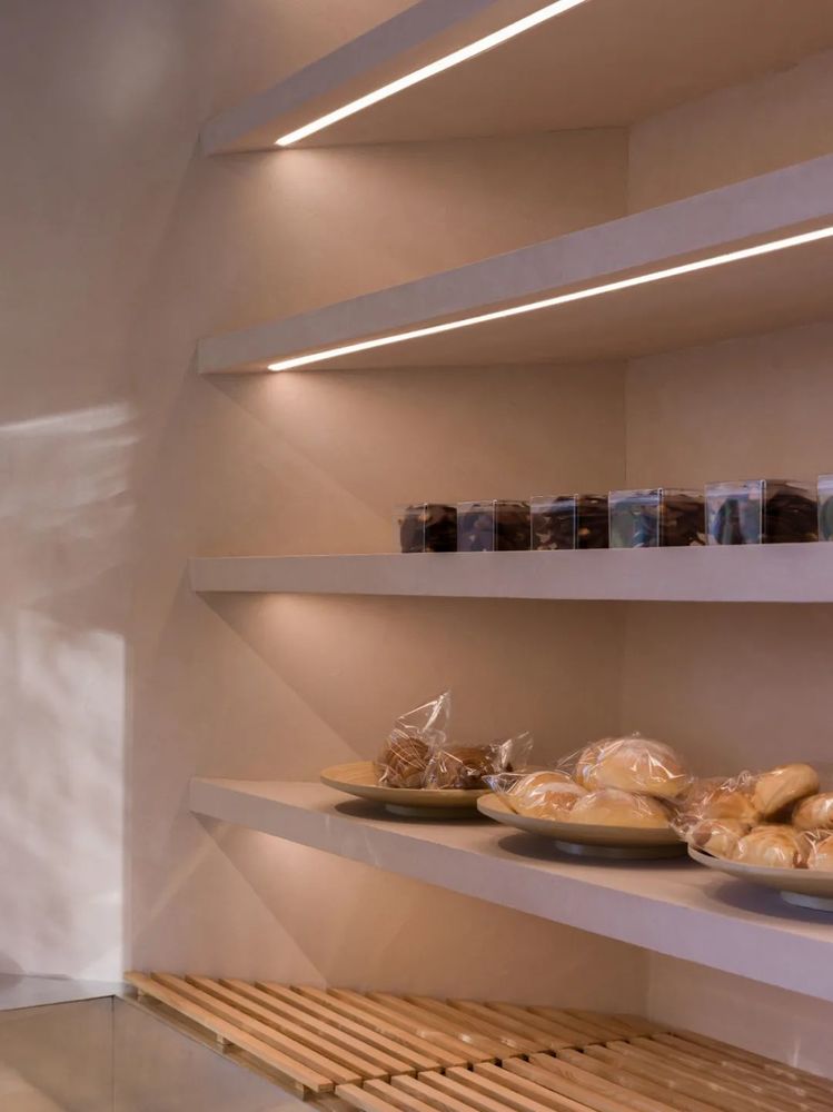
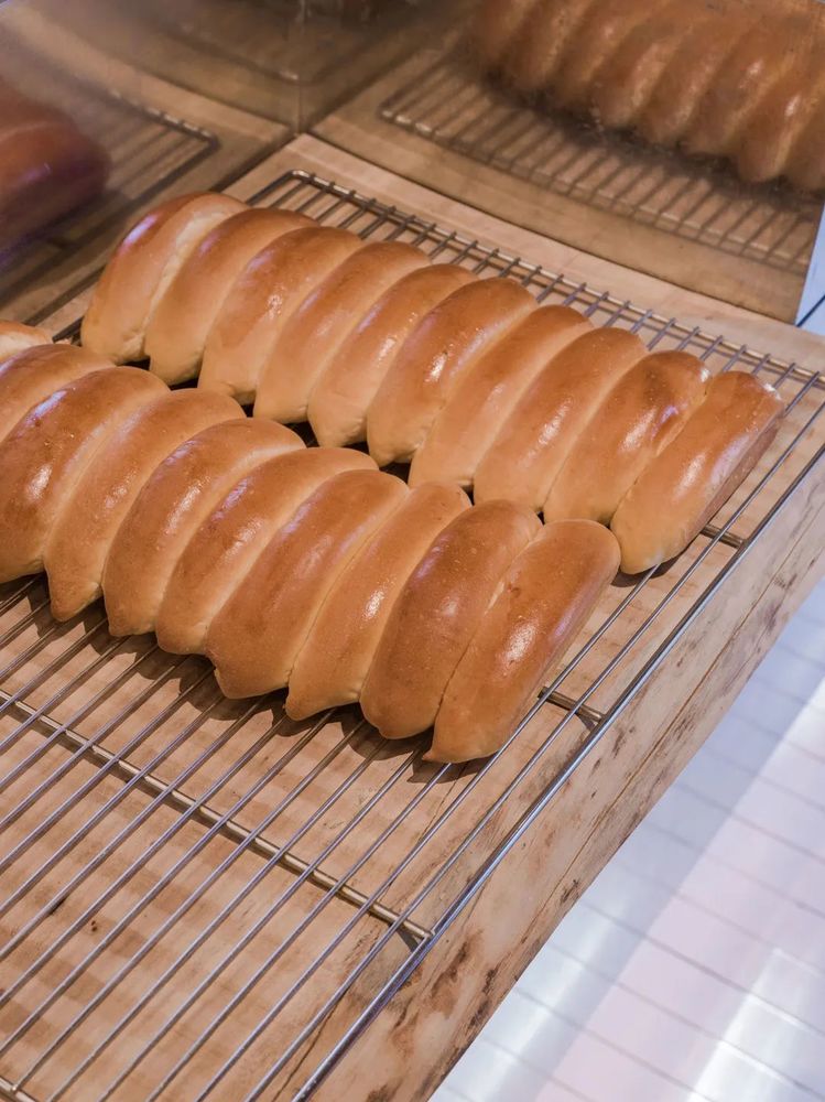
我们把面包的陈列台设置在店里的不同空间——柜台,墙面四侧,以保证顾客在店里的不同地方都能找到不同产品,如同寻宝的体验感。
We set up the bread display stands in different spaces in the store-counters and on the four sides of the wall to ensure that customers can find different products in different places in the store, just like a treasure hunting experience.
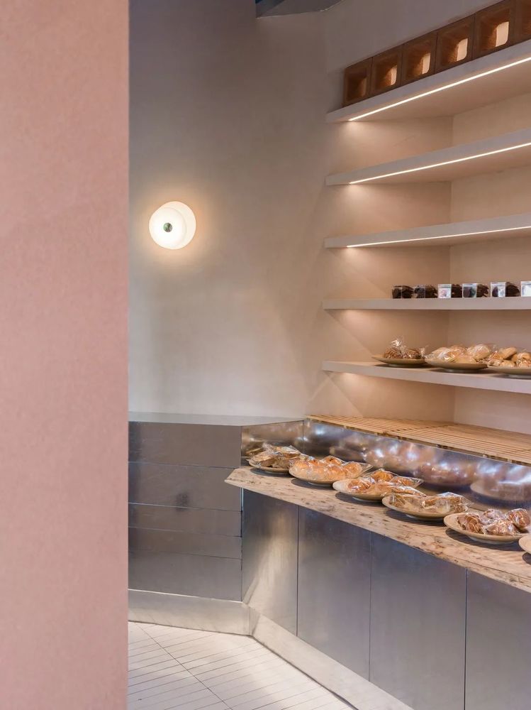
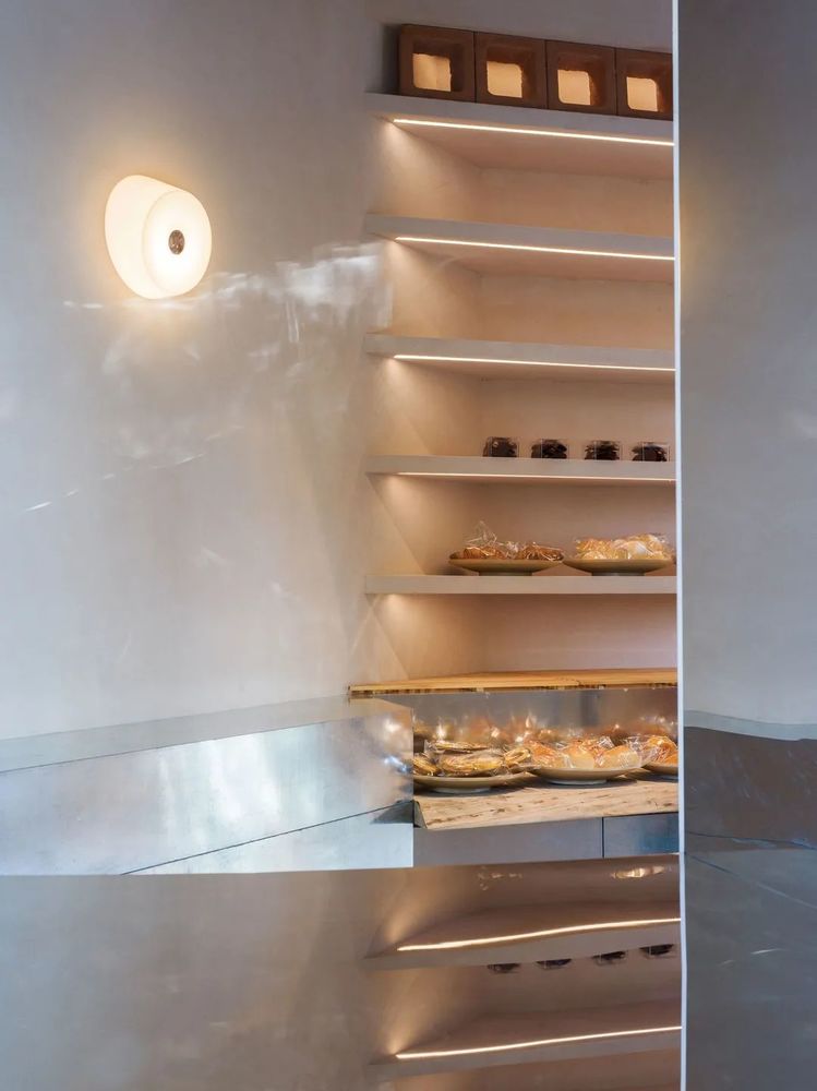
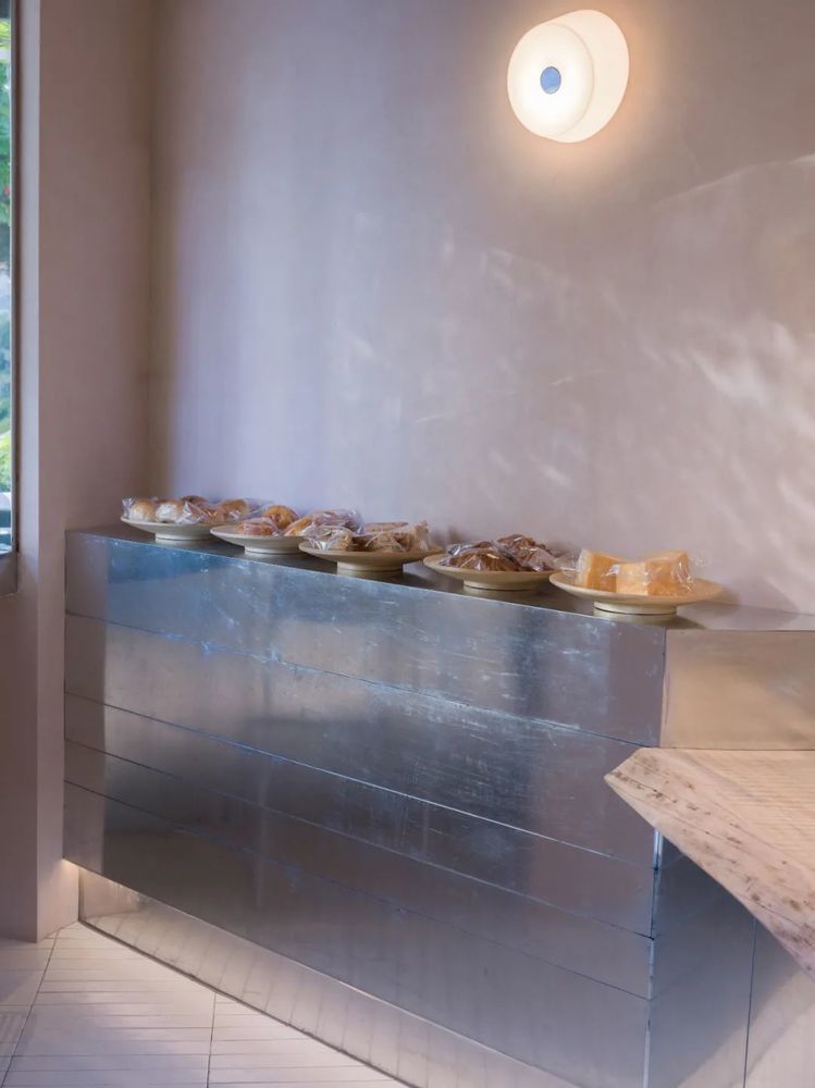
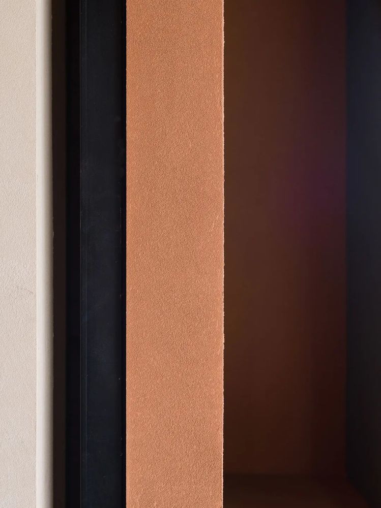
墙面整体使用艺术涂料,增加了本身的肌理感和粗糙感,摒弃掉一种过度的精致。
The overall use of artistic paint on the wall increases the texture and roughness of its own, and abandons an excessive exquisiteness.
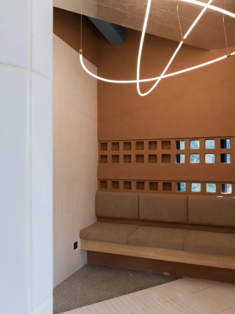
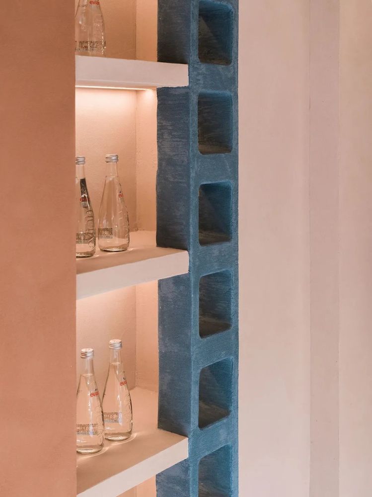
顾客与店内工作人员的互动也是我们本次设计的考量。我们将店铺后厨打开,形成面向公众的制作间,让顾客更加直观地注意到制作者在空间背景中的存在。
The interaction between the customer and the staff in the store is also our consideration for this design. We opened the back kitchen of the store to form a production room facing the public, allowing customers to more intuitively notice the existence of the producer in the background of the space.


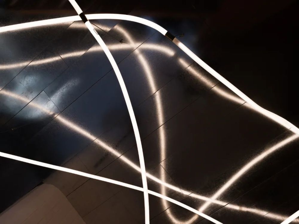
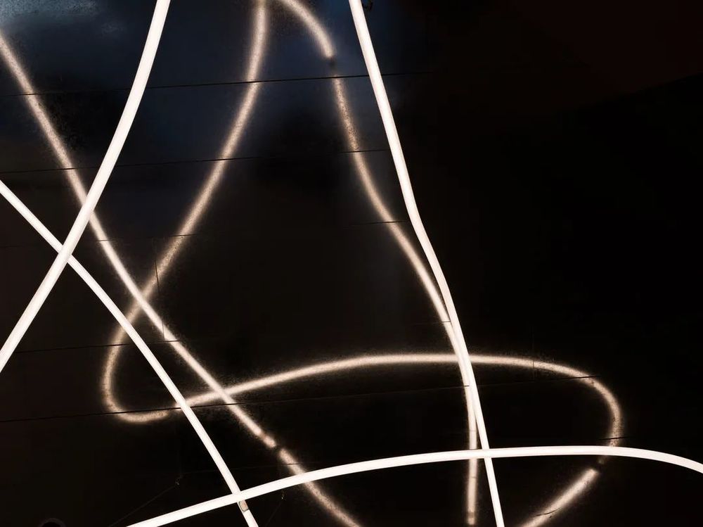
柜台和蛋糕陈列台强化了空间的纵深体验。灯具灵动的线条牵引顾客的视线至前台的尾端至角落的窗户。
The counter and cake display stand enhance the in-depth experience of the space. The flexible lines of the lamps draw the customer's line of sight to the end of the front desk to the corner window.
在面包房的西北角处,我们打开了一处与外界交流的“窗口”。我们想象坐在此处的人,一边细品手中的咖啡,一边偶尔与相熟的邻居打着招呼,又或者是两个此前并不认识的人,分立窗户内外,却也分不清到底是对方还是自己身处景内。
后疫情时代的居民交流与过往不同,交流可能是来自于一种单纯的视觉交互。
At the northwest corner of the bakery, we opened a "window" for communication with the outside world. We imagine the people sitting here, tasting the coffee in their hands while occasionally greeting familiar neighbors, or two people who didn’t know each other before, separated the inside and outside of the window, but couldn’t tell the difference between them. The other party is still in the scene.
社区小店设计的意义和愿景强调在现代繁华、快速的生活节奏下,使人们的居住环境回归相互沟通、与社会充分交流的形态。我们希望蓝孔雀社区将来是一个创意型社区,是一个适宜居住的社区,并为此做出更多尝试。
The significance and vision of the community shop design emphasizes that under the modern prosperous and fast pace of life, people's living environment returns to the form of mutual communication and full communication with the society. We hope that the blue peacock community will be a creative community in the future and a livable community.
项目名称 |小雨爸比烘焙工坊
项目地点 | 杭州
项目类型 |商业空间
业主单位 |
小语
爸比
设计单位 | 水丁集设计
主创设计 | 张晓军
项目设计 |
叶
紫东
项目团队
|
吴静雷
倪旭辉
吴建波
历小景
室内摄影 | ONCE STUDIO
项目面积 | 90㎡
主要材料 | 金属白板,艺术肌理涂料,砖,
设计时间 | 2021.9
-2021.10
完成时间 | 2022.1
WATER TEAM DESIGN
////////
建筑 / 室内 / 视觉
Architecture/ Interior/ Graphic
///////////////////
欢迎分享至朋友圈
Welcome to share to friends
////////////////////////
营造生活空间气质美学
Creating a temperament space aesthetics
////////////////////////
//////////
Reproduced paease specify Water team deign,Rights reserved.
往期作品
---------------------------------------
Magic π融合餐厅 - 无限不可能
FFA OFFICE /克制的光与影(下)
FFA OFFICE/ 克制的光与影(上)
ENJON COFFEE/ 秩序的平衡
生活与艺术并存/Life and Art coexist
J SPA ROSE SPACE
TERRAN 未来云服务中心
ENJOY COFFEE 预告
RURAL PRACTICE 基于乡村文化的一次实践
2019项目预告MOONGOOD HOTEL
SO JOIN IN EDUCATION 思加益儿童成长中心
TERRAN 沉浸式生活体验馆-新零售
----------------------------------

