The brief of Goodness Gracious Café was to create a small boutique café in a leafy suburban setting with the possibly of extending into the neighbouring house in years to come. The existing building was originally an old Queenslander style home and then a corner store before being converted into a café. This style provided some inspiration for the finished product.
The design and layout of the kitchen was very important to not only cater for the patrons now, however with the possibility of catering for a larger space with the future extension in mind. We worked closed with our client and also Brisbane Commercial Kitchens to achieve the most efficient layout possible in a small space, as the menu and food produced in this kitchen was very important.
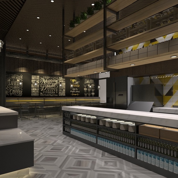
The palette was clean and simple with feature materials and finishes. Colours use were mostly grey and white with black trim used on all glazing frames. Rustic finishes like warm timber floorboards and a concrete look counter benchtop were used so the interior was no a stark grey and white. A simple white gloss subway tile was laid on a 45-degree angle to create an elegant look. The white tongue and groove ceiling through-out and feature profile panelling used helped to pay tribute to the style of the original building. This palette was set off with industrial features like the feature pendant over the counter, coffee machine, and open black ceiling hung shelves.
We were also engaged to design the logo for Goodness Gracious Café. The intention was to create brand which complimented the interior space…simple with a ‘hand drawn’ appearance. This logo was then used as exterior signage, film on the front glazing, a feature oversized astro turf sign, and right down to the menus, coffee cups and business cards.
{{item.text_origin}}

