打|造|高|端|品|质
随着人们的生活水平提高
对身体健康越来越关注
因此
健身房现在不仅
要有专业的器材
室内设计也是必不可少的
那么室内的布局
需要怎么设计呢?
要怎样才能打造成
一个舒适的运动场所?
入门处|Entry point
入门处采用黑色门框搭配淡黄色点缀,巧妙的融合了店铺logo,让人耳目一新。
The entrance is decorated with black door frame and light yellow, skillfully integrating the store logo, which is refreshing.
前台|Reception
台面采用大理石材料,底下搭配灯带;整体空间利用绿、白两种颜色表达出自然纯粹的本质。
The table top is made of marble, and the bottom is equipped with light belt; The whole space uses green and white colors to express the pure nature.
休息区|
Rest area
以简单的暖色光带配合原木地板,给顾客带来轻松愉悦、舒适温馨的环境。
With simple warm color light band and log floor, it brings customers a relaxed, pleasant, comfortable and warm environment.
器材区|
Equipment area
跑步机-Treadmill
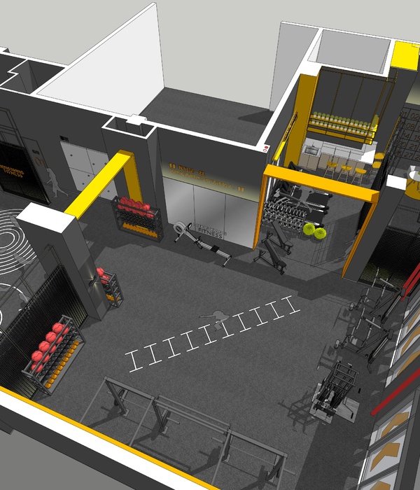
器械区域的吊顶增加白色灯光的装饰,结合几何形体与白色灯光的装饰,
营造充满现代且动感的氛围。
The ceiling in the instrument area is decorated with white lights, combined with geometric shapes and white lights to create a modern and dynamic atmosphere.
私教区|
Private diocese
地面铺设
绿草皮
与普通区域区分,放大私教训练的趣味性,
增加视觉冲击力
。
Green turf is laid on the ground to distinguish it from ordinary areas, so as to increase the interest of private education and training and increase the visual impact.
主创设计:
梁道伟
本案例出品机构:
格梵装饰
门窗合作品牌:
亿合门窗
合作品牌全屋定制:
意品家居
{{item.text_origin}}

