数字化立面融入法兰克福旧城住宅
Frankfurt Germany Kleine houses
设计方:Franken Architekten
位置:德国 法兰克福
分类:居住建筑
内容:实景照片
机电工程
师:BBK Elektroanlagen
设计团队:Bernhard Franken, Frank Brammer, Robin Heather, Natascha Baier, Kai Heyd, Felix Schneider, Isabel St
委托人:Rothenberger 4xS
图片:27张
摄影师:Eibe Sînnecken, Oliver Tamagnini, Axel Stephan
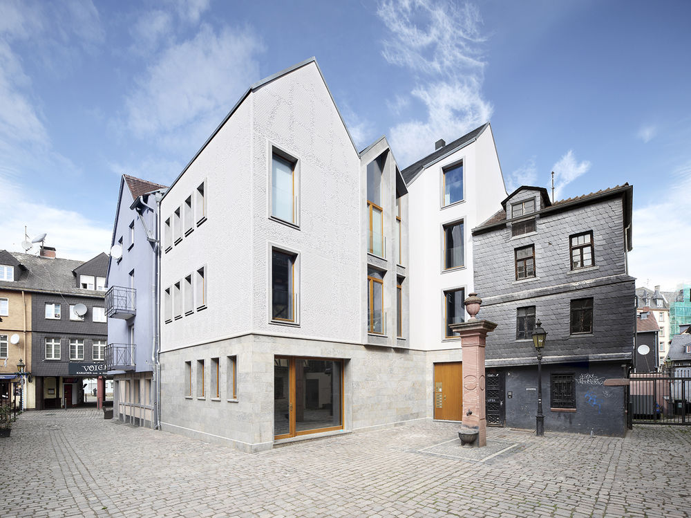
这是由Franken Architekten设计的Kleine Rittergasse11住宅,位于法兰克福。建筑师使用了不夸张的手法,为这个新建住宅及工作室赋予了一个数字化立面。原建筑从经济、结构甚至建筑历史角度来看都是破败不已,因此建筑师和客户决定拆除原建筑,并创建能与当地村庄般的氛围相协调的小尺度建筑。建筑的尺度和外观需要很好地融合在一起,因此建筑师复制了现状建筑的造型,通过移除悬挑屋顶对其进行简化,并将它们与石头底座相互协调。
译者: 艾比
From the architect. Good architecture takes its environment into account, particularly surrounding buildings. In Frankfurt am Main, Franken Architekten has taken a literal approach through a digitally drawn façade for a new home and studio in old town Sachsenhausen. Frankfurt’s Alt-Sachsenhausen is a neighborhood that, according to the city, urgently needed to change. Until the 1990s, traditional cider houses dominated the area valued for its entertainment and nightlife, but it was heavily run down in recent years. The city created a preservation statute that placed premiums on the conversion of the gastronomy establishments to housing and other uses. A small scene of art galleries, ad agencies, and fashion and designers shops sprung up in the area, leading some people to call the district SoMa (South of Main), inspired by New York’s famous SoHo (South of Houston) area.
Franken Architekten was commissioned to renovate an existing building into a home and studio on Rittergasse in the heart of Alt-Sachsenhausen, but preserving the run-down, three-story building turned out to be prohibitive from the perspectives of economics, construction, and even architectural history. So the architect and client decided to demolish the building and create something new that would nevertheless fit in with the small-scale, village-like atmosphere of the district. The building’s scale and façade had to integrate themselves successfully, so the architects duplicated the form of the existing, simplifying it through the removal of the roof overhangs and tying them together with a stone base.
But it’s above the stone, in the plaster walls, where the architectural delight is found. For the façade, Franken Architekten employed the notion of the afterimage – the effect of staring at an object for a length of time and seeing a blurry or faded rendition of it after closing one’s eyes. So a fuzzy picture of the demolished building (visible at bottom) would be produced in the new building, but an image that would be blurrier the closer one gets. To achieve this, a computer algorithm scanned drawings of the original to create a new drawing of parallel lines and inserting a “parametric jitter” each time it crossed the trusses. The below video, though in German, illustrates this process both in drawing and in fabrication.
The transition from drawing to material reality was seamless, since the jittery lines were milled into the plaster panels using a CNC (computer numerical control) router. The architects opted for StoDeco plaster panels, 144 of them with joints patched to create a seamless effect, so the panel joints do not compete with the lines expressing the old building’s afterimage. Furthering the overall effect of the façade is its monochrome finish, which makes the afterimage a subtle effect, rewarding those who take a longer look at the building, rather than just a quick glance.
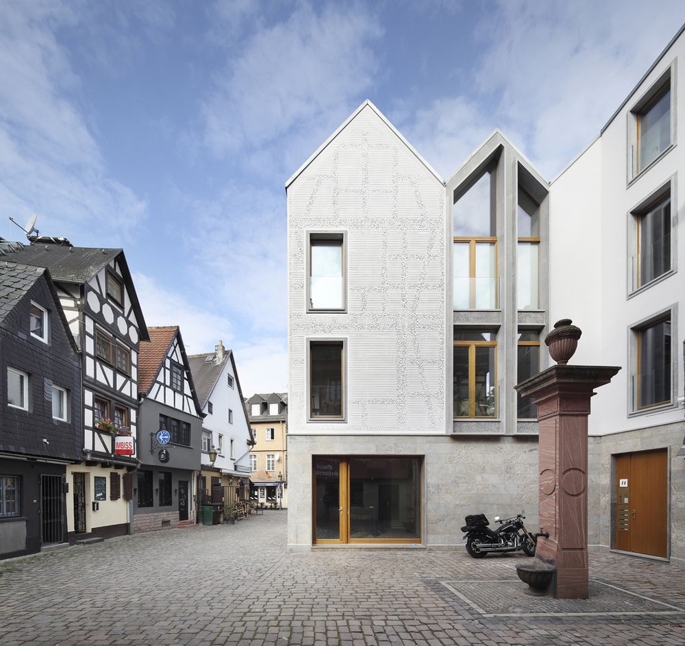
德国法兰克福Kleine住宅外部实景图
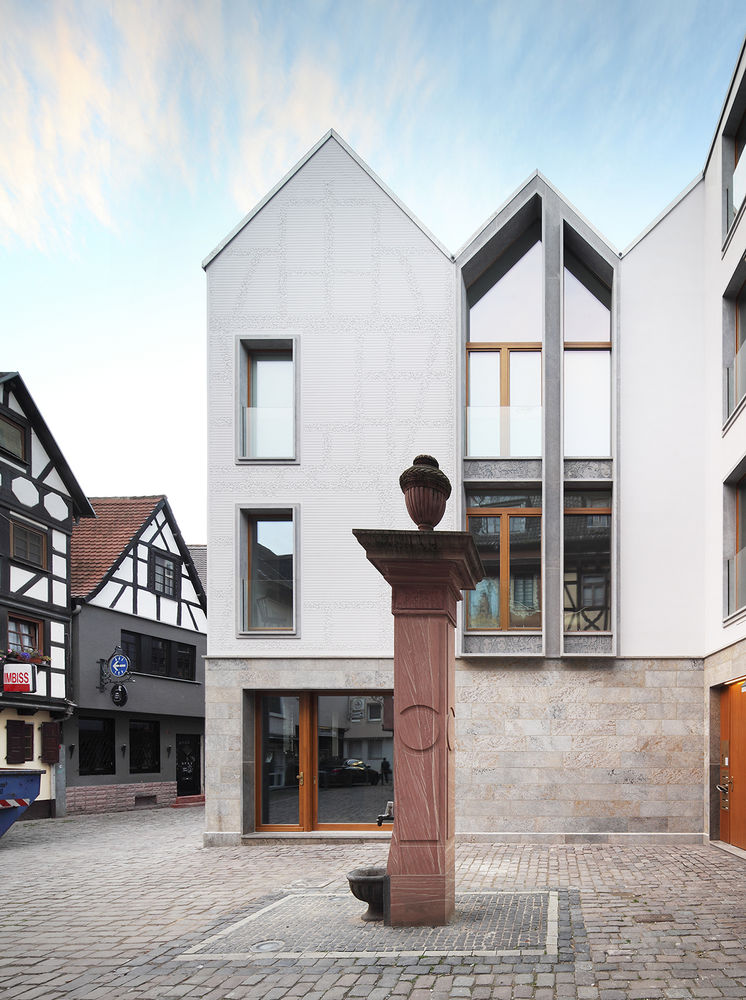

德国法兰克福Kleine住宅外部局部实景图
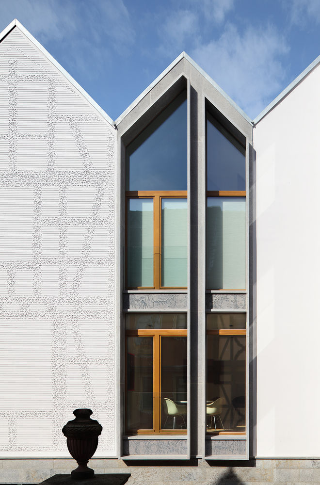

德国法兰克福Kleine住宅外部侧面实景图
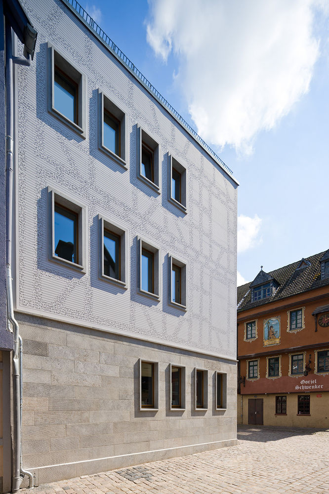
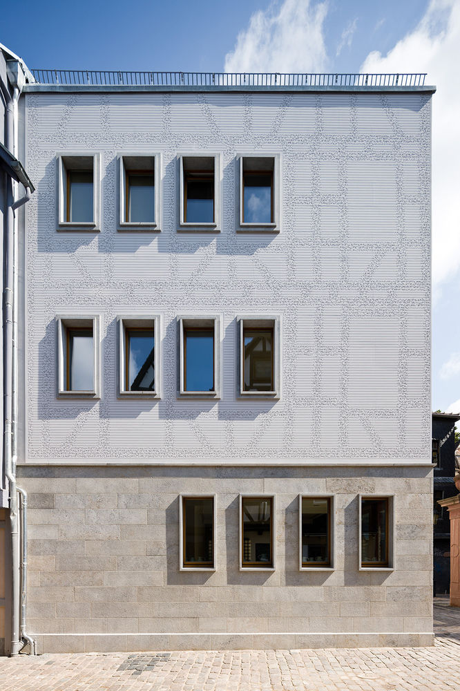
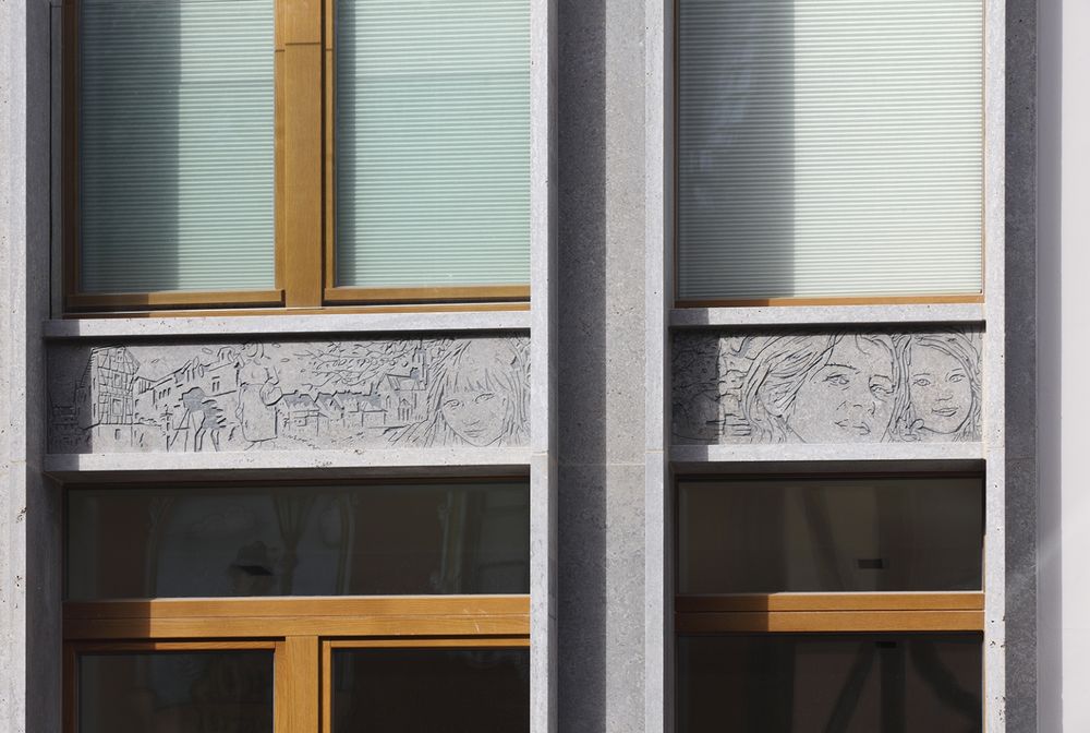
德国法兰克福Kleine住宅外部细节实景图
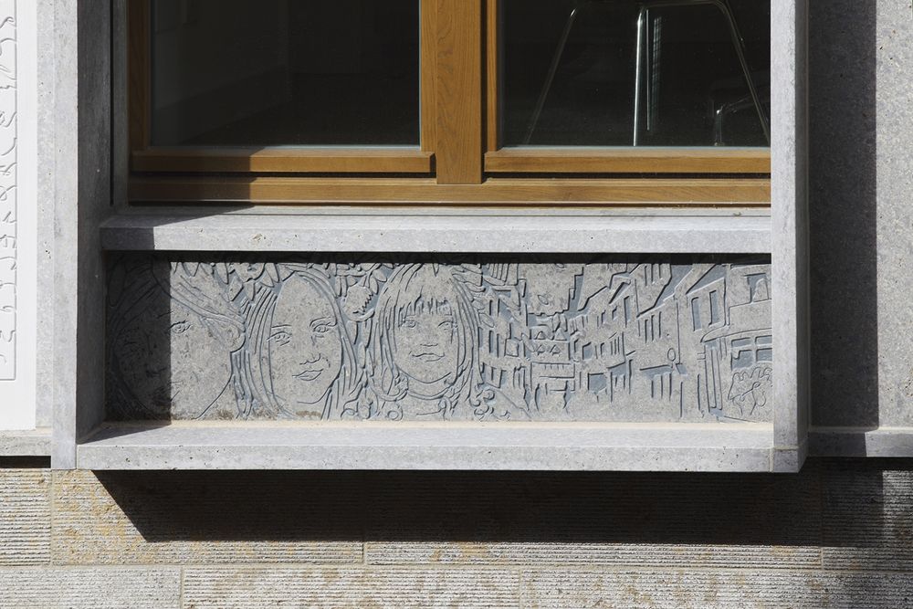
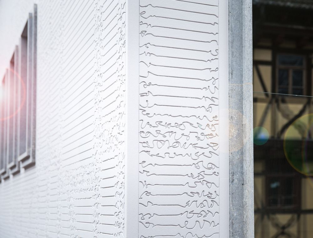
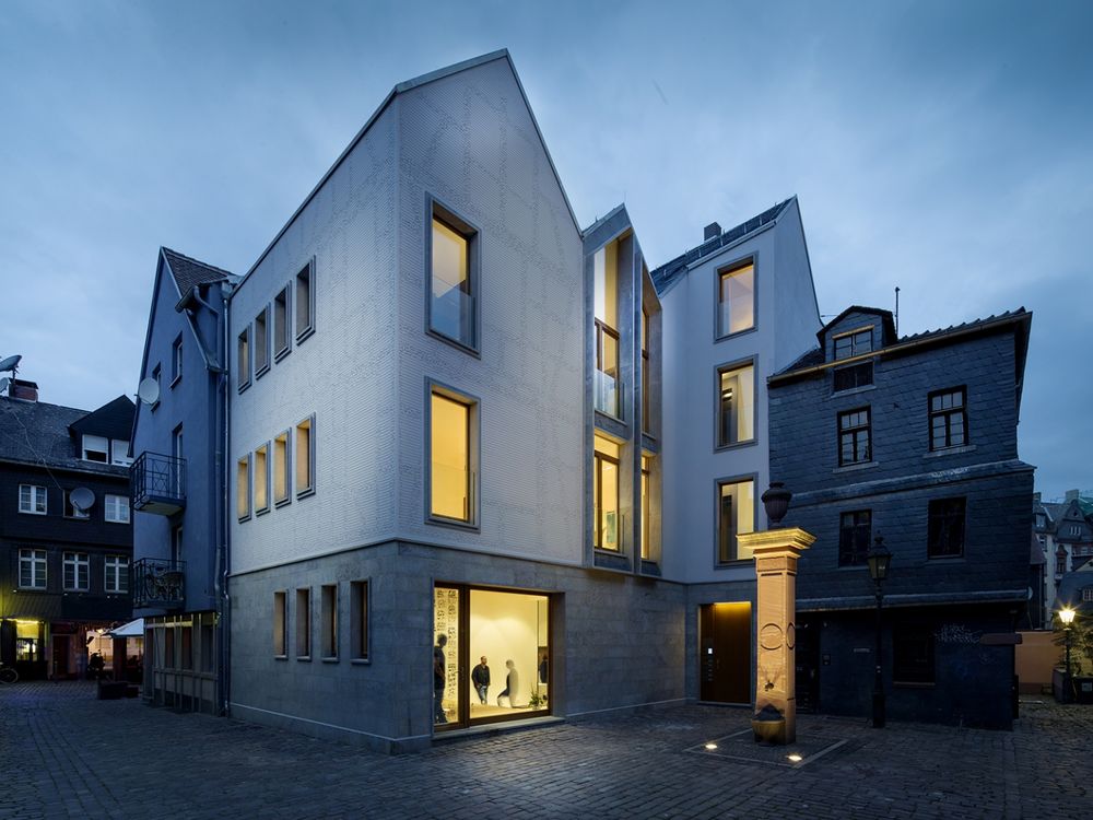
德国法兰克福Kleine住宅外部夜景实景图
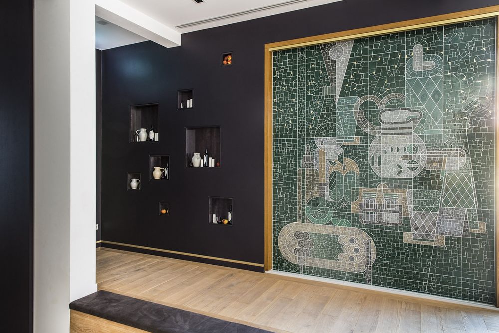
德国法兰克福Kleine住宅内部过道实景图
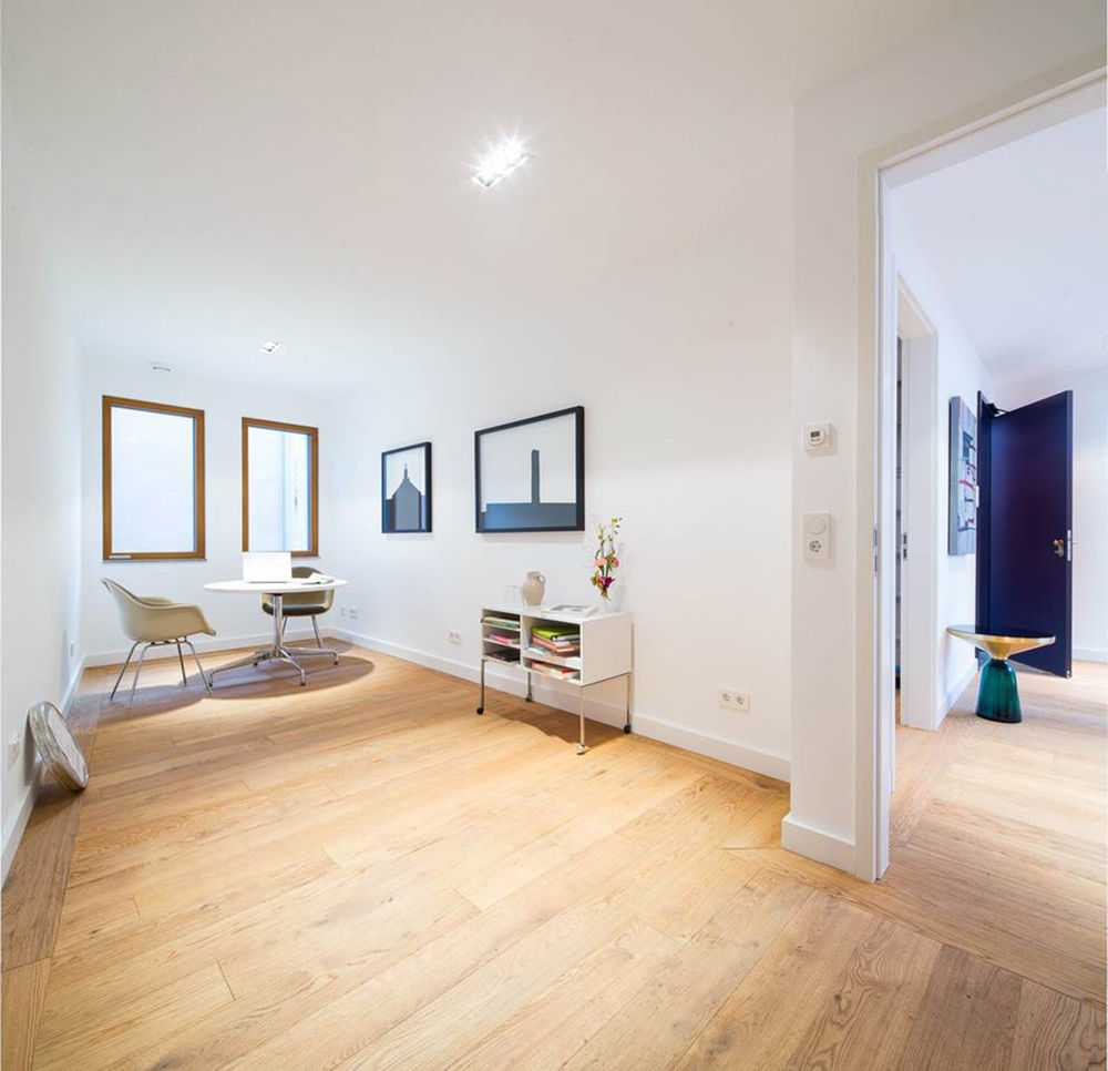
德国法兰克福Kleine住宅内部局部实景图
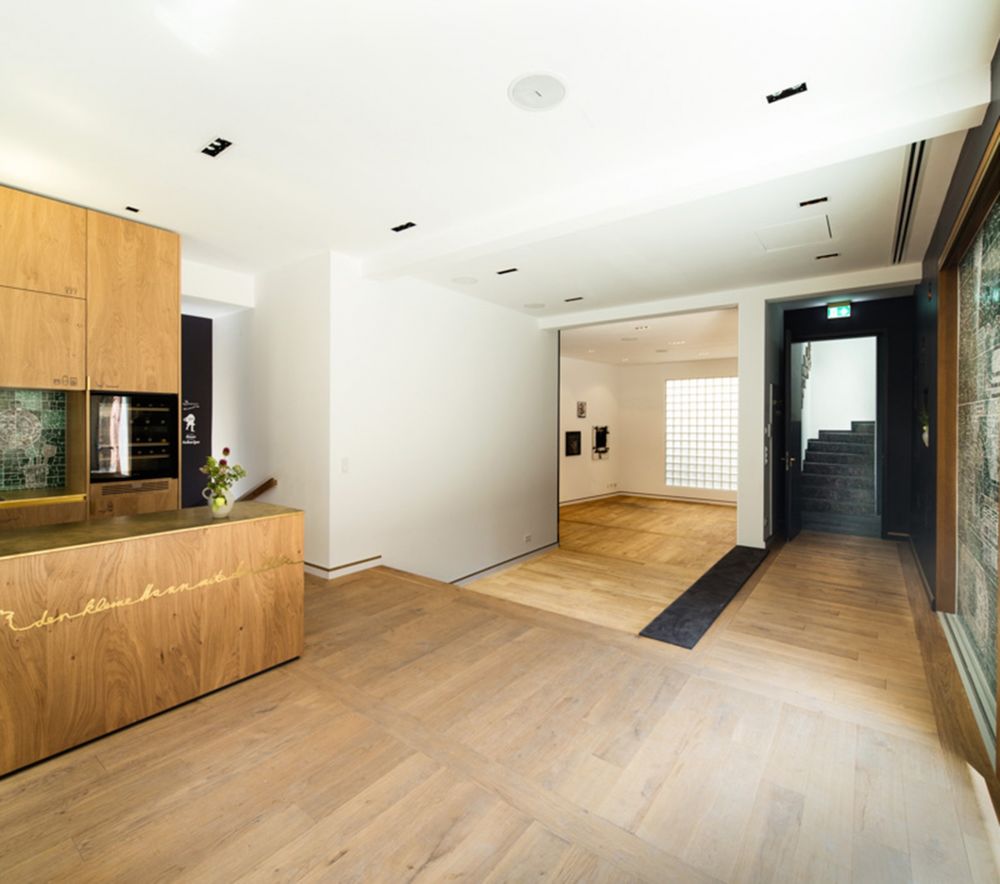
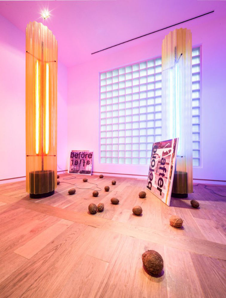
德国法兰克福Kleine住宅内部实景图
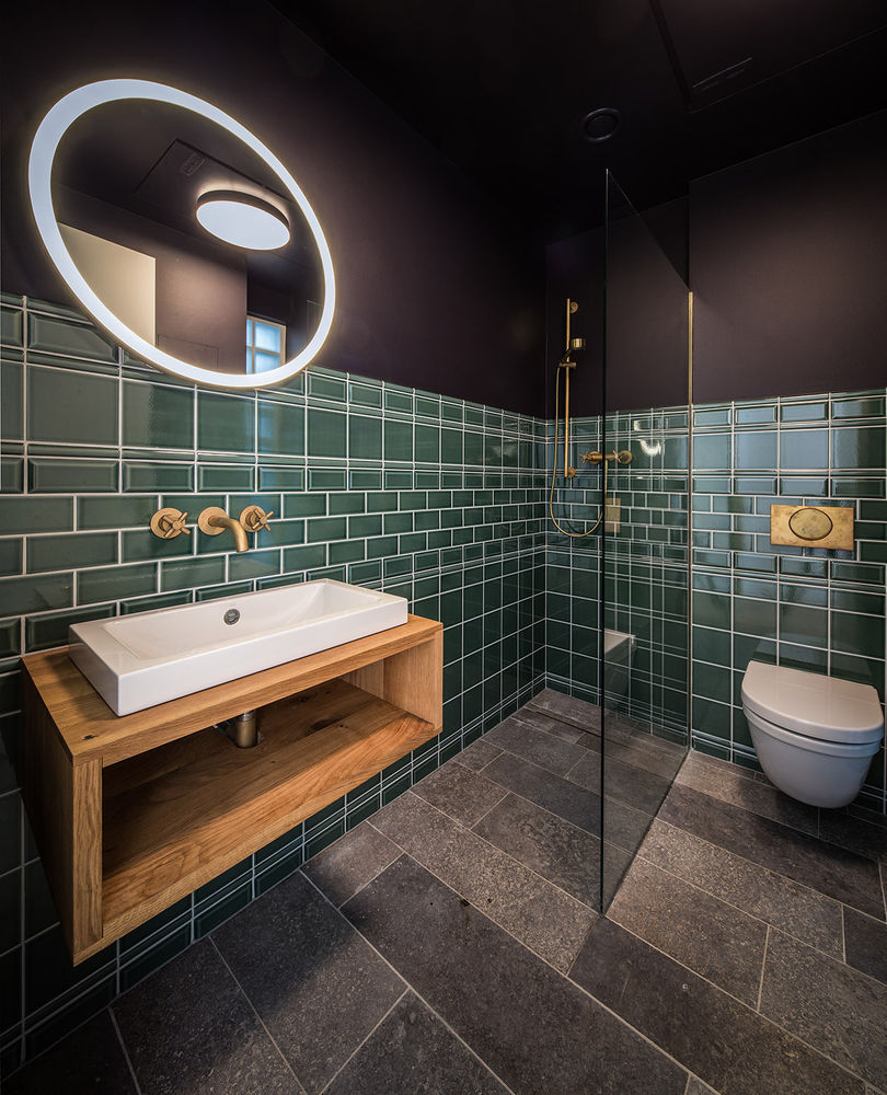
德国法兰克福Kleine住宅内部浴室实景图
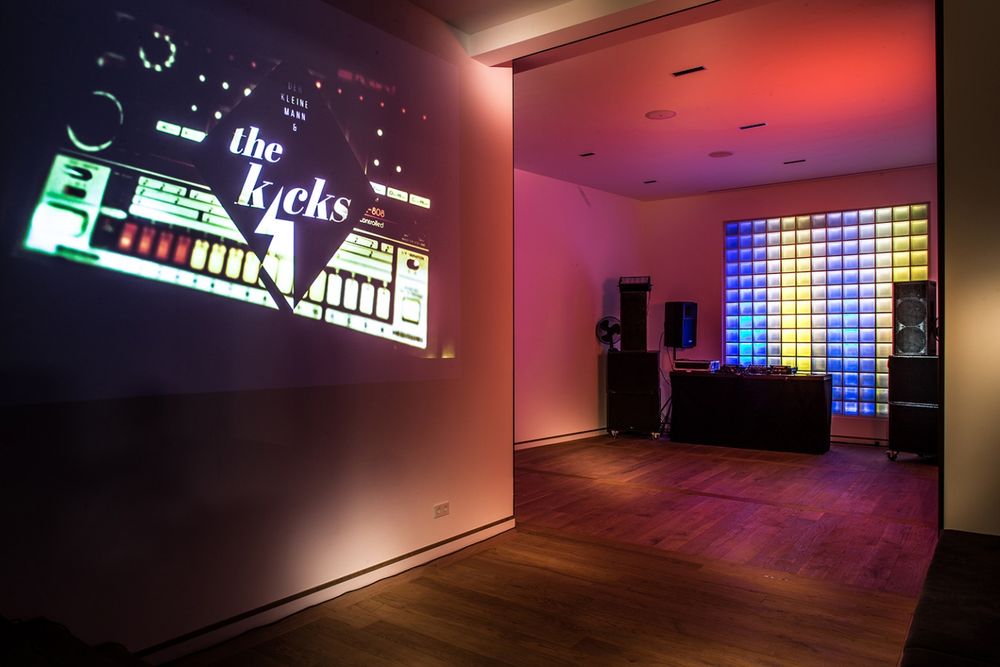
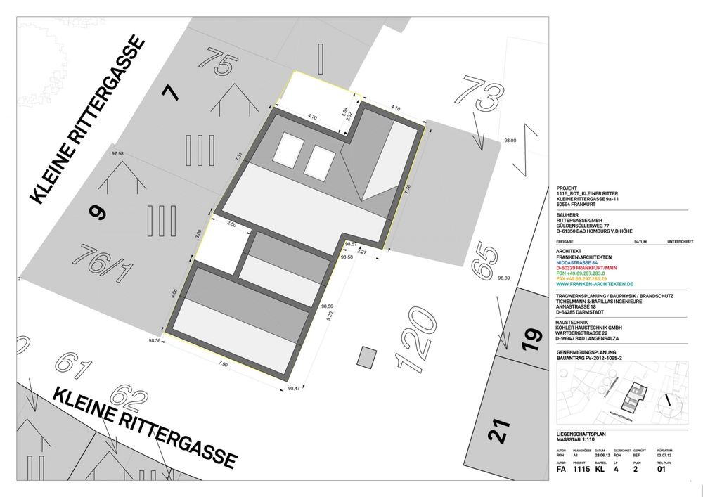
德国法兰克福Kleine
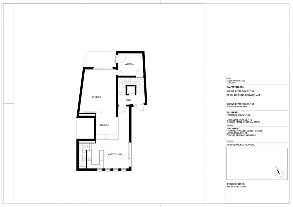
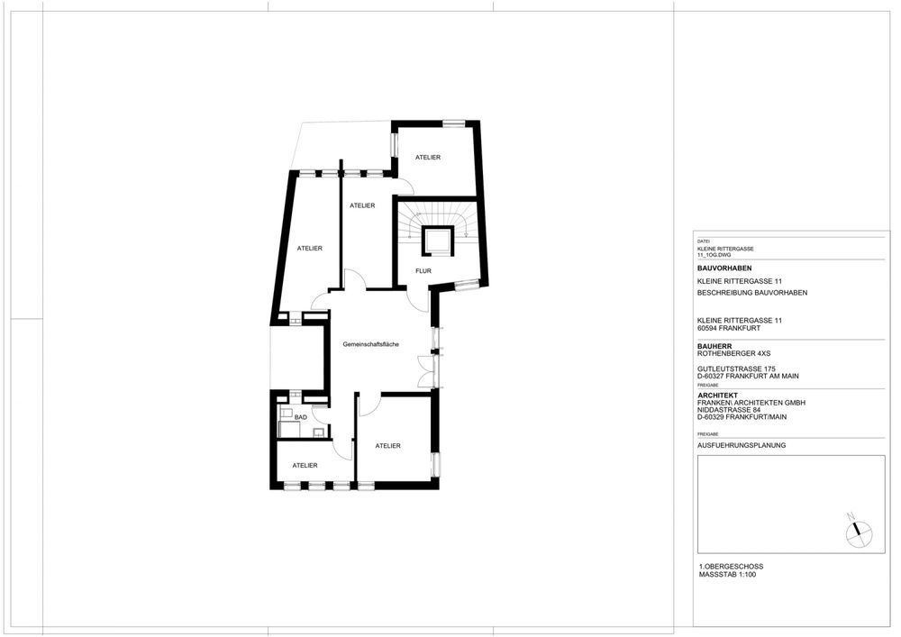
住宅平面图
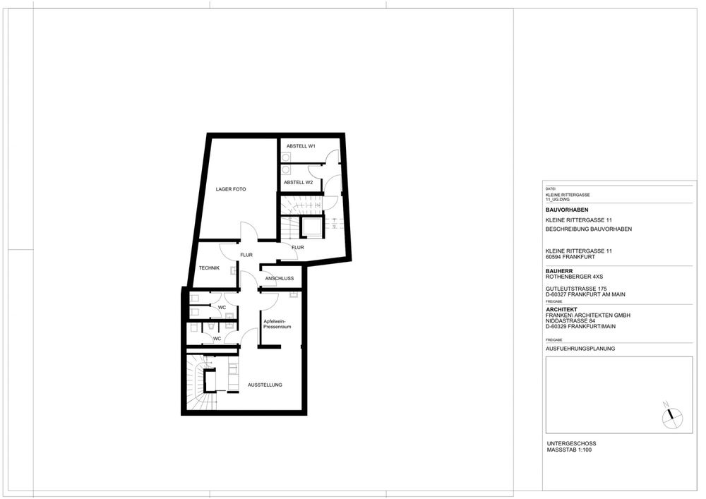
德国法兰克福Kleine住宅平面图

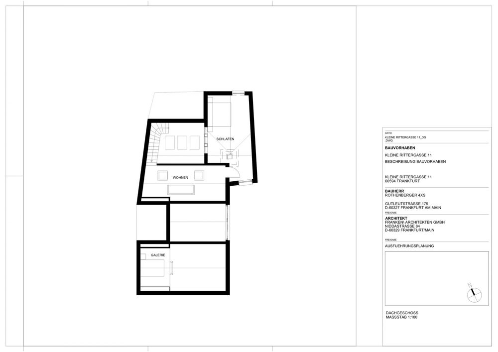
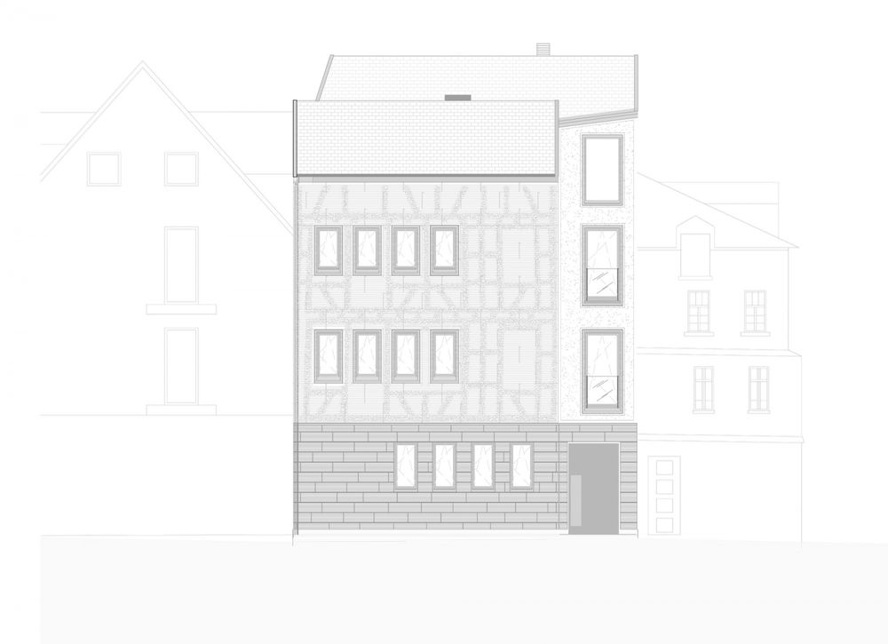
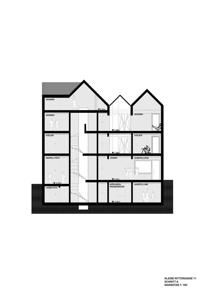
德国法兰克福Kleine住宅剖面图
