Firm: Studio Ardete
Type: Commercial › Office
STATUS: Built
YEAR: 2018
SIZE: 1000 sqft - 3000 sqft
BUDGET: $50K - 100K
Project Name – Skewboid
Architect or Architect Firm – Studio Ardete
Design Head- Ar. Badrinath Kaleru
Design Team- Ar. Badrinath Kaleru, Ar. Prerna Kaleru, Ar. Anusha Sharma, Ar. Mehak Gupta , Ar. Ramandeep Rathour
Project Management- R.S Builders
Electrical & Lighting Consultant- The Luminars
Metal Fabrication- B.N.K Dome Archi
Completion Year – 2018
Built Area – 2387 SQFT
Project Location – Mohali (Punjab) INDIA.
Photographer – Ar.Purnesh Dev Nikhanj.
Material used: Glass – Art N Glass (Laminated glass)
Lighting – I Guzzini
Veneers – Turakhia Veneers
Stone – CERA Grey Granite
Furniture- Durenzo
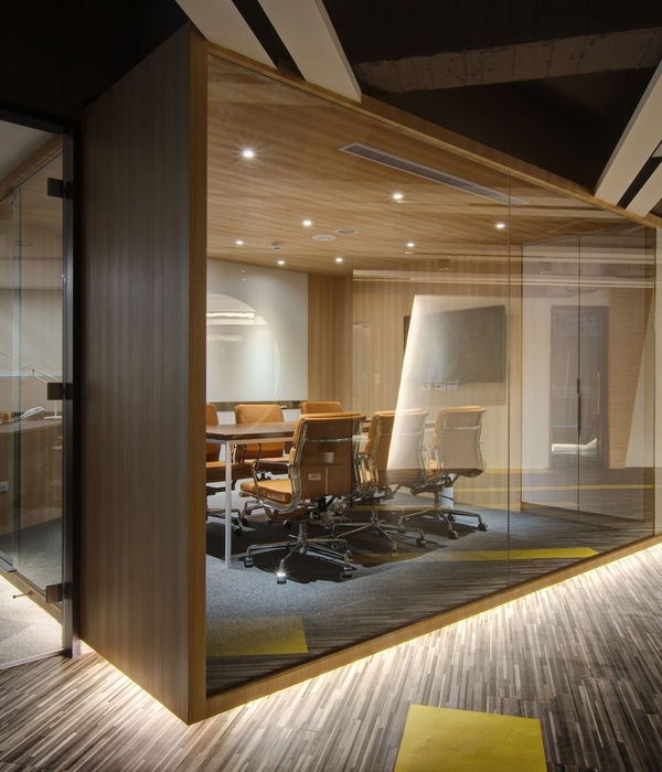
Breathing life into an urban monochrome through intimacy is an engaging frame of reference. Skewboid is a terrace office situated on an existing building in the industrial sector around the suburbs of Chandigarh. The rugged ennui of the industrial neighborhood presented by the lack of pleasant views steered the objective to develop a built environment as a whole where the construct would be an extension of the macro environment rather than consuming it completely.
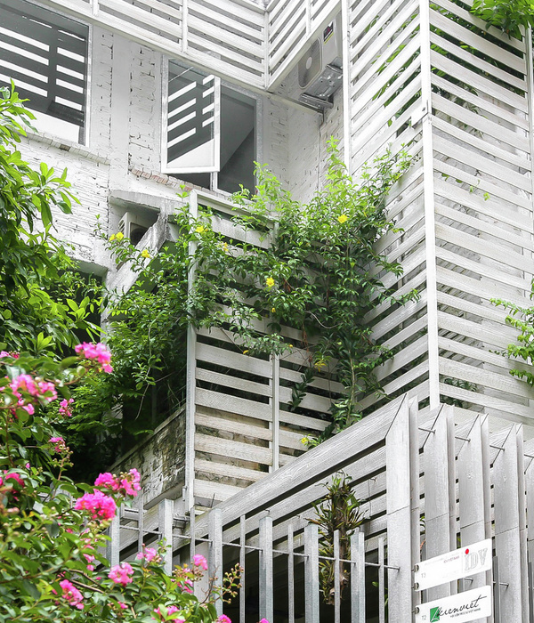
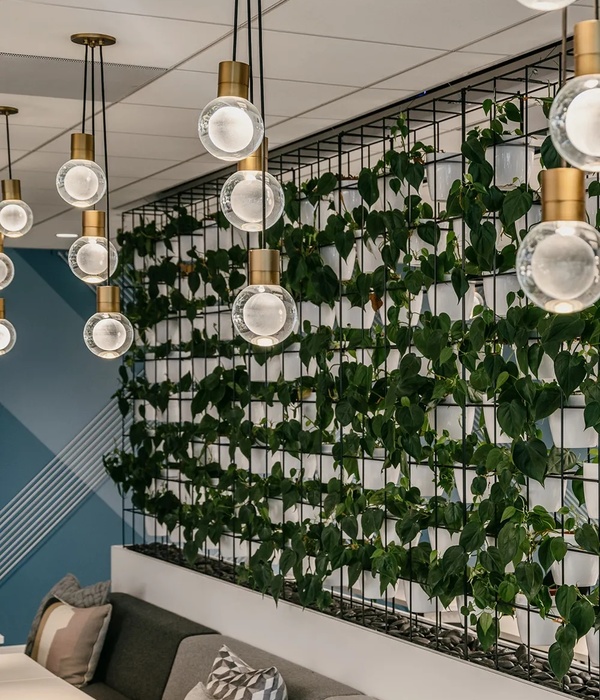
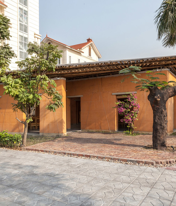
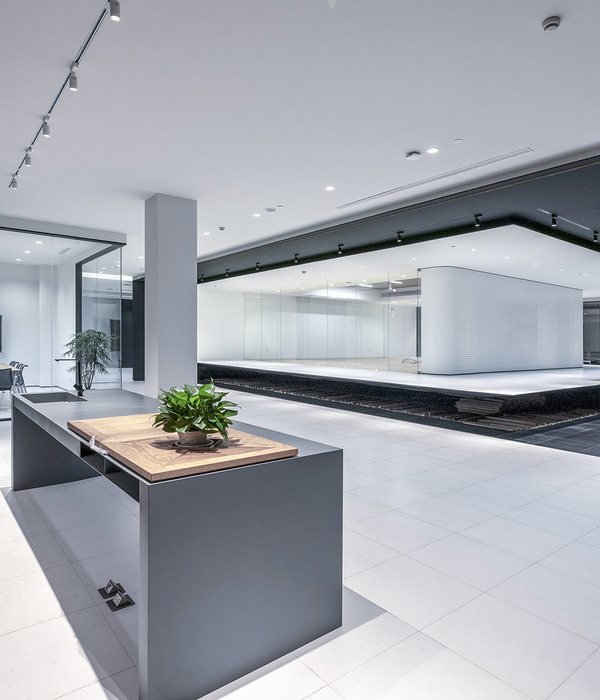
The office was interpreted as a microcosm of outward flowing spaces within a bounded box. From the exterior, the building appears to be an assemblage of distinct volumes representative of a larger milieu. The open spaces and the closed ones intertwine with one another unifying the spatial volume. Skewboid offers a dynamic skew of perspective through its varying heights and perceptive volumes which propound a visual dilemma of longevity. The meandering spaces within lead to individual encapsulating microcosms. The landscape is intimately created for each of these envelops providing a sense of unique inheritance and privacy. The terrace is envisioned as a congregational space for friends and family. The granite, gravel and the wood continue through the extroverted environment into the enclosure creating a sense of fluidity, emphasizing the building as a part of the whole and an augmentation of the environment thus created.
The two main volumes are laid in an angular manner, making two axis of vision. The spaces are interpenetrating volumes which face away from each other, welcoming different views into the room. The swathe is created in a considerable manner which tends to complement the axial configuration by providing a refreshing sight of grandeur through exclusivity. The construct is further accentuated by the varying heights of the volumes. The structure is made by a spatial lattice, a skin and bones structure flowing freely from wall to ceilings forming an amalgamation of surfaces. The sloping roof-scape of aluminum clad paneling with directional pattern following the slope is an integral element of design which acts as the skin. ACP paneling with brushed finish laid over a matrix of steel frames presents a beguiling yet artistic conundrum reacting to the shades of nature. The firm boldness of the structure is balanced by the lightness of the materials and the tones of white and grey. The tonal spatiality is heightened by the windows in all directions forming a play of light across the days and seasons. The patterns thus created, makes the light an inherent material of the space providing a texture of serenity. At once both an inclusive and an exclusive affair, Skewboid offers an enticing oeuvre of benign tranquility.
{{item.text_origin}}

