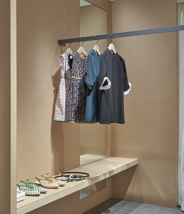
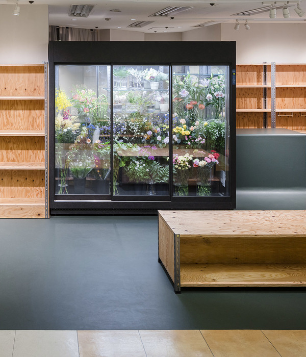
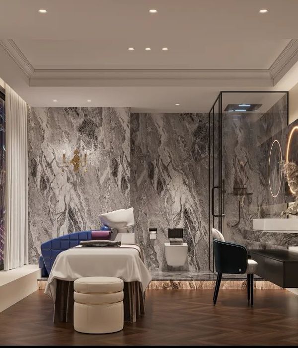
被简化的色彩,看起来比它们在以全部细节得到展现的情况下,更加人性也更加具有生命力。
——胡安·米罗
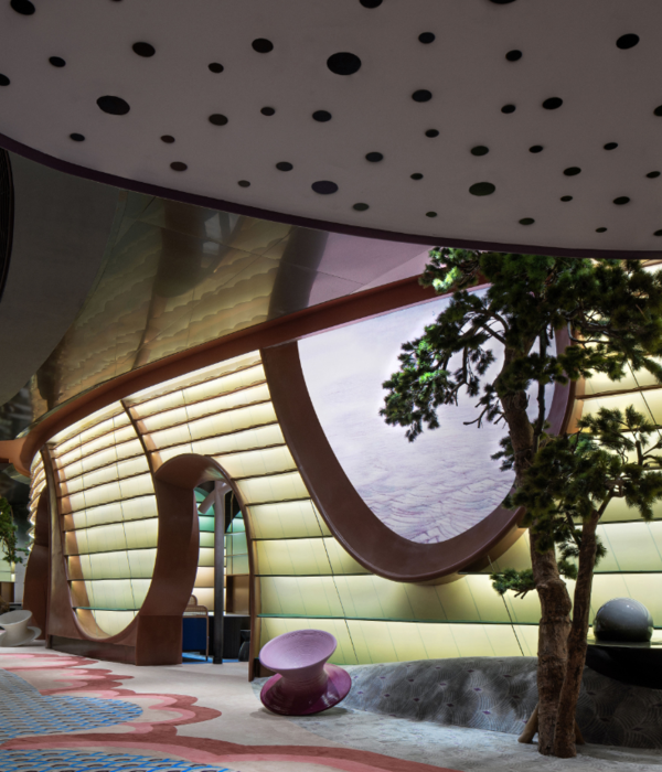
WM是一间设计师品牌集合定制店,与常见的服装店不同,WM服装店以“用色彩简化世界复杂”的理念,展示方式触动内心,提供更清晰直观的色彩感受,带有一丝神秘氛围和内向性格,为顾客带来沉浸式的购物体验。
WM is a designer brand collection customization store. Different from common clothing stores, WM clothing store uses the concept of "simplifying the complexity of the world with color". The way of display touches the heart, provides a clearer and more intuitive color experience, and has a mysterious atmosphere. And introverted personality, to bring customers an immersive shopping experience.
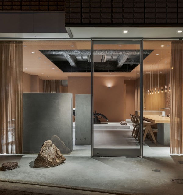
店面外部通体微水泥材质,没有奢华耀眼的视觉冲击,直线与弧线,有序组织硬朗的体块与充满感性的曲面形态,试图描述空间表象,同时简化空间内部结构及设备的复杂度,以一种抓眼的极简造型呈现在空间中。
The exterior of the store is made of micro-cement material, without the luxurious and dazzling visual impact, straight lines and arcs, orderly organized and tough blocks and perceptual curved surfaces, trying to describe the appearance of the space, while simplifying the complexity of the internal structure of the space and equipment, to An eye-catching minimalist shape is presented in the space.
路过于此,一切看似平静但却又蕴藏着的神秘力量,当灯光逐渐亮起,材质的颜色质地变幻映射着最真实的自我情感,在放大的个人情绪中,人们将重新审视自己的内心与周围的环境,鼓起勇气去追寻自我灵魂的声音。
Beyond this, everything seems to be calm but contains mysterious power. When the lights gradually turn on, the color and texture of the material changes to reflect the truest self-emotion. In the amplified personal emotions, people will re-examine their hearts. With your surroundings, summon the courage to pursue the voice of your own soul.
顺应空间规律进入,空间内线、面与构件沿着形式逻辑和内在结构有条不紊地展开,带来了韵律的美和深度的层次。在灰色基调中,微水泥的自然感和舒适感穿插其间,为空间带来了合宜的温度。
Entering in accordance with the laws of space, the inner lines, surfaces and components of the space unfold in an orderly manner along the formal logic and inner structure, bringing the beauty of rhythm and the level of depth. In the gray tone, the naturalness and comfort of microcement are interspersed, bringing a suitable temperature to the space.
在空间语言上,设计师用纯粹的几何形体去除刻意的装饰和造型,使空间回归本源,为从城市的嘈杂中脱身的人们带来片刻宁静。空间中心采用不锈钢和天然石材制作的矩形展示台,两种不同材质从碰撞到融合,自然艺术得以充分体现。
In terms of space language, the designer uses pure geometric shapes to remove deliberate decoration and modeling, so that the space can return to its origin, bringing a moment of tranquility to people who escape from the noise of the city. The center of the space is a rectangular display stand made of stainless steel and natural stone. The collision and fusion of the two different materials fully reflect the natural art.
玻璃岛台是空间的又一个中心,也是设计中的焦点。设计师静心挑选白色的天然肌理及质感的大理石,让细致入微的触觉、感官和情感融入空间,以微妙的对立关系,用保有美好浪漫的心感受人性和世界,在空间与心灵及服装之间构建链接,是对于品牌精神的延续。
The glass island is yet another centerpiece of the space and a focal point in the design. The designer carefully selects the white natural texture and textured marble, and integrates the nuanced touch, senses and emotions into the space, and uses the subtle opposition to feel the human nature and the world with a beautiful and romantic heart, between space, soul and clothing. Building links is a continuation of the brand spirit.
为了让空间足够开放通透,设计师将门框、轨道等做了最大限度的隐藏,从而为街道视角提供几乎不受干扰的室内效果,同时街道的鲜活场景被纳入空间内,成为动态展览内容。
In order to make the space open and transparent enough, the designer hides the door frames and rails to the maximum extent, so as to provide an almost undisturbed indoor effect for the street perspective. At the same time, the vivid scenes of the street are incorporated into the space and become dynamic exhibition contents.
室内对称的层架延伸了顾客的视野,角落隐藏着试衣间;墙面细腻的肌理与大理石粗旷的纹路为宁静的空间增添了一丝野性。
Symmetrical shelves in the interior extend the vision of customers, and the corner hides the fitting room; the delicate texture of the wall and the rough texture of marble add a touch of wildness to the quiet space.
试衣间外通体镜子将整体空间带回宁静,嵌入式照明来加强店铺的层次感,灯光衬托出金属的层板,使其质感更加饱满与突出。
The full-body mirror outside the fitting room brings the whole space back to tranquility, and the embedded lighting enhances the sense of hierarchy of the store. The light sets off the metal laminate, making the texture more full and prominent.
在不断变换的环境中原始粗旷的表皮充分与等光互动,营造出另一种变幻的肌理。此处整体底色以更纯粹的黑灰色调为主,柔和的沙发带来舒适的体验,满足展示,更衣,休息交流的功能,达到沉浸式购物的效果。
In the constantly changing environment, the original rough skin fully interacts with iso-light, creating another changing texture. The overall background color here is dominated by purer black-gray tones, and the soft sofa brings a comfortable experience, which satisfies the functions of display, dressing, rest and communication, and achieves the effect of immersive shopping.
石头的天然肌理,粗犷斑驳,朴质原始的自然元素增加了空间的叙事性,不锈钢材质的加入为过去与现在建立联系,为消费者与空间之间搭建无界的对话。
The natural texture of the stone, rough mottled, simple and primitive natural elements increase the narrative of the space. The addition of stainless steel creates a connection between the past and the present, and builds an unbounded dialogue between consumers and the space.
从商品到空间,每个细节的雕琢都经过反复考量和推敲。基于空间性质和细部考量,从灯光、陈列到色彩配置,设计在展示商品的同时始终注重购物体验,最终显现出极高的品质。
From merchandise to space, every detail has been carefully considered and scrutinized. Based on the nature of space and detailed consideration, from lighting, display to color configuration, the design always pays attention to the shopping experience while displaying the products, and finally shows a very high quality.
▲项目平面图
Project Information
项目信息
项目名称 | 我们
设计公司 | 叶设计
设计团队 | 陈伟涛燕秀
店名 | WM品牌买手集合店
项目地址 | 浙江省台州市椒江区亿嘉路29-31号
END
叶设计|YE INTERIORDESIGN
叶室内设计事务所是一家高端全案设计公司,致力于从事别墅私宅、商业地产等高级定制化设计服务。我们善于从分析项目定位,针对客户需求从项目策划、空间设计、施工指导到软装落地等专业系统服务。
我们通过对居住理念和需求本质的深层思考,构建当下人对空间的物质与精神的感受,平衡生活艺术和情感体验两者的关系,为客户造就更好的感受与生活方式。对创新的不懈追求,以当代的感官体验为设计视角,将艺术与设计融入设计,致力打造高品质人性化的奢华空间。
叶设计 | 现代性语境下的办公区
叶设计 | 770㎡现代轻奢风别墅,精致典雅
叶设计 | 大理石与原木的碰撞,勾勒出空间艺术脉络!
叶设计 | 理性闪烁典雅艺术浪漫,感性层叠高贵现代奢华!
叶设计 | 玩转金属色,打造鲜活而明丽的前卫顶层住宅!
叶设计 | 璀璨简生:黑白交织下的优雅、浪漫!
精致私宅:听说,平静奢华的别墅长这样?
567㎡别墅私宅,时光藏艺!
精致与现代的完美邂逅:打造雍容气度之家
18969621351
联系地址台州市椒江区市府大道Z中心2号楼313室
{{item.text_origin}}

