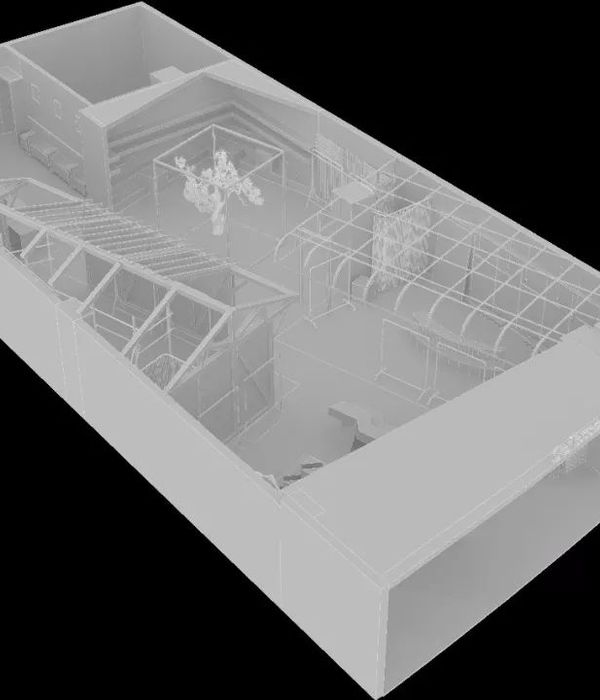
Kyoto Machiya (traditional townhouse) has been renovated into a showroom for a Kimono shop and photo studio. The client told that it was difficult for a Kimono business to just keep its tradition and that they wanted something interesting that would attract customers.
This request was mainly responded with replacing the existing exterior wall with a glazed curved wall that crosses the original interior and exterior boundary. The contrast between the old and the new is naturally eye-catching, but a sense of humor and ingenious beauty that go beyond was aimed to add. As the original idea of the curved glass turned out to be unrealistic with our budget, it was changed to a polyhedron with a series of small flat glass sheets. Since a polyhedron of small pieces of glass seemed to fit this project more, as its glitter is like a Kimono’s one rather than trying to make it look transparent with a large piece of glass and the vertical lines of glass joint also gave the sense of connecting the glass wall to the traditional townhouse design.
A semi-outdoor space was created by removing the original front door which faced the street and drawing the approach into the inside to give depth to the visitor’s entry experience. For accommodating various usages, a large entrance directly facing the street was required. Therefore the glass door was bent at its middle to apply the polyhedron as it is.
Also for another side entry door, to match the width of each polyhedron glass sheet, the glass was split in the middle and a gap like a joint was left. An ordinary floor-hinged glass door looks fresh just by bending it or having a little gap. This time only the room facing the street was designed. But the beauty of the view from the street to the garden through the new room and the existing traditional rooms and shooting a figure in that view were aware as beautiful from the beginning. The new glass door was designed for maximizing it.
Stepping stones for an approach in Japanese tradition are generally thick chunks of stone with a roughed surface by a chisel. However, since the client frequently comes and goes with products, he asked to align the level of the stone surface with the mortar floor to prevent from over-turning. So thin 600 square jet-burner finished stone pieces were cut into freehand shapes and placed into the floor. As result, the client’s practical request led to a neat and modern expression.
It is intended to be used both as a near-empty photo studio and as a showroom for Kimonos. Also, the simple system to hang the Obi (sash) and textile from the ceiling with the cloth in between, to display them dynamically has been designed. Hope the new space stands out surrounded by the old Machiya and makes the Machiya itself look attractive again.
Architects: 07BEACH
Photographs: RuRi Photo Studio
{{item.text_origin}}

