中庭造景
Atrium Landscaping
SeibmacA是一家潮牌买手店,我们受邀为其设计在常州爱琴海购物广场的中国第一家分店,服饰以高标准的材质及不盲目跟风的设计理念而闻名。宣扬将街头文化的精神与艺术品相互融合,作为各方文化之间隔阂的桥梁,体现“多元文化”的品牌核心价值。
SeibmacA is a fashionbuyer shop, we were invited to design their first branch in China at the AegeanSea Shopping Plaza in Changzhou. The store is known for its high standards ofclothing materials and its design concepts are not blindly follow the fashion.They combine the spirit of street culture and art, as a bridge between thecultures of all aspects, and reflects the core value of the brand of “multiculturalism”.
▼
国际区 International
当我们接手这个项目的时候,客户告诉我们距离开业的时间只有一个多月,意味着要以最快的效率完成设计和施工。并且在有限的预算范围内规划四个不同品牌的区域,各自独立又要彼此相连,还要保持品牌的特有形象。
When we took over theproject, it was only more than a monthbefore the opening, which means that the design and construction should becompleted with the utmost efficiency. And plan four different brands of areaswithin a limited budget, each area should be independent and connected to eachother, but also maintain the brand's unique image.
▼
鸟瞰图 Aerial view
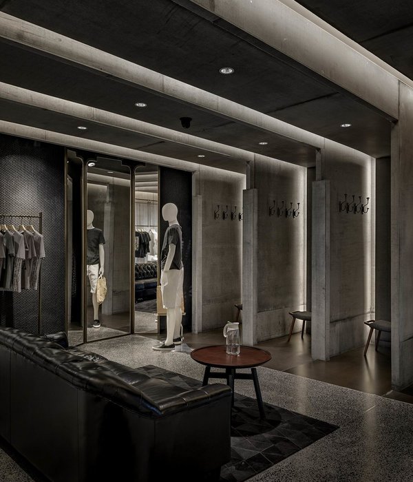
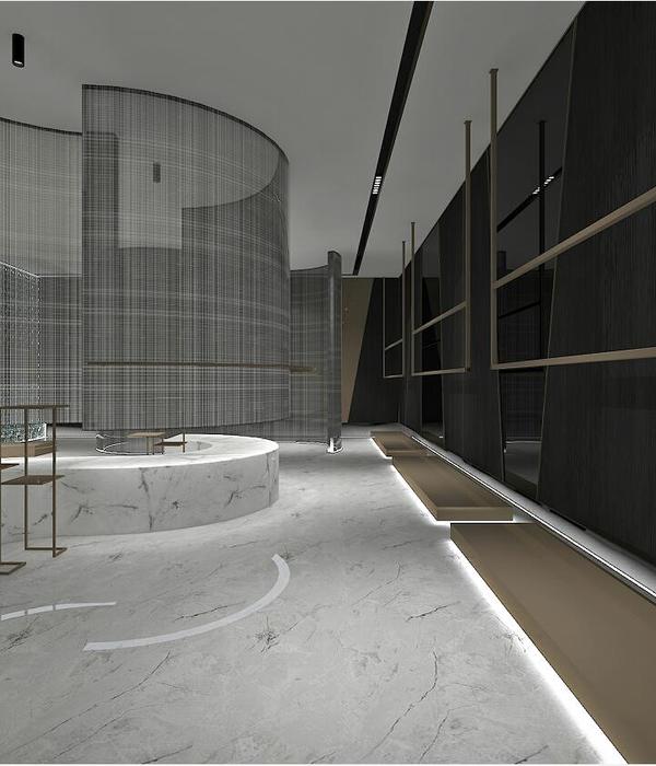
SeibmacA秉承“多元文化”,提倡“包容”“尊重”“博爱”,这是潮牌的一种态度。我们在店铺内植入了两个不同性质的盒子,以斜切的方式插入空间,分隔成四个区域,分别是International、Sence.LA、SeibmacA、Keios.打破固有空间的呆滞,营造一种动感的视觉。我们保留了原有的混凝土柱子和裸露的顶部,尽可能的采用一些街头元素的建筑材料,更好的体现潮牌风格。
SeibmacA adheres to “multiculturalism” and advocates “tolerance”, “respect” and “fraternity”.This is an attitude of a fashion brand. We have inserted two boxes of differentmaterial in the store, and inserted them into the space in a diagonally cutmanner, which is divided into four areas, namely International, Sence.LA,SeibmacA, Keios. Breaking the inherent space, creating a dynamic Vision. Wehave preserved the original concrete pillars and exposed tops, using somestreet elements as much as possible to better reflect the street style.
▼
Sence.LA
SeibmacA区域是采用方木搭建的房子,整个内部是素黑的空间,并以错拼的瓦楞板和工地的脚手架,衬托服饰的高街感。
The SeibmacA area is ahouse built of square wood. The whole interior is a black space, with astaggered corrugated board and scaffolding on the construction site, settingoff the high street feeling of the clothing.
▼
SeibmacA
Keios主要是出售帽子,我们捕捉了平面中正斜线条的冲撞,以阶梯的呈现形式摆放产品。使陈列更具有层次感。
Keios area mainly sells hats, we capture thecollision of the positive slanting lines in the plane, and put the products inthe form of a ladder. Make the display more layered.
▼
Keios
▼
收银区
▼
平面图 Plan
项目名称
:SeibmacA服装买手店
设计
:上宅良营空间设计
完成年份
:2018.12.20
设计
:汪春林
项目地址
:中国.
江苏.常州
建筑面积
:238m²
摄影
:刘宇杰/稳摄影
施工单位
:上海君蓝装饰
施工监理:
余乾坤
客户:
香港潮艺基金管理有限公司
材料:
铁板、乳胶漆、木材、不锈钢、瓦楞板、阳光板、PVC管
Project Name
:SeibmacA clothing buyer shop
Design Company :
SHANGZHAI LIANG YING Space Design
Year of completion
:
2018.12.20
Designer
:
Chun Lin Wang
Project Location
:
Changzhou,Jiangsu,China
Project area
:
238m²
Photograph
:
Yu jie Liu/WEN Photography company
Construction company
:ShanghaiJun lan decoration
Construction supervision
:
Qiankun Yu
Client
:
Hangzhou Chaoyi Enterprise Management Co., Ltd.
Material:
iron plate, latex paint, wood, stainlesssteel, corrugated board, sun board, PVC tube
如有设计需求,敬请咨询
T / 13588295546
●
建筑。室内。
Architecture。Interior。
●
欢迎分享至朋友圈
Welcome to Share to friends
Reproduced please specify elegent deign,
Rights Reserved.
{{item.text_origin}}

