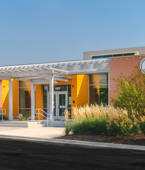
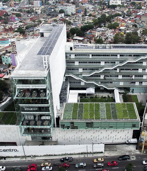
Client Brief. The client came to us with a requirement to design a pre-primary school for about 80-100 students on a site, which was part of a commercial building abutting a large residential colony. The client (already having two operational schools) gave us a very clear brief for this new addition. She wanted a school that will stand out from the other preprimary schools in the vicinity so that the number of admissions increases. Maximum utilization of the space available across 3 floors and having a child-friendly premise was her prime requirement.
Initial Thoughts. One of the first challenges was to deal with a total area of 3000 sq. ft. spread across 3 levels. Secondly, out of this total area, covered space was just 50%. During our initial discussions with the client, we made an attempt to understand their new ways of teaching and conducting classes. We also visited other similar schools in the vicinity. To our surprise, a very radicle system of conducting classes has evolved over the years. It is not only about lessons taught in the class but also about activity-based learning. We also noticed that most schools catering to this age group between 2-5 years were very similar in terms of look and feel and space aesthetics.
Another important aspect that we explored was to understand the behavioral patterns of kids around us. At the age group that we were looking at, we realized that confining them in four walls of a classroom for a long time is not an idealistic scenario. Their energies have to be left free so that learning happens as a part of their natural growing process. This was our cue for design development. We decided to create a space that offers opportunities to learn and grow, not only in confined classes but also outside. Idea was to create an environment for a kid to absorb, explore and learn right from the point he/she enters the school premises. Thus, it evolved 'The Outdoor Classroom'.
Design Deliberations. Material palette & overall design vocabulary was derived to be more earthen so that a human connect is achieved. Bamboo, ‘kavdi’ flooring, cement boards, and agro wood helped us in defining aesthetics. Customized graphics, minute detailing & child-centric approach formed the backbone of our designs. Splashes of color were strategically used to highlight certain aspects of design.
Play of shadows cast by various pergolas helped in creating interesting visuals that keep changing as the day progresses. Our designs revolve around natural ventilation, multi-functional furniture and visual connection between spaces. Moreover, the entire project focuses on creating opportunities for kids to keep learning and exploring thru’ out the day. All spaces are multifunctional, have kids’ centric graphics, blackboards for them to draw, pin-up panels for them to display and elements inbuilt for them to sit, read and play, which eventually will help them grow happily…!!
{{item.text_origin}}


