Factory has accomplished the office design of M.Moustache, a footwear design company, located in Paris, France.
Created in Paris in 2012, M. Moustache is a French shoe brand with a vintage spirit. It is with carefully selected materials and refined curves that the brand develops its unique range of shoes. The head office moves to rue de Paradis into a typical building from the 70s, with a surface area of 380 m2 and a large terrace.
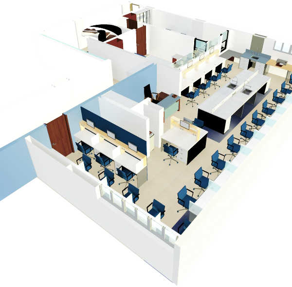
Three main objectives: The first was to achieve a functional arrangement while taking into account the company’s growth and potential reorganization needs. The second aim was to create a universe that reflected the brand’s identity, warm, authentic and elegant, with a home-like atmosphere. The third challenge was to bring together three different minds and organisations in the same place: an office, a collaborative work space and an area similar to a showroom.
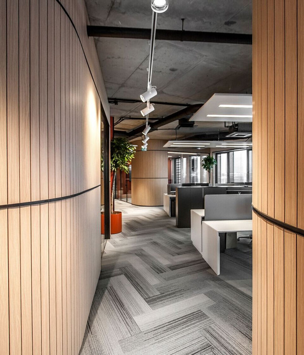
Formerly located in a Haussmann-style building, the team lacked space, storage and comfort. The company decided to make a long-term investment and acquired a new, larger and more comfortable place, reminding one of an old ocean liner from the 70s. The idea was to play with the specificities of the premises and to be inspired by this typical, round design. The angled shape was multiplied all over the room, on the platforms and on the floors. They contrast with the very linear canopies of the glass partitions.
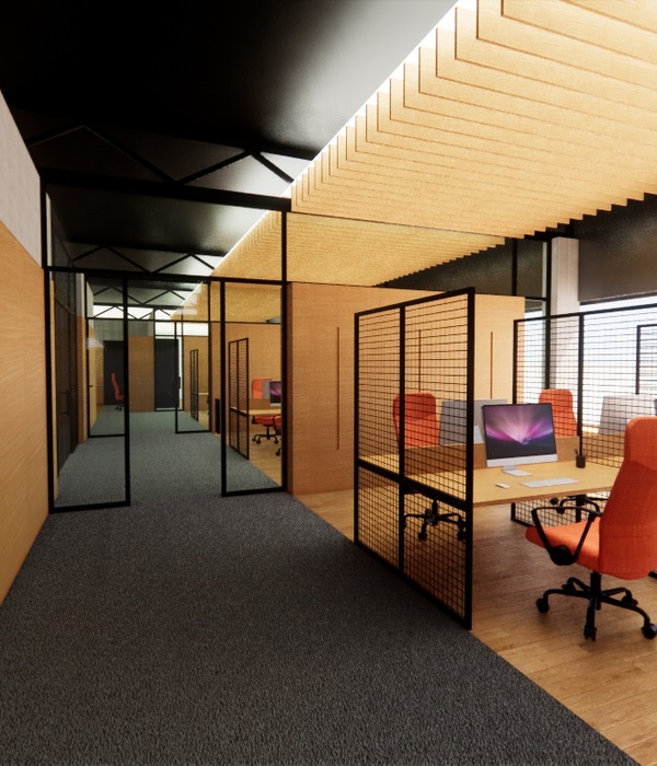
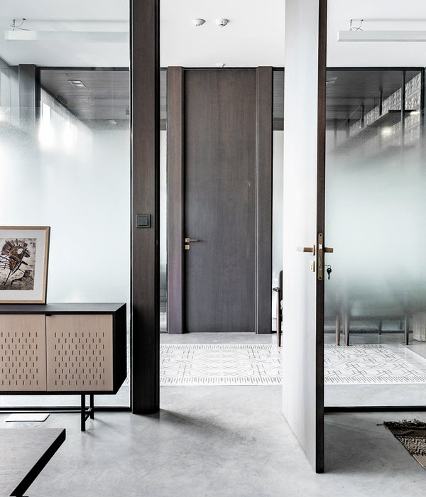
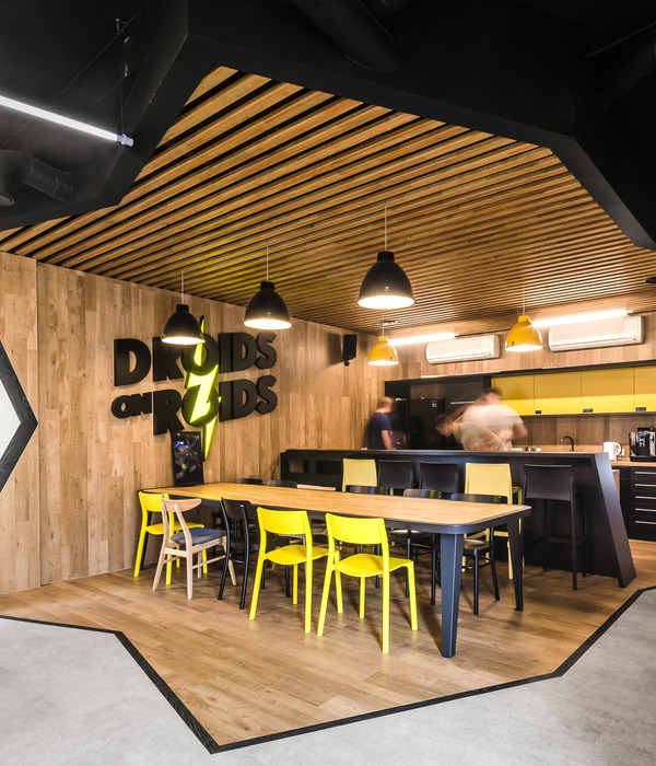
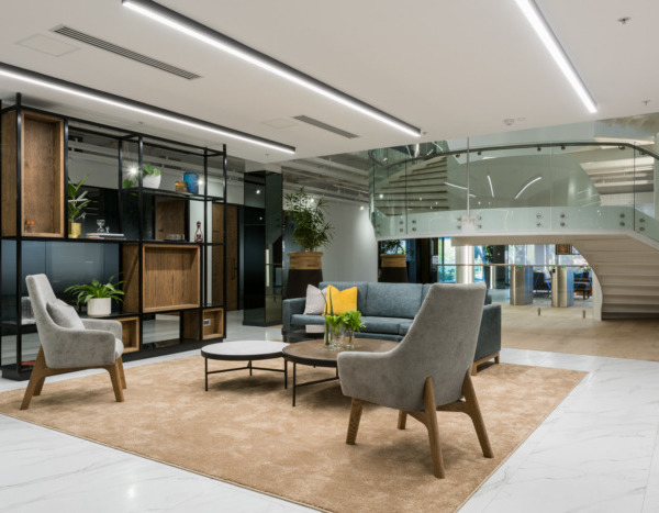
At M. Moustache’s, the offices are both a showroom and an Atelier dedicated to creation. They allow the team to work in the best possible conditions: each division has its own space, adapted to its needs. The different departments are partitioned by different types of parquet, leather, carpet and PVC flooring, allowing them to be organized, while maintaining the open space dimension and thus the circulation and communication between the teams. One of the rooms is only dedicated to the storage of stocks and boxes. One part of the office is reserved for the B2B and B2C showrooms, which add a whole new dimension to the place. These two places both serve as sales areas as well as meeting rooms. Finally, the cafeteria allows the team to gather and have lunch together around a big table.
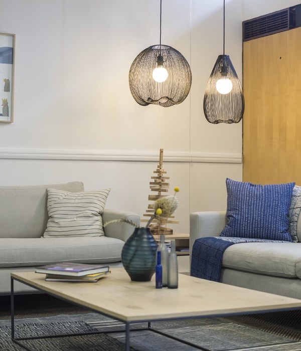
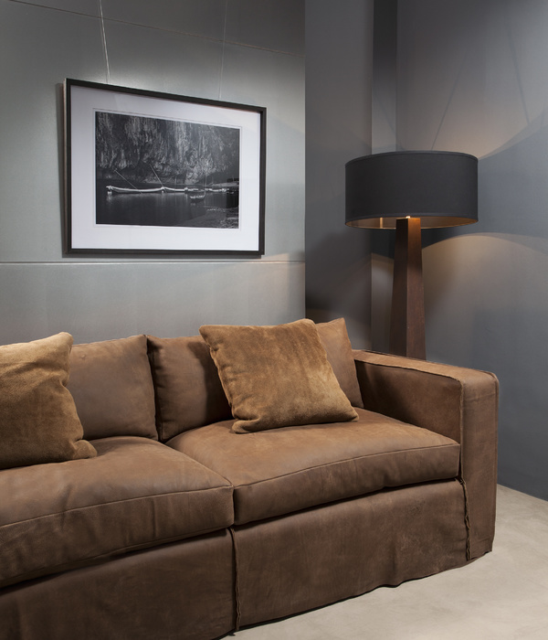
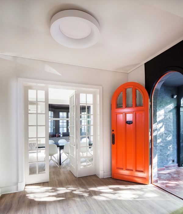
Far away from the classic offices, this new place has been transformed into a warm, home-like space. The choice of colors echoes the brand’s corporate identity with blue, but also the seventies side of the place is supported by orange. The design concept was based on the look and feel of M. Moustache’s stores: colors, materials, organization. A few carefully chosen pieces bring an authentic aspect, which is very present in the brand. The balance of those give a “wow effect” that lasts and which will age well, all in the image of the brand which we hope to accompany for a long time.
Design: Factory
Photography: Agathe Tissier
9 Images | expand for additional detail
{{item.text_origin}}


