蒙特利尔 Videoville Showtime VVS 电影公司办公室 | 艺术与现代的完美结合
Inside Studio realized the newly located offices of leading film distribution company, Videoville Showtime VVS Films, located in the historical old town of Montreal, Canada.
The century-old building received a modern expansion in 2018 providing the 7,000sq.ft. space with both historic character and contemporary edge; a subtle nod to where the company has been and where they are headed.
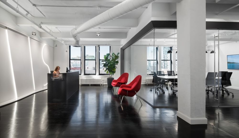
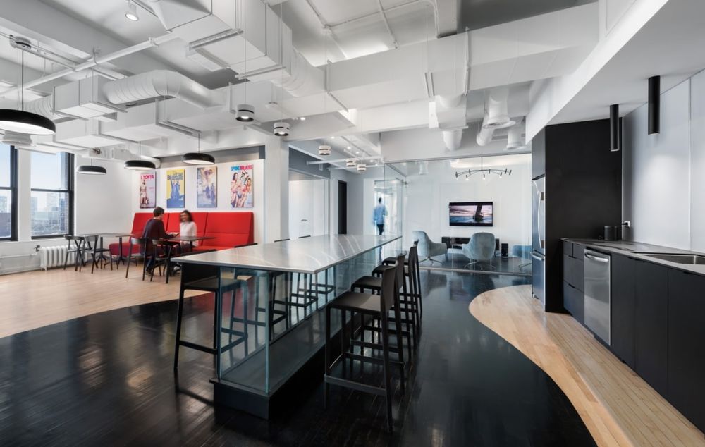
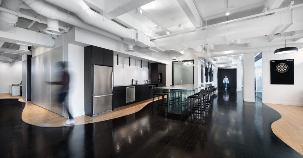
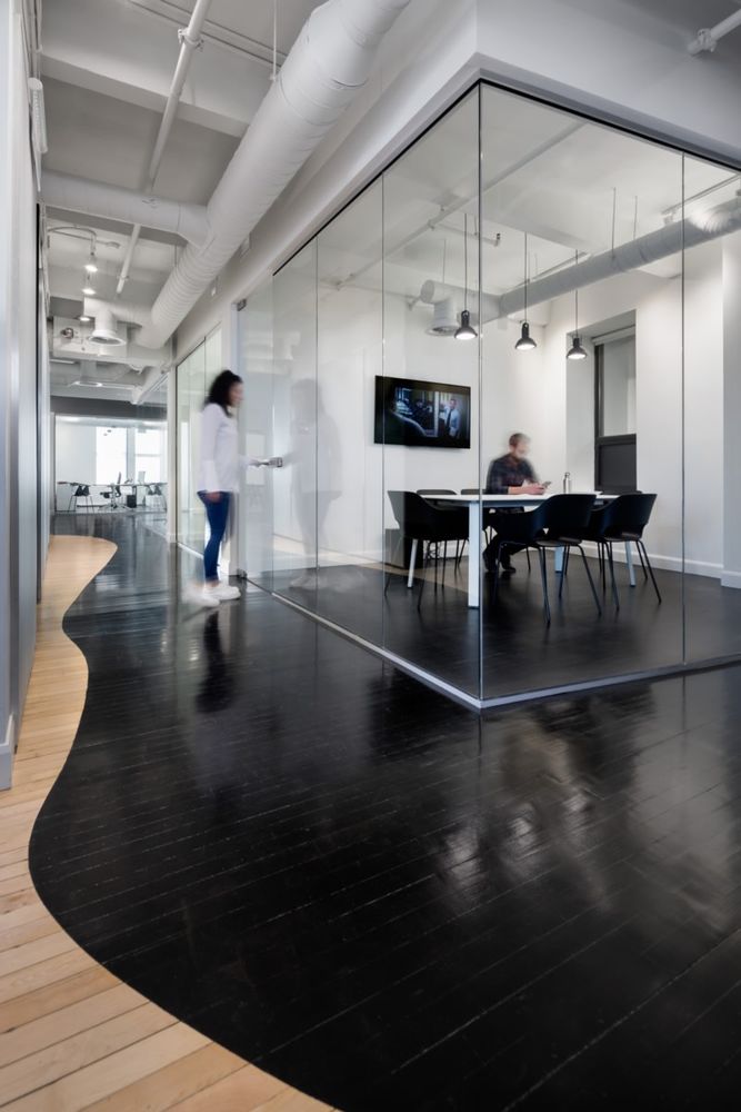
While the design team was given much creative liberty, there was one prominent inspiration which was the catalyst in creating a concept; their appreciation for the arts and minimalist interiors. As a general concept, white served as a main color palette in order to receive, and better reflect, the firm’s art works and film posters. Black details, exhibited in light fixtures and built-in furniture, were incorporated as a contrast to emulate the street art style of local artist Stikki Peaches and the like. The original wood floors were sanded and stained black while some portions remained in their natural coloration. The curved lines demonstrate the fluidity of paint spills and served as an artistic contrast to the surrounding rectilinear architecture.
Each element of the space is sculptural and reminiscent of walking into an art gallery or museum. The reception desk, formed out of a powder-coated steel grid, catches the daylight as it passes through the openings of the grid. Through the use of LED strips, the wall backing the reception shapes the name of the company.
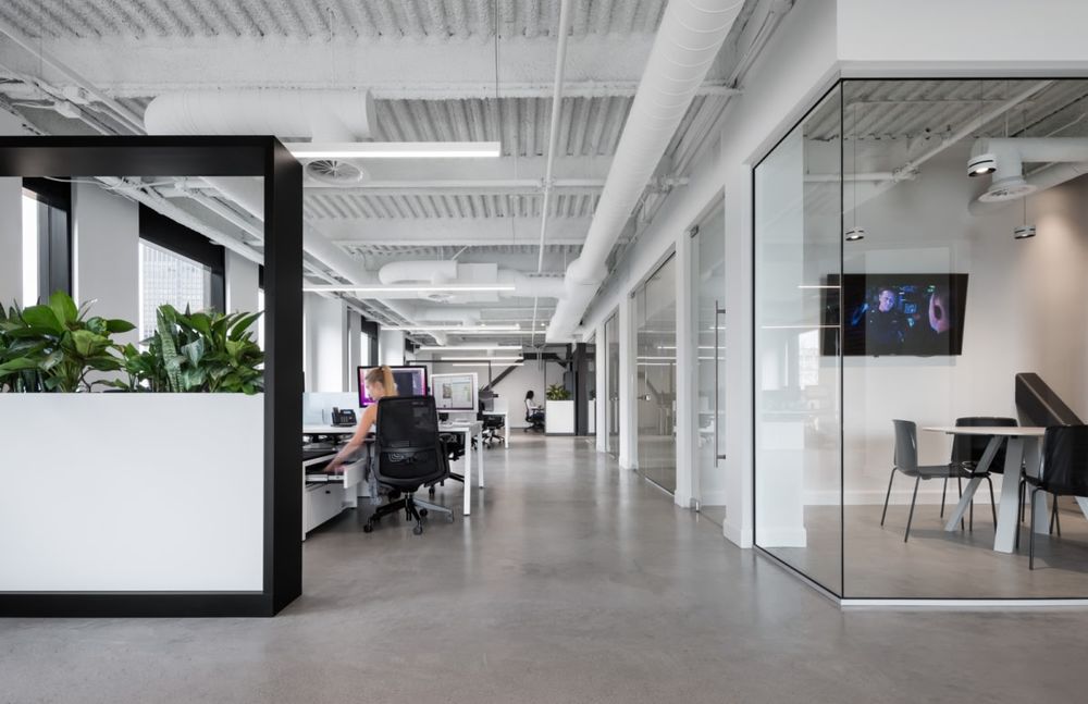
By enclosing the conference room in glass, framed by a thick dark border, it emulates a camera’s viewfinder. The main corridor contains three screens running movie trailers while, below, refurbished vintage theatre seats sit atop the light wood floor highlighting their historical significance to the company. Beyond the reception we approach the main gathering space and kitchen. Pulling inspiration from museum display cases, the kitchen island is made up of glass with a seamless stainless steel surface that serves as a canvas for meal sharing and communal gatherings.
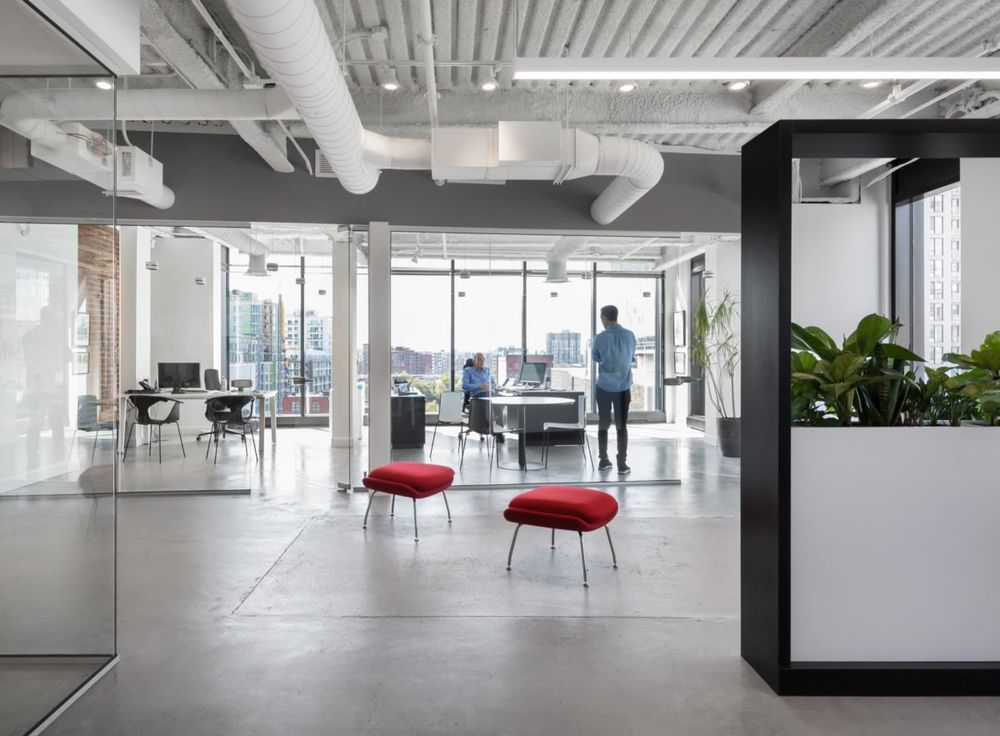
An archway through the brick wall, that was once the exterior of the historic building, leads us to the exposed concrete extension. The designers allowed the architecture to speak for itself while the addition of custom planters serves as both space dividers and decorative elements. The minimal palette and light filled space acts as a contrast to the creative work happening within the company.
Design: Inside Studio
Photography: Stephane Brügger
7 Images | expand for additional detail
