- 项目名称:初乡の茶 (Choice Tea)
- 项目地点:浙江宁波 (Ningbo,China)
- 辅助设计师:姚运,陈进,周丹凤,李阳
- 摄影师:徐义稳
- 项目造价:3000元,平方米
- 设计风格:时尚简约 (Fashion and Simplicity)
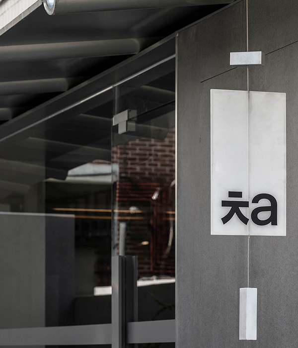
在本案的空间设计中,典型的东方传统文化在当代极简的美学语境中催生了新的灵感,设计师颠覆了常规,将饮品休息区打造成一片茶田。当顾客进入,在这里坐下来享受饮品之时,近可闻悠悠茶香,远可见攘攘人群,温柔的光影让人忘记时间的流逝,在远离城市的喧嚣一隅,体会偷得浮生半日闲的宁静与闲适。门头的设计红白相称,主题明确。以隔而不断的玻璃材质取代传统门面,在视觉上更加通透,层次感十足,即创造了隐私感,又扩展了空间,让人一眼便可看到店内风格,直观感受初乡の茶的内部品质及氛围。
In the space design of this case, the typical oriental traditional culture gave birth to new inspiration in the contemporary minimalist aesthetic context. The designer subverted the conventions and turned the drink rest area into a tea field. When customers enter and sit down here to enjoy drinks, they can smell the tea fragrance, and see the crowds in the distance. The gentle light makes people forget the passage of time. In the noisy corner far away from the city, they can feel the quiet and leisure of floating life for half a day. The design of the door head is red and white, and the theme is clear. The traditional facade is replaced by the glass material, which is more transparent in vision and full of layers. It creates a sense of privacy and expands the space, so that people can see the style of the shop at a glance and intuitively feel the inner quality and atmosphere of Choice Tea.
▼门头的设计红白相称主题明确,the design of the door head is red and white and the theme is clear
走进店内,清新的气息扑面而来。点餐区光滑的水磨石台面保留了材料原始的自然感,奠定了雅静的空间基调的同时,弱化了背景的渲染。红色台架以一种无边的形态,为方形为主的物理空间注入随机的不确定性。金属元素的巧妙介入和运用,令空间更加灵动有趣,鲜艳的色彩活泼醒目,创造视觉焦点。操作间的设计干净利落、有条不紊,墙砖的灰结合乳胶漆的白,给人以“极简、冷淡”的直观感受,摒弃装饰主义,实用性极强。
Entering the shop, the fresh breath blows on your face. The smooth terrazzo countertop in the ordering area retains the original natural feeling of the material, lays the elegant and quiet spatial tone, while weakening the rendering of the background. The red bench injects random uncertainty into the physical space dominated by squares in an infinite form. The ingenious intervention and application of metal elements make the space more flexible and interesting, bright colors lively and eye-catching, and create visual focus. The design of the operation room is neat and orderly. The gray wall bricks combined with the white of latex paint give people an intuitive feeling of “minimalism and indifference”, abandon decorationism and have strong practicability.
▼由店内看向街道,view from indoor to the street
▼操作间墙砖的灰结合乳胶漆的白,给人以“极简、冷淡”的直观感受,the gray wall bricks combined with the white of latex paint give people an intuitive feeling of “minimalism and indifference”
店内休息区的布局别具一格,这里没有规规矩矩的桌椅板凳,设计师通过装置手法对茶田进行抽象表达,以几何美学的思维,对空间的轮廓进行勾勒。层层阶梯与连绵茶山交相辉映,一轮红日当空,普照飒飒茶田,向人们揭示“坐饮香茶爱此山”的意境的同时,与品牌的内涵形成玩味互动。墙面主体部分由寻常可见的乳胶漆覆盖,在高度统一的处理方式中,材质本身的传统与粗粝属性转化叠加,提升空间的品质感与纯净度。采用灰色水泥砖铺就地面,与现代简约的空间基调相辅相成,形成强烈的高级感。既凸显了茶的历史悠久与醇厚沉稳,又让消费者在不知不觉间,完成了一次城市中的“心灵净化之旅”。
The layout of the rest area in the shop is unique. There are no regular tables, chairs and benches. The designer expresses the tea field abstractly by means of installation, and outlines the outline of the space with the thinking of geometric aesthetics. Layers of ladders and continuous tea hills reflect each other, a round of red sun overhead, to reveal to people the mood of “sit and drink fragrant tea to love this mountain”, while interacting with the connotation of the brand. The main part of the wall is covered by common latex paint. In a highly unified treatment, the traditional and rough attributes of the material itself are transformed and superimposed to enhance the quality and purity of the space. Gray cement brick is used to pave the ground, which complements the modern simple spatial tone and forms a strong sense of high-level. It not only highlights the long history and mellow calm of tea, but also lets consumers unconsciously complete a “spiritual purification journey” in the city.
▼层层阶梯与连绵茶山交相辉映,一轮红日当空,普照飒飒茶田,layers of ladders and continuous tea hills reflect each other with a round of red sun overhead
▼“坐饮香茶爱此山”的意境,sit and drink fragrant tea to love this mountain
▼细部,details
▼平面图,floor plan
项目名称:初乡の茶 项目地点:浙江宁波 空间设计机构:无锡欧阳跳建筑设计有限公司 辅助设计师:姚运、陈进、周丹凤、李阳 摄影师:徐义稳 项目面积:30平方米 设计起止时间:2019年04月~2019年05月 项目造价:3000元/平方米 主要材材:乳胶漆、肌理漆、防火板、不锈钢 设计风格:时尚简约 空间用途:休闲娱乐
Project Name: Choice Tea Project Location: Ningbo, China Space Design Company: OYTT Design Chief Designer: Tiao Ouyang Assistant Designer: Yun Yao, Jin Chen, Danfeng Zhou, Yang Li Photographer: Yiwen Xu Area: 30 square meters Design Cycle: April 2019 to May 2019 Cost: RMB3000 per square meters Main Materials: latex paint, texture paint, fireproof board, stainless steel Design Style: Fashion and Simplicity Space Use: Leisure and Entertainment
{{item.text_origin}}

