Architect:Franz&Sue
Location:Gärtnergasse 5-7, Gänserndorf, Austria; | ;View Map
Project Year:2022
Category:Secondary Schools
Bright hallways, friendly classrooms, and an airy aula as a communicative hub: With our new extension and the renovation of the existing buildings, we have transformed an outmoded, dark corridor school into an open house for contemporary learning.
Accommodating around 1000 students, the Konrad Lorenz Secondary School is the largest building complex in Gänserndorf. However, the existing sombre school, with its single-story classroom wings and long corridors, was no longer fit for the task. So we developed a new spatial concept for a total of 40 classes. We renovated and adapted the existing buildings to the north and south and inserted a new connecting structure between them, which resulted in a modern and friendly school ensemble where teachers and pupils can feel at home.
»By equipping an otherwise functionless leftover space under the stairs with the yellow gymnastics mat, we created a highly frequented area where children queue up during recess to let off steam.«
Lucie Vencelidesova, Franz&Sue project manager
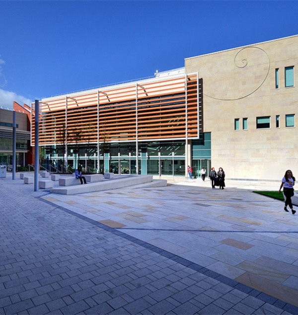
With the new addition, the secondary school also obtained a new, characteristic exterior. The delicate wooden lamella façade lends the building lightness and dynamism. Made of native larch, the diagonally and vertically aligned slats will, due to weathering effects over time, acquire a beautiful silvery-grey patina.
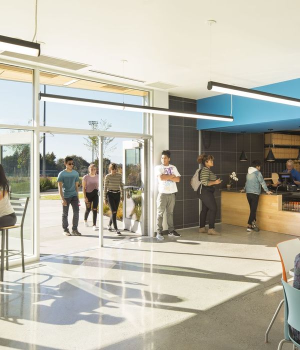
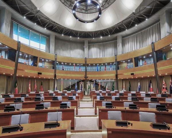
The spacious aula at the centre of the complex forms the communicative and emblematic heart of the school. A broad seating staircase with multi-coloured cushions connects the garden, ground, and upper floors. In the zone underneath, schoolchildren can play table tennis or table soccer during breaks and romp around on a gymnastics mat. Three large skylights bathe the space with plenty of daylight.
Starting at the public areas, such as the aula and the redesigned foyer, the classes are grouped spatially into clusters. In additional break and activity zones, there is comfortable seating or climbing poles for the pupils to clamber around on.
»We developed a graphic design concept for this expansive building that assigns each classroom a unique visual address – a complex system of patterns, each derived from different combinations of three elements: colour, grid, and motif.«
Kriso Leinfellner/Visuelle Kultur KG
To ensure easy orientation in the expansive building, we developed a visual guidance system together with Kriso Leinfellner/Visuelle Kultur KG, which assigns each class its own unique visual address. While sea green is the primary colour throughout the interiors, each floor is also marked with an own signal colour – red, green, or blue. Depending on the location in the school, there is also a distinctive pattern for each class cluster, which can be found, for example, on glazed surfaces or the seating niches, which are designed as multifunctional built-in furniture that separate the classes from the corridors. The opposite sides of these elements provide ample storage space in the classrooms.
From the room-height windows in the classrooms, pupils have a view to the schoolyards and the lavishly designed school garden. The outdoor areas, like the indoor spaces, are anything but monotonous: With a variety of furniture and alternating structured squares and natural areas, there is plenty of space for relaxing, movement, play, and creative learning.
»We have created spatial conditions for contemporary, flexible teaching and learning.«
Wolfgang Gleissner, BIG Managing Director
▼项目更多图片
{{item.text_origin}}


