Architect:Soeur Interiors
Location:15 east 30th street, NYC, USA; | ;View Map
Project Year:2023
Category:Apartments
A unique location
Spread over 1,700 square feet / 158 square meters, the two-bedroom apartment is on the 40th floor of a new building in the neighborhood of NoMad (in the heart of Manhattan), with wrap-around views of New York City from every room.
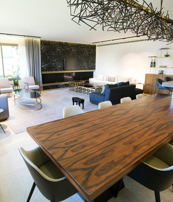
The entryway brings you into a spacious great room with 11 foot / 3.3 meter ceilings and south, east and west exposures. On the other side of the apartment remain the private bedrooms with a primary wing including two closets and a marble bathroom.
Interior design
Soeur Interiors (an interior design studio founded and led by Larisa Barton.
Homeowner
An accomplished woman in her late 30s (originary from Rhode Island) who seamlessly blends her global adventures in London and Singapore with a thriving career at a prestigious investment bank. She has a passion for fashion and an artistic background.
“We hit it off right away aesthetic wise,” remembers interior designer Larisa Barton.
Maximizing the views
The interior designer really wanted to let the views speak for themselves so with her team she created a palette of warm neutrals throughout.
In the great room Larisa Barton brought in black to add a layer of sophistication while in the bedroom she kept to whites and ivories. “My client has a very busy life and we wanted the bedroom to be a sanctuary at the end of the day,” says the interior designer.
A few artworks to highlight
- The homeowner had a piece of art by Ash Holmes (currently in the entry) that the design team pulled a lot of inspiration from. It is an oversized abstract piece with an organic nature to it – much like the furnishings in the apartment. Like the rest of the home, it has warm neutrals with black accents for a sophisticated touch that adds complexity and depth.
- “I also admired my client's artistic ability and she always had this black and white photograph sitting on the floor that she took on one of her travels,” says Larisa Barton who hung the piece in the hallway between the entry and the living room. “I thought it was important to use for a personal touch to the space and it is equally tied into the design with its subtle abstract nature and use of negative space.”
- The homeowner fell in love with the artwork the design team commissioned to Macazlyn Harris for the great room along with the textured walls implemented in the hallways. “She was so inspired she embarked on a 6 month journey of playing around with different plaster and ceramic mediums,” confesses Larisa Barton. “She has artists in her family and it really shows in what she was able to create. We convinced her to use one of her pieces in the guest room. Her photography is also hung up in the great room.”
- “Our specialty painter Michelle Kole picked up on all of the natural materials we brought in and introduced us to a new medium for the powder bath walls called abalone,” remembers Larisa Barton. “We were craving a touch of shimmer in the bathroom but wanted something unique. Michelle brought in sheets of shells that she hand placed throughout the pattern on the walls so from every angle you get the most subtle hint of sheen.”
Inspired by Scandinavian design
- Drawing inspiration from Scandinavian design principles to keep the space streamlined for the homeowner’s busy life, the design team emphasized the importance of form and function over unnecessary clutter. For instance, when incorporating a small bar component for the homeowner, Larisa Barton opted not to allocate a separate space for it, considering its occasional use. Instead, she designed a floating media console, seamlessly integrating a small, functional bar with a mirrored interior, conveniently positioned at the ideal height for preparing drinks.
- The design team also focused on adding a lot of soft natural lighting to the space, which is seen throughout Scandinavian design. “All of our ceiling fixtures provide an ambient light to the room such as the natural crystal dining light or the fabric fixture in the bedroom,” says Larisa Barton. “We focused on creating a feeling of coziness and comfort among all of the clean lines and minimalism.”
Focusing on a practical layout
“The biggest challenge we faced in this home was having my client commit to a great room layout,” says Larisa Barton. “The natural instinct is to want to face the views; however, it did not allow her to use the space how she lives day to day. Therefore we convinced her to do something more practical.”
The space took 1.5 years to complete due to a massive delay on the dining table, which got held up in Brazil for several months and was the last item to come in.
A cohesive palette
- Keeping the bones in the apartment, the interior designer brought in a lot of natural materials such as oak and Calacatta Borghini marble, along with plush textured fabrics.
- Plaster is used in several different capacities on the walls to add natural dimension without taking away from the brightness of the space.
- The interior designer tied this in with ceramic furnishings throughout.
A balanced atmosphere
- A sophisticated home that the homeowner can easily go from lounging to entertaining.
- An open and airy feel so the space remains inviting.
- Some funky shapes such as the custom cut entry runner were introduced to add a touch of playfulness.
What was the brief?
We were asked to create a contemporary neutral home where our client can relax as well as entertain.
What were the key challenges?
We were challenged by not wanting to obstruct the beautiful surround views of the city but also wanting to create a highly functional floor plan.
What materials did you choose and why?
We chose oak, natural stones and ceramics to integrate the natural elements already in the existing space. These also create a large impact without overwhelming the minimalist space.
Team:
Interior design: Soeur Interiors
Photography: Kelsey Ann Rose
Material Used:
1. Furniture, lighting and accessories: RH, Menu, DWR, Ben Soleimani, Modsop, Arteriors, Oly, Wentz Design, Rove Concepts, Henge, Kravet, Made Goods, Schumacher, West Elm, CB2
2. Art: Macazlyn Harris, Ash Holmes
▼项目更多图片
{{item.text_origin}}


