本项目坐落于印度尼西亚,由当地政府发起,目的是振兴南苏拉威西省Syech Yusuf Discovery地区。场地毗邻本地大清真寺,以及包括市长办公室在内的市政大楼,该地区也因此成为了当地市政会议活动的中心。不仅如此,这里还有许多运动设施,包括一条慢跑道以及一系列运动场,丰富的活动与便利的设施使这里成为人们青睐的休闲目的地,每逢周末周边城市的市民也会来此休闲运动。在周边市政设施以及体育设施的包围下,本项目设计的主要关注点在于如何运用轴线将周边设施联系在一起,最终这条轴线以贯穿整个场地的路径的方式呈现在大众眼前。
This project was initiated by the local government who wanted to revitalize the Syech Yusuf Discovery area. The site itself is surrounded by The Grand Mosque, the government office including the mayor’s office which made this area into a central meeting point of governmental activities. Not only that, this location is filled with many sports facilities such as jogging track and a couple of sports fields turning it into a desirable destination even for people from different cities such the people of Makassar during weekend. Having surrounded by these facilities, the main concern of the design is to connect the axis between these objects creating a direct circulation path across the site.
▼项目整体鸟瞰,bird’s eye view of the project © Agung Fadriansyah
▼场地局部鸟瞰,partial bird ‘s-eye view of the park © Agung Fadriansyah
从规划的角度来看,现有设施的布局并不合理,分散的场地与人群不利于监管,从而造成了安全隐患。正因为如此,设计团队所做的第一步就是重新规划场地布局,并且适当增加了一系列额外的体育设施来进一步形成场地内的分区。重新规划后,以前分散的小摊贩集中在场地的北侧,以强调出场地内的南北分区。
From a distribution stand point, the pre-existing facilities were not placed accordingly which scattered its users all over the site creating a security problem from low supervision. Because of this, the first step that we did was to redesign the distribution of zones. We also add a few additional sports facilities to form its zones. The previously scattered PKL (hawkers) are now centralized in the northern area to emphasize the division of the northern zones.
▼由跑道看塔楼,viewing the tower from runway © Agung Fadriansyah
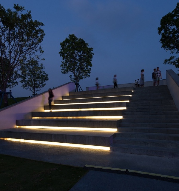
▼与跑道和谐呼应的观众台,the spectator stand in harmony with the runway © Agung Fadriansyah
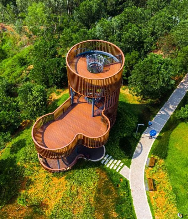
标志性的塔楼被明智地放置在场地的最东端,项目中的绝大部分设施与设计元素都朝向塔楼。设计的灵感来自于“patonro”,这是一种起源于南苏拉威西岛当地的头带饰品。除了以“patonro”为场地朝向的中心外,设计师还希望人们在场地内的任何区域都能观赏到塔的全貌,且场地内的每个元素都能构成塔的景观框。为了达到这一目标,塔楼周围的场地相比于其他部分更加平整。
Position wise, the tower is placed at the eastern most part of the site. Almost all of the elements and facilities in this design are facing it. This orientation was inspired by “patonro” a headband originated from the people of South Sulawesi. Other than orientation centred to this patonro, the whole area of this site was design with full view of the tower, each element of this site able to frame the main tower. With this goal in mind, the surrounding area was formed more horizontally.
▼由滑板场地看塔楼,viewing the tower from the skating field © Agung Fadriansyah
▼塔楼的设计灵感来自当地人民戴的头巾,The tower was inspired by the “patonro” originated from the people of South Sulawesi © Agung Fadriansyah
由于北部集市区域与公园直接相连,为了避免大量人流造成的交通堵塞,设计师采用了将交叉环路与斜坡地形相结合的方式,在场地内创造出不同层次的视角。交叉环路在多处与场地边界相交,创造出丰富的空间节点,不同高度的视角与带有坡度的跑道为使用者提供了更为自由的路线与使用选择。
To avoid blocking from the northern zones unto the park that directly borders to site. The cross circulation was then combined with the use of slopping to create viewpoints from elevations scattered across the area. These cross circulations created intersections with edges that always meets. The combination of the elevated viewpoints and the slopping track gave the user freedom on choosing possible path and how to use them.
▼不同的地形高差提供了丰富的景观视野,The different elevation of the terrain provides a rich view of the landscape © Agung Fadriansyah
▼台地细部,detail of the terrace © Agung Fadriansyah
倾斜的跑道不仅为人们提供了一条欣赏周边美景的散步路径,同时跑道侧部的高墙还可以起到围栏的作用,这样,从球场上飞出的球就不会进入室内,避免了室外运动对其他活动的干扰。砾石材质的应用则可以减少球的反弹,这两种干预措施都允许运动区域在没有任何围栏的情况下保持开放。
Slopping tracks were not only meant as viewpoints to enjoy the scenery, but these elevated slopping tracks also functions as high walls that replaces the functions of fence to keep any kind of balls inbound so the user won’t bother other zones. The usage of gravels was meant to reduce ball rebounds. Both of this intervention allows the zone meant for sport to stay open without any fence around it.
▼集市区,commercial area © Agung Fadriansyah
▼封闭的外墙避免了球类运动对室内活动的干扰,The enclosed exterior walls avoid the interference of ball games to indoor activities © Agung Fadriansyah
▼温暖的色彩与丰富的光影使建筑体量变得柔和,Warm colors and rich light and shadow soften the volume © Agung Fadriansyah
▼砾石的应用减少了球的反弹,The application of gravel reduces ball bounce © Agung Fadriansyah
项目的选材旨在突出材料的纹理,增强光线的漫射效果,棱角分明的场地以及场地上建筑元素也因此变得柔和了起来,营造出舒适的视觉与空间环境。
Finally the materials used in this design are meant to be textured. This was intended to scatter bounced light so the solid massive form of these site wouldn’t cause harm to the user of site.
▼集市区入口,entrance of the commercial area © Agung Fadriansyah
▼柱廊与光影效果,Colonnades and light and shadow effects © Agung Fadriansyah
▼总平面图,master plan © andramatin & ARA Studio
▼平面图,plan © andramatin & ARA Studio
▼场地总体立面图,elevation of the site © andramatin & ARA Studio
▼场地总体剖面图,section of the site © andramatin & ARA Studio
▼局部立面图,Partial elevation© andramatin & ARA Studio
▼局部剖面图,Partial section © andramatin & ARA Studio
▼项目更多图片
{{item.text_origin}}

