Design: Begum Seckin
Visualization: Begum Seckin
Project: SKY High Head Office Design
Area: 187 sqm
Challenges:
1.General manager room must be bigger than others.
2.General manager and commercial manager should have a direct access to meeting room.
3.Toilets must be separated for two genders.
4.Toilets can not be relocated.
5. IT room and Archieve should be minimum 6 sqm.
6. Only one inspirational image
The SKY High Head Office project stands as a recent milestone in my portfolio as a freelance designer. Within this endeavour, I swiftly devised a conceptual design, navigating the constraints of limited client-provided information within a condensed timeframe. Commencing with a comprehensive assessment of the pre-leased office space layout, I meticulously analysed client briefs to compile a comprehensive list of project requisites. A pivotal consideration was the inherent constraint regarding plumbing alterations, necessitating strategic positioning of wet areas. Moreover, the challenges enumerated in the project documentation profoundly influenced the design trajectory, guiding key decisions.
In the second stage, I created an organizational diagram from the layout plan, ensuring alignment with the client’s expectations. After finalizing decisions, I refined sketches into technical drawings, prioritizing ergonomic design for a healthy and pleasing workspace.
Following this, I curated a mood board inspired by the singular image provided by the client, which posed an additional challenge for the project. Throughout this phase, I meticulously analyzed the influence of colours and textures on productivity, studied noteworthy office design endeavors, and delved into the core principles guiding these designs, striving to emulate a similar ethos.
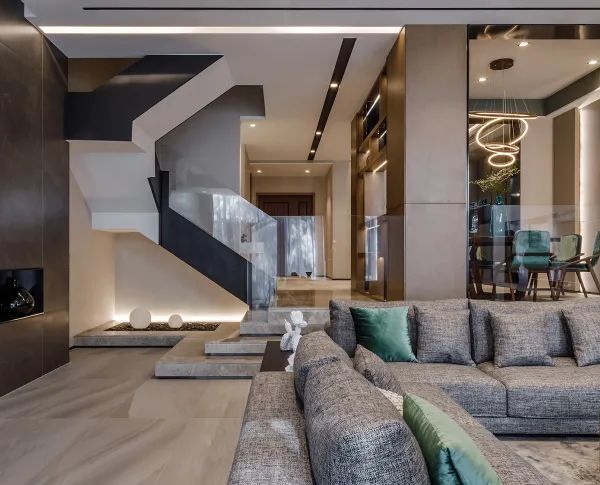
Transitioning from the reception area to the open office space, the addition of a botanical partition wall served multifaceted purposes. Not only did it obstruct direct access to the open office area, enhancing privacy, but it also incorporated natural elements to create a more welcoming ambiance. Furthermore, it delineated the corridor and circulation path with clarity. While the project constraints may not fully embrace biophilic design, subtle touches were integrated to harmonize with the overall vision.
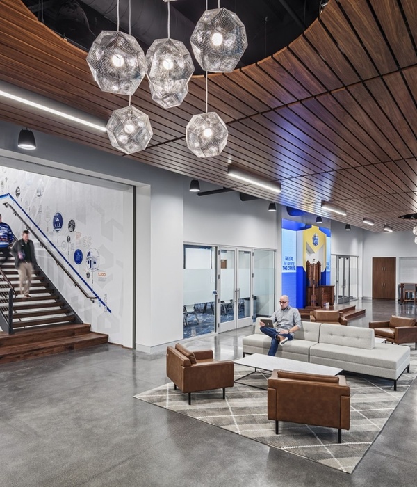
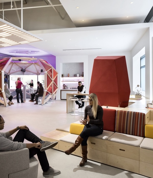
Here, glass partitions were employed to maximize natural light exposure, optimize brightness levels, and maintain spatial integrity within the relatively compact layout. Additionally, a comfortable seating area was integrated into the design, providing employees with a space to relax and engage in informal conversations during breaks.
The necessity of having 3 doors in the meeting room was one of the most challenging points in this project. For this reason, the column in the meeting room positioned in the corner of the layout plan was covered and turned into a television cabinet and storage area. Thus, the design coincided with the client's wishes.
{{item.text_origin}}

