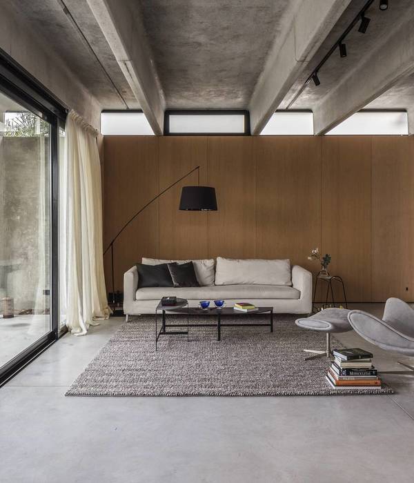
To coincide with strategy director Paul West’s restored Victorian maisonette in Stoke Newington coming onto the market, we paid him a visit to get a sense of what life has been like in the space and hear his thoughts on how design can enhance everyday life at home. Paul moved to Farleigh Road in 2014 and subsequently worked on a comprehensive restoration project, pulling together his past experience working as an interior architect and creative director into the exterior and interior spaces, which respectfully update the period fabric of the building for a timeless, classic feel. His partner, Michelle Bower, has moved in since then, and their collective input into the design evolution of their home now has them looking for a fresh project to work on together. Check out the sales listing here.
: “Since being here, I have tried to avoid the overly architectural approach. I have lived in white boxes before and have lived with sharper aesthetics, but this is different.
“In recent years I’ve been inspired by designers like Ilse Crawford, who manages to create spaces that are contemporary feeling but also forgiving and familiar, and she talks of having a ‘frame for life’ and emotionally-connected design, which resonates with me a lot.
“Because, to me, a home should feel like a retreat but, at the same time, support modern life and all that comes with it, be that working from home, socialising, taking time out, or simply being able to get to work easily.
We all lead busier lives now, and we’re more and more connected to technology, and exposed to such an overload of information. So, I suppose, for us, modern living at home is about finding or creating a space that is a bit of an antidote to that; something that repairs you and makes you able to hit reset.
“That’s what I’ve found here. It took a long search to find something that had a good amount of space, light, a nice garden, good-sized rooms and that hadnt been played around with too much, that had retained a lot of its original space and character.
“I was surprised when I first came in because it’s an unassuming Victorian house on a quiet street, but then you enter to really quite a grand space, with high ceilings and big, well-proportioned rooms. The house is on the curve of the road, meaning it’s one of the widest in the terrace, with a mature garden that is generously-sized and secluded at the back of the house.
“It just had a feeling of being very calm, of being like a retreat, especially with the garden and the trees outside and the different aspects. It’s very nice having the living space upstairs, making the most of the light, the views and the space. There was also a feeling that it was a bit of a blank canvas, that I could do whatever I wanted to it because there wasn’t a prescriptive architectural style that forced a certain style of furniture or a specific look.
“It means we’ve been able to collect and mix different eras here, from original Victorian features to mid-century furniture and some contemporary stuff, but it all hangs together in a way that feels like a natural combination of interesting and useful things. The versatile spaces in the house have meant we have been able to evolve it according to how we want to live in it, enjoy it and share it.
“I studied interior architecture and soon after worked for a range of design and architecture studios, including Foster + Partners and Richard Rogers, where I learned a lot about the basic principles of design, space and proportion, as well as the importance of concept, narrative and human experience. I believe a lot of those learnings are important when creating a home, as is the need to carefully work with spaces that you already have, that was another big thing.
“Throughout my career, I’ve worked on projects from small residential concepts to entire airports, and through that I’ve learned to work across many scales – and that the micro-detailing of a kitchen, for example, is as important as the overall feel and the total experience.
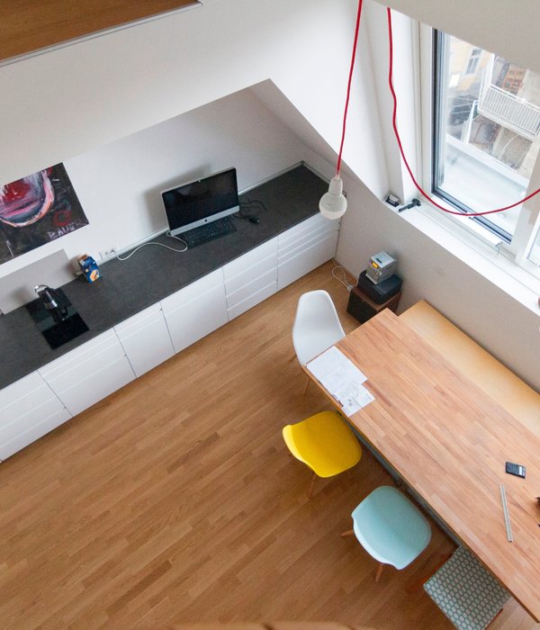
“Here, that’s meant designing bespoke carpentry throughout, from the entire kitchen to the shutters, wardrobes, smart storage – all of it. It comes back to that emotion-led design thing as it’s about making sure those moments of tactile interaction in a house, the things you interact with every day, are pleasing, positive experiences.
“And now, mine and Michelles work at creative agency Dalziel & Pow is all about thinking about how people experience and engage with a brand. It was quite a natural progression from interior architecture, which is ultimately tasked with creating experiences for people. If a space doesn’t offer the possibility of a great experience, it’s just a physical thing that may look impressive but doesn’t emotionally connect with people.
“Here, the experience I wanted to create was having somewhere to escape to and that felt like it was in the middle of nowhere, despite being in central London. So, I tried to avoid anything too visually stimulating so that everything feels quite calm and relaxing. I didn’t want to be overly architectural or contemporary, but to work with the great architecture and design already here, and to use the great canvas for our eclectic tastes, interests, and ways of living.
“It was also about discovering the qualities of the different spaces at different times of the day, week or year. So, it’s nice how we have spent so much time in the garden this summer. I’ve become a gardener in the last two years, which I didn’t know anything about before!
“Just shaping it, maintaining it and enjoying is great, and the more you do it the more it becomes addictive. We use the garden room quite a lot in summer and have people over for barbecues, or to just eat outside and enjoy the space.
“And then in winter upstairs feels very Christmasy and cosy, and we have friends and family around the big dining table. So, it’s a place that can work seasonally but also at different times of the day, like when the sun’s coming in the front in the morning – that space is such a joy to be in with a cup of tea, a bit of breakfast and some music playing. And then, in the afternoon, the sun comes into the kitchen at the back and it feels different again; you can just sit here at the end of the table or in a chair in the corner and have the radio on, looking out onto the trees and the wildlife.
“In the last year, I’ve started to take photographs of the space and share it on Instagram, on a profile called Considered Things. It’s just for a bit of fun and to create a sort of visual diary of how the space has progressed. It’s moments around the house, things that we’re collecting, or some thoughtful design detail, with a focus on simple living, inspiring design for everyday life. It’s been a lot of fun and there’s been a really positive reaction from individuals, photographers, publications, and some interesting brands, so who knows where it’ll go…
“Michelle and I are ready for the next chapter now, to work on another project together. We’re not even looking for something bigger, just something, like this, that feels right and we can grow into.”
{{item.text_origin}}


