Firm: ONG&ONG Pte Ltd
Type: Commercial › Bank
YEAR: 2011
FRANK by OCBC was an exercise in creating a banking experience that would appeal to the Millennial Generation. The design challenge was to design a bank that the target audience could relate to and trust in.
Extensive user research revealed the general negative impression many young people held of banks, and their desire for greater levels of transparency and honesty. The research also highlighted three characteristics of Generation Y – the importance of community and peer opinion to them; an absence of a disciplined approach to tracking their personal finances; their need for personal expression and emphasis on individualism, which are expressed in their preference for products that allowed for personalisation.
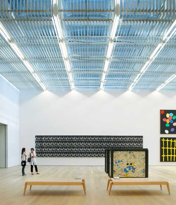
In creating a banking experience that caters uniquely to the Generation Y crowd, innovative design solutions were employed. The new name, FRANK by OCBC, capitalises on its double meaning as a principle and a person’s name, communicating a sense of honesty while making it more relatable as a brand. In addition, FRANK by OCBC deviates from the traditional appearance of a bank and instead, projects a look that is trendy, fun and relevant. Custom pop art hang off the walls while box crates are transformed into tables around which customers can speak to FRANK bank ambassadors and enquire about FRANK’s banking services.
Personalisation of the bankcard is also made available. Customers can choose from more than 100 card designs when they enter the bank. Each card has a name and a brief description of what the design symbolises, allowing customers to select the one that they feel describes them the best. FRANK’s rewards point system further caters to the target audience’s shopping habits with its tie-in with blog shops.
These series of innovative design solutions led to the creation of a unique banking experience that captured the Millennial Generation’s attention.
{{item.text_origin}}


