The restaurant was designed and built within 30 days. The space we had to work with was located on a semi-basement floor and consisted of three small rooms, with many protruding concrete elements of the building's foundation. These were later transformed into cosy seating places. The only sources of natural light were an entrance door and a small recessed window. Due to that we preferred to use white colour where possible, to provide maximum daylight reflectivity.
Staying true to the restaurants concept of healthy food and eco-friendly design, we used mostly natural finishing materials like wood massive and ceramics. In the original concept, a living green wall was placed along the walls, but due to near impossible construction deadlines and low natural lighting we opted to simulate it using artificial lawn. This turned out to have its own strong points. We were able to place text and logos on the walls using two different heights of grass. Over time, it has become the most recognisable feature of the design.
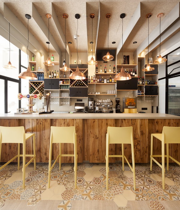
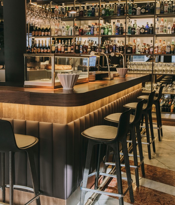
At the heart of the restaurant is the bar, where visitors as well as ordering non-alcoholic drinks can also watch master classes and even participate in the cooking process. The glass partition at the entrance separates the antechamber from the main hall and provides a surface for advertising. On the baring wall that splits the main hall into two areas, cork was used for finishing, to pin leaflets, news boards and children creativity, although in the original concept, a chalkboard was placed here.
Year 2012
Status Completed works
Type Interior Design / Furniture design
{{item.text_origin}}

