荷兰Maastricht UMC+超重青少年及儿童互动医疗中心(COACH),荣获2018欧洲医疗保健设计大奖最佳室内设计及艺术项目。“COACH是一个趣味横生的创意活动项目,也是针对当代青少年健康问题的积极应对措施。它冲破了医疗保健空间设计的惯例,赢得了评委会的一致推举。”
The interactive and playful Centre for Overweight Adolescent and Children’s Healthcare of the Maastricht UMC+, The Netherlands, has been named as the best Interior Design and Arts project at the European Healthcare Design Awards 2018. “COACH is a playful, action packed creative project and a strikingly innovative response to contemporary issues regarding healthy behaviour and lifestyle changes at a young age. It challenges current conventions in healthcare design and services and was the unanimous choice of the judges.”
▼空间内景,interior view
设计方法:寓教于乐 Design approach: transform treatment into play
来自乌特勒支Tinker imagineers有经验的设计师们深刻理解到孩子们对游乐环境的渴求,而建筑空间所营造的互动性可以满足这种诉求。如今,在Maastricht UMC+超重青少年及儿童互动医疗中心(COACH),这里的医护人员指导孩子们体验更加健康的生活方式。在Tinker imagineers的打造下,该医疗中心摆脱了传统的医护氛围,无限接近却又有别于普通的运动和竞技空间,是一个全新的空间体验。
The experience architects of Utrecht-based Tinker imagineers understand the desire for play. The urge for activity should be supported with stimulating interactive architecture. For the temporary location of COACH—the Centre for Overweight Adolescent and Children’s Healthcare of the Maastricht UMC+, where medical staff coach kids to live a healthier and more active life—Tinker imagineers made a stimulating environment that seems miles away from the world of doctors and hospitals, but does not look too “sporty” or competitive either.
▼鸟瞰透视图,birdseye perspective
“营造具有独特风格和感觉的医疗空间是一件细活,”创意总监Ralf Lambie说道。“我们的设计构思完美契合COACH的使命,即让青少年及孩子们发现真正的自己。” “Finding the right look and feel for such an outpatients’ clinic is a delicate matter”, states creative consultant Ralf Lambie. “We came up with a set-up that matches the mission of COACH to empower children and young people: ‘finding their greatness’.”
▼互动性空间,an interactive space
在COACH,游乐是治疗的一部分。问诊与称重空间分设在两个位于中心区的彩色隔音盒子里,色彩与线条在不同的游乐区域中交织。开放等候区并非传统意义上的等候区,在预约问诊之前,这种互动型的医疗活动便已经发生了。来此就诊的孩子们甚至无法安静坐下来等待,因为他们早已沉浸在等候区的游乐氛围里无法自拔。各种互动游乐设施如攀爬、拉扯、摇摆、乘骑、移动等丰富了这个空间。孩子们可以在互动屏上收集掉落的健康食物时,进行维持身体平衡的运动,或者伸展并与他人互动完成正确的连接游戏。
At COACH, play is half the treatment. Consultations and weigh-ins take place in colourful, soundproof pavilions scattered around two central squares, while intersecting lines and surfaces are reminiscent of a mash-up of various playing fields. In the open waiting area, where nobody actually waits, “treatment” starts before the appointment does. The number one stimulus is the fact that you can’t sit down and wait for your turn because the waiting area has been changed into a playground. There is an array of interactive games that require stretching, climbing, swinging, riding, moving, and working together. They can, for instance, try to keep their balance while collecting the healthy products falling down on a display. Or stretch and work together to make the right connections to switch the lights on.
▼问诊与称重空间分设在两个位于中心区的彩色隔音盒子里,consultations and weigh-ins take place in colourful, soundproof pavilions scattered around two central squares
一面大型的互动墙壁将就诊的孩子们带入COACH的世界。在这里,孩子们会收到一系列问题如:“你知道吃早餐是一天中最重要的事情吗?”“你知道你的身体如同一个巨大的蓄电池吗?”内置在木墙中的传感器对孩子们的触碰做出回应,而问题的回答则经由设备投射到墙面上。这些有用的信息活灵活现的呈现在孩子们面前。某些故意抬高的触碰点,是为了鼓励家长们也能参与其中。
An interactive wall introduces the participants to the world of COACH. Children are asked questions like: “Did you know that breakfast is the best way to start the day?” or “Did you know that your body is like a rechargeable battery?” A sensor in the wooden wall responds to their touch, and an animation projected on that wall provides the answer. The information is truly brought to life here—in a light, non-patronising way. Some of the touch points are deliberately placed higher on the wall, to encourage children to involve their parents in the game.
▼一面大型的互动墙壁将就诊的孩子们带入COACH的世界,an interactive wall introduces the participants to the world of COACH
▼内置在木墙中的传感器对孩子们的触碰做出回应,a sensor in the wooden wall responds to their touch
▼互动装置激发孩子们的兴趣,the interactive set-ups encourage children to involve in the game.
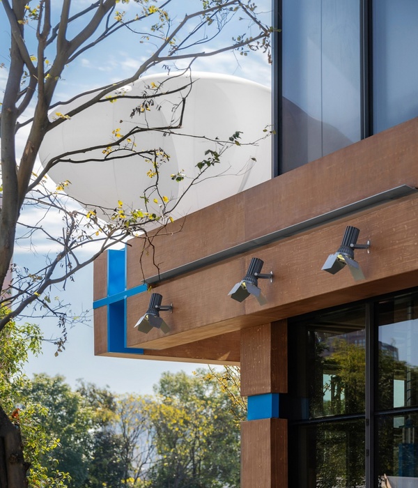
各功能空间均拥有不同的形状、色彩和形式,并搭配有不同的座椅和家具。设计师十分注重这些空间的细节设计,如意想不到的色彩运用和令人印象深刻的内置结构。为了强调空间的临时性,该区域所有结构均采用半成品木材,天花板的管道也裸露在外。设计师与施工人员的通力合作使项目实现了极高的完成度。
Every pavilion is varied in shape, colour, and form and has different seating and standing furniture. The pavilions have been constructed with an eye for detail: unexpected touches of colour and remarkable constructions. In order to stress the pop-up character, the structures were made of unfinished wood and the pipes in the ceiling are still visible. The synergy with the builders pushed the project to a higher level of execution.
▼各功能空间均拥有不同的形状、色彩和形式,并搭配有不同的座椅和家具,every pavilion is varied in shape, colour, and form and has different seating and standing furniture
▼细节设计,detail of the space
成功的尝试 Successful approach
事实证明这种设计方式是十分成功的:百分之七十的参与者都成功减重,并在COACH的帮助下收获了更为健康的生活习惯和方式。COACH项目的创始人,儿科专家Anita Vreugdenhil说道:“在一个互动的氛围里,孩子们更能感受到放松,并愿意释放自己,他们也更愿意学习如何以健康的方式生活。该空间摒弃了传统的医疗环境设计,趣味性十足的问诊空间帮助我们维持了轻松的医疗氛围。我们与孩子们及他们监护人之间的医疗计划便是在这样愉悦的环境中制定完成。”
The design approach and strategy of the programme has proved to be successful: 70 percent of the participants lose weight and adopt a healthier lifestyle under the supervision of COACH. The program’s founder of COACH, paediatrician Anita Vreugdenhil, states: “In the interactive environment, children feel at home and tend to start exploring. They learn about a healthy lifestyle without any pressure. The room does not refer to a hospital environment, and the playful consulting rooms help us to keep it light. As a result, the children and their caretakers feel at ease drawing up a treatment plan with us.”
▼轻松愉悦的医疗环境,a playful treatment space
▼功能盒子解析,the pavilions
Facts and credits Client—Maastricht UMC+ Location—Maastricht, The Netherlands Interior and experience design—Tinker imagineers Game development—Tinker imagineers Decor construction — Landstra & De Vries Interactive software—Shortplay Size—400 sq m Project End Date—2017 Photographer—Mike Bink
{{item.text_origin}}


