Architect:ZEST architecture
Location:Barcelona, Spain
Project Year:2015
Category:Apartments
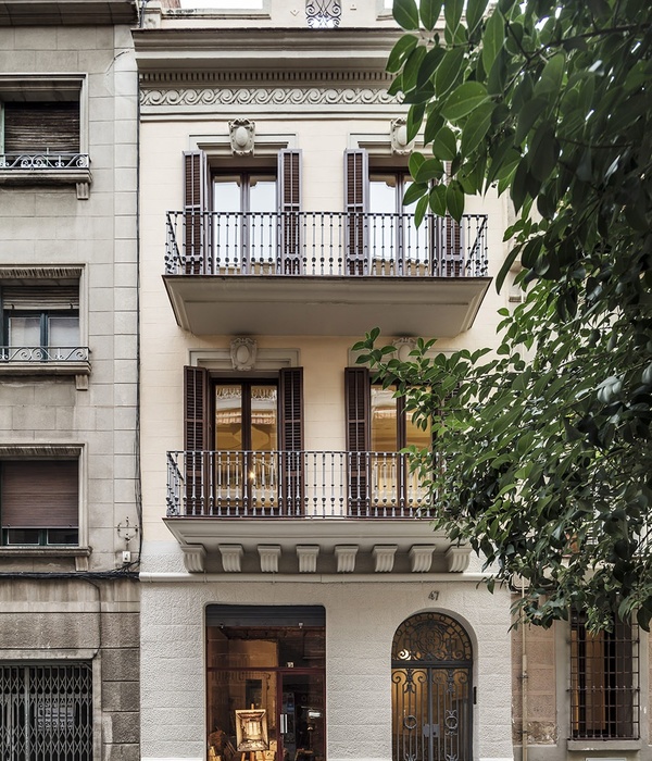
The clients came to us with an apartment on the top floor of a nineteenth century heritage-protected building in the heart of the old town in the city of Barcelona.The couple wanted a home where they could escape on their vacations and weekends to the attractive city of Barcelona. Due to the state the attic was in, it made it impossible for them to imagine its full potential.
The 75 m2 apartment was initially very dark and gloomy, with a long and dark passage giving way to multiple, small rooms, each of them with an exterior balcony. At the end of the hall was a small living room with an open kitchen. The result was a very compartmentalized and dark house that needed a total renovation.
José Hevia
The clients, for whom this apartment is their second home, came to us with the request to convert it into a spacious apartment, with plenty space for their art collection. They rather liked some of the original features of the apartment, yet wished to modernize it and make it more comfortable for them and their guests.
José Hevia
The challenge was in opening up the apartment and maximising the light from its seven exterior balconies. We needed to create plenty of storage space, two bedrooms with en-suite bathrooms and a spacious and open living space with a large kitchen island. As the apartment was long and rectangular but narrow, we maximised space by removing passages and entrance halls. A central open plan living-dining room space was created with an open kitchen in solid oak and an island with Macael white marble countertops and VOLA chrome taps. The kitchen was made to measure by specialised carpenters who were able to continue the grain of wood throughout all the units.
José Hevia
The two bedrooms with en-suite bathrooms were then located at the two ends of the house, on either side of this open plan social space. By arranging the spaces in this way, we were able to fully maximise on light and illuminate fully all the interior spaces.
José Hevia
Another challenge we had was finding a way of running the installations from one side of the apartment to the other. As one of the clients' requirements was the creation of ample storage space and display areas for their extensive art collection, we saw an opportunity here and chose to run these installations in a joinery unit with carefully thought-out display niches and cupboards running along the central back wall that linked to the interior patio. This joinery unit fulfils different functions throughout the house. In one area there is a mirror with recessed lighting which serves as a hidden pivoting door, behind which is a washing area; later there are solid oiled oak cabinets designed to exhibit the owners' art; near the main entrance it hides the technical machine room from which the installations are accessed and controlled; at another point it is a coat rack, and later it becomes a shoe rack. The joinery unit is an important conceptual element in the design, used to simultaneously hide and reveal.
José Hevia
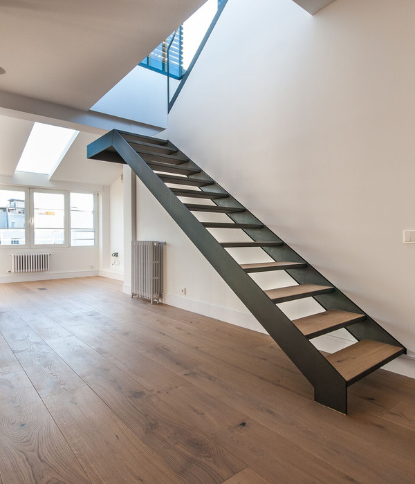
The materials have been chosen for their simplicity and warmth. The flooring throughout the house is unvarnished solid oak parquet, except in the kitchen area where the original hydraulic mosaic flooring has been restored, and in the bathrooms where a matt Roman travertine marble was chosen with a honed treatment for humidity.
José Hevia
All the existing exterior doors and shutters have been preserved, as have the double-leaf interior doors that lead to the bedrooms. They have simply been stripped of the existing dark paint and varnished to restore the original colour of the wood.The wooden beams have been preserved and the exposed brick walls were left exposed.Both bathrooms have been clad entirely in honed Roman travertine marble. Shower trays, cupboards and sinks have been made to measure from the same material and all the taps and accessories are from the Danish brand Vola.
José Hevia
All the installations were replaced, and underfloor heating was added. The house also has air conditioning in the false ceilings, controlled by keypads integrated into the built-in furniture.There is a home automation system for the lighting in the central living space and kitchen which was important so that different lighting zones could be controlled, illuminating the artwork. The switches and plugs are from Gira and the spots are from Delta Light. The result is a diaphanous space with streams of light entering from its balconies. The sense of spaciousness is enhanced by the lightness of the wood and the light colours of the Macael white marble, the lacquered cabinets, and the cloud white paint on the walls.
José Hevia
▼项目更多图片
{{item.text_origin}}

