- 项目名称:非空
- 主创及设计团队:祝年微,江伟,罗玉春,夏佩雯
- 建筑面积:1000㎡
- 摄影师:Shengsu Architectural Photography
- 客户:艺盟百胜红木家具
空之有无,因人不同。这是一个矛盾的标题。确切的说,我并不知道给这个最后落成的空间安放一个怎样的主题。当然,这并不能代表我对于自己的设计毫无想法,只是我并不喜欢把原本可以简单表达清楚的设计意图,一定要像一个文人说事一样,安排那么多的故事。为了给原本是“照骗”的照片穿上一件华丽的外衣,好似一个设计说明没有一个“引子”就失去了意义。而另外一面的看客,却从来都是在图片上停留的时间多过于在文字上停留的时间。
The existence of emptiness varies from person to person.It is a contradictory title.To be exact, I don‘t know what kind of theme to put in the final space.Of course, this does not mean that I have no idea about my design, but I do not like to arrange so many stories to the design intention that can be expressed simply and clearly, like a literati saying something. In order to put on a gorgeous coat for a originally “deceived” photo, it seems that a design description will lost its meaning without an “introduction”. however, the viewer on the other side always spend more time on the picture than on the text.
为了不被人诟病我对自己的设计毫无想法,我还是解释一番罢了。“非”,它是一个否定词?还是一个肯定词?不同的角度,不同的看法自然是不一样的结果。与“是”相对,例如:是非,它是表示错误的;与“不”呼应,例如:非成功不可,它又是表示必须的。“空”,它可以是空间的空,本义为室,是室内或其他区域内之空间,时空,宇宙之空间;它可是精神角度的空虚;亦可是指空名,空箱,空空间,不实不满,实为虚。古人有言:“空之有无,因人不同。信有暗物,则有;眼见为实,则无”。非空,是我们为线上红木家具头部品牌“艺盟百胜”打造的3.0版本线下展厅。之所以是3.0版本,是因为这是业主方在距2017年年底邀请我们对其旧展厅在原场馆基础之上进行改造之后的再一次设计邀约。这中间间隔的时间不到两年。与上次设计不一样的是,这一次我们是要推翻我们自己前次的设计,再进行的升级改造。
In order not to be criticized that I have no idea about my design, I will explain it.Is “non” a negative word or affirmative word? It will come to different conclusions from different perspectives and different views. It is opposite to “yes”. For example, “yes and no” means wrong. It echos “no”. For example, in the sentence non-success is not necessary, it means necessary.“Emptiness” can be the emptiness of the space. With the original meaning of room, it is the indoor space or the space in other areas, the space-time, the space of the universe; it can be the spiritual emptiness. It also refers to the empty name, empty box, empty space, not hollow and not full. Trueness is the falseness.As the saying goes: “The existence of emptiness varies from person to person. If believing the existence of hidden objects, there is emptiness; if seeing is believing, there is no emptiness”.Non-emptiness is the offline version 3.0 exhibition hall we created for “Yimeng Baisheng”, a top brand of mahogany furniture. The reason why it is the version 3.0 is that this is a further design invitation after the owner invited us to renovate the old exhibition hall on the basis of the original venue in the end of 2017. This interval is less than two years. Unlike the last design, we need to overthrow our own previous design and then carry out the upgrade and reconstruction.
▲展厅改造前Before the reconstruction of the exhibition hall
展厅1.0版本是业主方创业初期简单装修的一个线下展厅,当时面临的问题是空间动线无序,产品陈列杂乱无章,无任何色彩灯光造型,严重缺乏设计感。伴随着产品与客户品质的提升,一个更好的空间成为当时最为迫切的需求。业主方在2017年12月通过互联网了解到我们,于是便对我们发出了邀请,尤格设计在了解业主方详细的情况后,对其展厅空间进行了第一次的升级改造。除了要实现焕然一新,我们还需要对“旧物”进行再利用。所以在第一次的升级改造中我们运用了大量旧格珊及旧屏风,采用廊形动线及开放式吊顶等设计策略,最终以相对较少的投入为业主方取得了超出预料的效果。
The version 1.0 exhibition hall is an offline exhibition hall that the owner simply renovated in the early days of start-up. The problem faced at that time was the disorder of space lines, disorder of product display, shortage of any color and light modeling and the serious lack of design sense. With the improvement of the product and customer quality, a better space became the most urgent need at that time. The owner got to know us through the Internet in December 2017, so he sent out an invitation to us. UGD carried out the first upgrading and reconstruction of his exhibition space after understanding the details introduced by the owner. In addition to acquiring a completely new look, we also need to reuse the “old things”. Therefore, we used a large number of old grids and old screens, and adopted design strategies such as corridor-shaped lines and open ceilings in the first upgrading and reconstruction. In the end, we achieved relatively unexpected results to the owner with relatively little investment.
▲首次升级改造后After the first upgrading and reconstruction
改造升级后的展厅为产品销售更好的提供了一个展示载体,也应验了设计助力商业成长的设计目标。伴随着业主方产品品质及客群的再一次飞跃,升级后的2.0展厅已经无法再满足新的销售需求了,于是2019年8月,业主方再次向我们发出邀请,希望我们能在2.0基础上再做一次升级改造。
The exhibition hall after reconstruction and upgrading provides a better display carrier for product sales, and also fulfills the design goal that design helps business growth. As the owner’s product quality and customer group made another leap forward, the upgraded 2.0 exhibition hall can no longer meet the new sales requirements. Therefore, in August 2019, the owner sent out an invitation to us again, hoping that we can conduct a further upgrading and reconstruction based on the version 2.0 exhibition hall.
要推翻我们自己的设计,代表着之前升级改造过程我们对空间的设定要推翻重来,从零 开始。出于运营及投资的角度,我们并没有对其进行全部拆除,对旧展厅的核心位置还是进行了最大限度的保留。
To overthrow our own design means that we have to overthrow our setting of the space in the previous upgrading and reconstruction process, starting from zero. From the perspective of operation and investment, we did not completely dismantle it, we retained the core position of the old exhibition hall to the greatest extent.
“空”是经业主方与我们共同确认的空间定位,它寓意着我们将放弃旧空间中醒目的色彩,放弃为了迎合中式而设立的屏风隔断,以达到让空间更加简单与直白,使得尺度,色彩,造型都为产品让位,让红木家具本身的光芒在这个空间内可以诉说着它们自己的言语。这一束红,它是缘自旧有空间本我的色彩,我们以此为立点,让新空间和旧空间之间得以对话。它置立的转角,链接着过道区与内部分独立空间。而拱形是我们在方正中寻求变化之外安设的一点小情趣。
“Emptiness” is the space location jointly confirmed by the owner and us. It means that we will give up the striking color in the old space, and give up the screen partition to cater to the Chinese style, in order to make the space more simple and straightforward, so that the dimension, color and modeling all make way for the product , allowing the radiance of mahogany furniture itself to tell their own words in this space.This bunch of red is the original color of the old space. With this as the standpoint, we allow the conversation between the new space and old space. Its standing corners connect the corridor area with the independent space of the inner part. The arch is a little bit of fun that we set in the square in addition to seeking changes.
“非”,是我们保存的一点小私心,以期望这个空间它除去白,还能有一私小趣味存在。当这些小的惊喜出现的时候。人置立在展厅中又能跳脱出出红木家具的厚重与传统,有那么一刻空间本身又突然从后转至了前,现在现代与传统中以每个人不同的观察点演绎着不同的收获。我们并没有刻意的去制造光,以期许它会以光的形式与谁相遇。当灯光透过这排切割的T型小窗,它形成一道光影,这便是我们在“空”之外收获的另一番喜悦。
“Non” is a little selfishness that we have saved, hoping that there is a little fun in the space in addition to white. When these little surprises appear, people can jump out of the thickness and tradition of mahogany furniture while standing in the exhibition hall. For a moment, the space itself suddenly shifted from the back to the front, performing different harvests with each person‘s different observation points in modern and tradition.We did not deliberately create light, in the hope that it would meet with others in the form of light. When the light passes through this row of cut T-shaped windows, it forms a light shadow, which is another joy we harvest outside the “emptiness”.
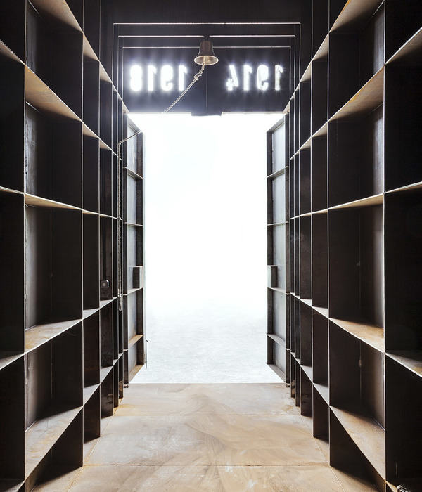
拱形,并且以三个阵列的形式出现,这着实让业主方很是不能接受。我们总是想像着我们脑海已存在的景象。而所谓的创造无非也是从翻腾的千奇百怪的想法中去寻找一个合适的衣服套在已经不可改变的身体上。他们困惑着无论是新中式,还是中式,从没有一种设计语言是以一种这样的形式出现的,于我们而言同样是困惑的。在这个没有配饰,只有白的空间里,花格窗,月牙门都不可能的是最适合的形式。从来就没有哪 一种形式一定是正确的,亦或者是一定是错误的,你与我在寻找的都是共同的“妥协”。向左行,还是向前进,我们眼中的物在此处都避不开正中的博古架。
Arch, in the form of three arrays, is really not acceptable by the owner. We always image what we already have in the mind. The so-called creativity is nothing more than the search for the right clothes to put on an already immutable body from a seething sea of all sorts of strange ideas. They are perplexed that no matter whether it is the new Chinese style or the Chinese style, no design language has ever appeared in such a form, so it is equally perplexing to us. In this white space with no accessories, neither lattice windows nor crescent doors are possibly the most suitable forms. There has never been a form that must be correct, or must be wrong. What you and I are looking for is common “compromise”. Moving to the left or moving forward, the things in our eyes can’t avoid the antique-and-curio shelves in the middle.
和原有的回字形开放动线不一样,这一次我们选择复杂模式,让动线变得更加迂回。以制造更多停留的可能性,同时避免产品与产品之间相互产生的干扰。原有的灯光与吊顶被业主方要求保留,在大空间内搭建许多小方盒子变成了界定内部空间的一个载体。局部封闭的吊顶与大空间的开放原顶形成了另一种虚实的对比。弧形的导角在方正中巧变成一种引导方式,指向着另一处空间。而他与她也有可能从不同的方向在此处相遇。
Different from the original open zigzag lines, we chose a complex pattern this time to make the line more circuitous, in order to create more possibilities for staying while avoiding interference between products. The owner required to retain the original light and suspended ceiling, and a lot of small square boxes were built in the large space to become a carrier defining interior space. The partially enclosed suspended ceiling and the original open roof of the large space form another kind of contrast between empty and full. The cambered guide angle cleverly became a way of guiding in the square, pointing to another space. It is possible that he and she meet here from different directions.
项目信息——
项目名称:非空
建筑师或者建筑公司:尤格空间设计事务所(苏州)
项目设计 & 完成年份:2019.07 / 2019.10
主创及设计团队 :祝年微, 江伟,罗玉春,夏佩雯
项目地址:江苏 苏州
建筑面积:1000㎡
摄影师:Shengsu Architectural Photography
客户:艺盟百胜红木家具
{{item.text_origin}}


