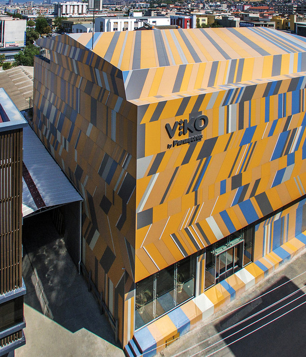
- 项目名称:深圳海上世界招商局广场
- 设计面积:56500平方米
- 设计时间:2006年
- 竣工时间:2006年
近年来随着社会发展的多样化,引导了一群新的顾客,他们渴望新的产品和新的场景。因此
毕路德
设计的理念不再停留在办公空间的表层,而更着重于挖掘精神功能的要求(视觉反映心理感受、情感感染等)。办公空间设计的精神就是要影响人们的情感,乃至影响人们的意志和行动,所以要研究企业的运作和文化,研究人和环境的相互作用。运用各种理论和手段去冲击影响人的情感,使其升华达到预期的设计效果,以产生强烈的感染力,更好地发挥其在精神功能方面的作用。建筑设计是一种思想、生活。现今人们追求多元化的生活方式,就引发了多元的设计解决方案,设计团队不仅只是为一个办公场所增添风景,而是通过一系列的链接延伸其目的,将这个复杂的链接上的环节相协调在一起并艺术地升华其功能。
With the diversification of social development in recent years, people’s expectations and needs require new products and new scenes. Therefore,
BLVD
no longer confines its design concept just to the simple office space; it pays more attention to exploring the spiritual needs of the space (visual sense reflects the psychological and emotional feelings etc.). The essence of office space design is to influence people’s feelings, and further to affect their behaviors. That is why we need to study the operational mode of a corporation and its culture, as well as the interaction between people and environment. We endeavor to affect people’s sensation by applying various theories and approaches in the design to achieve the anticipated design effect and arouse a strong influence. Architecture design is a kind of thought and life. Nowadays, people tend to pursue more diversified ways of life, which leads to the advent of many design solutions. Design teams should not just intend to add scenery for the office; instead, they should adopt a series of links which interact with each other to artistically enhance the function of the space.
杭州新天地
Hangzhou Xintiandi Office Towers
项目位置: 中国 杭州
设计范围: 室内办公楼
设计公司: 毕路德
设计面积: 7,800平方米
设计时间: 2013
竣工时间:在建
Location: Hangzhou, China
Design scope: Interior design office towers public areas
Interior designers: BLVD International Inc.
Floor area: 7,800 m2
Design date: 2013 March
Construction date: 2013 November
杭州新天地是几个月前我们中标的项目群的总称。起初是投标设计一个面积不大的大堂,最终的设计范围扩展到7个写字楼的公共空间的室内设计。总平图中包括了四个地块(K,E,P和B),他们分别有着自己的特色和设计语言。
杭州拥有悠久的历史和绵长的传统。杭州西湖孕育了许多传说与神话,长达六十公里的湖岸以及沿岸的苏堤、白堤和历代的私家园林等供游人亲近西湖。我们的设计并非只注目于传统或者现代类型,而是想要表达抽象与诗意的层面。从此,办公空间也可拥有梦幻元素。
K地块是我们与新天地集团合作的首个项目,该项目的挑战在于在促狭的平面空间中做出有冲击力的设计。三层楼的高度和链接两塔的廊桥让我们得以增强竖向效果,让空间看起来更为宏伟。
我们的突破点是从自然光线上找寻人类与大自然的关系。在大堂顶部开口,引入光线以强调空间的竖向属性,于此同时赋予空间象征意义与戏剧性。竖向属性在走过接待处后得以有冲击性体现。接待处的背景墙沿对角线折叠,尖角指向顶部光线引入处。空间延续了三角几何的造型以创造包含各种元素的灵动效果。独创设计提高了整个大堂的复杂性。两种不同石材的应用,若干以金属表达的重要空间,这些都契合该项目的高端商务定位。暖色调石材将犹如日光一样的明亮清新感带入到空间。
E地块明亮和轻盈的室内与封闭和厚重的外观形成鲜明对比。建筑犹如闭合的黑色盒子,从盒子顶部一步步地被柔和的阳光掏开。首层大堂仍然延续着人与自然的概念。写字楼的高端性体现在奢华和高科技材料上。石材,金属以及玻璃的完美结合营造出一个独特而又具有冲击力的空间。从首层高度渐变到三层高度,室内空间尺寸随之变化。
柔和的线条暗喻人造自然,并且使得空间感受随观者角度的变化而变化。餐厅和健身房的精巧处理,从二层挑出让空间更具复杂性。流畅的线条横向延伸到左右两端,两端沉稳的电梯厅是整个项目创造性体验的穷尽处。
显然,每个地块和塔楼都有自己的几何属性,我们借助运用适宜的材料来寻找令人怀念的人与自然的关系。
Hangzhou Xintiandi is the name given to a number of projects won by bidding few months ago. It started with a small lobby ended up with 7 office towers and its public areas interior design. The master plan includes 4 plots (K, E, P and B), all of them with different characteristics and design language.
The city of Hangzhou has a long history and tradition. The romantic west lake with its smooth perimeter 60 km long with several bridges and gardens close to human scale has been the stage of several myths and legends.
Our design doesn’t want to be just traditional or modern but instead wish to reach a level of abstraction and poesy where the working spaces could also beload with fiction and fantasy.
Plot K was the entry project; the challenge for this particular design was to get the impact of the lobby despite its small size in plan. The 3 floors height and the bridge connecting both towers allowed us to enhance the vertical effect and make it looks monumental.
Our approach looks for the relation of human with nature through the sunlight. By opening a top light transformed the roof of the bridge we emphasis the vertical space while adding symbolism and dramatics. The vertical impact can be seen only after passing the reception area. The back wall is folded pointing the top light. We follow the triangle geometry to produce a dynamic effect which includes all the elements. The new and original creation enhances the sophistication of the whole plot.
Two types of stones and key areas made by metal match the high ending business level. The warm tones bring the feeling of bright and fresh like the sun.
In Plot E a bright and light interior opposed to a heavy and massive hermetic envelope. The closed black box is opening step by step like a valley; soft natural lines produce a gap dividing the 2 towers with harmony.
From the ground lobby we follow the concept of nature connect human. The high ending office tower is reflected in the luxury and high tech materials. A perfect combination of stone, metal and glass create a unique space with outstanding impact. The sequence from one height to triple height gradually increases the scale of the interior.
The soft lines enhance the metaphor of man made nature and complete a dynamic space always changing while moving. The second floor restaurant and gym can take part in this composition adding sophistication through a delicate design elements cantilevered in the atrium.The flow moves horizontally to the right and left to find the calm on the lift lobbies areas at the end of this creative experience.
Every plot and tower follows a particular geometry, using materials which look for the perhaps nostalgic connection between man and nature.
郑州传媒港
Zhengzhou Media Port
(河南出版产业基地三期工程数字化出版中心、中原文化创意广场)
(Henan Publication Industry Base Phase 3—Digitization Publication Center, Centerline Cultural Creativity Plaza)
设计范围:室内
建设单位:中原出版传媒投资控股集团有限公司
建筑面积: 7620平方米
项目性质: 办公
项目位置:河南 郑州
设计时间: 2013
竣工时间: 在建
Design scope: interior
Construction unit: Centerline Publication Media Investment Holding Group Co., Ltd.
GFA: 7620 sqm
Project feature: office
Project location: Zhengzhou, Henan
Design time: 2013
Completion time: under construction
传媒港作为文化创意产业办公空间的集中地,将凝聚并形成该区域从现在到未来的文化穿透力。我们的设计理念也因此而着重展示该地区的年轻心态,打造高端商务与宏伟的现代办公空间。
北大堂采用了随意的几何图形以呼应整个不对称的平面;而南大堂里从天花一泻而下的两个抽象的黑色瀑布,使得整个空间优雅而又令人难忘。南北大堂由下沉式广场连接且彼此对称。前台与电梯厅在同一条东西走向的中轴线上,让进入具有恢宏的仪式感。
所有的设计理念都围绕着这条轴线展开。室内的材质与色调与南北座的建筑立面相呼应。自然元素在这个设计中也有所体现,如水幕与灯光的结合起来的景观,该景观与中庭广场相呼应。具有雕塑感的前台背景墙与电梯厅的天花让整个空间具有完整的象征性意义。
As a place where most of offices engaging in cultural creativity industry locate, Media Port will cohere and form the force of cultural penetration from now to future. The design concept emphasis is on displaying the work of the younger generation of this area and aims to create a high-end business office environment that features modern and grand qualities.
The geometrical graphs are used as design language and applied randomly in the North Lobby to respond to the overall asymmetrical plan. In contrast, the 2 abstractive black waterfalls running down from ceiling adopted in South Lobby make the space more elegant and impressive. The South and North lobbies are linked by the sunken plaza. The Host and Elevator Lobby are placed on the central axis of East-West orientation, creating a ceremonial sense of entry for guests.
All design concepts develop centered on this axis. The materials and color tone applied in the interior echo with the architectural façade of the South and North towers. Natural elements are also visible in the design. The waterscape created by waterfalls and lighting is responsive to the atrium plaza. The sculptural feature wall behind the host as well as the reflected ceiling above Elevator lobby reinforces the symbolic meaning of the whole space.
北京华通
Beijing huatong office
项目位置: 中国 北京
设计范围: 室内办公楼
设计公司: 毕路德
设计总监: 刘红蕾
主创设计师: Abel Erazo
设计面积: 326.8平方米
设计时间: 2013
竣工时间:在建
Location: Beijing, China
Design scope: Interior design office towers public areas
Interior designers: BLVD International Inc.,
Design Director: Liu Honglei
Designer in Charge: Abel Erazo
Floor area: 326.8m2
Design date: 2013
Construction date: 2013
本案是为华通建筑公司设计的一个小型展示厅和会议空间。它位于建筑首层,与入口大堂相连接。尺寸为24米长6米宽 6米高,是个中型空间和休息区。我们利用户外来扩大室内空间。它面朝南,户外绿色挡墙可起到隔离光照的作用,同时挡墙本身也是个竖向花园。几何形态概念取自像素矩阵,我们将不同尺寸的显示屏和投影设置到墙面上。立体部分由天花和墙面的白色喷漆胶合板模块组成。空间的抽象感由白色进一步增进。白色代表着一张有待信息填充的白纸。大到演讲和讲座,小到小组讨论和小型会议,可移动式家具和板块让空间得以按照不同功能需求进行变化。空间后部有水吧提供饮料服务。
空间后端有我们为沉浸式投影仪量身设计的夹层。它的出现赋予空间圆润的线条,打破了整个直角空间。银色半球漂浮在半空中,它不仅代表着信息时代的高科技,而且也代表着乌托邦时代的梦想。
This is a small exhibition and meeting space for WDCE architectural company. The site is connected to the entrance lobby at the first floor. The proportion of the site, 24 meters long by 6 meters width by 6 meters high, works as an intermediate space between circulations and resting areas. We use an outdoor land for extension. Due to its south orientation the green areas can help both as a screen to protect from isolation and as a horizontal and vertical garden.
The geometry comes from a matrix of pixels which allow us to set the different formats of the digital screens and projections. The tridimensional effect is build with white panels made out of painted plywood for ceilings and walls. The abstraction of the space is enhanced by white color giving the idea of an empty page waiting to be load with information. Mobile panels and furniture change the layout up to the different activities. From big lectures and talks tosmall group chats and meetings. At the end of the plan a water bar for snacks and drinks act as a service station.
At the background we offer a mezzanine level for 3D projections. Its shape adds the round edges to the composition and breaks the orthogonal lines. This silver sphere floating in the space represents not only the high-tech of the information era but also the fantasy of the utopia time.
郑州IFC(国际金融中心)
Zhengzhou IFC (International Finance Center)
设计范围:室内 景观
建设单位: 深航(郑州)置业有限公司
建筑面积:9990平方米
项目性质: 办公
项目位置:河南 郑州
设计时间:2012
竣工时间:在建
Design scope: interior, landscape
Construction unit: Shenzhen Airlines (Zhengzhou) Properties Co., Ltd.
GFA: 9990sqm
Project feature: office
Project location: Zhengzhou, Henan province
Design time: 2012
Completion time: under construction
设计理念强调黑、白、灰的对比与穿插,将简洁硬朗的线条和流动柔美的水概念相交织,给人以超凡大气、纯净明快之感。错落有序的地面及天花着重展现建筑的空间美、结构美和韵律美。墙体以沉稳的色彩和丛林感的外观,巧妙的隐喻中原文化厚重悠远与博大精深。空间在对比中获得了优雅的平衡,创造出了极具效率的办公空间的同时,升华空间的品质和精神。
The design emphasizes the contrast and artistic play of black, white and grey. The simple and straight lines are perfectly blended into the fluid and curvilinear “water” concept, creating a grand, pure and bright space. The aesthetic of space, structure and rhythm are displayed through the flooring and ceiling. The color applied on the wall, together with the forest-like façade, artfully tells about the central-China culture’s profoundness and extensiveness.
The elegant balance is achieved through the tone contrast of the space. While creating a highly-efficient office space, the quality and spirit of the space are greatly enhanced.
深圳海上世界招商局广场
Shenzhen Sea World China Merchants Plaza
设计范围:室内
建设单位:深圳海上世界招商局
建筑面积:1631 ㎡
项目性质: 办公
项目位置:深圳南上海上世界
设计时间:2010
竣工时间:2014
Design scope: interior
Construction unit: Shenzhen Sea World China Merchants Plaza
GFA: 1631 sqm
Project feature: office
Project location: Shenzhen,Guangdong
Design time: 2010
Completion time: 2014
在本方案中,从线条到灯光,都充分汲取了水的跳跃性和流动性,奠定了人们对整个建筑雅致但不乏灵动的第一印象。
设计在SOM的整体概念基础上给室内空间加入了舒适、放松、新奇的设计感、充满乐趣和愉悦等空间体验。通过一些设计元素调整和变异,使得身处其中的人们从建筑外立面到手可以触摸到的室内细节,深深感到“水”的概念。由外到内高度配合,从一种感官到内心感受递进,创造出舒适惬意的氛围,让人感到轻松自在。在此环境下体会室内在设计细节的细致、独特和关怀,进而产生发自内心的欣赏和愉悦。通过设计师精心调配,以多变的形态进一步给空间增添了一丝活力,同时又体现出我们创造的环境所给予人们的关怀。
In this design, the vibrant and flowing feature of water is artistically applied to the interior design and beautifully lighted to emphasize the fluid lines of the water. It is an impressive feature due to its elegant and dynamic appearance.
Based on the SOM concept, the design gives the interior space a more comfortable, relaxing and joyful ambience. The “water” concept attracts viewer’s attention from the exterior of the building and invites an intimate and touchable view once inside. The variation of patterns also adds vibrancy to the interior space, representing the designer’s care for people as well as the environment created. Interior and exterior are highly responsive to each other-first impressing people by the exquisite and unique design character and further arousing people’s inner joy.
成都九龙仓办公楼
Chengdu Jiulongcang Office Building
(成都市锦江区东大街11号地块A1区办公楼)
(A1 office building, land plot #11, Dongda Street, Jinjiang district, Chengdu)
设计范围:室内
建设单位: 龙茂房地产开发(成都)有限公司
设计面积: 1642
项目性质: 办公
项目位置: 四川 成都
设计时间:2009
竣工时间:2013
Design scope: interior
Construction unit: Longmao Real Estate Development (Chengdu) Co., Ltd.
Design area: 1642sqm
Project feature: office
Project location: Chengdu, Sichuan
Design time: 2009
Completion time: 2013
本案采用简约的设计风格,以简洁的氛围衬托出现代人简单的生活态度,摒弃了无谓、复杂的造型,体现出现代办公空间本质的美感。
在用色方面,以白色为主色调,深棕色为辅助色彩,偶尔穿插些许黑色,使得空间在纯净之余还透露出自然、神秘的气息,这样的色彩组合简练的线条成功地打造出时尚且富有格调的商务空间,不仅能让人感受到优雅,和谐的气氛,还能增加空间的宽敞感。
镜面大理石和具有自然气息的木质材料,将成为整个空间的主体,大理石的简约、平滑是现代感的最直接表现,而木质材料则最大限度引入自然元素,为空间增添了舒适和谐之感。
用极为简单的线条来演绎空间,展现出现代办公中干脆、利落的美感。造型上以有序的直线为主,将平滑的曲线元素穿插其间,使得纯净的空间中有了动态,营造出动静结合的商务氛围。
The office building is designed in a minimalist approach to reflect modern people’s pursuit of simple life. Many meaningless and complicated structures are abandoned in the design, so as to achieve the aesthetic feeling of modern office space.
In the design, white is the dominating color. Dark brown is the supporting color and black is an accent tone. By adopting this color scheme, a pure yet natural and mysterious space is achieved. The minimalist lines among the colors successfully create a very stylish business space, which not only enchants people with its elegant and harmonious ambience, but also enhances the sense of spaciousness.
The whole space is dominated by reflective polished marble and natural wood. The minimalist and smooth texture of marble best represents a modern feeling of the space. Wood introduces nature into the interior to a large extent and greatly enhances the feeling of comfort and harmony.
The clean and simple lines used in the whole space create a simple and neat aesthetic to the office. The sculptures are composed of straight lines in an ordered manner. Smooth and curved lines crossing each other give the ordered space a dynamic expression. The purpose of this approach is to achieve a business ambience of a peaceful yet a kinetic sense of play in the space.
国电宁夏太阳能有限公司办公楼
Office Building of Guodian Solar Co., Ltd.
设计范围:室内 建筑 景观
建设单位: 国电宁夏太阳能有限公司
建筑面积:8230㎡
项目性质: 办公
项目位置:宁夏 石嘴山
设计时间:2009
竣工时间:2010
Design scope: interior architecture landscape
Construction unit: Guodian Solar Co., Ltd.
GFA: 8230sqm
Project feature: office
Project location: Shizui Mountain, Ningxia
Design time: 2009
Completion time: 2010
设计从建筑室内空间的需要和造型出发,结合企业产品特点,将多晶硅矿石的造型和现代化的审美情趣结合,打造出别具一格的建筑空间体验,利用太阳能节能环保企业特性,将生态建筑的概念引入建筑设计当中。国电宁夏太阳能公司是以多晶硅为主要产品的企业。多晶硅的需求主要来自半导体和太阳能电池,是高集成的高科技产品。从办公楼的建筑上,不仅能读出国电的气度,更能看到高科技的内涵。从理念到外型,从旧建改造到风尚前瞻,国电宁夏都引领着中国内陆城市建筑设计的新一轮风潮,也为新兴高科技产业的发展趋势进行了设计研读,跨界衍生与低碳生活在本案上得以全维体现。建筑之美,不仅在于自身的璀璨,也在于对于大地绿洲的滋养。
宁夏身居西北内陆,地处中温带干旱区,大风、沙尘暴天气出现次数较多。因而建筑立面是由现代感很强的合金镀锌波纹板,以绚烂荧光的色彩和天然彩宝的独特剖面形式拼接而成。这种材料不但能防止风沙腐蚀,更能让金属色彩烘托出现代化企业的高科技性质。夺目炫色,使建筑从周边灰黄的环境中跳出来,成为了此区域当之无愧的视觉焦点。西侧的立面网状结构看似平淡无奇,其实是一块神奇的生态绿化的区域。在春夏季节,可以实现立体绿化的效果,使得建筑更加和谐融入自然。
Starting from the architecture shape and interior needs and in conjunction with the product feature of the enterprise, the shape of polysilicon ore expressed in a modernized and aesthetic manner is applied in the design to create a unique architectural space experience. Additionally, by making use of environmental protection feature of solar energy, the concept of ecological architecture is introduced into the design.
Guodian Solar is a manufacturer with polysilicon as its major product. Several forces were factored in to create the aesthetic language of this project. The architectural shape, the interior programmatic needs along with the composition of this silicon crystal used to make polysilicon itself, combine to create a unique architecture space. Additionally, utilizing solar energy adds to address the concerns to create an ecologically minded architecture.
The demand for polysilicon mainly comes from high-tech products including semi-conductors and solar batteries. The building itself not only reflects Guodian’s grandness, but also expresses the connotation of high technology. From design concept to the building shape, from redevelopment to the upcoming fashion, Guodian Solar is in the forefront of architectural design in China’s inner cities.
The designers also carried out research on the development trends of emerging high-tech industries. Low carbon output and cross cultural internationalism were given full design expression in the planning and visuals of the space.
The beauty of architecture not only lies in its brilliance, but also in its nourishment for the earth.
Ninxia is located in the Northwest inland which has an arid temperate zone and is always frequented by strong winds and sand storms. Inspired by this, the faceted architectural façade is designed as a patchwork of alloy corrugated panel with a colorful zinc coating similar to a natural gem stone exquisitely cut into multi-facets. The metal corrugated panels and zinc coating material is erosion resistant. Expressing the colorful metal panels of the roof highlights the modern and high-tech nature of the building. The brilliant color scheme enables the architecture to stand out from its surroundings and become a visual focus of this region. The net-like structure on west façade conceals that it is actually a magical ecological greenery area. During spring and summer, it becomes a full height wall of greenery which blends the architecture with nature in harmonious approach.
毕路德北京办公室
BLVD Beijing Office
设计范围:室内 景观
建设单位:毕路德
建筑面积:760平方米
项目性质:办公
项目位置: 北京
设计时间:2012
竣工时间:2013
Design scope: interior, landscape
Design unit: BLVD
GFA: 760sqm
Project feature: office
Project location: Beijing
Design time: 2012
Completion time: 2013
它是斑驳却延续千百年文脉的围合建筑,亦是续写未来空间传奇的原点,它是毕路德(BLVD)北京公司的新址所在。
700平米院落,低层建筑形态,以京城传统的四合院为主体建筑风格,用单栋的房子围合而成的院子,坐北朝南,正房四五间,东西各设厢房,房与房之间以廊相连,廊上段段自由景致也成为设计师们灵感丛生的地带。通过创造性的修缮,呈现出不引人注目却愉悦舒适的工作环境,最大限度地带来强烈的荣誉感和归属感 。
抬头向上,随时可见与四季随变的天空,设计令天空的明亮舒服地照进每一间房子,居其内,从和美之道,毕路德(BLVD)正在这样一方雅韵古香与疏朗灵动并存的老北京四合院里创造着通向未来的崭新设计。
The building is an enclosed courtyard style architecture with a timeless appearance telling about thousands of years of Chinese way of life. It is the new site of BLVD office in Beijing.
This 700m2 traditional courtyard structure with Beijing style detailing and characteristics is a low-rise building composed of 5 principal rooms with one main room on East and West wings respectively. All rooms are connected by a vestibule. Pieces of randomly placed yet exquisitely made carvings in the vestibules also become a source of inspiration for the designers working there. A simple yet delightful and comfortable working environment is achieved through creative restoration, which brings a strong sense of purpose and belonging to the working environment.
Standing in the courtyard as one gaze up, you will capture the ever-changing sky as the seasons change. Sitting inside, you can enjoy the warm sunlight coming into every room, feeling the beauty of harmony with nature. It is a traditional courtyard which never fails to enchant you by its antique elegance as well as its inspiring brightness. BLVD is creating a completely new futuristic design just in here.
深圳招商海运中心
Shenzhen Merchants Marine center
设计范围:建筑 室内
建设单位:招商地产
建筑面积:56500平方米
项目性质:综合办公楼
项目位置:广东 深圳
设计时间:2006
竣工时间:2006
Design scope: architecture, interior
Construction unit: Merchants
GFA: 56500sqm
Project feature: office building complex
Project location: Shenzhen, Guangdong
Design time: 2006
Completion time: 2006
深圳招商海运中心位于深圳市南山区招商局前海湾3.5平方公里物流园区内,项目包括口岸楼及主塔楼所有空间的设计,室内总设计面积56500平方米,设计 定位于中档以上的综合办公楼。
设计将建筑单体打造成了场地中最具体量的集装箱,把集装箱的状态变成一种视觉的语言,运用到设计中,使设计消失在场地环境里,更具有场地精神!口岸楼大堂是个狭长的4层高空间。平面成一个干净的矩形,空间中有几条连桥贯穿,我们利用层高的优势,在吊顶做了很多盒体,平面呈矩阵的布置方式,但在高低,色彩上富于变化,形成一个丰富的表皮肌理,两侧的高耸的墙面,我们把它想像成巨大的集装箱,利用错位的条纹,组织成一个丰富的集装箱表皮。
报关大厅的顶部,利用了条状彩色铝板的特点,形成了平面化的pattern。在组织色彩的时候,米色、白色、棕色为办公室空间注入了温暖的情绪。
主塔楼的大堂为双层高空间中,设计师把中间的核心筒部分利用表皮化的方块语言雕塑出形体,顶部采用了“黄金分割”,做了一个大小白色方块的构成变化。
Shenzhen Merchants Marine Center locates within a 3.5 square kilometer logistics park of Shenzhen Nanshan Merchants Bureau. The project includes interior design for port building and main tower. The total interior design area is 56500sqm. This project is positioned as an office building complex.
The visual language applied to the building is to emulate a massive port container, alluding to its site location as part of the port.
This port building is a long and narrow four-story building. It is a clean rectangular configuration in plan with pedestrian bridges connecting the various spaces. Several “box” configurations are achieved in the ceilings by making use of the floor height differences. Although it is quite rectangular in plan, the variations in height and colors give the building a rich texture—the solid walls rising up on the two sides are imagined as a huge container, whose skin is enriched by adding lots of dislocated strips to appear as “box labels”
The top of the Customs Lobby is composed of colorful aluminum strip panels. The color scheme of beige, white and brown applied in the interior space creates a warm ambience for the space.
The lobby of the main tower is a two-story high space. The core circulation cylinder is artistically transformed into a sculptural square shape by adding a secondary skin. The top is designed into a composition of many large and small squares under the principle of the golden ratio in geometry.
南海意库(三洋厂房改造)
Nanhai Yiku (Sanyang Workshop Redevelopment)
设计范围:建筑、景观、室内
建设单位:深圳招商地产有限公司
建筑面积:24000㎡
项目性质:办公
项目位置:广东 深圳
设计时间: 2006
竣工时间:2008
Design scope: architecture, landscape, interior
Construction unit: Shenzhen Merchants Real Estate Co., Ltd.
Project feature: office
Project location: Shenzhen, Guangdong
Design time: 2006
Completion time: 2008
2006年设计完成的南海意库(三洋旧厂房改造项目)是一个“建筑到室内及景观的一体性改造”的项目。毕路德(BLVD)建造设计的目的是创造一个可持续发展的绿色节能建筑。业主招商地产利用了一个老的厂房(原三洋公司厂址)把它改造成招商地产控股有限公司的总部办公楼,希望能对社会有牵头示范作用。毕路德(BLVD)在建筑到室内及景观一体性改造的同时,进行节能及建筑生态的技术改造,使建筑以低耗、节能的新面貌重新投入使用。通过屋顶绿化、垂直绿化、景观水池等多种生态绿化技术,形成生物气候缓冲带、改善建筑微环境,将创意与生态完美结合,创造绿色生态建筑。
三位一体的改造设计为旧建筑注入新生命的历程,是令人惊诧的,更是感动的!你会发现,与你一同生长的建筑、绿地,甚至是一个隐藏在转角的光源设置投射在记忆里的维度……都被最大程度地保留与延续,无论何时,无论何人,路过或是探访,都依然能在今日的南海意库寻到深圳蛇口所历经的那些重要的发展轨迹。毕路德(BLVD)对南海意库三位一体的设计方案,在2006年的深圳创造了第一个在旧建改造项目上全力突出低碳环保的主题项目。
The design of Nanhai Yiku (Sanyang workshop redevelopment) was completed in 2006. It is an integrated redevelopment project of architecture, interior and landscape. The goal of BLVD’s design is to create a green and energy-saving architecture with sustainable development. The owner, Shenzhen Merchants Real Estate, wanted to transform the old workshop into its headquarters, hoping to set an example in this field.
While working on this integrated redevelopment, BLVD also attempted to carry out technical reconstruction to introduce energy saving criteria and ecology into the architecture. The building that was put back into use had a new look with low energy consumption. By applying various ecological techniques and use of natural materials and landscape, such as roof greenery, vertical greenery and waterscape, the micro-environment of the architecture is improved.
The new architectural design and ecological approach perfectly combine with each other, creating a green and eco architecture.
The integrated redevelopment gives the existing architecture a new life. The result is a stunning yet very pleasant and comfortable environment. Various existing features and assets of the original building are retained and enhanced. This includes much of the natural landscape, major architectural components, down to a small hidden light in one of the corners.
The integrated design for Nanhai Yiku proposed by BLVD is the first redevelopment project themed on low-carbon and environment protection.
MORE:
毕路德建筑顾问有限公司
BLVD Architecture Consultant Co., Ltd.
更多关于:
{{item.text_origin}}

