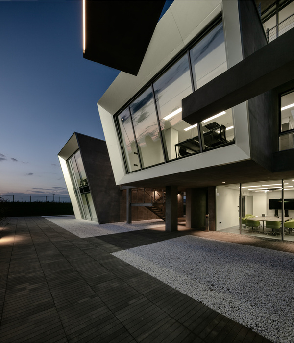
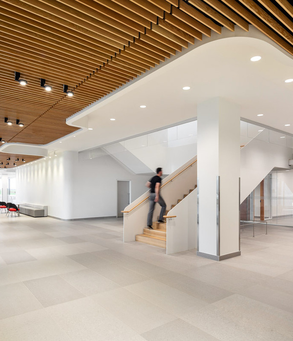
在中国北京市、市中心和郊外的分界线区域东五环附近,红砖仓库区周围的区域(支持1960年代的纺纱时代)正在作为新的商业区进行各种翻新。我们在街区的一角的一处旧仓库进行了Echo House的店铺设计。该客户在市中心已经有一家相对较小的商店,只能出售用有机植物制成的饮料。但从现在开始,业主方将不仅会考虑饮料,并且考虑食物都与身体健康之间的联系作为业务的拓展的方向;于是业主方购买了旧仓库区和砖瓦房的一部分,并要求我们进行设计。
The site is located in a special border area between the city center and the suburbs, around the 5th ring in Beijing, China. It’s also an industrial block which has plenty of red brick warehouses that supported the Spinning Era in the 1960s. It is undergoing various renovations to a new commercial area, and our project is to renovate one of them.The clients already own a relatively small shop in the city center, which sells beverages made only from organic plants. They are undergoing an extension of their business which not only sells beverages but every perspect of healthy food,so they have bought one of the red brick warehouses as the main studio+food bar, and have asked us to design it.
▼建筑与街道,the building and streets© Yuming Song (Beijing Ruijing Photography)
业主希望新店铺能够包括饮食实验室、饮食空间、销售空间、研讨会空间、画廊(项目组中也有艺术家)、小规模的办公空间、一部分植物培育温室以及二层建筑。认识到它们对自然生态系统(包括植物)的浓厚兴趣,我们寻求一种可以将室外元素主动融入房间的配置。另外,作为商业建筑,我们决定使外面的路人可以看到店铺的人,营造出一种热闹的商业效果。我们将设计理念转换为八个规则。所有这些规则都有双重意义,使产生的空间尽可能地令使用者情绪上产生共鸣。
A two storeys building was requested, including a food lab, dining space, sales space, workshop area, a gallery for the artists working in the team, office zone, and a greenhouse. Inspired by the clients’ strong interests in natural ecosystems, including lots of plants in the greenhouse, we have tried to actively introduce the outdoor space into the indoor space. As part of a retail area, it’s important to display a popular and busy atmosphere inside to be seen from the outside to attract more guests. Therefore we have designed our project according to the 8 rules below. All of these rules have a multiple perspective, so that the resulting space is as emotional as possible.
▼临街立面,facade to the street© Yuming Song (Beijing Ruijing Photography)
▼临街入口,entrance to the street© Yuming Song (Beijing Ruijing Photography)
▼入口细部,details of the entrance door© Yuming Song (Beijing Ruijing Photography)
概念 – 共存
Concept – Coexist
1.动线可以从外部视觉识别,并且应该是三维的。
2.内部的使用者可以看到外部的空间,并且有视点上的变化。
3.将低密度和细长的动线空间化。
4.作一个没有隔板或门的连续三维空间,并确定每个位置相对于外部空间的关系。
5.建筑环境计划首先应是基于自然统一性的被动式节能设计,而机械设备应起辅助作用。
6.结构上的设计应该是的综合考虑的,不应仅仅强调机械张力以及装饰性,并且力的流动应该是可见的。
7.建筑材料应该就地取材,考虑本地已有的建设技术的可行性,并且应该能够将过去的时间与未来联系起来。
8.室内家具,装饰和艺术品的创作应建立在建筑空间和产品设计的联系上。
▼外观,external view© Yuming Song (Beijing Ruijing Photography)
▼从街道看向温室,street view to warmhouse © Yuming Song (Beijing Ruijing Photography)
功能构成
Function
在对建筑的多样化组合进行深入考虑的情况下,设计充分考虑了各室内功能与外部环境的对应关系,进而在最适合的位置设置了相应功能的空间。具有聚集顾客功能的实验室及零售贩卖的空间,被放在从外部的视觉认知度最好的1层的北侧。而对于阳光及土壤管理有所需求的温室则被设置在1层南侧向阳的位置。展览厅内的作品希望更多地被外界人群认知的同时,考虑到对展览作品的保护,展览厅被放在从室外主街都能看到的2层北侧。至于具有私人聚会功能的工作坊空间则被设置在2层西南侧的角落。
With the consideration of the layout for various functions, the optimized spatial quality is designed to coordinate with the exterior environment.The lab and retail space, which are expected to attract daily customers, are allocated in the north side of the 1st floor plan. They are visually recognized from either the street or the interior. The warmhouse, whose sunlight exposure and soil management need to be seriously thought of, is allocated in the south side in order to gain enough sunlight. The art pieces displayed in the gallery are placed with the glass next to the street on the northside of the 2nd floor, avoiding direct sunlight. And on the southwest side of the 2nd floor, a workshop space for private gathering is set.
温室,warmhouse © Yuming Song (Beijing Ruijing Photography)
零售贩卖空间,retail space © Yuming Song (Beijing Ruijing Photography)
▼巨大的环形灯悬挂于餐桌之上,large ringlamp hanging over the table © Yuming Song (Beijing Ruijing Photography)
▼实验室,lab© Yuming Song (Beijing Ruijing Photography)
空间Space
店铺室内各空间之间并没有使用明显的门作为分割,使整个室内空间通过气味及声音联系。在主流线上也并没有局限空间使用的灵活性,顾客甚至可以坐在任何位置,对内部空间形态及用途并没有作过多的限定。而是更希望突出在室内环境中感受四方光影的变化,立体的螺旋,如同植物生长时带来的上升感。
There is no door designed in the interior space, in the attempt of connecting the 3 floors space with smell and sound. No strict rules for the usage of the space, leaving the space flexible and vague. Customers can even sit in the middle of the traffic flow line. Meanwhile, the natural light can be felt from any direction inside the building, resulting in 3 dimension spiral-like space that grows upward like a living plant.
通向二层的楼梯© Yuming Song (Beijing Ruijing Photography) stairs leading to 1st floor
▼展览厅,gallery © Yuming Song (Beijing Ruijing Photography)
工作坊空间,workshop space © Yuming Song (Beijing Ruijing Photography)
▼通向屋顶的楼梯,stairs leading to the roof© Yuming Song (Beijing Ruijing Photography)
▼屋顶平台,roof terrace© Yuming Song (Beijing Ruijing Photography)
城市近郊的建筑
A building in sub-urban area
ECHO HOUSE同时也作为KLC对建筑公共与私密性混合存在状态的一种思考。顾客从具有公共属性的街道空间进入店铺内部,流线作为一种异质的空间被溶解在室内,而随着流线的行进流线在室内和室外的感受之间不断切换,直到上升至屋顶平台时完全被打开,眺望远方是北京城市高密度的建筑群,这种单纯对建筑空间的认知在此时转变成为对城市影像的感受。通过一条与高密度城市分为不同的时间轴(自然)的介入,使每个空间感知主体的意识在近远及虚实之间切换,个体也能从城市的束缚中得到解放。
交通空间突显于立面,traffic space is highlighted on the facade © Yuming Song (Beijing Ruijing Photography)
在屋顶平台可以眺望城市,overlooking the city on roof terrace© Yuming Song (Beijing Ruijing Photography)
流线
Customer Traffic Flow Line
在确定各空间的功能及配置原则后,如同行云流水的书法一笔到尾一般,通过连续不间断的交通流线空间串联及交织起所有功能。一般设计上来说为了保持空间的效率,各个功能空间都相对集中,交通流线也常被作最短化处理,以确保在最紧凑的空间中确保最大限度的商业空间面积。而在该设计中,交通流线被尽量延长,使各功能空间之间被同一条主流线贯通,顾客通过主流线回游在店铺的室内,在小规模的商业店铺里创造了空间体验的最大化。
The main interior traffic flow line is designed like a continuous stroke in calligraphy that links all functional space as a whole. Often the traffic flow line is compact, and connects space with a minimal distance so that the maximum floor area is used as commercial space. While in this case, the customer flow line is extended between various types of space, assuring a most diverse experience of space in a limited shop floor area.
▼流线分析, circulation diagram© KLC
东京 – 北京
Tokyo – Beijing
设计及与现场施工的讨论全部都通过网络进行。一般为了对场地有更深的理解及更确切的解读都会有数次从日本飞到现场与业主及施工单位沟通的需要,但在新冠病毒蔓延的2020年,所有的进出国都被限制,结果即使竣工后也没能到现场进行视察。过程中也遇到了因为各种原因的延迟甚至停工,通过与业主及施工单位的共同努力,也经常利用各种网络社交工具对现场的情况进行确认,施工也顺利完成,并最终已经投入运营。
The design and construction supervision is accomplished fully online. As a result of the corona pandemic, the regular site visits from Tokyo are all cancelled. No site confirmation can be made before and after the completion of the building. Even though there are multiple elements that postpone the construction, thanks to the clients’ efforts and all digital communication technology, the construction ends up smoothly and now is already open for business.
▼一层平面,1F plan© KLC
▼二层平面,2F plan© KLC
▼屋顶平面,roof plan© KLC
▼立面,elevations© KLC
▼剖面,sections© KLC
Project Name:Echo House
Completion Year:2020
Gross Built Area:257.1㎡
Project Location:Beijing,China
Program:Retail,Gallery
Lead Architects:Yoshihiro Kamiyama
Office’s Team Design Credits:Colin. L, Lauren.L
Photo Credits:Yuming Song (Beijing Ruijing Photography)
{{item.text_origin}}

