Firm: DesignInc
Type: Commercial › Office
YEAR: 2012
SIZE: 10,000 sqft - 25,000 sqft
BUDGET: $1M - 5M
Photos: Trevor Mein (4)
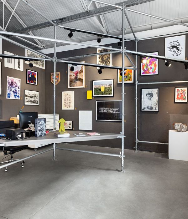
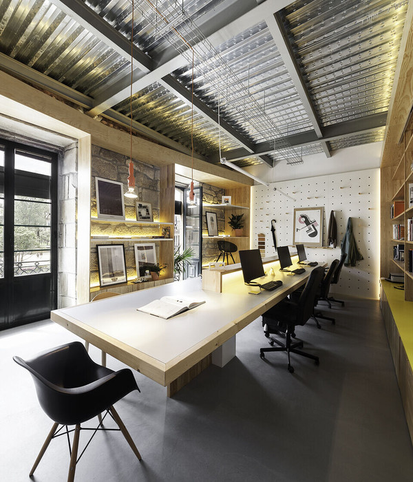
DesignInc’s new design studio was delivered as an integrated fit out. It combines exposed base building services and a new workspace into level two of the heritage listed Melbourne GPO building. New and old contrast to create a timeless aesthetic of recycled timber and steel on a backdrop of white masonry. A generous pinup gallery, imagined as an active street, links studio collaboration areas.
Reclaimed furniture, industrial column lighting, and generous amounts of internal planting generate a domestic scale. Operable mixed mode windows, combined with a large wall projection of nature and street life, further increase the natural experience. Design collaboration opportunities are maximized with the integration of kitchen, meeting spaces, a resource area, and an outdoor terrace.
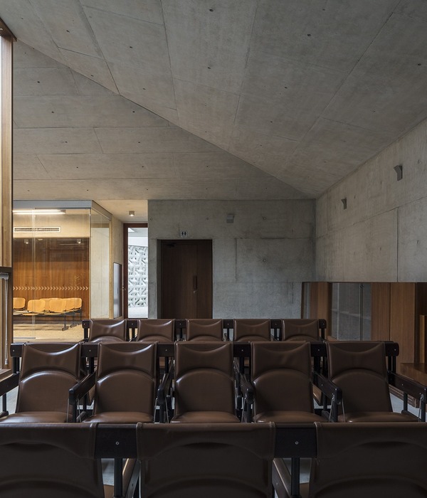
A strong relationship between the resource spaces, kitchen, and social spaces has been incorporated for maximum staff interaction and the opportunity for discussion of projects in informal ways. A large spatially robust, flexible, and reprogrammable “Lab” inserts into the more modern segment of the building fabric. It includes a moveable timber stadium seating joinery unit that allows for project screenings and office workshops and meetings.
The “recycled” theme continues throughout the fitout with the majority of furniture and joinery constructed from recycled materials, sourced secondhand or reused from the previous DesignInc tenancy. Recycled timber from one of DesignInc’s major projects was utilized as feature cladding throughout.
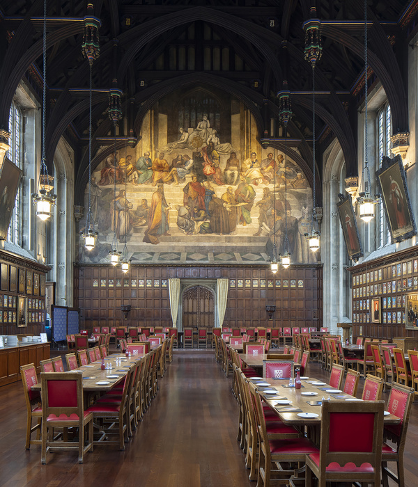
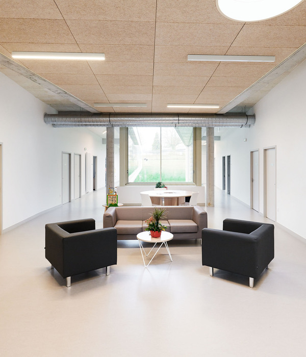
Formal proportions and high volumes, with windows and operable sashes placed well above head height, dominate major studio spaces. The existing fabric has been celebrated as a contiguous surface with walls and ceilings kept a neutral white while the dark charcoal floors and joinery units draw the eye up into the volumes above.
The rhythm of the existing archways informed placement of the linear workspaces where new workstation screens with integrated storage combine with recycled desks from DesignInc’s previous office. Work areas incorporate new layout tables and pinup spaces topped off by planting, allowing for quiet workshops as well as wider communication.
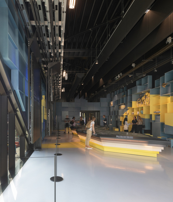
Main circulation within the office is directed through the gallery space that has been finished to support interaction, display and informal meetings, while providing much needed linear storage space.
The team loves the new design and central location – that allows staff to fully experience the inner-urban precinct through open windows and city sounds. A hub of collaboration, the new office design facilitates open and informal moments of communication alongside the inclusion of quiet spaces for times when staff require a peaceful setting for more concentrated periods of work.
{{item.text_origin}}

