© Petra Rainer
佩特拉·雷纳
架构师提供的文本描述。眼科诊所的设计主要围绕着该遗址的历史遗产的重要性。1403年,瑞士阿彭泽尔的人民获得了独立。出于这一意义,形成了一个类似岩石的体积,提醒了早期的稳定性。
Text description provided by the architects. The design of the Ophthalmic Clinic was focused around importance of the historic heritage of the site. Wherein the battle of Vögelinsegg in 1403, the people from Appenzell, Switzerland attained their independence. Out of this significance, a rock-like volume was developed that reminds of the steadiness of earlier times.
© Daniel Ammann
(Daniel Ammann)
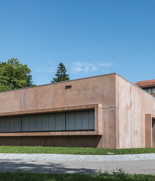
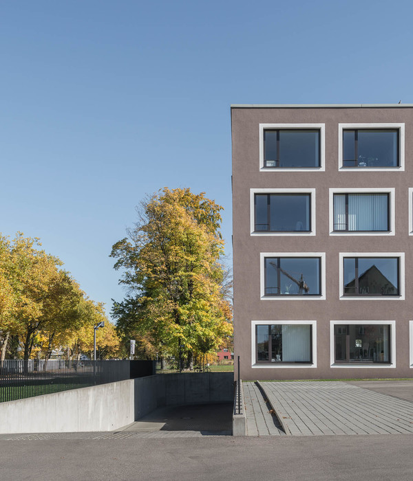
建筑物高高耸立在地形边缘之上,向康斯坦斯湖开放。尽管它的巨大,黑色的建筑物压抑自己,同时遵循地形的斜坡三扭结。深色白面混凝土的堆叠表面强化了房屋形状的石质特征。建筑物的紧凑性通过水平运行的窗口带在中间部分去物质化。整个医院都在这个区。玻璃提供了一个有节奏的结构立面,给建筑一个清晰的外观和一种轻盈。所有用于治疗和病人的房间以及新装备的手术室都位于北部,提供视野而不承认自己的洞察力。房间高的窗户提供自然闪电的条件,并在视觉上将环境吸引到建筑物的内部。电子可修补玻璃可以在按下按钮时使用,并允许-特别是对敏感的眼睛-使房间变暗。
The building towers neatly above the terrain edge and opens itself towards the lake of Constance. Despite its remarkable size, the black-coloured building represses itself and at the same time follows the slope’s topography with three kinks. The stacked surface of the dark pigmented fair-faced concrete strengthens the stone-liked character of the house form. The compactness of the building dematerializes in the middle part through a horizontally running window belt. The entire hospital is located in this section. The glazing provides a rhythmical structuring of the façade and gives the building a clear appearance and a kind of lightness. All rooms for therapy and patients as well as the new equipped OPs are located in the north and provide outlooks without conceding insights. Room-high windows offer natural lightning conditions and visually draw in the environment into the inside of the building. Electronic tintable glass can be used at the push of a button and allow – especially for sensitive eyes – to dim out the room.
© Petra Rainer
佩特拉·雷纳
Ground Floor
© Adrien Barakat
阿德里安·巴拉卡特
四套精美的豪华公寓坐落在医院的顶部。在那里,你可以找到相同的建筑语言的材料减少调色板和强烈的内部和外部的关系。
Four exquisite luxury apartments are located on the top of the hospital. There you can find the same architectural language of a reduced palette of materials and strong relations between inside and outside.
© Petra Rainer
佩特拉·雷纳
这座建筑通过令人叹为观止的房间序列和连贯、正式和简洁的表达来超越。该诊所自2016年10月起投入服务,是一个成功的例子,说明了一个结构如何直接应对任务的条件和网站的挑战。除了历史与当代的互动之外,最重要的是医院的卓越品质使其成为一座非凡的建筑。
The building exceeds through a stunning sequence of rooms and a coherent formal and substanced expression. The clinic is in service since October 2016 and is a successful example of how a structure directly addresses the conditions of the task and the challenges of the site. In addition to the interplay between history and contemporary, most importantly it is the outstanding quality that makes the hospital an extraordinary building.
© Petra Rainer
佩特拉·雷纳
产品说明:暗色白面混凝土的堆叠表面强化了石材的形状,北行的水平窗带为外墙提供了有节奏的结构,给建筑以清晰的外观和一种轻盈的感觉。整个医院都在这个区。房间高的窗户提供自然闪电的条件,并在视觉上将环境吸引到建筑物的内部。电子可修补玻璃可以在按下按钮时使用,并允许-特别是对敏感的眼睛-使房间变暗。
Product Description. The stacked surface of the dark pigmented fair-faced concrete strengthens the stone-liked character of the form.The horizontally running window belt in the north provides a rhythmical structuring of the façade and gives the building a clear appearance and a kind of lightness. The entire hospital is located in this section. Room-high windows offer natural lightning conditions and visually draw in the environment into the inside of the building. Electronic tintable glass can be used at the push of a button and allow – especially for sensitive eyes – to dim out the room.
© Petra Rainer
佩特拉·雷纳
Architects Carlos Martinez Architekten
Location Speicher, Switzerland
Category Clinic
Architects in Charge Carlos Martinez, Alexandra Tilgner
Area 7400.0 m2
Project Year 2016
Photographs Petra Rainer, Daniel Ammann, Adrien Barakat
Manufacturers Loading...
{{item.text_origin}}

