一组现代主义建筑群曾经占据了整个基地,因其无法适应当今的可持续发展标准而被取代。由于安特卫普市中心几乎没有绿地,因此将这里从一个隐蔽的硬质基础建设用地改造成公共花园是设计的关键。建筑师需要把零散的绿地整合成一个连续的公园,但是绿地间要求保留的展馆成为了阻碍。
The new building replaces a complex of modernist building volumes that used to occupy the entire site and could not be adapted to today’s sustainability standards.As the Antwerp city centre has few public green surfaces, the transformation of the site from a merely private, mineral and infrastructural area into a public garden is a crucial requirement of the competition brief. Surrounded by fragments of public green, the parcel is key to the formation of a larger, coherent park. Another – contradictory – demand was to maintain a more recent representational pavilion, which was positioned as an obstacle in between the fragments.
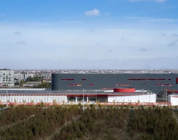
▼项目外观,appearance © XDGA-Matthias van Rossen
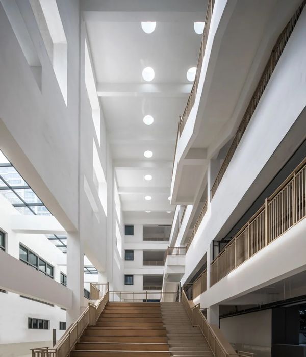
建筑师将该项目设想成跨越展馆的桥梁结构。在平面中,大型钢桁架连接两端中心,另外两处钢桁架与混凝土侧墙合并,其三角形部分决定了窗户形式,并被应用到整个建筑中,有效地控制了阳光入射,避免室内温度过热。行政大楼的立面不透明,其封闭白墙之间嵌有玻璃,而展馆是公园中完全透明的体块。
The building is conceived as a bridge structure over and across the pavilion. At the centre of the plan one large steel truss spans from one core to the other. Two more trusses are integrated in the concrete side walls and their triangulation defines the form of the window openings. In a next step this window form is applied all over the building as it turns out to be very efficient when it comes to an ideal balance between daylight access and overheating by the sun. The opaque façade is clad in circular, white glass mosaic, while the pavilion is a fully transparent box in the park.
▼形体生成,volume diagram © XDGA
▼立面,封闭白墙之间嵌有玻璃,facades, closed white walls with glass between them © XDGA-Matthias van Rossen
▼展馆屋顶,形成灰空间,the roof of the pavilion,forming grey space © XDGA-Matthias van Rossen
▼三角形元素延伸至屋顶,triangular elements extending to the roof © XDGA-Matthias van Rossen
建筑师将整个项目集中在紧凑的体块中,使其跨越展馆,因此建筑的正立面被切割,主入口设置在靠近街道一侧。然而,巨大的体量将公园分成前后两部分。为了使其联系成整体,建筑师使平面围绕一角进行旋转,随着楼层增高,建筑两端向中心偏移,既为相邻建筑退让出一定空间,也使其呈现出雕塑感。在设计过程中,展馆最终被玻璃体块取代,用作会议中心和汇演场地。
By situating the full program in a compact volume across the pavilion, this frontage is cut up and the main entrance is brought close to the street. This large volume, however, divides the park in a front and a back garden. Finally, by rotating the plan around one of its corners as it climbs up, the building shifts towards the centre; existing neighbouring buildings are respected and a sculptural form emerges. During the design process the pavilion building is at last replaced by a glazed volume to house the congress and exhibition part of the programme.
▼休息厅,与展馆屋顶连接,lounge,connecting with the roof of the pavilion © XDGA-Matthias van Rossen
▼展馆大厅,玻璃体块,exhibition hall,a glazed volume © XDGA-Matthias van Rossen
▼阅览室,侧墙由钢桁架和混凝土构成,形成三角型窗户,reading room,side walls are made of steel trusses and concrete,forming triangular windows © XDGA-Matthias van Rossen
▼讨论室,discussion room © XDGA-Matthias van Rossen
▼会议中心,the congress © XDGA-Matthias van Rossen
▼汇演场地,exhibition part of the programme © XDGA-Matthias van Rossen
▼平面图,plans © XDGA
▼首层平面图,ground floor plan © XDGA
▼剖面图,sections © XDGA
Place:Antwerp, Belgium Programme:administration headquarters of the Province of Antwerp Year:2011-2019 Status:built Client:Province of Antwerp Surface:33.000 m² Designer:XDGA (Xaveer De Geyter Architects) Architects competition: Xaveer De Geyter, Doug Allard, Christophe Antipas, Lieven De Boeck, Yannis Igodt, Paul-Emmanuel Lambert, Federico Pedrini, Marie-Pierre Vandeputte Definitive design: Xaveer De Geyter, Yannis Igodt, with Doug Allard, David Ampe, Tom Bonnevalle, Karel Bruyland, Elena Caruso, Joris De Greef, Denisse Florea, Arie Gruijters, Annelotte Herrebosch, Willem Van Besien, Peter Vande Maele, Yannick Vergnaud, Stéphanie Willocx Implementation: Xaveer De Geyter, Tom Bonnevalle, Yannis Igodt with Joris De Greef, Arie Gruijters, Annelotte Herrebosch Studies offices:Bollinger + Grohmann (structure), Boydens (techniques), Michel Desvigne Paysagistes (landscape), Transsolar (competition phase – energy).
{{item.text_origin}}

