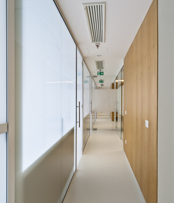
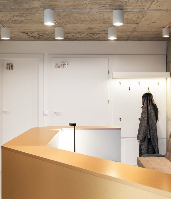
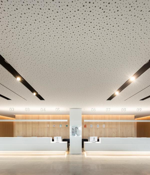
Clinic NK designed by 1-1 Architects, The site is a long shape facing the 4-lane highway on the north side and 4 meters wide on the south side, giving void to the townscape along these roads. The plan described here is building a dental clinic specializing in aesthetic dentistry and pediatric dentistry here. Considering the empiric position of the patient, we feel that a dental clinic should be able to contain various parts according to the different activities. For example, reception → waiting → tooth brushing corner → treatment room → X-ray → treatment room → waiting for → payment. In order to translate the act of movement into the structure of architecture itself, we considered each room of the clinic as the destinations and transposed “→” into an aisle connecting them together.
Courtesy of 1-1 Architects
Specifically, in order to conform to the directionality of the site, a long aisle is set at the center of the building, and necessary rooms that become destinations are arranged on both sides of the building. In the aisle, processing was done on the ceiling surface by whitening the surface deceives the human perception of the real size of the room and ends as a door that allows us to feel the extensibility of the space.As a result, the whole planned as a sensory outside space where the state of light changes throughout the day. The sensory outside which changes according to the natural light installed in the center of the building has a connection with each room, thereby preventing excessive consideration of privacy from which leads to a sense of limitation. The volume and setting of each room changes according to their destination. For both patients and staff, between rooms involve a change in perception as plants, the intensity of light and architecture vary from room to room, and it waits. As buildings and external environments change, users will accumulate several different spatial experiences.
Courtesy of 1-1 Architects
We designed an arch-shaped “boundary” between the aisle and the rooms. This shape, which is not symmetrical in the vertical direction, makes those who are in the aisle aware of the openings and accessibility of the rooms. Furthermore, the repeated arched shape homogeneity encourages the passage to be organized in the Gestalt principle. A metal coating covers the surface of the arch as a foreign object whose expression changes radically with the light. The passage of this “boundary” releases us from the aisle and reaches to the destination.From the outside, the part of the passage protrudes not only vertically but also horizontally, and guarantees the directional understanding of the site in relation to the city. The neighborhood does not feel any pressure or protrusion of the aisle thanks to the rooms that are attached to it. By positioning windows and plants differently between the inside and the outside, a feeling of privacy is guaranteed, while always giving a sense of openness of the outside.
Courtesy of 1-1 Architects
Project Info: Architects: 1-1 Architects Location: Aisai, Aichi Prefecture, Japan Area: 808.0 m2 Project Year: 2018 Manufacturers: Lixil Corporation, Flame, BEAL, Tajima Project Name: Clinic NK All Images Courtesy Of 1-1 Architects
Courtesy of 1-1 Architects
Courtesy of 1-1 Architects
Courtesy of 1-1 Architects
Courtesy of 1-1 Architects
Courtesy of 1-1 Architects
Courtesy of 1-1 Architects
Courtesy of 1-1 Architects
Courtesy of 1-1 Architects
Courtesy of 1-1 Architects
Courtesy of 1-1 Architects
Courtesy of 1-1 Architects
Courtesy of 1-1 Architects
Courtesy of 1-1 Architects
Courtesy of 1-1 Architects
Courtesy of 1-1 Architects
Courtesy of 1-1 Architects
Courtesy of 1-1 Architects
Plans
Sections
{{item.text_origin}}

