Johnson &johnson eyesight health institute
设计方:Sergey Estrin Architectural Studios
位置:俄罗斯 莫斯科
分类:办公空间装修
内容:实景照片
图片来源:Sergey Estrin Architectural Studios
图片:15张
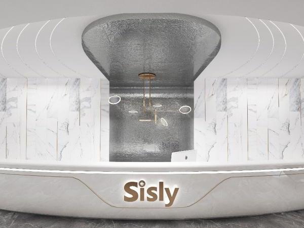
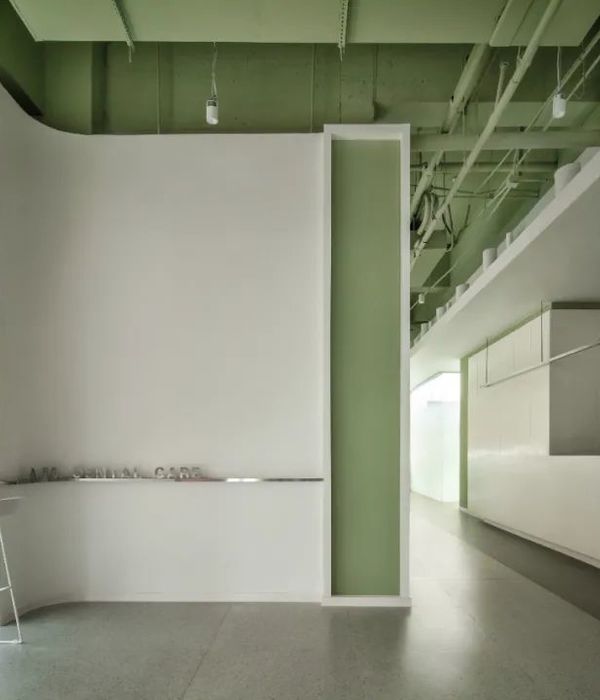
精心挑选的材料以及灯光细节,这是Sergey Estrin Architectural Studios设计的强生视力健公司研究所办公室,位于俄罗斯莫斯科,展示了权威视力保护专家坐镇的现代视力保健场所。其工作环境不是看上去使人愉快,也十分温暖。一进入该办公室,圆大理石接待桌展示的有机玻璃是聚焦点。而铜墙定义一个无菌的环境。避免使用经典的白色,取而代之的是隐藏的亮光,。设计师将整个空间变得有活力起来。明亮的颜色加上与品牌相关的时尚的蒲公英的出现在室内显得十分突出。
从地板到天花板,在铜板之间的玻璃隔板使得室内变得更加宽敞。与单调的设计相反的是,一些几何图案设计的插入打破了室内单调的氛围。接下来介绍一些闪光的设计细节:灰色的防水板做成的墙;在视力检查室的盲人墙随处可见;窗户在走廊的尽头也不觉得有封闭感;室内的门都是白色的薄木门;会议和表演室的墙与梯形的木板在一起。
译者: Jasereen
Do you take joy in going to the ophthalmologist? You just might after seeing this modern eye clinic imagined as a place of wonder, an adult’s version of an eye doctor’s fairyland. Carefully selecting materials and light details, creative minds of Sergey Estrin Architectural Studios captured the essence of eye care in a modern, hope-filled atmosphere inside this professional education center for vision care specialists.
Eye care professionals work in an environment that is not only visually delightful, but also warm and calming. A rounded Corian reception desk showcasing “lashes” of glowing acrylic glass is the focal point once you enter the Johnson & Johnson Vision Care Institute Offices in Moscow. Copper walls define an otherwise sterile environment. Avoiding the “classical”, fearful use of white and replacing it with bright lights hidden in the design, architects enlivened the spaces. Bright colors and brand-related stylized dandelions appear as accents throughout.
From floor-to-ceiling, glowing glass inserts installed by NAYADA between the copper panels create the sense of a larger space. Contrasting with the discreet monochromatic design interiors, these geometric design insertions break the monotony by offering a multitude of visual dimensions.
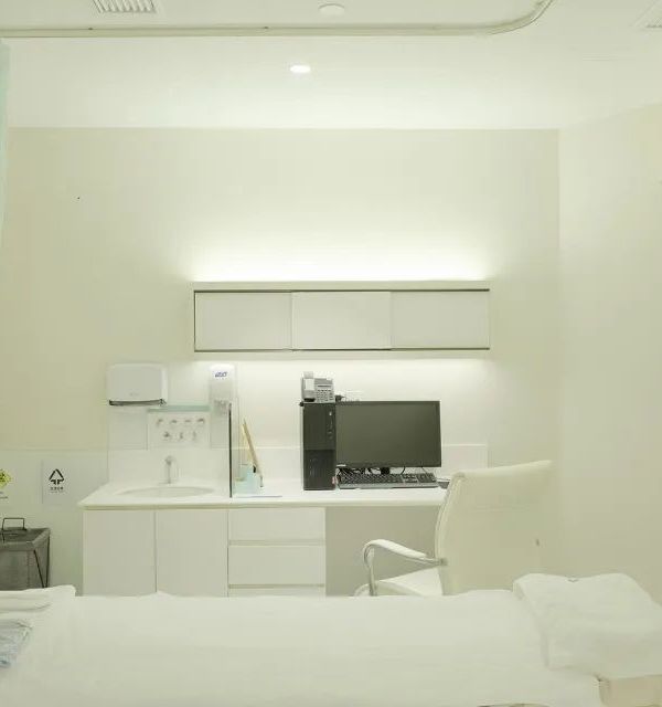
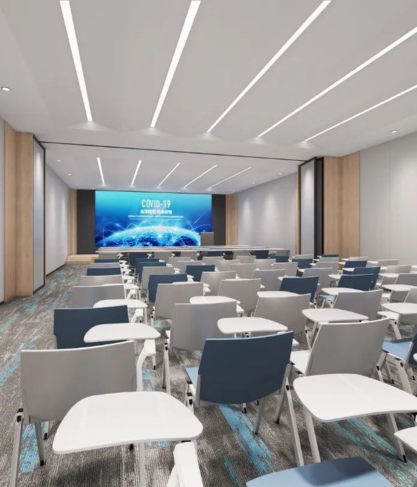
Here are a few details that shine light on architectural solutions employed in this inspiring modern eye clinic: “Dubbing of walls is made using gray water-resistant panels. Eye examination rooms require limitations on natural light, so deaf walls are located everywhere in these premises. At the same time, there is no feeling of an enclosed space – as windows are located at the ends of all corridors. The interior is harmoniously enlivened by white laminated doors. The opal film on the glass partitions and doors is made according to the architects’ designs. The internal walls of the auditorium used for conferences and performances are lined with trapezoidal panels. LED light strips are mounted at the ends. The walls with geometric patterns, tables with beveled bases and triangular lights, all form a very dynamic space. Convertible partitions allow controlling the interior space of the auditorium.”Care to take a closer look and share your favorite details with us?
强生视力健公司研究所室内局部图
强生视力健公司研究所
{{item.text_origin}}

