A restyling project of a 70 sqm attic in Valenza for an eclectic entrepreneur with the need to have a welcoming and reflective place of support. The gem of this pied à terre is the retro-style bathroom where we have also inserted the wallpaper in the shower. The design proposal started from the desire to create a warm and elegant environment through the study of color, materials and furnishings.
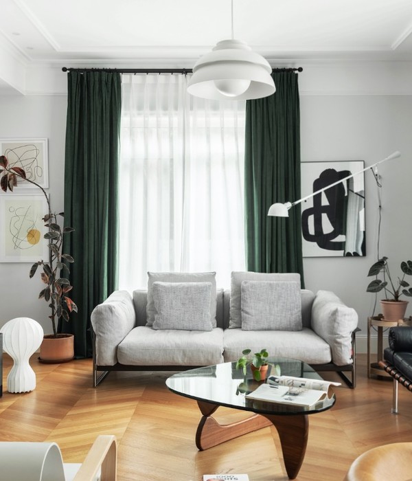
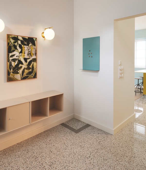
Together with the customer, we decided to play with contrast between design elements and cheaper elements, to be able to give character and style but at the same time contain costs by being a support house. To warm the environment we have chosen to lay oak parquet throughout the house including the bathroom, with a classic installation. In order not to lose brightness, we chose dark colors for the walls in contrast to light colors and strictly white ceilings. In the plan, it was decided to open the kitchen visually onto the living room, in this way the environment also enjoys the light on multiple exposures throughout the day. In this pied à terre, together with the client, we have pursued a saving approach for some elements and an emphasis on others, such as some lighting covers, works of art, finishes and accessories. A mix of low cost and design pieces, all chosen to create the desired atmosphere.
For example, the linear kitchen is an Ikea model without wall units, wooden top in the same color as the parquet and black bases, anthracite gray walls and a touch of iconic design with the choice of the anthracite-colored Lampe de Marseille by Le Corbusier by Nemo. The living room is characterized by a painting by Paolo Troilo. In the living we have the MAD CHAIR armchair by Poliform designed by MARCEL WANDERS STUDIO.
The most characteristic part of the house is the bathroom where we wanted to play with elements of character such as the wall paneling of Orac Decor color Railings by Farrow and Ball in combination with the Nuvolette wallpaper by Fornasetti for Cole & Son.To maintain a style consistent with the finishes we have chosen Alice sanitary ware from the bohème collection and as taps the crossa road line by Cristina which incorporates the retro style but with more minimal lines.
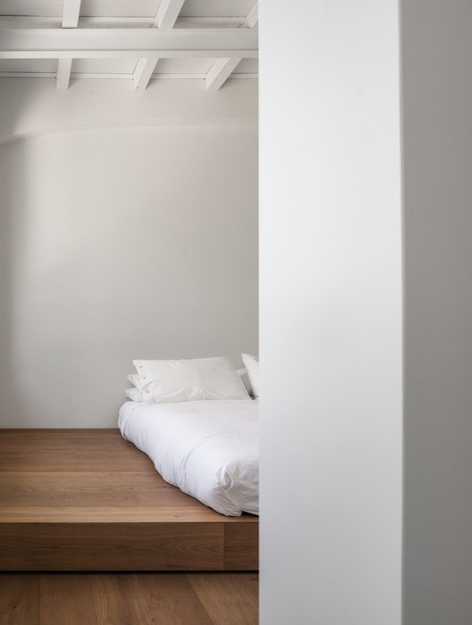
The bedroom is characterized by retro elements such as the white wrought iron bed and sacred sculpture elements that decorate the side of the bed.
{{item.text_origin}}

