苏州“狮子口”遗址环境保护与扩建 | 历史与现代的完美融合
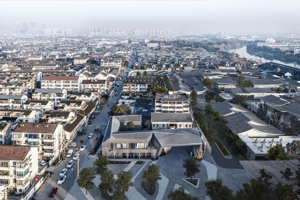
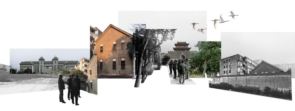
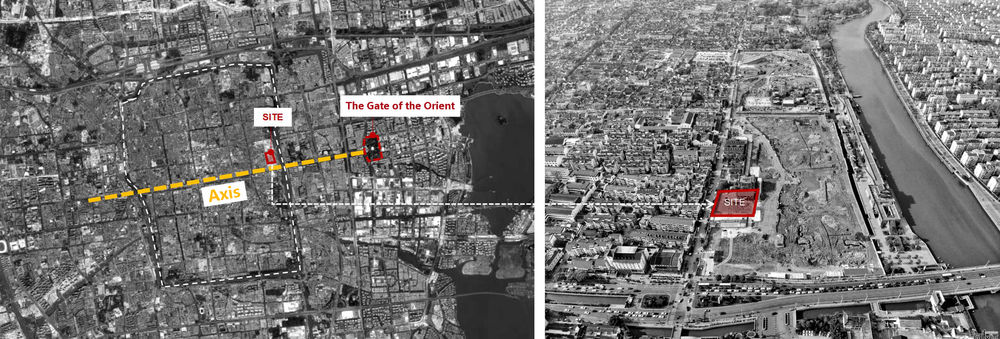
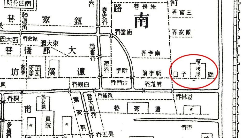
Environment: vestige of time East of Cangjie, Suzhou stands “Shizikou (Lion Mouth)” prison that used to be one of the three major prisons during the Republic of China, and it is only one block away from Pingjiang Road, a famous historical and cultural street. The KMT brought a charge against the “Seven Gentlemen” in 1937, for which Soong Ching-ling, He Xiangning and Hu Yuzhi launched the campaign of “save the country and go to prison”. In addition, Chen Gongbo, Chu Minyi, Miao Bin and other prisoners were executed by firing squad here, and Chen Bijun, the wife of Wang Jingwei, was also jailed here.
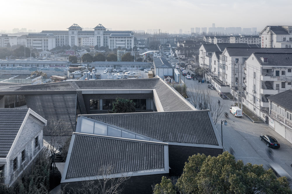
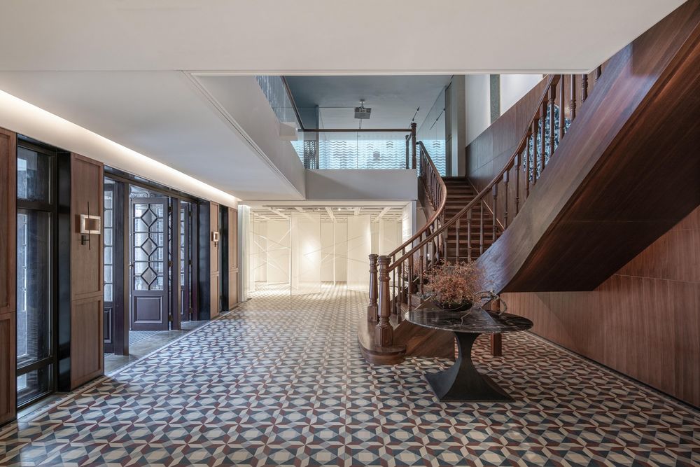
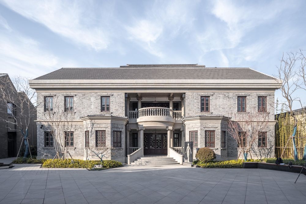
Now there only remain an office building of the Republic of China and a section of the prison wall. New paint gradually peels over the years, leaving the grey-brick wall of the Republic of China exposed. The influence of western culture on Chinese architecture can be obviously found in this two-storey double-pitched building. Former settlements east and north of the site are reduced to the dilapidated wall, and a new Jiangnan-style street will be built here.
Original purpose: making memories last A place is the presentation of spatial significance in different environments, but such significance is created primarily depending on people’s collective memory of space or place. For residents in Suzhou, open and inclusive spaces formed by streets and courtyards are their common memory as well as a spatial image of their hometown. There are a few places with collective memory for local residents of several generations within the site. The office building and wall show the original ambience of the site. From a historical and public perspective, designers intend to preserve them for the benefit of later generations, stimulate the potential of the site without ruining historic value of the original building, inherit the spirit of the site and redefine it.
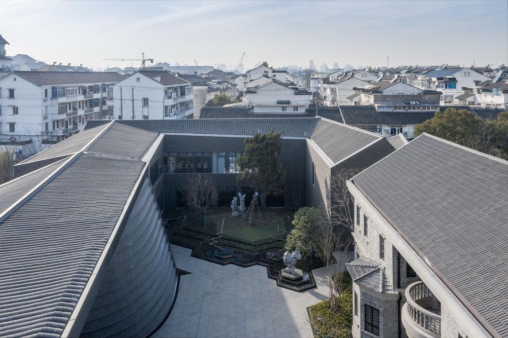
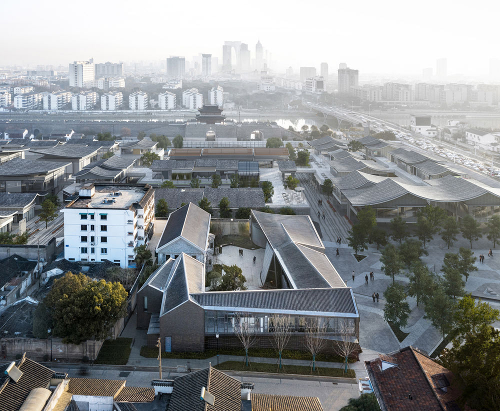
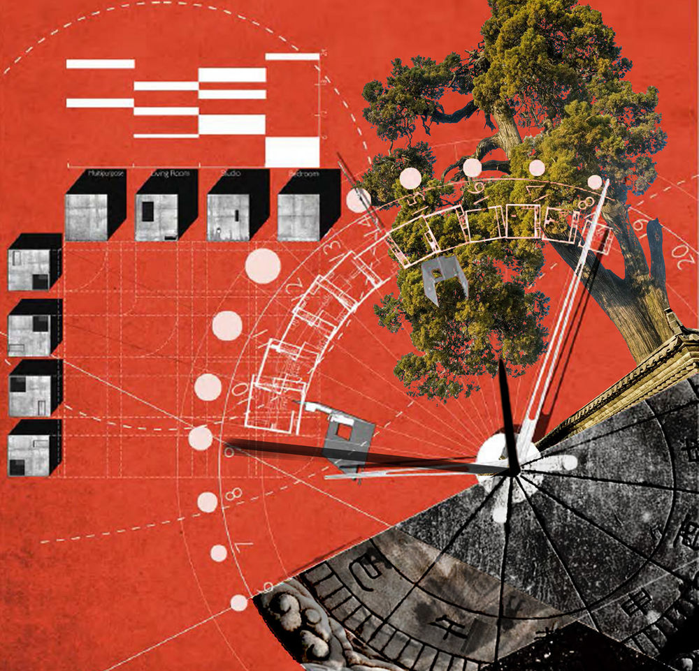
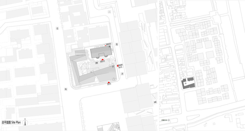
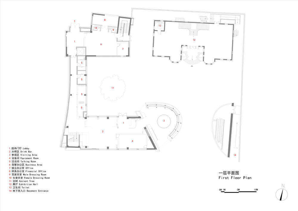
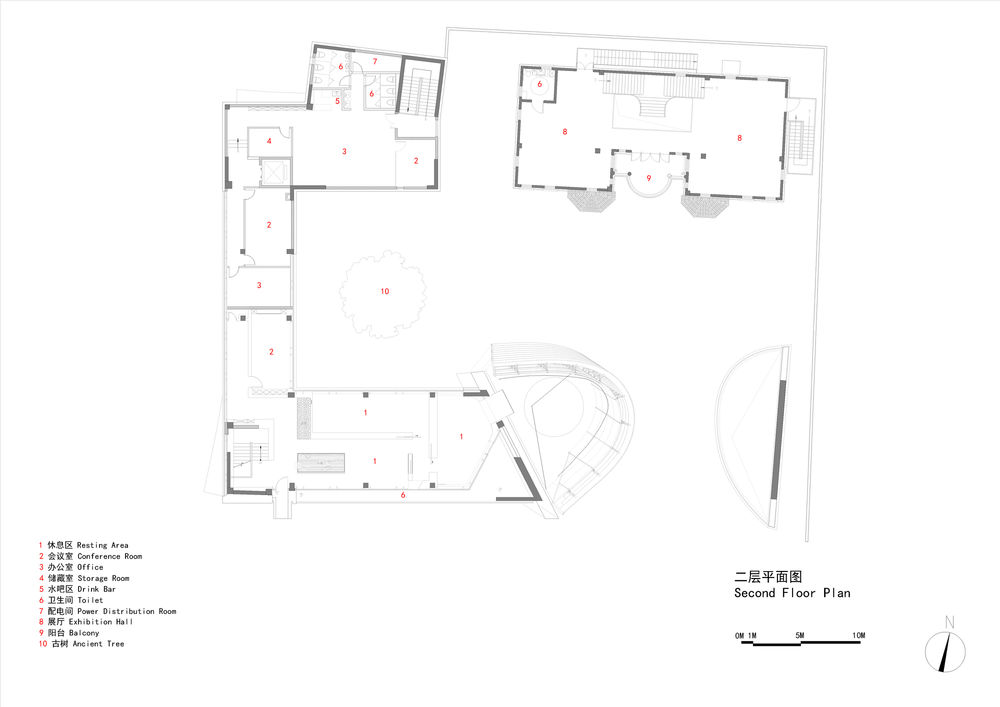
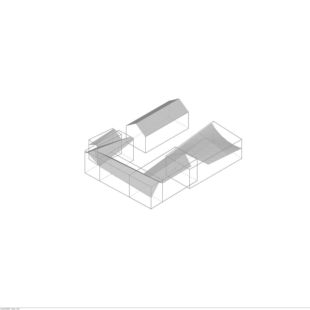
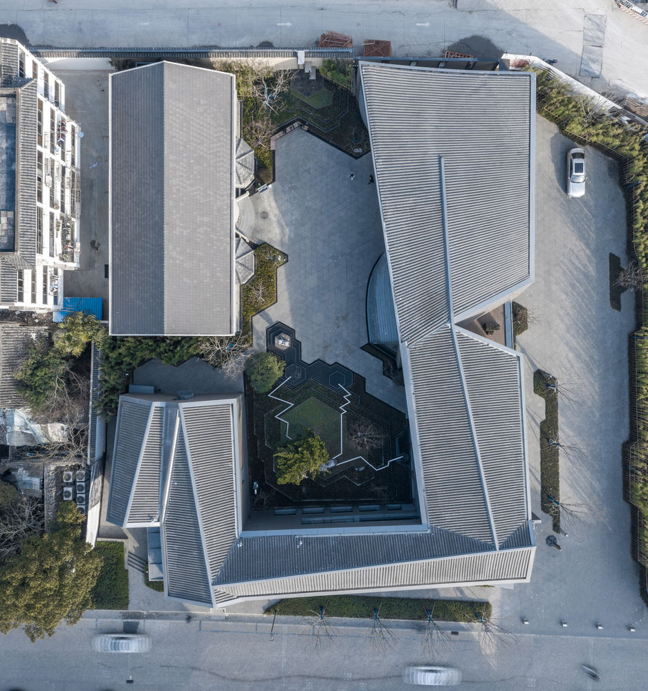
Space: a dialogue between the new and old There is a century-old cypress nearby the old building, and it has witnessed the history of over 100 years. Inspired by the “sundial in space”, architects develop an initial idea of overall layout: with the old cypress as the axis, it forms a continuous space that establishes an effective dialogue with surrounding environment, makes up a centripetal inner yard and opens a “window” to the city square on the south side and subway entrance/exit. It facilitates a dialogue between modern urban life and historical building.
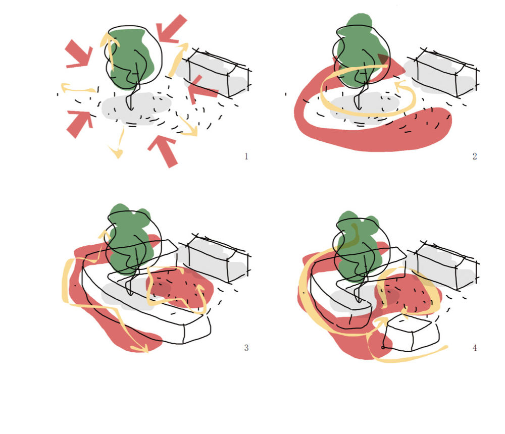
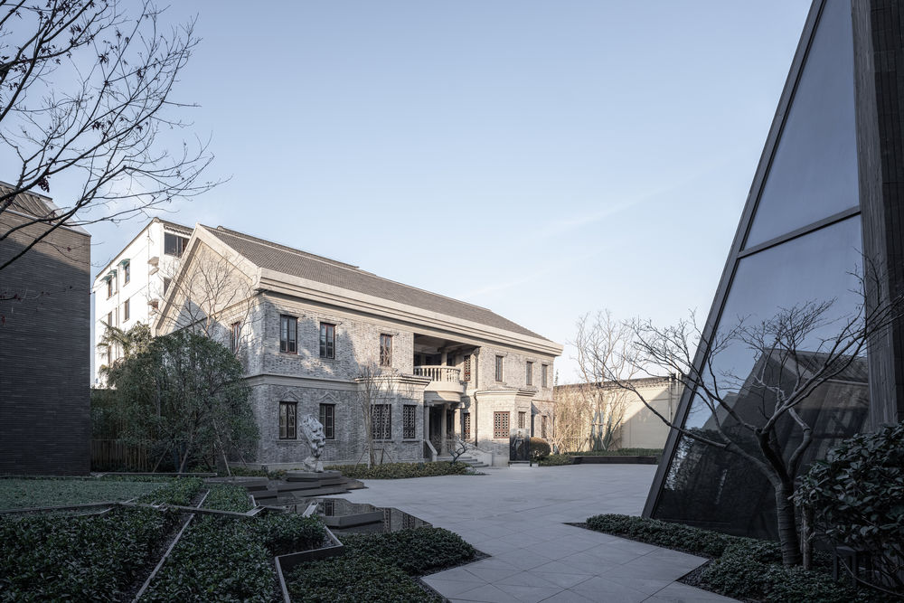
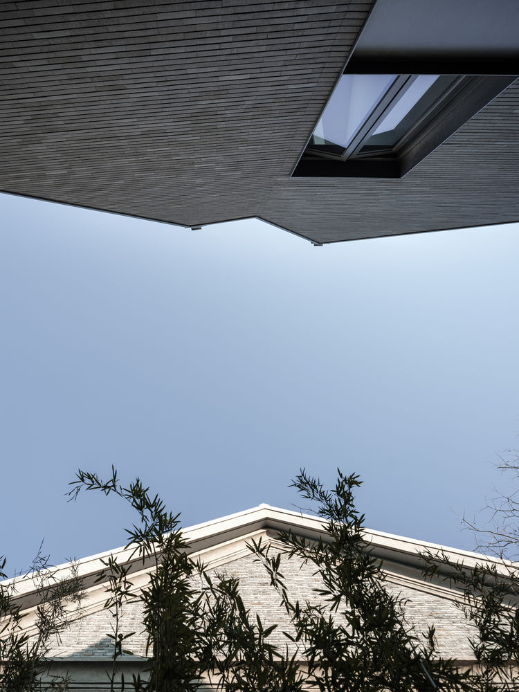
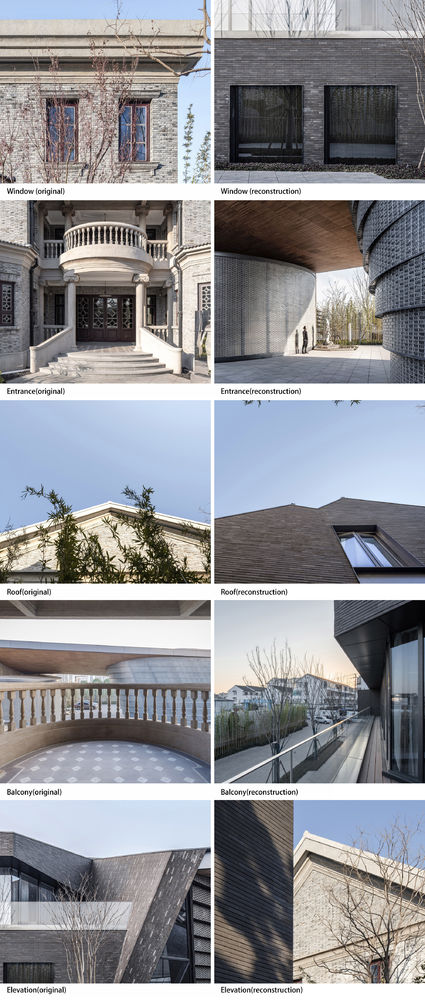
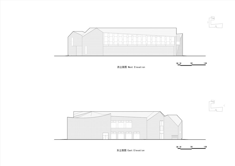
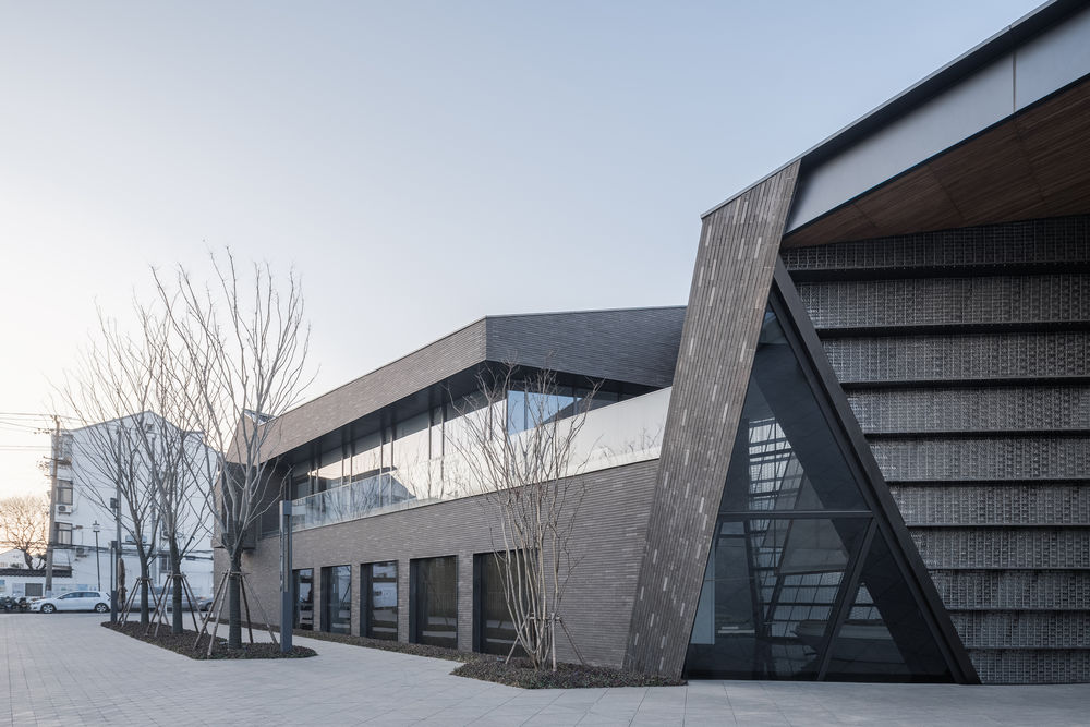
The exhibition hall extension serves to link office building, old cypress and external space. It is temporal extension and growth of office building, as original architectural features can easily be seen in the extension, yet they retain proper independence. The new-old visual impact is weakened so that a new entirety emerges. New and old buildings are superimposed and juxtaposed in the same time and space.
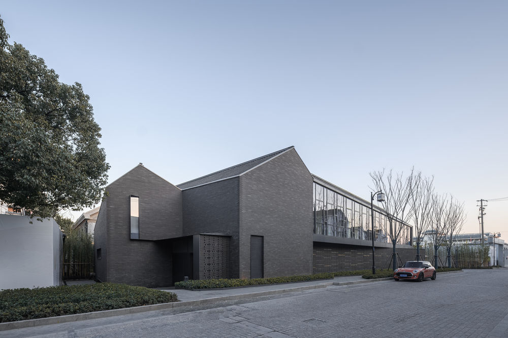
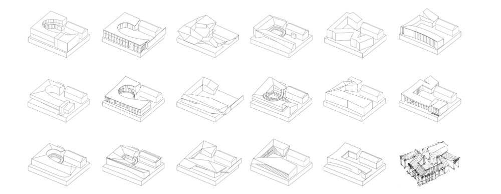
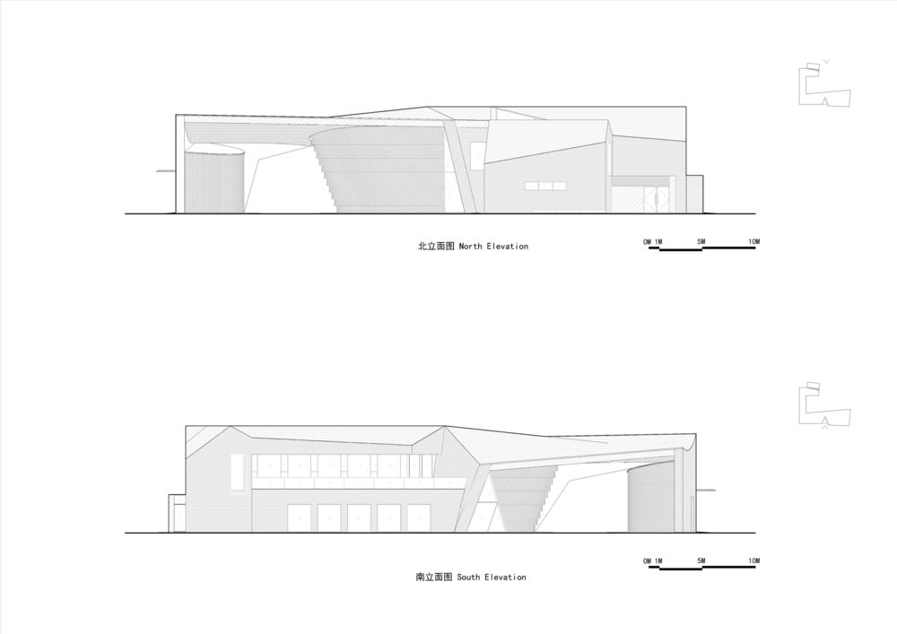
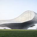
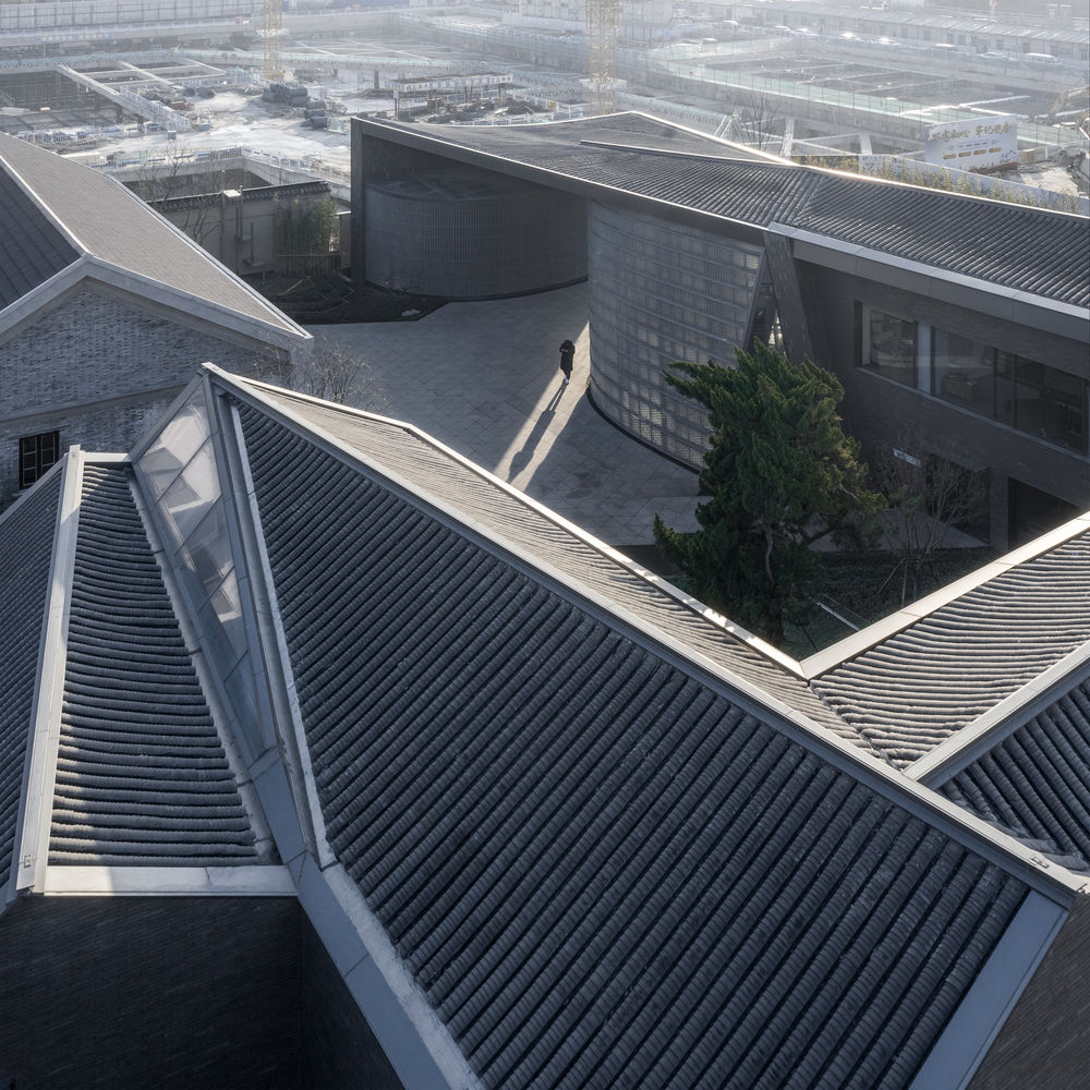
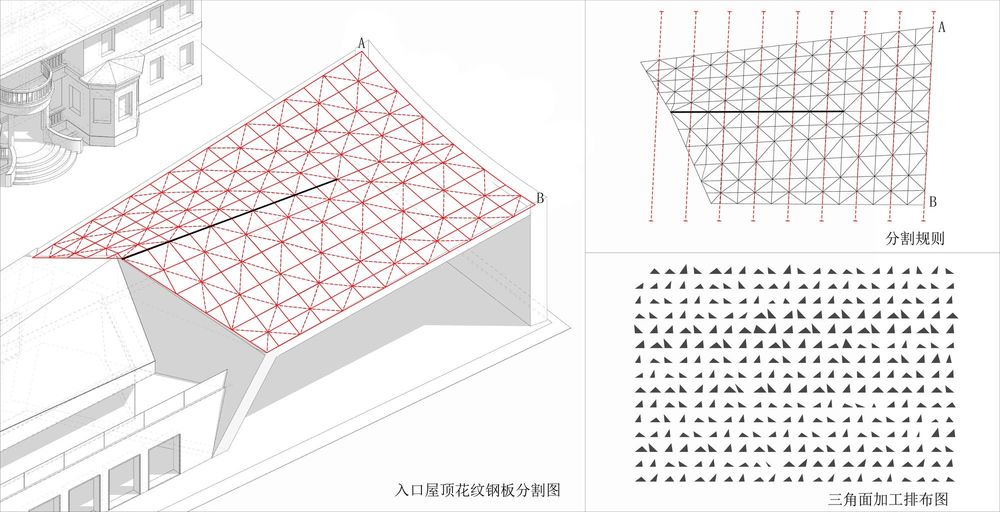
Form: sameness in diversity The roof of new building begins to grow in the direction of the office building’s ridge line. Based on the original double-pitched roof, it splits, rotates and merges like brushstrokes, and then it reaches the southern entry with a different shape. As the ridge line is eliminated through the fading surface, the double-pitched roof of the Republic of China is finally transformed into Suzhou-style single-pitched surface. The new building also becomes a transition from the style of the Republic of China to traditional Suzhou-style. We make the roof’s ridge line the sole input element affecting roof forms by parametric control; when rotation angle of the ridge line is adjusted, we can observe roof form change and its relationship with office building’s roof any time. In this process, we can easily find the conflict between concepts and applications and work out the best balance for them.
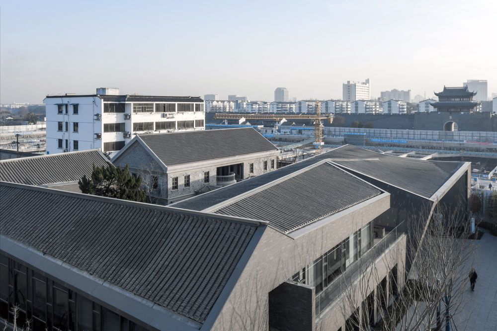
The project is situated at one corner of Suzhou Yanlord Cangjie Commercial Plaza, and its changing corner design allows people to feel the power of space twisting when the line of sight shifts. The topological change in roof form translates the double-pitched roof of the Republic of China into a curved roof, which combines architectural styles of different ages and also offers a special fifth façade. From roof to wall, designers always try to make the typical image of the city abstract and convey hereditary form and space through different materials and forms. The new building façade “borrows” the office building’s original façade form, and it is applied to the extension by typological method. It is lexical expression in the same sentence in different eras.
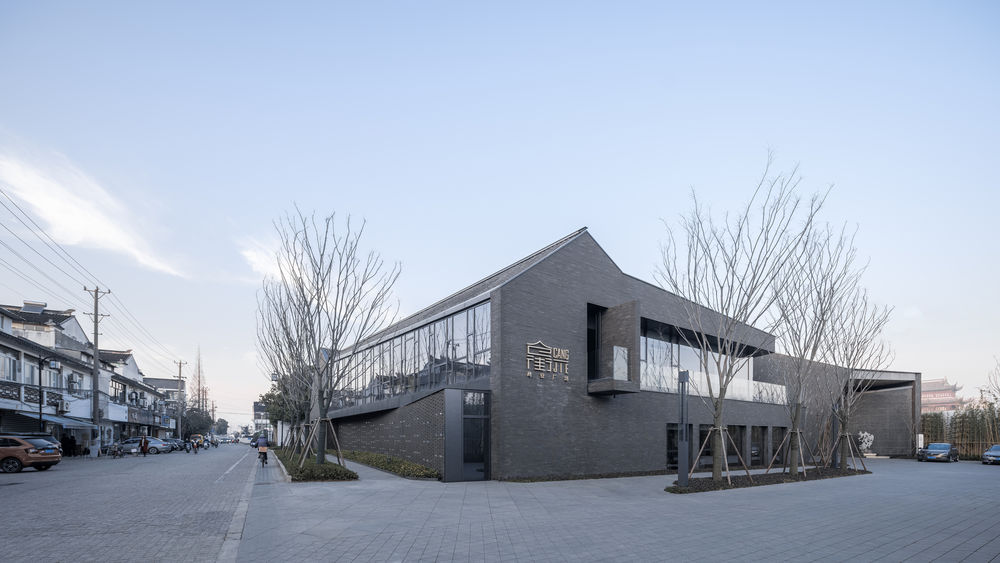
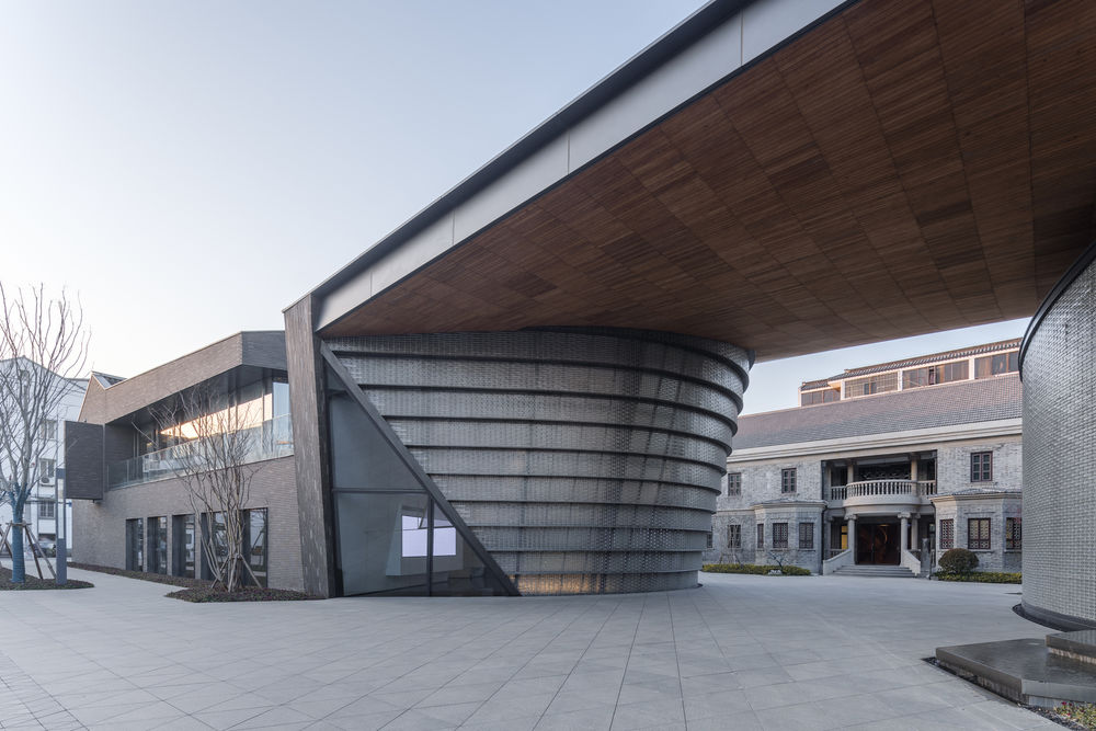
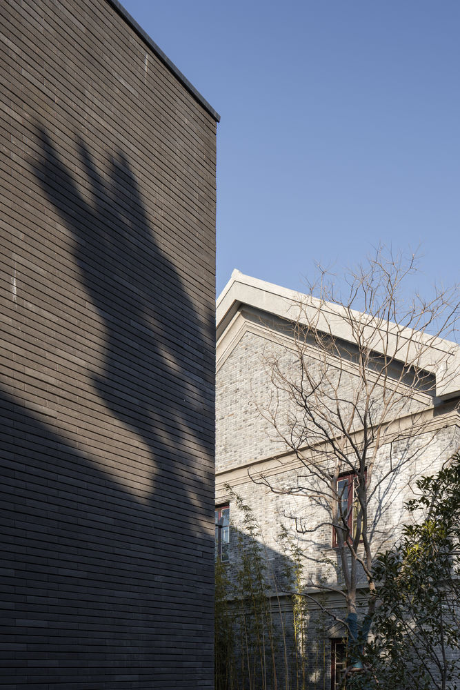
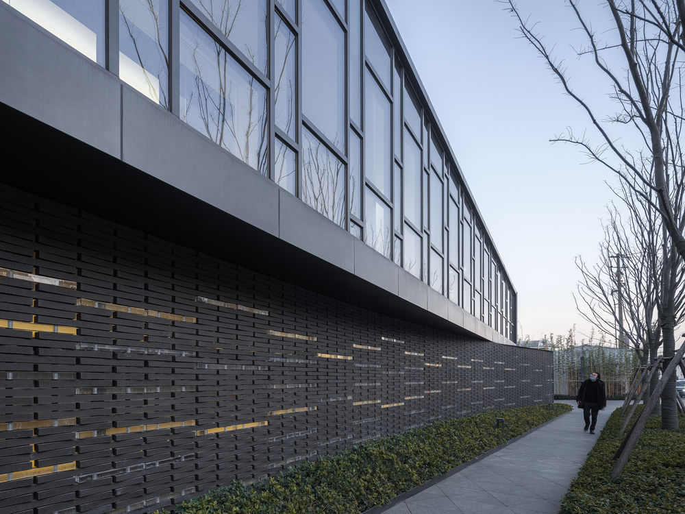
Materials: same structure with different textures Grey bricks are used for old building revocation in this project; ceramic bricks are applied to the façade of the extension, which is consistent with grey-brick texture of the office building’s facade and brings a new tactile sense. It presents a new image of the site and arouses people’s dormant memories at the same time. Brick and tile texture starts from the roof to the ground, creating an elegant and tranquil space.
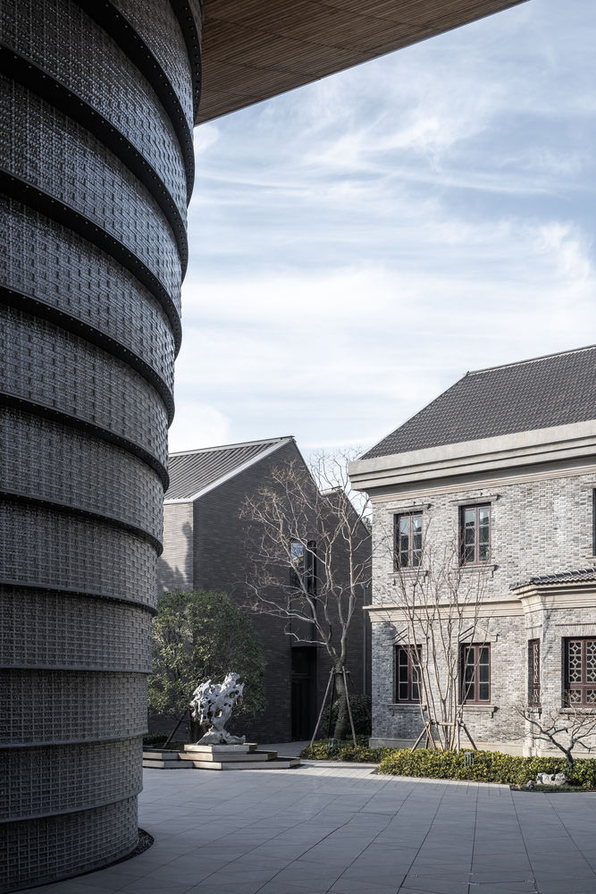
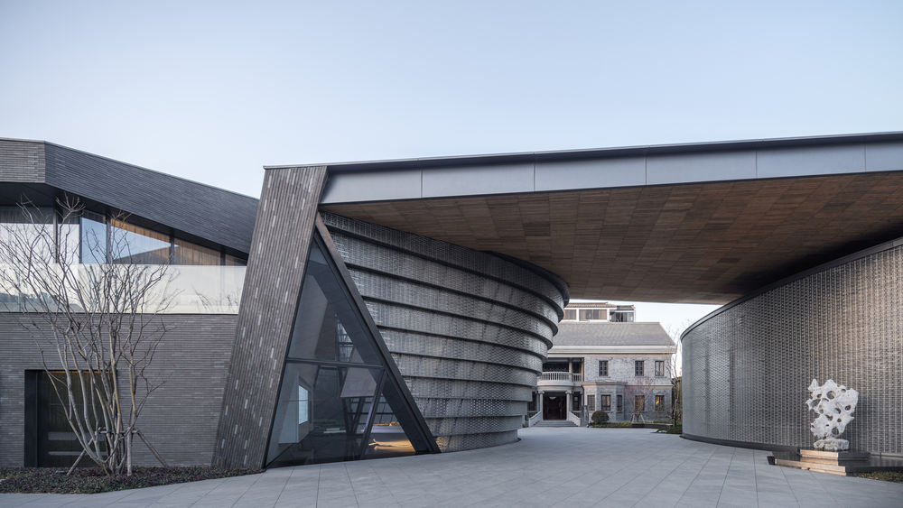
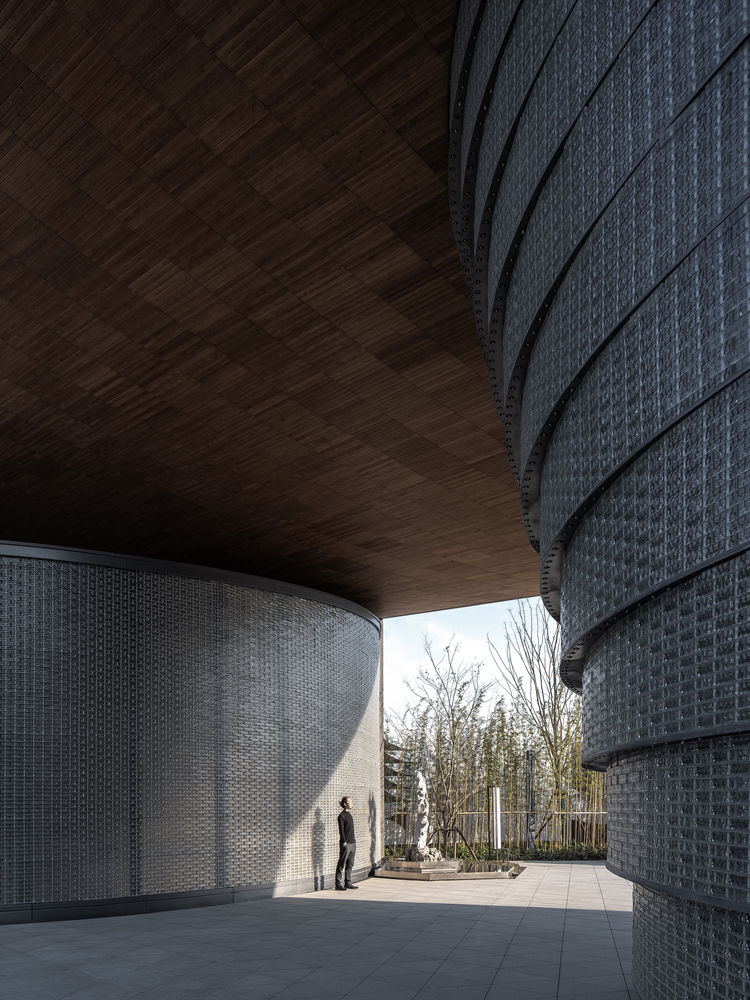
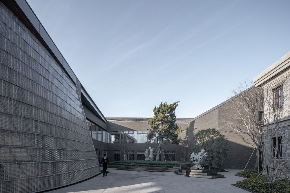
The circular-arc glass bricks at the entrance obscure the spatial relationship between the office building (inside) and square (outside), which serves to recall the history, reflect modern life and expect the future. From grey brick to ceramic brick to glass brick, the extension has achieved an inheritance and continuity in the old building’s texture.
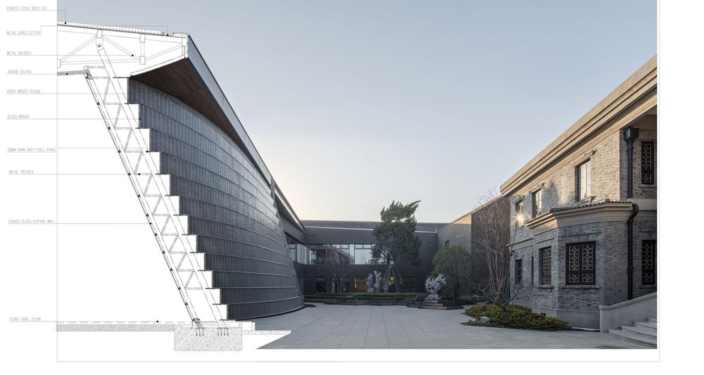
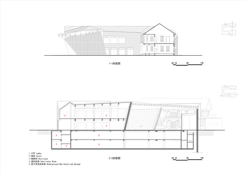
Structure: skin-skeleton combination The interpretation of the concept relies on perfect combination of the “structure” (skeleton) and “curtain wall” (skin). To match new roof form of the extension, designers adopt mixed structure. The main part of the extended exhibition hall adopts reinforced concrete structure along with the use of steel truss structure for the entry. The steel truss well fits the roof shape to attain the roof system with maximum span of 21m and height at 700mm.
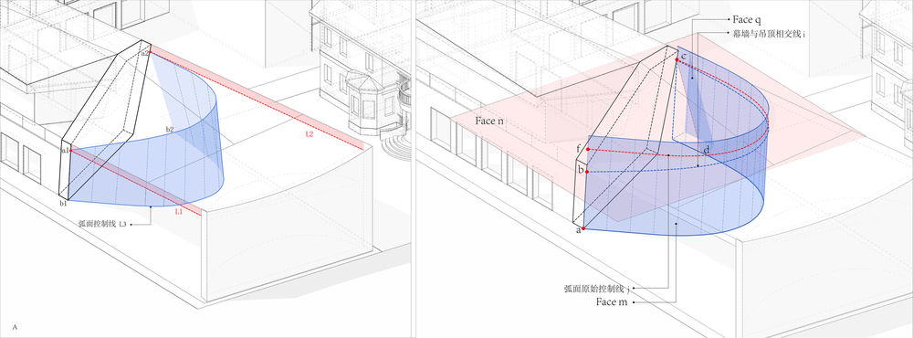
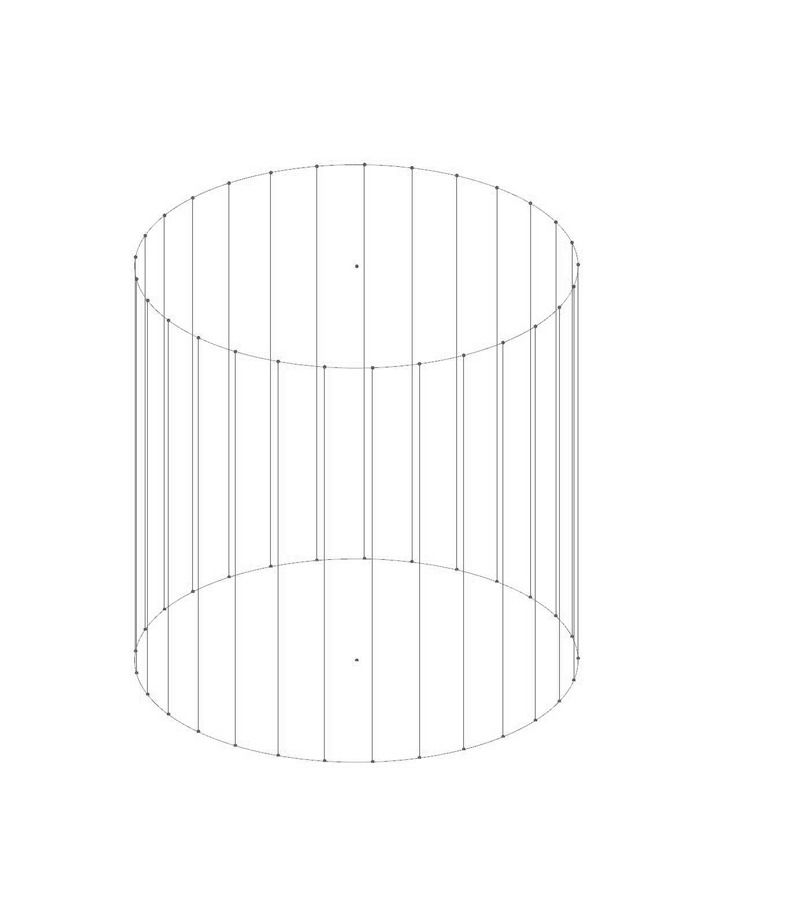
The sloped glass brick wall suggests the existence of sloped inner yard as well as a shift of the new and old in time and space. To realize design ideas in a standardized way, we first optimize curved surface by changing three-dimensional curved surface into single one, then arrange steel plate in every 12 rows of glass bricks at the height of 7.8m, and finally control the setback of glass brick wall together with the truss and vertical frame behind the steel plate. Meanwhile, it provides support for the pileup of glass bricks in every row.
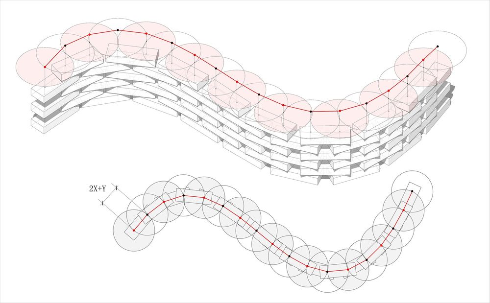
Steel tie bars are put between steel plates to connect glass bricks in interwoven arrangement. We set up an arc-shaped glass curtain wall inside glass brick wall to avoid gluing, which ensures air tightness and heat insulation of the building and also creates a pure and neat façade. Thanks to the optimization of curved surface form, the building structure and curtain wall members are perfectly integrated, which is a perfect combination of the “skin” and “skeleton”.
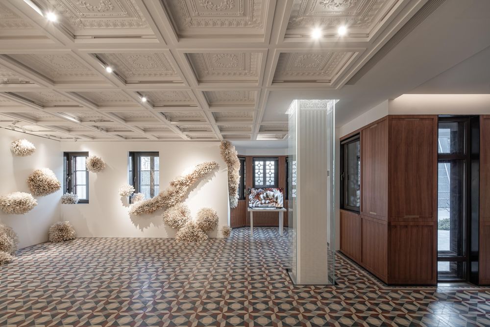
Function: new type The trail of history is still in the museum, but dynamic in life. Activities related to people’s daily lives are happening here all the time, which is the same with the past and future. New functions are added to keep the site alive. The former site of new office building that is open to the public will be converted into Cangjie History & Culture Exhibition Hall, and results of new plan will be showcased at the extension. After Yanlord Cangjie is put into commercial operation, it becomes a specialty restaurant and an attractive destination together with the exhibition hall. The original ambience of the site is inherited with new functions.
