Architects:MAENA design conecta
Area :301 m²
Year :2021
Photographs :Alcindo Dedavid
Architecture Firm : MAENA design conecta
Project Team : Aline Palma, Michelle Raimann, Roberta Rammê, Júlia Carolina Zielke e Manuella Oliveira Haygertt
Clients : ABF developments
Engineering : Andora Engenharia
Landscape Design : Fernando Thunm
Consultants : Ana Cristina Costi, PROINST Engenharia- projeto de PPCI
Collaborators : Contemporânea Online
City : Porto Alegre
Country : Brazil
Designing the new headquarters for ABF Developments was full of invigorating challenges. The first one was to represent a groundbreaking innovative company, focused on designing real estate properties that correspond directly to the customers’ needs and longings. Assuring that this rigorous public felt connection to the project’s language was one of the main purposes of the intriguing and appealing design and shape in the urban landscape.
The neighborhood where the building stands is predominantly residential, with houses built many years ago, without a distinctive design character, so the second challenge was to create a building with a change provoking design but also fully integrated to it’s surroundings. Lastly, there was the need to combine all of these design needs to the multiple functionality of having administrative headquarters and the business and sales center for the projects that will be launched there, using a very narrow site to build it.
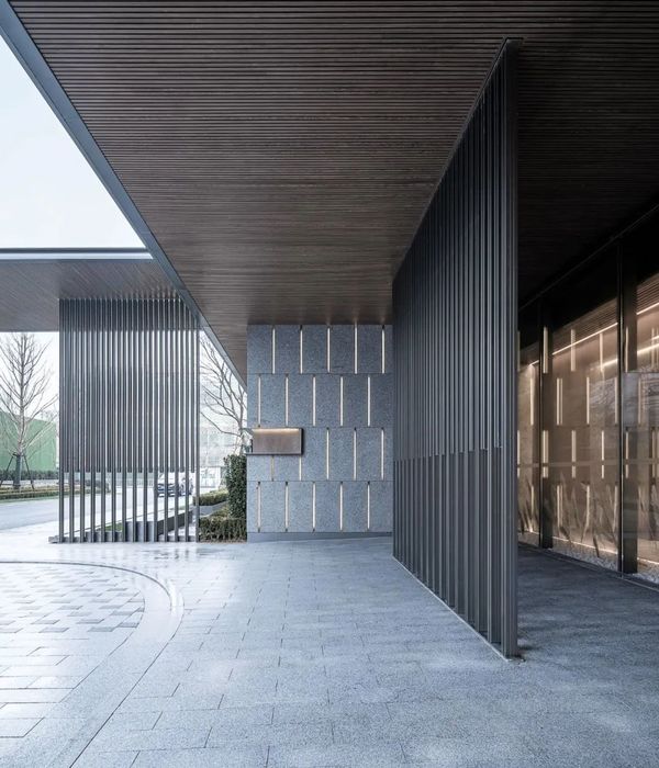
In order to meet all these needs, we created an iconic shape, structured through six metallic frames of slightly different shapes, supporting two floors where the spaces are laid out. There’s the exhibition area, with product demonstrations, meeting rooms, customer service, cafè and bar area and other administrative support. Folding over the steel frames is a metallic corten steel roof, with edgy angled slopes, encloses the building. In the front façade, a big glass surface acts like a stores’ window, allowing continuity between inside and out, for the public area, and a metal covering provides privacy without compromising light or permeability.
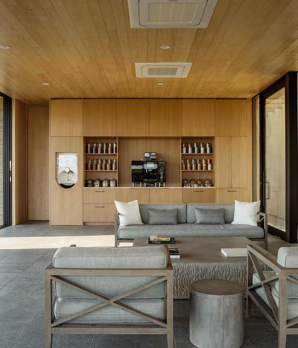
The interior design is made to enhance the beauty of the raw materials, complementing their textures and finishes. O flooring in concrete in contrast to the corten steel creates a balanced and contemporary space. Adding clean and sophisticated furniture, the area is made wide and spacious, ready to attend every need.
Reinforcing the brand’s logo even the pictograms and wayfinding signaling was thoroughly designed.
Inspired directly by the ABF Developments’ logo and the headquarters architecture, vertical lines are used as guidelines for setting the atmosphere and complementing the space. For this, the space communicates with the users in every scale of the project, creating a full experience that brings out the brand’s innovative and sophisticated standards.
▼项目更多图片
{{item.text_origin}}

