Architect:VURPAS ARCHITECTES
Location:Lyon, France
Category:Libraries Universities
The first phase of the renovation of the Lyon East Faculty of Medicine is a milestone in the history of Vurpas Architectes's work on the Rockefeller site.
The architects undertook their first project on the site in 2009, with the construction of the Jean-François Cier building. Designed to replace the somewhat dilapidated Hermann amphitheatre, built in 1968, the new building contains all the spaces needed for teaching medical students, and adopted an architectural style that fitted in with the wider university campus, which had fallen into disuse.
In 2011, as part of a framework agreement, the agency was tasked with drawing up a charter for the restoration of the whole of the original building. This charter was intended as a guideline for any work on the site in the near future or longer term, to ensure the greatest possible coherence.
The diagnostic, based on a study of all the heritage, architectural and technical considerations, and extensive research carried out allowed users of the building to re-discover the many qualities of this immense vessel, which had gradually become obscured through a series of ill-thought out interventions over the last 80 years.
"Everything was already in place. The restoration was simply a case of revealing the original building, to which we added a few contemporary touches."
The first phase of work has just been completed. It has concerned the front building, which houses the collective spaces and the offices of various clubs, societies and administrative structures dealing with different aspects of student life: the entrance area, the library, the thesis room, the student accommodation office, the student's union, the laboratories and the training room. The delivery of this phase of the work was a key milestone in the renovation of this 50,000m2 giant.
THE EXTRAORDINARY HISTORY OF A TRULY EXCEPTIONAL BUILDING
The Faculty of Medicine and Pharmacy was built in the period 1928 - 1930 by Pierre Bellemain, architect for the Rhône region and the University of Lyon. It was built opposite the Edouard Herriot hospital, one of Tony Garnier's most emblematic projects. These two men, master and pupil, together built an imposing architectural and urban ensemble, which stands as a testament to the Lyon school of architecture of the interwar period.
Medicine has always been prominent in Lyon, represented by institutions such as the Hospices Civils de Lyon and some remarkable buildings such as the Hôtel-Dieu. The school of medicine was initially housed in the Hôtel-Dieu. It then moved to new premises built on the quai Claude Bernard in 1884. However, it rapidly grew out of the new buildings. It was at this time that Dean Jean Lépine saw the construction of a major new hospital at Grange Blanche in the east of Lyon as an opportunity to create an innovative university-hospital, like those in the United States. The site would bring together teaching facilities and laboratories for research and patient treatment. It took twenty years to build the hospital. In 1924, a major stakeholder became involved in the project: Georges Vincent, President of the Rockefeller Foundation. He agreed to provide the dean with the investment required to build the faculty. The Rockefeller Foundation contributed 41 million francs, the State 12 million francs, and the City of Lyon 3 million francs. It was one of the first facilities in France with an integrated hospital, medical faculty, school of nursing and research laboratories. At this time, the faculty was connected to the hospital by an underground passage, which was destroyed in the 1980s when the Lyon underground was built. Through a series of trips, meetings, discussions, and negotiations the project developed into a Franco-American joint venture. The design phase lasted from 1925 - 1928 and construction from 1928 - 1930. In this two-year period 48,820 m2 were built.
AN "INDUSTRIAL" DESIGN USING REINFORCED CONCRETE
The block plan forms a double H. A front building 100 metres long over four floors forms the main facade, extended by an H-shaped building over six levels. These two entities are functionally, structurally and architecturally distinct. The central and rear buildings house the teaching and research facilities, the "hive". It was built using a construction system composed of standardised components known as "window units". This repetition affords great freedom in terms of the building's use and means it can be modified without making any structural changes to the architecture. The front building is home to the programmes where the collective life of the university unfolds, in wide, open spaces, freed up by the use of a column and beam construction system. The figures give an indication of the sheer size of this industrial-scale building: 1,204 windows, 632 rooms connected by 4 km of corridors. The simple architectural style conforms to the logic of the construction, there are no embellishments but the composition is harmonious and the components designed with style and finesse. The characteristics of 1930s monumental architecture can be seen in the symmetry, the proportions of the large bay windows, the imposing staircase, and the elevated pediment proudly displaying the name of the university with its crowning cornice.
A PAINSTAKING RENOVATION WITH CONTEMPORARY TOUCHES
As for the rest of the site, the renovation of the library aimed to restore the spaces to their former glory, freeing them from the weight of successive additions. The objectives were very clear: to make the structure visible, in particular the characteristic box ceilings, to free up the space by leaving it as open as possible, to restore the harmony of the original materials and to add a few contemporary touches.
The library, the centrepiece of the faculty of medicine: the library takes up the second and third floors of the whole of the front building, as well as a mezzanine level. It is accessed by the majestic staircase found opposite the main entrance. The organisation is simple and functional: the central sections contain the front desk and archives and the reading rooms are located around the edges, benefiting from plenty of natural light. The large reading rooms are housed in the side wings and the smaller reading rooms run along the length of the facade. In the centre, study booths allow students to work individually or in small groups. The ensemble is completed with teaching spaces as well as the staff offices and toilet facilities.
The inaccessible archives, a rare curiosity: On the third floor, the archive of rare and precious books, which are not freely accessible, is stored in an original structure imported from the United States. Made of folded sheet metal it develops continuously and autonomously to a height of 4.5 metres, supporting the steel shelves. At halfway height, an unsupported stone paving walkway allows access to the racks. Historically, it took up the whole of the third floor.
HARMONIOUS MATERIALS
With an architecture that aims to reveal the true nature of the construction, the materials used for the finishings play a vital role in developing the building's identity. They were therefore chosen with care, and allocated to different parts of the building according to the purpose of the space, and the technical constraints, in terms of acoustics or resistance, for example. They make up and qualify the geography of the site. The floors, walls, lighting, openings, doors, shutters, woodwork, signage, metalwork and colours all contribute to creating a certain atmosphere. The architects aimed to get as close as possible to the original fittings and fixtures, using the same models where possible, or having identical reproductions made. The door handles are a case in point. With over fifty different types used over a period of 80 years, it was important to harmonise the style used. A mould was made of the original form, which was then used to produce new aluminium door handles for the whole site.
The flooring: The quality and diversity of the flooring warrants a special mention. It is used to mark out the building, symbolising the different technical or more prestigious spaces. The rubber flooring in the library has been replaced with carpet for acoustic purposes. Different types of carpet are used to designate different areas.
Terrazzo, characteristic of the 1930s, is a coloured concrete and marble-chip flooring that is poured in place and polished. The small black marble chips emphasise the beige and grey checkerboard-like mosaic in the most prestigious spaces such as the entrance hall, the main staircase, the main corridors and university cafeteria. The floors of the corridors are covered in beige and grey tiles and the middle sections are replaced with asphalt tiles when serving the technical rooms.
In the library, the rubber flooring is replaced with carpet for acoustic purposes, the carpeting is composed of different sections which mark out the various walkways and transitional space.
The wooden marquetery flooring in the thesis room has been restored and reproduced identical to the original.
The walls: the walls in the connecting spaces, such as the corridors and entrance hall, are lined with ceramic tiles in shades of grey and yellow. A grey border forms a continuous horizontal line throughout the building. With the aim of effecting a restoration that remains faithful to the existing building, the architects chose to reproduce exactly the same tiles to replace those that were chipped or broken. In the toilet facilities, modern ceramic tiles create contrasts between matte and shiny finishes. In the living spaces, such as the library or university cafeteria, the walls are lined with perforated acoustic panels. The woodwork in the thesis room has been restored and its dark colour creates a stark contrast.
Furniture: the furniture is also generally homogeneous, with its dark shades and noble materials. As far as possible the original pieces have been restored in the library the large wooden tables were restored, slightly darkened, and fitted with individual lamps and switches, in addition to the indirect lighting. The shelving and reception desk were made of walnut. The new furniture was chosen with an eye for simple, but contemporary shapes, in shades which blend in with the overall colour scheme.
Colours: generally speaking, the beige colour of the walls extends right to the underside of the beams, and the white ceiling highlights the box ceiling structure. These warm, soft colours set the tone, with the wood and white glass providing a harmonious counterpoint. Just one other colour is used with parsimony to lift the tone in certain spaces: a red, taken from Le Corbusier's colour palette, using paint produced by Keim, used here exclusively. This red is also used for the armchairs and curtains in the thesis room.
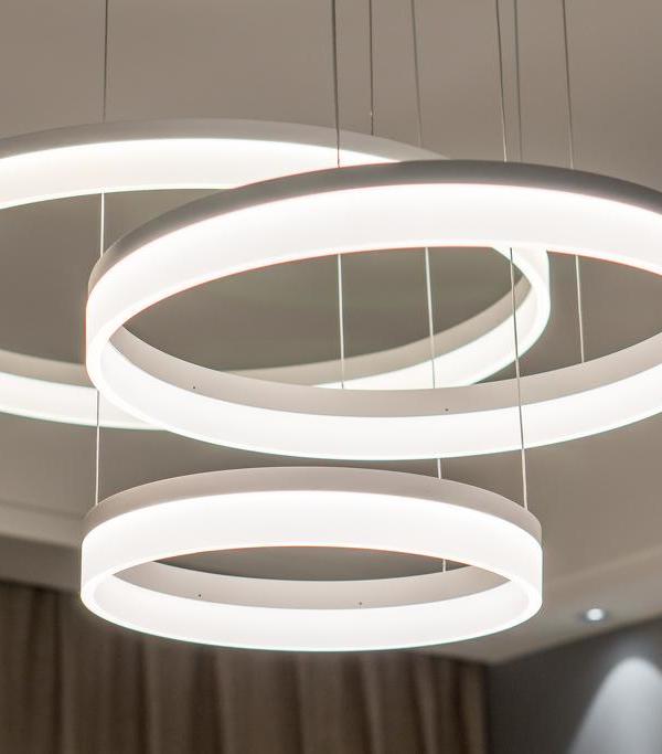
The light: In the name of simplicity, neon lighting has been used across the whole site, niched in the cornices, in strips and for the indirect lighting from the box ceiling. In the more prestigious areas of the building such as the library, the main staircase and the university cafeteria, additional lighting comes from white glass globes, a theme also used for the table lamps.
Woodwork: the woodwork is another repeat feature of the architecture of the university building. They bring a touch of warmth to the reception spaces and mail room in the entrance hall, the transom windows above the doors, the woodwork in the thesis room and the main entrance doors.
Frames and shutters: the frames on the main facade of the library were replaced and dark-green fixed, perforated louvered shutters were installed, imitating the appearance of the old wooden Bahama shutters. They operate as sunshades, protecting the interior from the intense sunlight, especially on the west side of the building, but still allow in a lot of natural light. An adiabatic cooling system was chosen over air conditioning to maintain a comfortable temperature in the summer.
The signage: the signage has been entirely reworked by the Atelier des créations fantasques. The aim was to make the information clearer and more comprehensible and to help users find their way around this maze-like building. It avoids the piecemeal, disorderly approach previously applied. Cubic maps are placed at strategic locations, and in front of each of the classroom doors there is a column housing various security and utility connections and displaying useful information about the room. Notice boards are also provided to avoid the haphazard posting of information leaflets and posters. There are no decorative features but there is an old photo of the building on each floor, whilst in the thesis room the portraits of the deans look solemnly on.
"WE FOUND OURSELVES IN THIS VERY REGULATED, VERY ORTHONORMAL BUILDING"
LIVING SPACES ADAPTED TO CONTEMPORARY STANDARDS OF COMFORT
As well as the heritage and architectural aspects of the requalification, the building also meets the technical and regulatory standards all modern libraries must comply with.
The acoustics, the quality of the natural and artificial light, the thermal comfort, the humidity levels, accessibility, ergonomics, ventilation and smoke control systems all contribute to creating a comfortable, peaceful environment. These varying requirements are met discretely, without show or demonstration. For the users' well-being nothing is visible. The lighting in the reading rooms is a perfect example. The systematic use of indirect lighting, as well as the restoration of the box ceilings diffuse the light perfectly, ensuring that just the right amount of light is available for reading. This adds to the natural light available to maintain a consistent level of light for readers.
Furthermore, each table is fitted with three centrally positioned individual lamps. In terms of the ergonomics, the slightly flattened spherical form means people's faces are not hidden from view. Made of white glass, they break up the space with a light touch, introducing a sense of poetry and fantasy to the library.
▼项目更多图片
{{item.text_origin}}

