Architect:Atelier Starzak Strebicki;Böll Architekten;CH+ Wojtek Chrzanowski
Location:Essen, Germany; | ;
Category:Offices
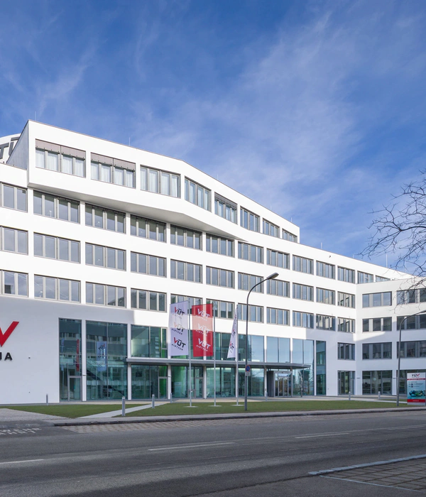
The main objective of the design was to create a simple and user-friendly office building that goes beyond standard typological decisions in its design solutions, as well as to develop a new front façade for the block's group of buildings that unifies their diverse stylistics and architectural expression into a harmonious whole.
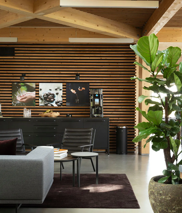
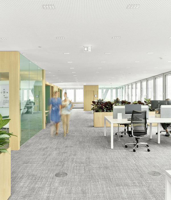
A mixed typology of different variants is proposed for the office floors. The rooms can be designed flexibly and can also be changed in the future with simple means. The permanently installed areas such as coffee tables, sanitary rooms and installation shafts are each located in the central zone of the floors.
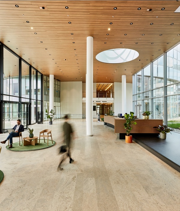
Informal areas with double room height can be used for individual recreation as well as for team activities. Opposite to them is an internal open staircase that connects all office floors, allowing for more versatile spatial - and social - connections.
The attic floor accommodates conference functions in addition to a terrace area. Parts of the roof area are greened to contribute to passive cooling and buffering during heavy rainfall. Trees are planted around the building at street level to serve as a "third, natural façade" for the property in the long term and are irrigated by rainwater collected on the roofs.
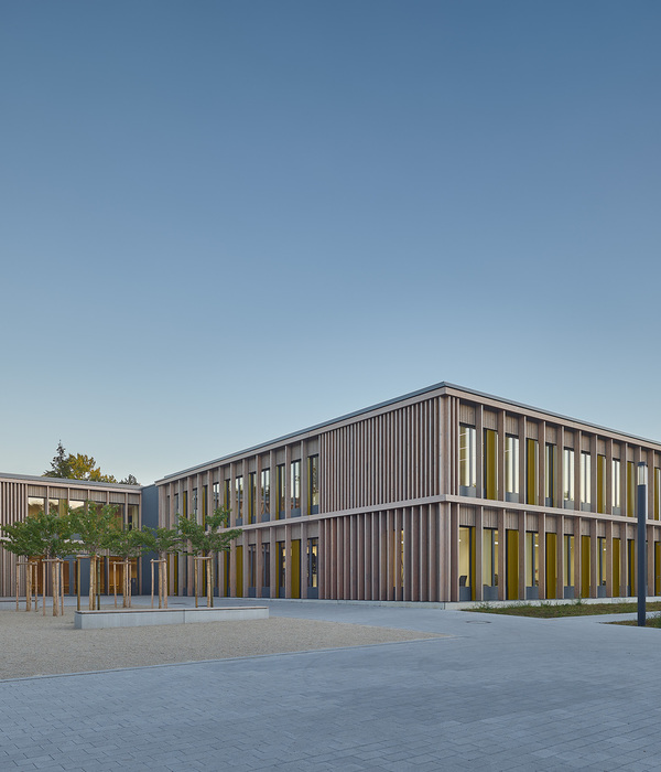
The depth of the colonnades in the presented façade creates an intermediate space that - similar to the Japanese Hisashi - creates a soft transition between inside and outside, a space that can be used as an extension of the office.
The exterior facades of the new office building and buildings of the quarter not only serve to improve acoustic and thermal comfort. As an integral part of the building structure, they also help to unite the historic part of the building complex with the contemporary additions. As a logical complement to the existing buildings of the block, the new façade is made of prefabricated elements of blasted concrete in a light, sandy grey tone. In the new additions, this heterogeneity translates into an expressive system of horizontal and vertical elements. The high windows in the colonnade help to connect the functions of the base floor with the urban space. The strict grid offers great flexibility in the infill of the façade elements. On the East side facing the busy street and along the entire length of the round corner, multiple glazing reduces noise pollution. The southern and southwestern parts are largely equipped with textile sun protection.
Due to its compact form, the new building has a very favourable A/V ratio. In order to keep operating costs low, high energy efficiency is ensured in both winter and summer with optimal comfort. The architecture and construction contribute to a favourable overall energy balance. This concept is intended to be promoted with environmental certification according to DGNB. The floor plan typology and the façade design enable optimal and glare-free daylight utilisation in all areas. To cover the remaining energy demand, the extensive use of renewable energy sources is proposed.The project designed for a competition was rewarded with a second prize as a shared winner.
▼项目更多图片
{{item.text_origin}}

