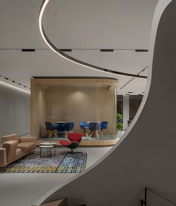
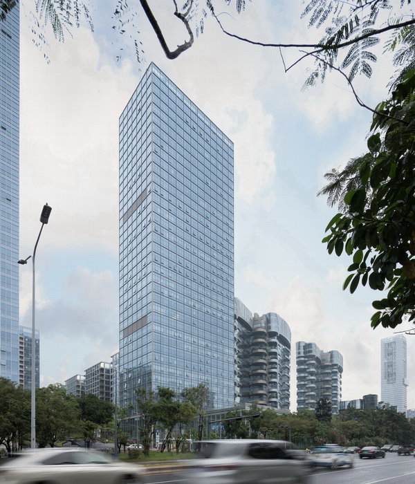
Derwent London是一家以设计为导向的地产公司,其总部自2000年起设立于伦敦梅菲尔区Savile Row 25号:一座建造于1930年代的Art Deco风格的建筑。在2014年之前,Derwent London一直占据着最顶端的三个楼层,基于升级改造的需要,公司决定将办公室迁移至底部的三个楼层,并分两个阶段对内部空间进行重新配置和翻新。
25 Savile Row has been the Mayfair home of Derwent London since 2000. The design-led property company occupied the upper three floors of the 1930’s Art Deco building until 2014 when, with the building in need of an upgrade, the decision was taken by Derwent London to move their offices to the lower three floors and to internally reconfigure and refurbish the building in two phases.
▼Savile Row 25号建筑外观,25 Savile Row- exterior view Jack Hobhouse ©Jack Hobhouse
Piercy&Company建筑事务所受托对整栋大楼进行翻新,同时围绕明亮的中庭空间和悬挂楼梯为Derwent London总部打造新的办公环境。事务所与Derwent London在项目的每个环节进行了密切合作,从大规模的建筑干预到家具、灯具乃至门把手等细部的设计,致力于让公司的气质和精神得到充分的展现。
▼轴测图,axon
Architects Piercy&Company were commissioned for the refurbishment of the whole building as well Piercy&Company reconfigures Derwent London’s headquarters around a light filled atrium and a suspended stair. With a brief to express the company’s ethos throughout, Piercy&Company worked collaboratively with Derwent London on everything from the larger architectural interventions through to the design of furniture and the smallest details of door handles, handrails and lighting.
▼围绕中庭空间和悬挂楼梯打造的新办公环境 ©Hufton+Crow Piercy&Company reconfigures Derwent London’s headquarters around a light filled atrium and a suspended stair
总部的办公空间分布在L形建筑的三个楼层,包括专用的街道入口、接待和展览区、会议室、休息空间、开放办公区、露台和员工餐厅。此外,建筑内还增加了一个以玻璃围合的冬季花园,作为建筑二层后方区域的延伸,提供了非正式的会议和休息空间。首层和三层增加了外部露台,为员工带来户外休闲空间。
Spread over three floors in an L-shaped building, the offices include a dedicated street level entrance, reception and exhibition area, meeting rooms, break-out spaces, open plan offices, terraces and staff eating areas. Additional space in the building was created by adding a winter garden – a glazed extension to the rear of the building at first floor level housing informal meeting and break-out space – and external terraces off the ground and second floor, providing informal outdoor space for employees.
▼以玻璃围合的冬季花园,the glazed winter garden at first floor level ©Jack Hobhouse
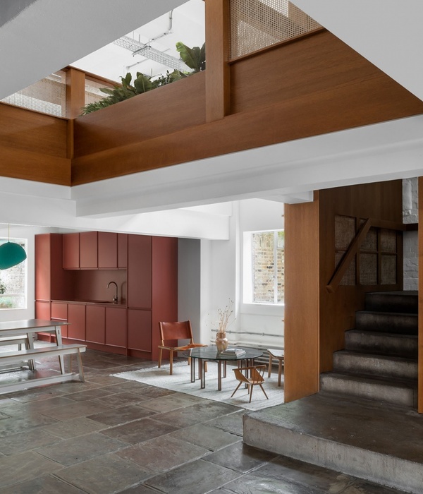
项目中最重要的一个结构干预是在既有的楼板上切割出了一个三层高的中庭空间,并在其中置入了雕塑般的楼梯。楼梯打开了建筑内部的动线,将原本彼此孤立的楼层和办公部门重新连接起来,让建筑内部的行走体验变得顺畅而轻快。非正式的协作空间和社交空间被设置在每个楼层的楼梯旁边,进一步促进了各部门的互动以及视觉上的连接。
The most significant structural intervention was the cutting of a three-storey atrium through the floor slabs and the suspension of a sculptural stair. The stair opened up the circulation routes, connecting what were once isolated floors and departments by making the journey between floors inviting and easy. On each floor, informal collaborative and social spaces are located next to the stair to further stimulate interaction and visually connect departments.
▼三层高的中庭空间和悬挂的楼梯将原本彼此孤立的楼层和办公部门重新连接起来 ©Jack Hobhouse the three-storey atrium with a sculptural stair connects what were once isolated floors and departments
楼梯采取了极为细致的设计和建造方法,为的是避免将中庭空间一分为二,从而营造出一种轻松漂浮在空中的视觉感受。弧线形的橡木扶手沿着楼梯向上延伸,一方面与同样采用橡木铺设的楼梯踏步形成材质上的呼应,另一方面则与底部和侧边栏杆采用的清冷白钢形成对比。扶手的轮廓在平台交汇处变得更宽更厚,让人能够放心地倚靠在上面,从而增加了员工们停留和交谈的机会。
The stair is highly engineered and delicate. The aim was to avoid cutting the atrium space in half and to create the illusion of floating effortlessly in the space. In contrast to the crisp white steel, a sinuous handrail in oak gently curves up the stair, the warmth of the handrail echoed in the oak which covers the tread and risers like a traditional carpet runner. The profile of the handrail is vertical on the flights but fattens and widens out enough to lean on at the landings, encouraging a pause for casual conversation.
▼楼梯细节,弧线形的橡木扶手与清冷的白钢侧栏形成对比 staircase detail: the warmth of the oak handrail contrasts to the crisp white steel ©Jack Hobhouse (left) + Hufton+Crow (right)
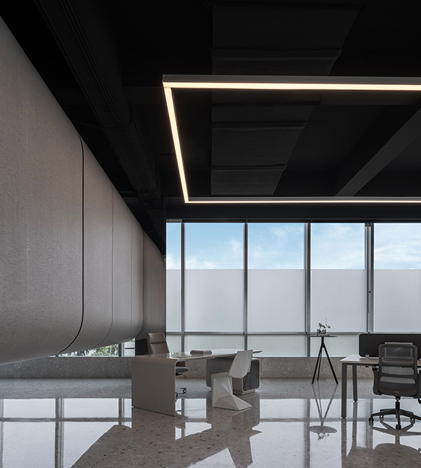
办公空间以开放式布局为主,同时配有休息空间和安静的工作区域,员工们可以根据自己的工作需要选择适合的办公环境。整体的设计方法是尽可能地引入自然光线,集中式的机电设备间将所有的服务设备置于交通空间内部,使其远离主要的办公区域,从而为办公空间赋予了最大的空间高度。工作区的照明可通过传感器进行调节,同时采用了独立式照明,不仅显著减少了能源消耗,还保持了天花板的干净整洁。
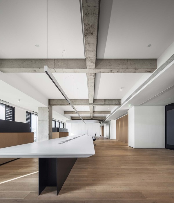
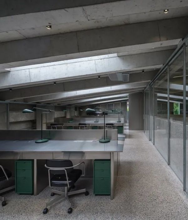
Throughout the office floors the layout is largely open plan with break-out spaces and quiet working areas so employees can move to the environment suiting their task. Across the office floors the approach was to introduce as much daylight as possible and to maximise the floor to ceiling heights through a centralised MEP services raft which places all services in the circulation space, keeping them out of main office bay ceilings. Task lighting is sensor operated and freestanding, minimising both energy consumption and clutter in the ceilings.
▼办公室, office ©Hufton+Crow
▼会议室,meeting room ©Jack Hobhouse
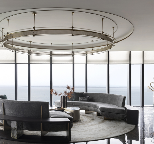
简单的材料搭配能够让人更容易注意到每种材料的天然品质。托斯卡纳石灰石、欧洲橡木、皮革、复古的青铜和涂以白漆的钢材在精心设计的细节处相遇,轮廓鲜明的半工业元素与温暖细腻的天然材料形成令人愉悦的对比。人们常常接触到的元素都点缀以较为柔和的材料:简洁的钢制扶手上设置了流动起伏的橡木扶手,定制的青铜门把手则加入了柔软的皮革衬里。
A limited material palette draws attention to the natural qualities of each material. Tuscan travertine, European oak, leather, patinated bronze and white painted steel meet in a series of carefully detailed counterpoints where harder-edge semi industrial elements contrast with refined, warmer elements. Often the elements which people touch are lined by a softer material: the undulating oak handrail on the otherwise crisply detailed steel stair; or the soft leather lining on bespoke bronze door handles.
▼休息区,seating area ©Jack Hobhouse
▼旋转楼梯,spiral staircase ©Jack Hobhouse
事务所还与其他一些英国顶尖的制造商进行了合作,例如与Benchmark共同设计了一系列固定和独立家具,并搭配以Bill Amberg Studio生产的皮革软垫。大部分家具以深棕色皮革和橡木为主要材料,受到了建筑本身的Art Deco风格的影响。
Collaborations with some of Britain’s leading makers lie at the heart of the project, including Piercy&Company’s collaboration with Benchmark to design a range of inbuilt and free-standing furniture, upholstered with leather from Bill Amberg Studio. The pieces, in rich dark brown leather and oak, are inspired by the Art Deco architecture of the building.
▼建筑师讨论室,Architects Room ©Hufton+Crow
由于公司迁移至大楼底层,建筑团队还专门为其打造了一个专用入口,从而创造出一个新的街景。定制的青铜和玻璃门由Piercy&Company亲自设计,由Capoferri负责生产和制造,其大尺度的网格形式与建筑原始的门窗有着相同的比例。主入口内部还将揭晓由艺术家Hugo Dalton特别为该项目打造的雕塑装置。进入大门后,接待区域的空间特征被刻意模糊,呈现出一种介乎时尚、文化和公共场所的气质。
Derwent London’s move to the ground floor provided the opportunity for their own dedicated entrance and a streetscape presence. Bespoke bronze and glass doors, manufactured by Capoferri and designed by Piercy&Company, feature a large grid with the same proportions as the original Art Deco window panes. A specially commissioned sculptural installation by artist Hugo Dalton will soon be unveiled just inside the front door. Passing over the threshold, the identity of the reception space is purposely ambiguous; recalling fashion, cultural and civic typologies.
▼入口大门,ground floor entrance ©Jack Hobhouse
特别地,英国摄影师Nick Ballón 还为该项目拍摄了名为“Making 25 Savile Row”的短片,记录了Derwent London新总部脱胎换骨的过程。
A short film “Making 25 Savile Row” by Nick Ballón records the project as for the fit-out of Derwent London’s new offices.
▼建筑立面,building facade ©Jack Hobhouse
Location: 25 Savile RowLondon W1S 2ER Client:Derwent London Architect:Piercy&Company Type:Offce. Cat A refurbishment and Cat B Fit Out Size: Phase 1 (Derwent London Offces; Basement, Ground, First and Second Floors): 24,963 sqft. (NIA) 37,964 sqft (GIA) Phase 2 (Third, Fourth, Fifth and Sixth Floors): 18,784 sqft (NIA) 23,552 sqft (GIA) Completion Date:Phase 1 Completed April 2017 Phase 2 Completion January 2018 Sustainability: SKA Gold for Fit OutBREEAM Very Good Contract Type: Traditional JCT SBC/Q 2011 Main Contractor: Knight Harwood Structural Engineer: Akera Engineers Project Manager: Blackburn&Co Quantity Surveyor: Exigere Lighting Designer: Pritchard Themis Services Engineers: Hilson Moran CDM / Building Regulations: MLM IT: Mix Consultants Specialist Glazing: IQ Glass Shopfront Glazing Package: Capoferri Serramenti Specialist Metalwork: Chay Wheeler Architectural Metalworker Specialist Joinery: Benchmark General Joinery: Adams Dry lining: David Andrews Construction Travertine: Campolonghi Serramenti Stone & Ceramic: Unique Surfaces Leatherwork: Bill Amberg Studio Builderswork: Pristine Electrical: M&M Mechanical: T Clarke Decoration: DEC Flooring: AJK Flooring Lifts: Specialist Lift Company Facade Repairs and Decoration: Paye Architectural Metalwork: Arminhall Kitchens: Dada Blinds: Soltech Still Photography: Hufton + Crow Film Credits: Director: Nick Ballon Cinematographer: Jorge Dieguez Production: Jahel Guerra Field Recording: Jahel Guerra Editor: Jaroslav Moravec Music Composition: Jean-Gabriel Becker, Sounds And Sons
{{item.text_origin}}

