杭州面料研发中心办公空间设计 | 简约大气,融入江景
This project is located in Hangzhou Zancheng Center, a building with square structure façade. It is adjacent to Qiantang River in the south, attracting many famous international companies to settle in for office. The owner is a company founder, who focuses on high-end clothing design and fabric R & D. With the development of business, a new space is needed to show the persistence and brand spirit of materials and fabrics.
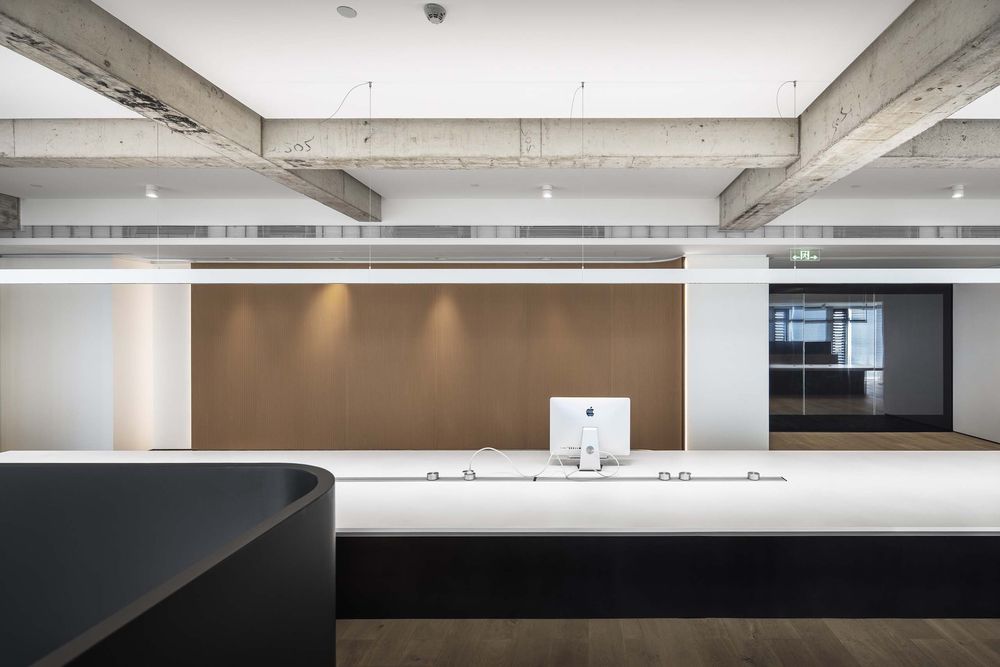
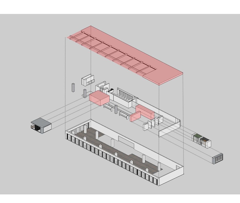
At the beginning of the project, designer Leo Hu and his design team, after many times of communication with the owner, focused on how to express the excellent fabric material and cutting through space and color. Leo Hu, the designer, hopes to use simple lines and devices to reshape the space and create a space integrating exhibition, reception and office.
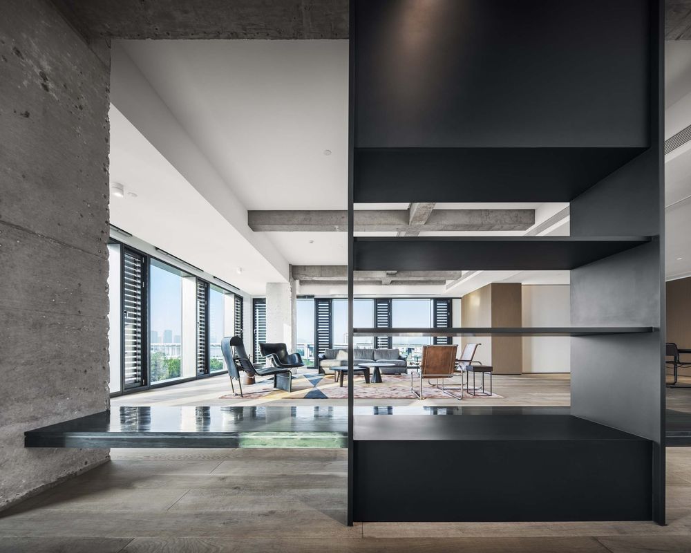
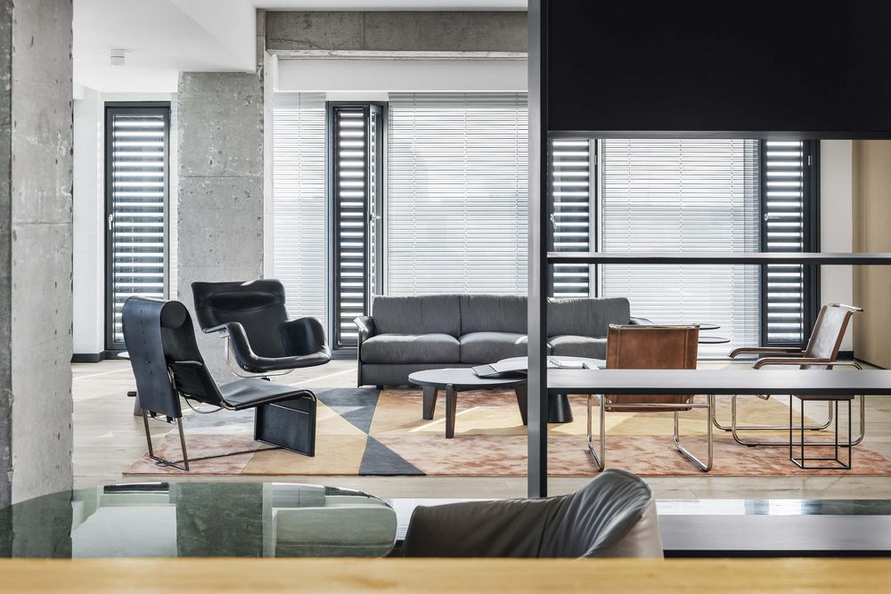
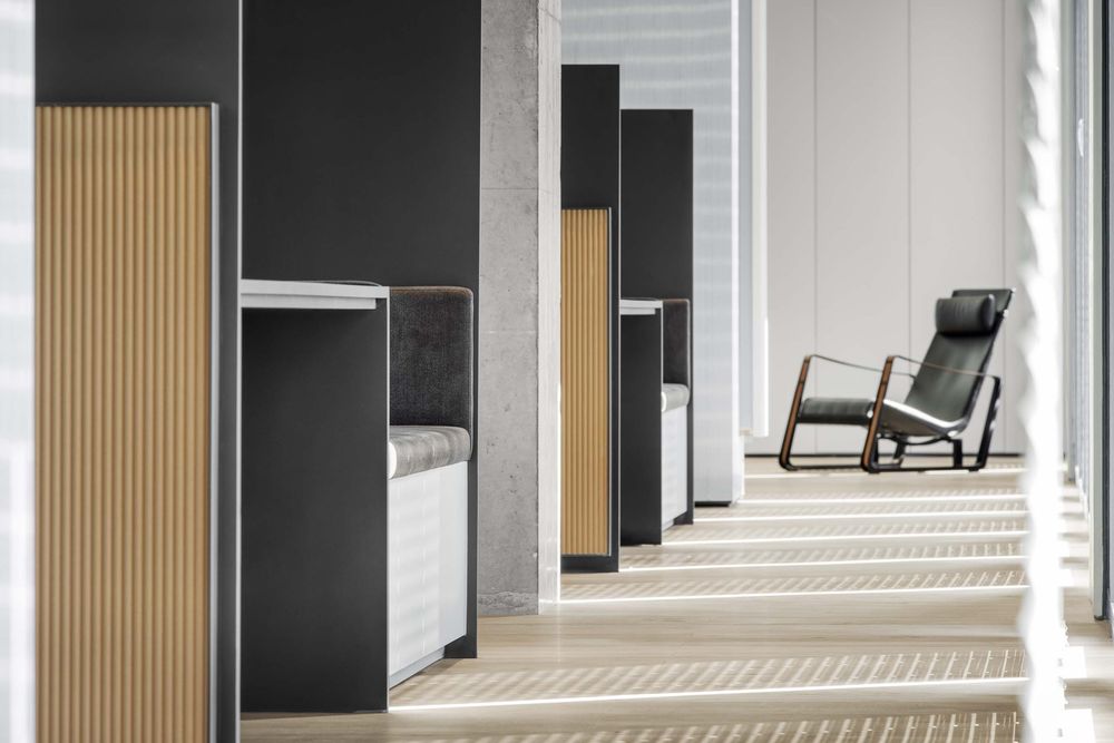
The simple color block and the space are separated by the use of design and customization materials make the large space not have a strong sense of regional function, and the body in it will not feel constrained. To create a space relaxing and comfortable, just like the comfortable wearing feeling brought by the high-end cutting materials. It will not feel constrained, but detached and comfortable.
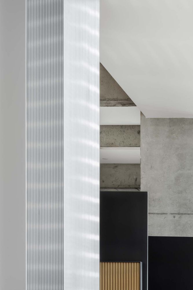
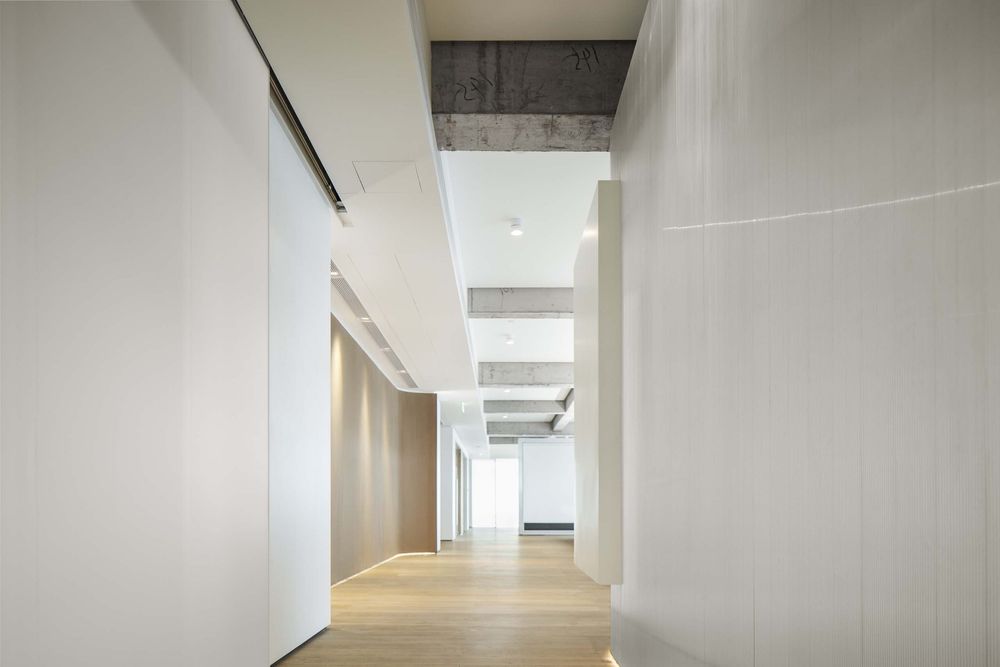
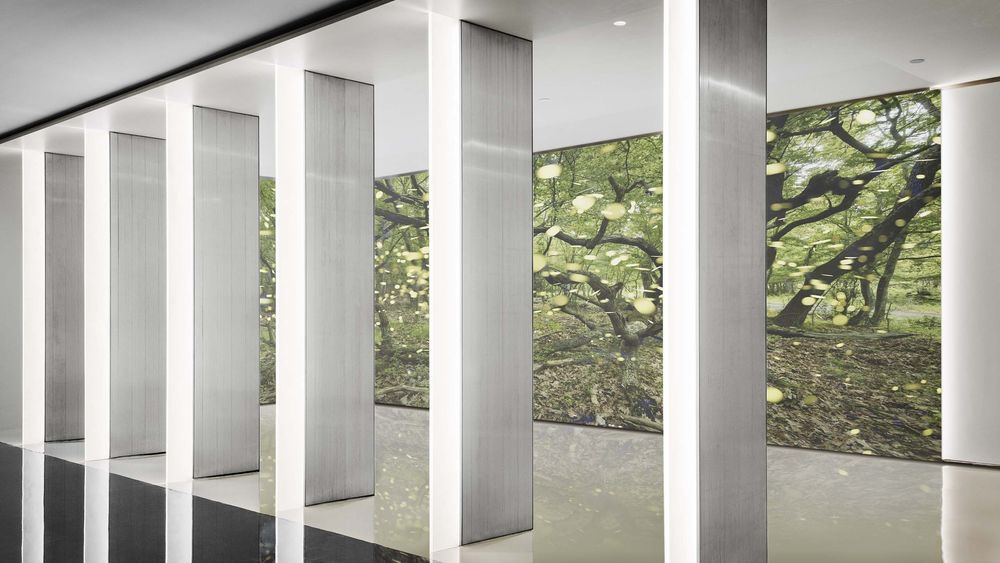
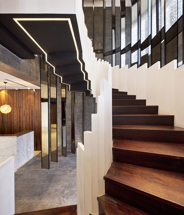
At the entrance, white is used for development, and only the simplest lines are used for decoration at the wall. Every visitor can feel the extreme purity when entering the space for the first time. The combination of white wall and projection makes the entrance space more modern and professional, and also makes the entrance space have different visual levels.
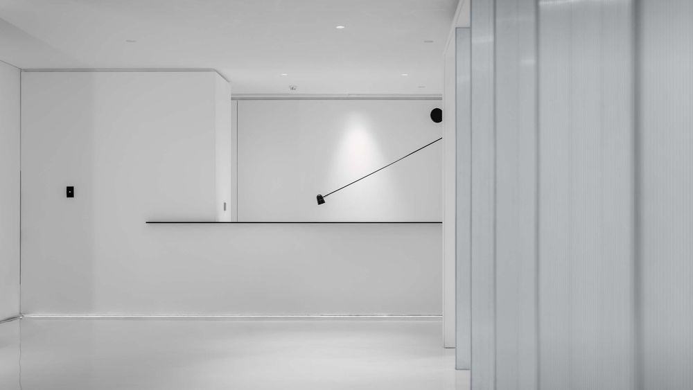
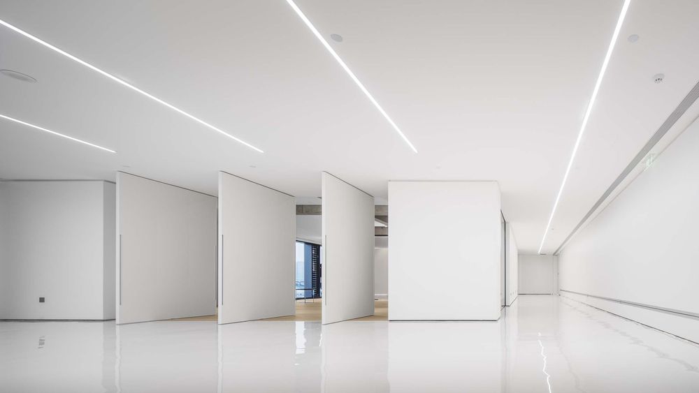
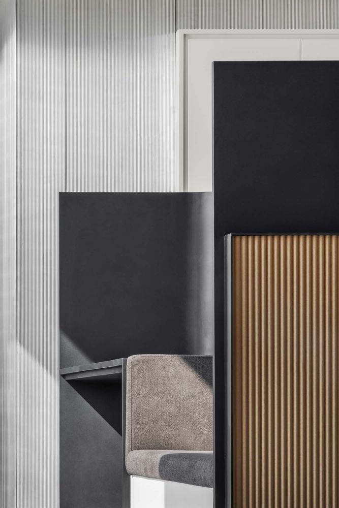
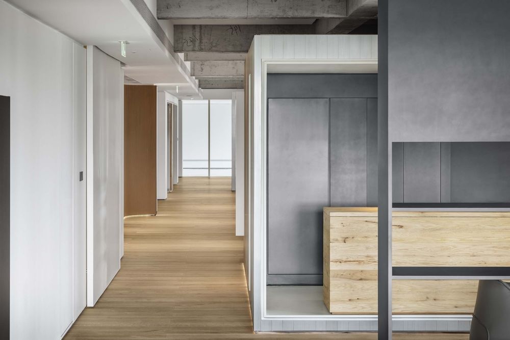
Different from the traditional office space, the entrance chooses the setting of no lobby and no entertainment. Subtraction in the space can make the whole office space more complete. Simple line decoration can be used for spacing, which has the function of separation and no rigid wall spacing. It makes the space have more simplicity It seems to be a simple quilting decoration on the clothing, which is orderly from the far view and close to the view Elaborate low-key design.
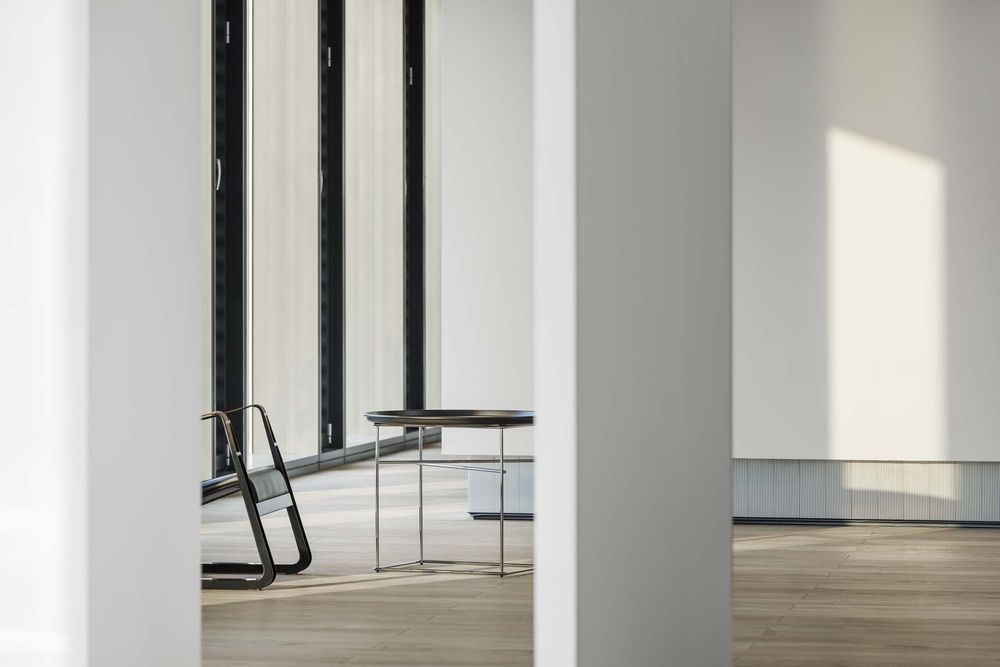
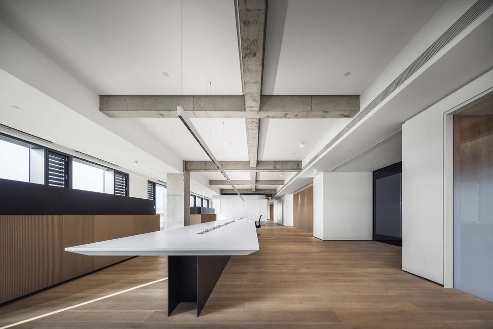
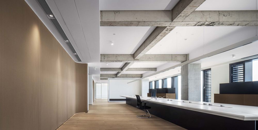
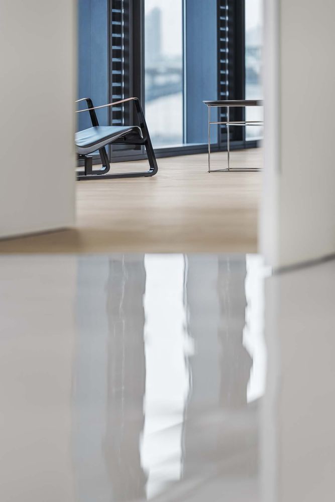
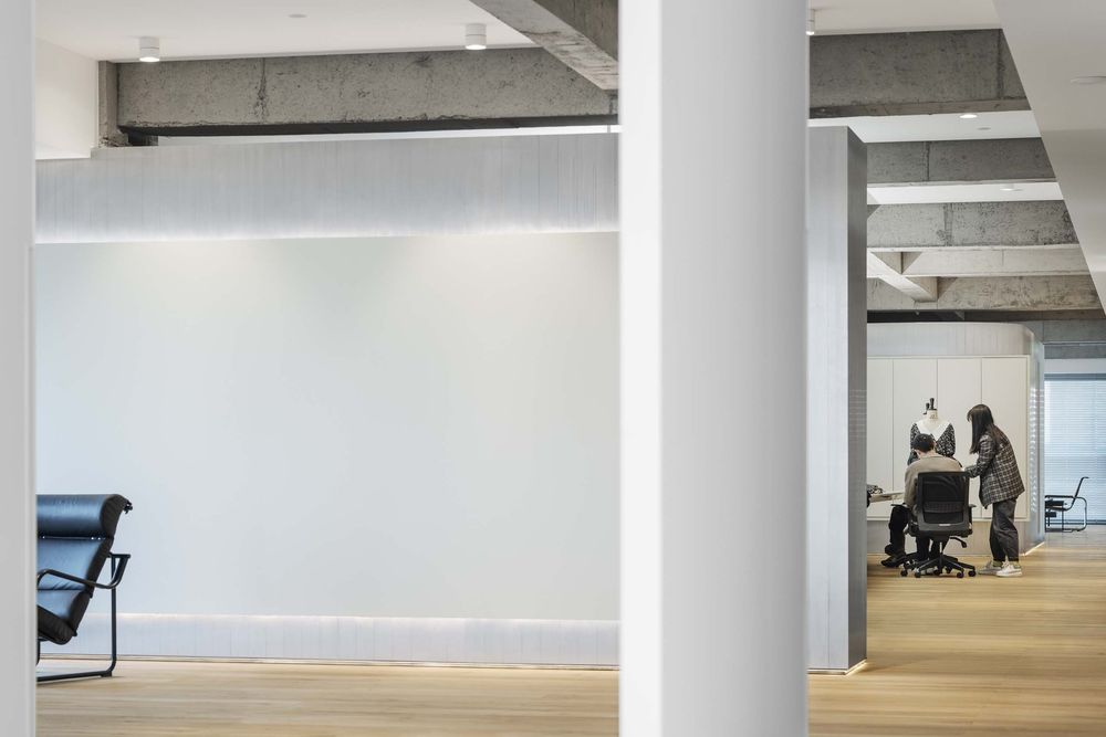
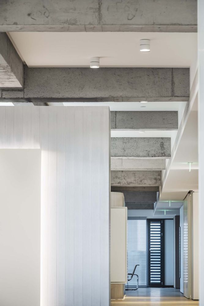
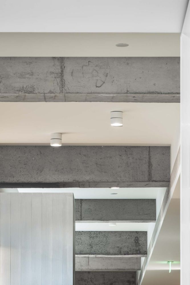
Entering the main space, the floor-to-floor window on one side allows the whole space to have a open view of the beautiful Qiantang River. The space only uses simple colors. The designer hopes to reproduce the texture and technology of the old industrial era.
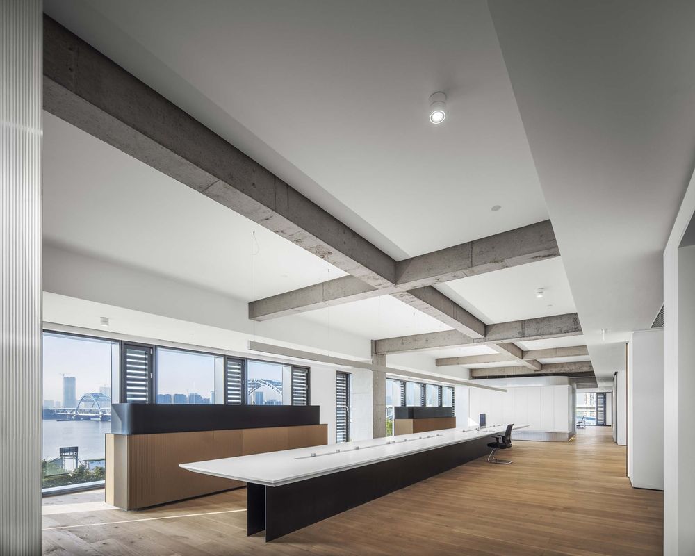
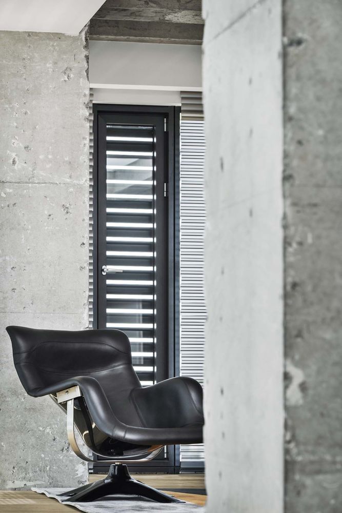
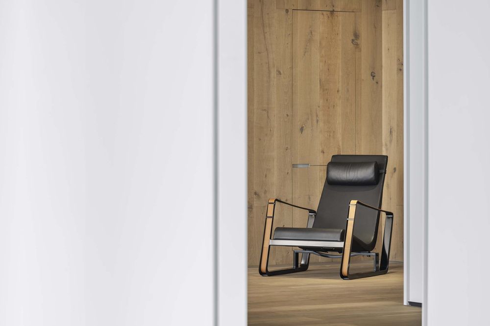
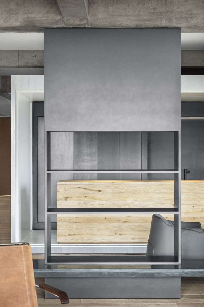
The use of new and old materials also makes the space collide with a new visual atmosphere, just like the use of different materials in clothing, splicing out various collocations.
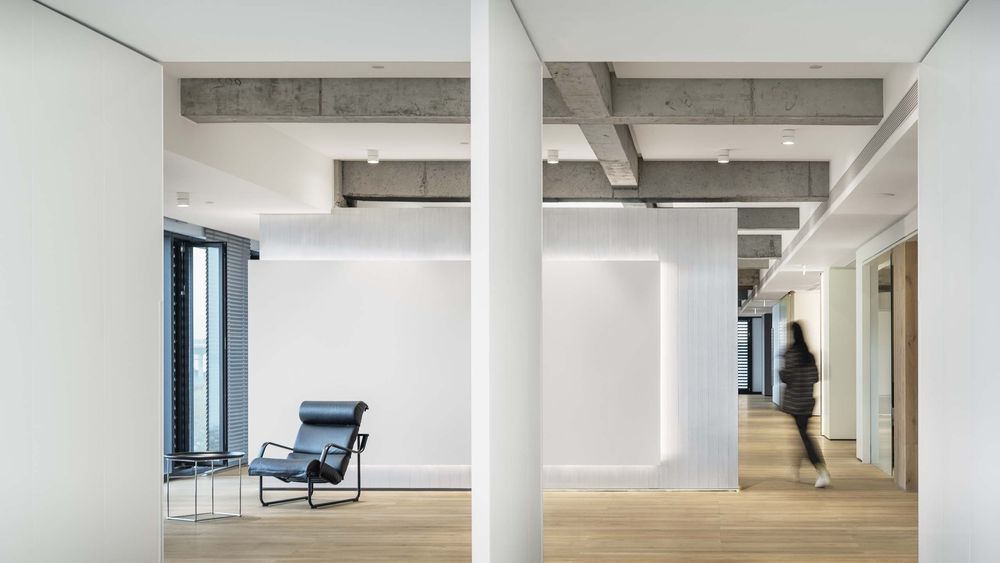
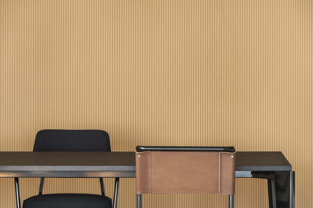
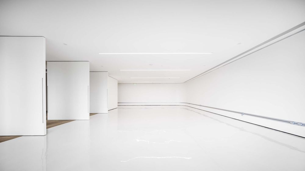
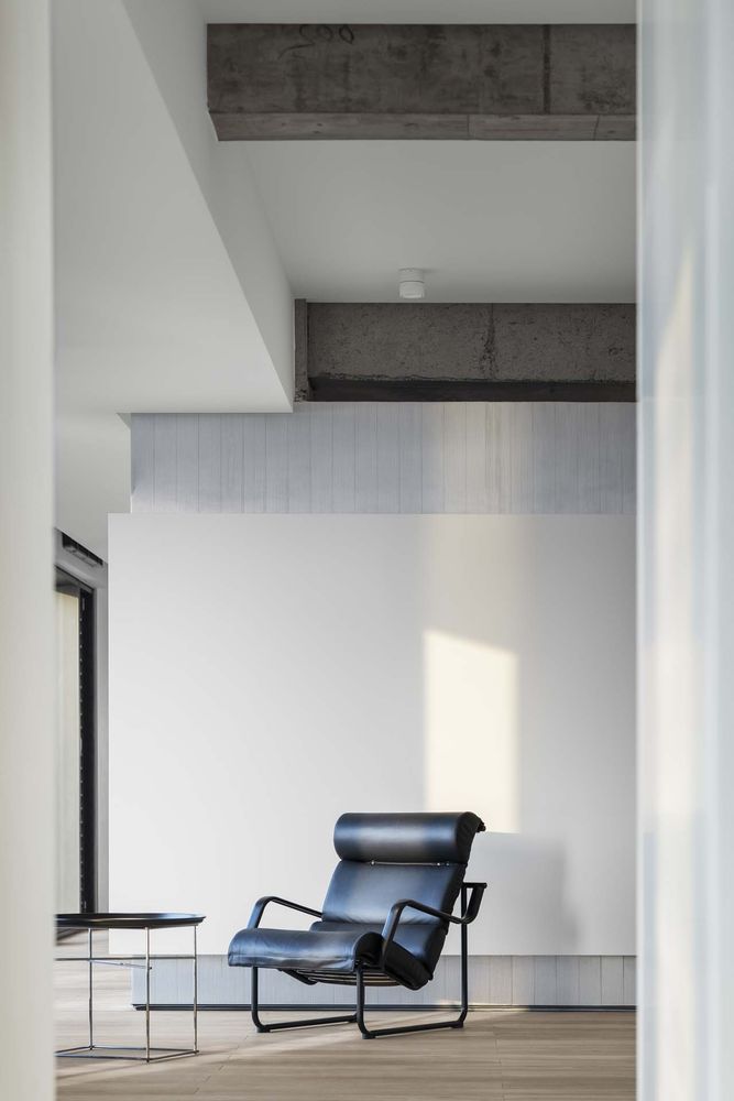
As a dual attribute of office and exhibition hall, space needs to be met is indispensable. The simplest color matching is to set off clothing and cloth, and the office area also provides more possibilities for daily work. In the fabric exhibition area, the designer chooses the simplest lines for combination. The vision of the space is clean, simple and straightforward. The design of lighting also makes the delicate materials and clothing displayed incisively and vividly.
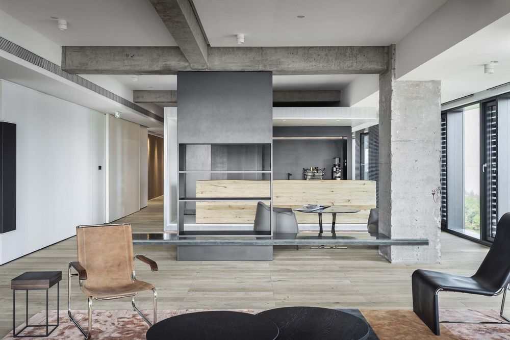
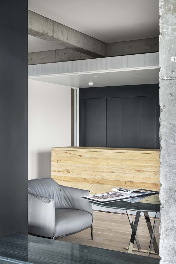
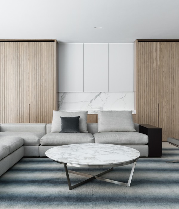
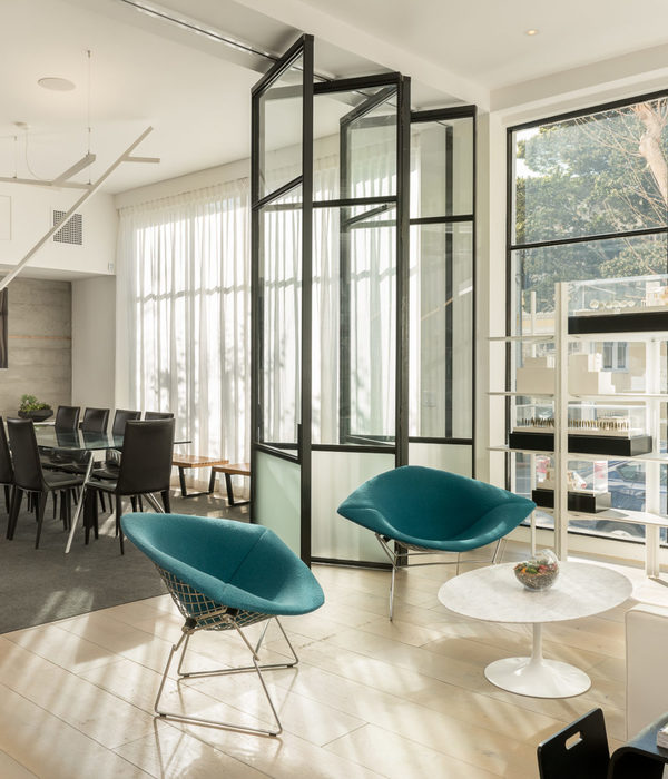
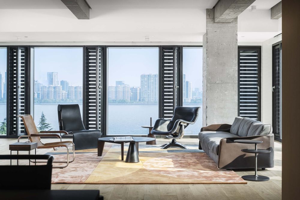
In the river view area, the designer has made a new planning and integration for the functionality of the area, making the use of the area space more relaxing. The sofa, carpet, single chair, texture and color complement each other. The designer hopes that every user will have a kind of leisure and comfortable mood. When the weather is good, look out and the river is sparkling. Natural and cultural atmosphere is expresing in the space between ships.
The small coffee box in the space breaks the past that the tea area is separate from the main space. The embedded small coffee and tea bar makes the time to enjoy a cup of coffee or tea more relaxed, and adds a little sense of daily life and interest to the afternoon tea in the working time every day. Simple things can often offer people more feelings in details. While space has its own identification degree, it also solves the complex feelings brought by the environment. A new space is playing its infinite potential.
