Studio 4A has designed this office building for Atech Technologies in the tropical city of Bangalore. The building is designed to house the company’s sales, marketing, design and engineering teams - disparate functions that require distraction free environments.
The site which has an old mango tree is located on a busy road with large trees and a noisy playground across it. The broader context is of a polluted city environment with declining tree cover and water bodies and work spaces that are confined to closed glass boxes which imprisons the occupants, leaving one without the awareness of nature or the passage of time.
The focus, therefore, was to design an office building that addressed the building function while responding to both the immediate and broader context, one that overtly integrated nature into the architectural experience of the end user. These and the notions of the ideal work space informed the design and detailing at every stage.
The approach to spatial planning addresses functional as well as artistic needs. "Servant” spaces such as the lift, washrooms, staircase, server rooms, etc. are enclosed in an austere brick mass, and located in the West to reduce glare and heat gain. A bridge connects this across a sky lit court, to the “served” work space which is located in the East. Movement within the work space is planned along the sky lit court which allows visual connectivity between floors while maintaining a distraction free separation.
To cut off noise from the work space, a blank brick wall faces the road on the upper levels. This is a dominant feature in the facade. The existing mango tree, with a water body around it, has been made central to the scheme and accentuated with steel girders, to create an external court. The choice of material and form making gives the mango tree prominence.
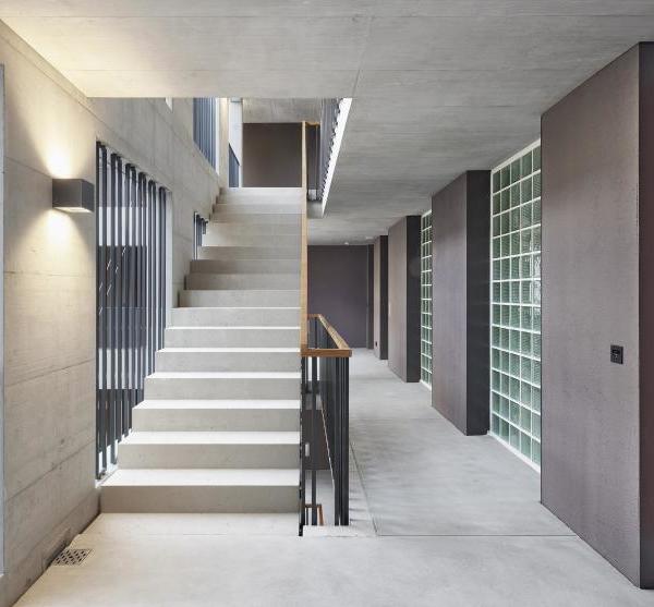
Materials such as brick, wood and concrete render a sparse yet naturally rustic feel to the building both internally and externally. Accents have been created using patterned motif tiles, laminated glass, upholstery etc. Emphasis is given to space, light, material and landscape by the use of minimal furniture and partitions. The detailing is kept simple in order to minimize distraction. Services like AC ducts have been exposed, avoiding false ceiling in order to keep the volume intact.
Breaking convention, nature has been made an integral experiential part of the commercial building. Interior design was forced to serve the broader notions of Architectural experience. Instead of a closed artificial office space disconnected from the outside, elements like a water body, sky lit courts, internal landscape and large windows to the East have been made central to the design.
{{item.text_origin}}


