Architects:Saboia+Ruiz Arquitetos
Area:2150m²
Year:2021
Photographs:Leonardo Finotti
Lead Architects:Saboia+Ruiz Arquitetos
Design Team:Alexandre Ruiz da Rosa, Haraldo Hauer Freudenberg, Rodrigo Vinci Philippi, André Bihuna D’oliveira, Lucas de Oliveira Freitas (student), Luca Fischer (student), Michela Neri (student)
Architecture Consultant:Thais Saboia
Steel Structure Consultant:Eng. Ricardo Henrique Dias and Eng. Norimasa Ishikawa
Thermal Comfort & Energy Efficiency Consultant:Eng. Aloísio Leoni Schmid
Landscaping Consultant:Arq. Raul Pereira
Concrete Structures:Eng. Mauer Egas
Mep Engineering:Eng. Eduardo Ribeiro
Funding:CODHAB-DF and SE-DF
Contractor:Combrassem
Country:Brazil
THREE BLOCKS WITH COURTYARDS
The plot of land that was selected for the UBS Parque do Riacho had a complex relationship with the surrounding urban areas because of the high voltage power lines and highways, and also because of its size - the land was almost five times the size of the building. Adapting the small project to the plot was challenging due to its large proportions, especially in length.
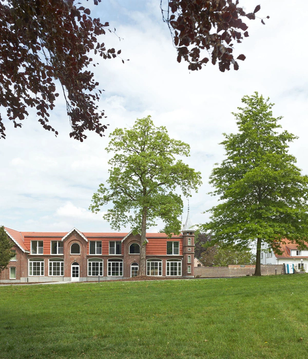
So the project relied on two main aspects: the exterior (urban spaces) and the interior (functional humanization). The exterior is marked by an urban fabric in need of a connection between the long corridor of social housing, the agricultural surroundings, and the previously established agro-urban complexes. To achieve this, the project features three separate rectangular blocks which demarcate and shape the external area while also creating more private inner courtyards. This strategy enlarged the volume of the building, allowing the project to benefit from the large plot of land and thus making it more visible and easily recognized as a community public facility that is welcoming and open to transformations in the neighborhood.
Dividing the building in blocks made it easier to adapt to the varying levels of the terrain, and connecting the blocks through ramps ensured universal design and accessibility. A relatively large area was left available for future projects, either for a rational modular extension or to be used as an open space for other activities. The creation of a community garden has recently been considered.
Meanwhile, the inner courtyards provide a quiet and reserved atmosphere, humanizing the hospital's built environment by creating a microcosm of protection and tranquility. The courtyards are designed on a human scale, encapsulating the outdoors and bringing natural light into the environments through a carefully planned landscape design. These spaces are protected from heavy wind, also providing shade and isolation from outside noises, and are connected to nature. They also help to create clear boundaries between the different sectors and functions of the building. Even though it was designed before the Covid-19 pandemic, the connection of the courtyards with the waiting rooms ensures the required ventilation for spaces with large groups of people.
ACCESS SQUARE
Access to the healthcare unit is made from the northern side, connecting the last stretch of the public sidewalk to the large entrance square, leaving the vehicular access and parking area at the end of the street. The large square is designed to prioritize pedestrian and bicycle access, also serving as a meeting place (which is likely to be very busy during vaccination periods), providing this public building with identity and visibility.
SECTORIZATION
The functional program of the building is divided into sectors within the three blocks, each with its own courtyard.
The block at the far end of the lot is where most of the medical care is located: triage, doctors' offices, and women's health assistance. Because it receives a large number of people, access to this sector is made directly, and the waiting rooms are divided into two areas. Following the design concept, these spaces are placed along the length of the rectangular block, always facing the large courtyard, and the offices are located along the width of the block. This arrangement around courtyards helps with sectorization, minimizing functional conflicts between sectors, and ensuring a welcoming atmosphere to all spaces.
The front block, closest to the parking lot and the passenger pick-up & drop-off area, contains the technical sector and service entrance. This block also includes part of the medical care, a dental office with all its associated departments. This way, the waiting room for this sector can be a little smaller.
MATERIALS AND TECTONICS
The building is designed based on economy of means, modularity, and rational construction techniques. The floor slabs are elevated off the ground, and the building structure is made of steel pillars and trusses. The building envelope is made of pre-cast concrete panels, pre-fabricated screen blocks, and steel windows and doors. The double-skin facade is composed of cobogó walls and glass, creating an intermediate cavity between layers that allows for thermal control while also providing a corridor for circulation between doctor's offices and other facilities. The materials used for the facades create visual harmony and provide privacy to the technical wings. The interior partitions are made of drywall for functional flexibility. The roof is made of thermo-acoustic tiles. The choice of building materials reflects the spatial and functional quality required for a Primary Healthcare Unit, creating a connection with users and patients, both physically and sensory.
STRUCTURE
The foundation consists of reinforced concrete slabs cast in place with a small overhang along the perimeter, made possible by the recessed grade beams placed above ground level. Besides being important for the building's passive thermal control system, this elevation creates space between the ground and the finished floor, allowing for the building systems to be easily installed or retrofitted in the future. Ramps in reinforced concrete slabs connect the different levels of the foundation of the three blocks.
Circular steel columns rise above the foundation, creating a braced structure that supports the flat trusses of the roof. These trusses are not expensive and easy to assemble, consisting of adjoining bars that receive the loads from the purlins directly at the nodes. Their design was adjusted to the variation of the ceiling height, creating a single-pitch roof with rain gutters that are easily reached for maintenance.
COMFORT
The project looks simple, but it contains a complex and effective environmental protection system. The inner courtyards collect rainwater to be used for watering the gardens, also providing fresh air. The exterior double-skin facade functions as a screen and a protective layer. Externally, the cobogós help cool the interior and diffuse natural sunlight. On the inside, the glazed walls control humidity and protect the spaces from outside noise. Night ventilation benefits from the atmospheric temperature range to cool down walls and slabs. Passive daytime ventilation provides evaporative cooling under the shade of the trees and the roof. This is an effective system that improves the energy efficiency of the building by eliminating the need for artificial air conditioning.
Project gallery
Project location
Address:Brasília - DF, Brazil
{{item.text_origin}}

