Designer:SpaceInvader
Location:Manchester, UK
Project Year:2021
Category:Offices
SpaceInvader has completed a boutique, 2,000 sq ft workspace for Manchester-based Tosca Debt Capital on the 5th floor of the Helical-owned Trinity Building on the city’s John Dalton Street. Not only was this a fast turnaround scheme, commissioned in July 2020, but it was designed and delivered by the SpaceInvader and wider installation team during lockdown and semi-lockdown, proving what could still be achieved under such exacting pandemic conditions.
Tosca Debt Capital is a financial services company that brings additional, complementary debt funding options to regional markets, giving SMEs – particularly those across the Northern Powerhouse - access to institutional capital to help drive entrepreneurial ambitions. The strong relationships the company builds with management teams set it apart and, with all decision-making, underwriting and portfolio management taking place from the company’s Manchester base, the office’s location, look and feel were crucial for its relationships with clients.
‘Our client is a very forward-thinking and successful finance sector business, with a real sense of quality and style’, SpaceInvader Founder John Williams commented. ‘It was important for them that their people could be together at their best and so the overall brief was for a lot of different spatial typologies within the 2000 sq ft overall space on the 5th floor of the Trinity building’.
Design Approach
The client’s brand values were defined as ‘experienced, professional and knowledgeable, reliable and responsive and relationship-driven’. SpaceInvader’s approach therefore was to create an interior that would reflect Tosca as a forward-facing professional company, without any kind of faddy or trend-led concept, but instead creating an understated, high-quality scheme with muted, warm tones and featuring high levels of bespoke joinery and craftsmanship to help create a quiet, sophisticated and timeless feel.
‘In many ways, this project is a vision of what the future workspace will be for many companies’, John Williams noted. ‘This is a client who has moved away from a traditional office and who briefed for a space to fit current and future needs, where the workspace becomes a hub, not only for them, but for clients too and for the businesses whose boards they serve on, with the space able to perform a multitude of tasks, ranging from meetings to focus work, one-to-one and larger collaborations, with enough space for project pin-ups and reviews, as well as spaces for breakout, hospitality and entertainment’.
Concept and Functionality
‘The overall feel is of a well-dressed, hospitality-led environment with an informally luxe feel, combined with the intimacy and scale of a domestic environment’, John Williams explained.
The overall space is comprised of a 5th floor split suite, with access to a roof terrace. With a prime position overlooking Manchester City Centre, the outlook and additional external terrace give the space a natural focal point. Key views were to be enhanced throughout via considered framing both in the interior spaces and out to the exterior urban landscape. To ensure views out were maximised, along with natural light ingress, the majority of the space was kept open plan with joinery used to divide areas without blocking views.
The interior space needed to include the following functionality:
• Large boardroom
• 4-6 person meeting room
• Visitor waiting area
• Staff teapoint
• Client-facing teapoint
• Open plan office area for 10 desks
• Space for collaboration / informal meetings
• Space to take phone calls
The material treatment for the scheme included warm timber tones; blue and auburn upholstery finishes and a feature deep blue paint finish set against the predominant neutral off-white. There are also neutral and textured wallpapers; deep blue and mottled grey acoustic finishes; carpet tiles in a mixture of charcoal grey and beige and a surface finishes, including marble, grey and black laminate, along with black-stained ply.
Design Walk-through
The feel for the Business Lounge is elegant, smart, neutral and natural and the design here includes feature joinery storage and a shelving unit with acoustic panel infills, providing framed views through and beyond to Manchester’s skyline. Curved lounge chairs from Hayche and occasional tables by Muuto and Ferm Living create a comfortable visitor setting upon arrival, whilst artwork and dressing items provide visual interest.
The Refreshment Area features a curved light fitting, suspended over a high informal meeting table and a mix of marble/stone and timber textures, combined with matt colours, for a contemporary and timeless materiality. Black-legged meeting table chairs are the Harbour Counter Chair by Menu, upholstered in a grey Kvadrat fabric. This space also features ‘stepped’ coving with integrated LED strip lighting and textured wallpaper to connect with the central joinery and frame the elevation. Corner glazing creates purposeful, framed views into the meeting rooms. The area also contains a moveable AV screen from Boss Design set on an upholstered furniture unit, for when the space is needed for presentations.
The Boardroom is the most formal area in the scheme and features executive meeting chairs and an oak boardroom table set on three conical-shaped legs, with integrated power, from Andreu World. A feature curved light fitting is suspended over meeting table, whilst linear-formed acoustic tiles with chamfered edge details frame the AV screen and provide a sound absorbing finish. An oak-finish credenza in the space is by Another Brand. Feature ‘stepped’ coving with integrated LED strip light and deep blue wall paint matches the acoustic panels and ties the elevation and materiality together.
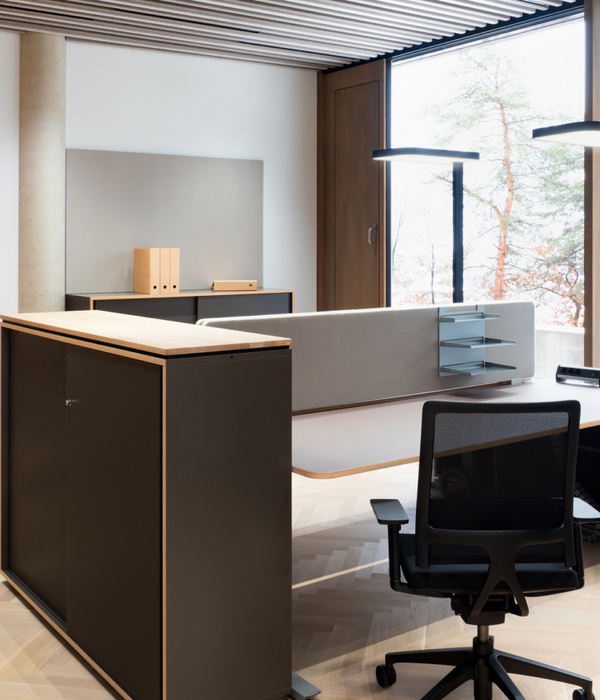
For the main open plan space, furniture includes smart desking furniture with warm timber tops and a black leg accent finish, plus a feature shelving screen with low level cupboards and acoustic panels. Stained ply joinery panels form divides to the booth-style seating with fixed upholstered seat backs. A concealed LED strip light behind the stained-ply joinery wall panel and textured wallpaper tie together the booth seating and a dedicated print area. Feature shelving above the staff teapoint is used for display, holding both crockery and glassware. The space also features an informal high meeting table with integrated power and a wall-mounted AV screen with write-on, wipeable wallpaper for collaboration and presentation, with a dozen counter height chairs from Normann Copenhagen.
Gary Davison, Partner at Tosca Debt Capital, commented on the project: ‘SpaceInvader were really great to work with – pushing at every boundary to make sure the design was strategic and truly reflected our culture and identity. The finished environment is exactly what we were looking for: warm and welcoming for both our team and our clients and with a seamless spatial flow. The look is crisp and sophisticated and, most importantly, offers us as a business the future-proofed flexibility we need to move forward.’
▼项目更多图片
{{item.text_origin}}

