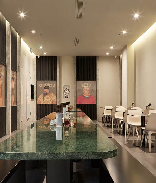
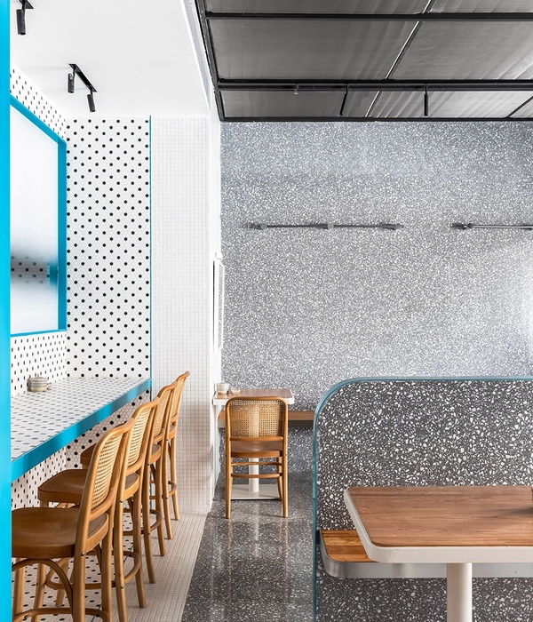
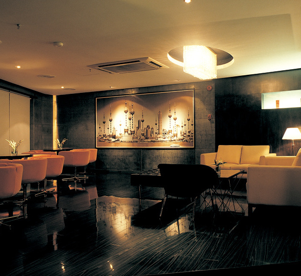
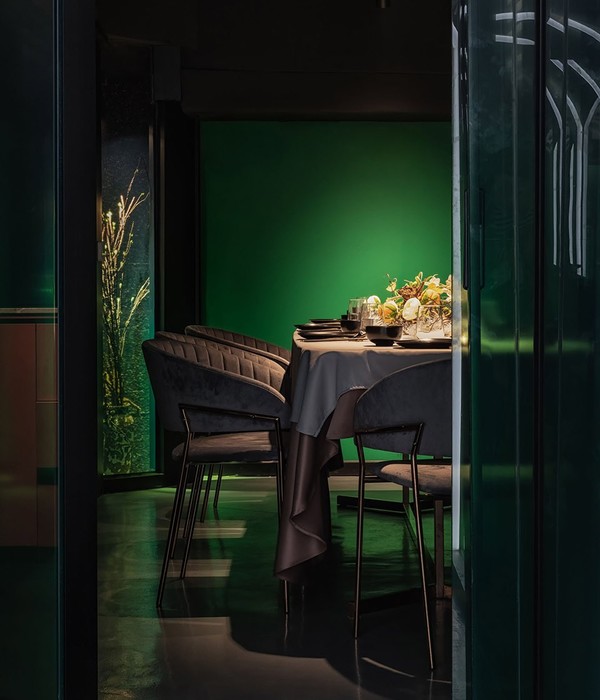
Ciao Bella, Bellisimo, Grande!? Now I don’t speak Italian but this new restaurant by Genesin Studio, in collaboration with Walter Brooke, has me feeling some kind of way. In a design that demands attention, the studios played with scale and space to capture the intrigue and established poise of an old Palazzo. Palladiana flooring and gloss stucco rendered walls are balanced with minimal concrete forms to exude Italian elegance that celebrates the bygone era of post-war Venice for this latest venue in SkyCity Adelaide.
Equilibrium is the word in this modernist Italian eatery. Being greeted first by a Carlo Scarpa-inspired concrete entry portal, patrons are invited to take in the expansive space above. Softly turning around the architecture of the building, the restaurant curates a seating plan of 190 patrons around 8 different experiences – an Espresso Bar, Lobby Lounge, Bar Dining, Kitchen Table, High Tables, Private Tables, Dining Room, and Alfresco Dining. But unlike feeling like a restaurant farm, the designers have used different depths and heights within the space and a flowing design language that invites the individual areas to contrast and complement each other.
Like a Negroni, their signature cocktail, the space is dynamic and layered. Pink palladiana flooring with black and white marble terrazzo inlay, an updated take on the Venetian classic, forms the foundation of the space. A very labour intensive tiling technique, the material was laid by some talented tilers locally in South Australia.
Walnut timber was fundamental to the palette. The designers integrated the material through timber joisted ceilings in high void areas and for all joinery, door pulls and loose custom tables, adding a warmth that envelopes the cavernous 2.7m to 5m ceilings.
Finished in a soft summer yellow gloss paint, the venues textured rendered walls have been applied with a trowel finish called Rilievo from Venetian brand San Marco. Adding dimension and a theatrical backdrop to the modernist elements within.
The space is its most open at the main bar, establishing it as the feature of the restaurant. The clean lines and modernist tones of the in-situ concrete sit in calm contrast to the patterned flooring with greenery spilling above from several pots. A blackened steel shelf divides the room with a fine selection of local and international booze. Grey-on-grey 50’s inspired stools by Grazia - Co sit quietly against the concrete, without demanding attention.
This relationship between local and international talent continues with a collection of art and ceramics from Italian ceramic houses Bitossi and Fornasetti mixed with commissioned pieces from local SA artist; James Brown contributed variously sized impasto art canvas sin colour and monochrome and Jeweller - Metalsmith Christian Hall who designed a blackened steel wall piece with reference to mid-century relief mural art. While there’s plenty to look at in this sprawling space the most eye-catching of all is the external vista looking out on to the River Torrens. Floor to ceiling windows snake around the perimeter with window seating and custom walnut and Arabescato marble inlaid tables. The space continues to evolve as the light and spatial volume changes.
Snag a seat by the window, order a cocktail and be transported to the canals of Venice – even if just for a second.
{{item.text_origin}}

