Prague Penthouse | 城市景观与室内空间的边界融合
The main
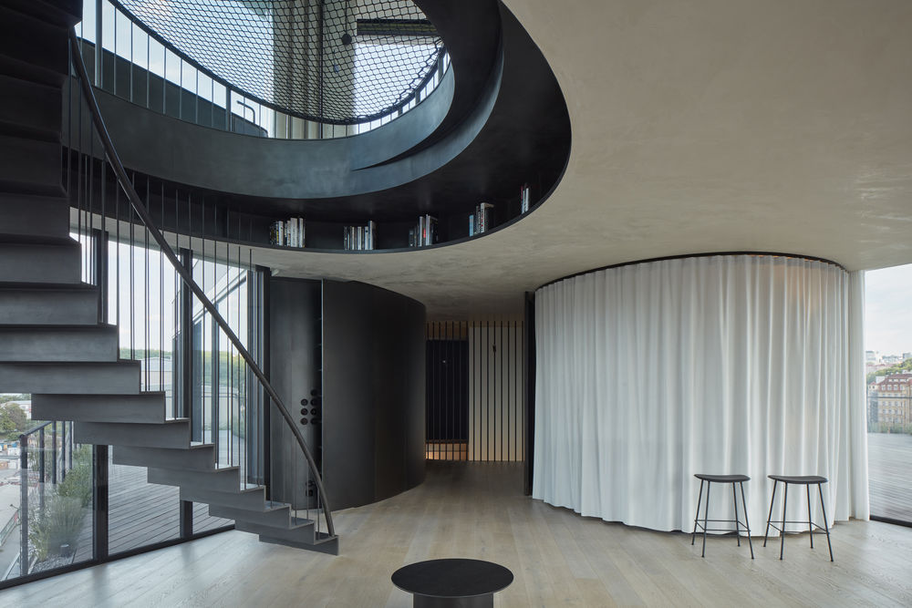
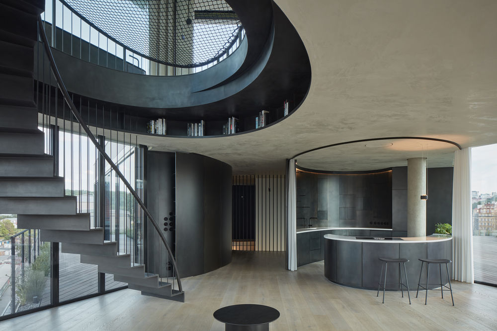
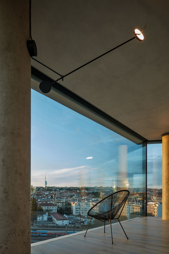
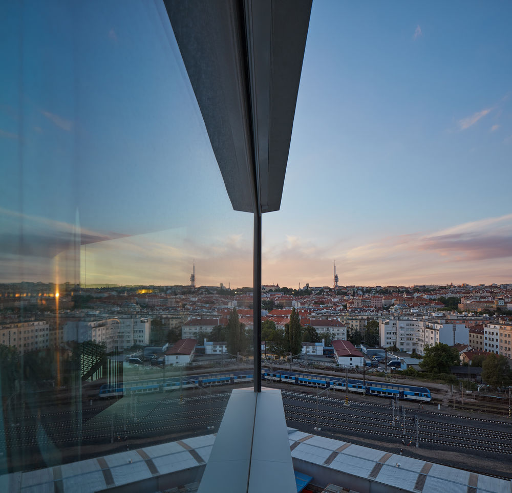
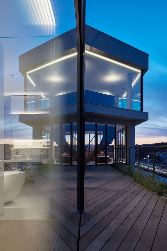
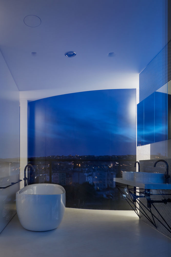
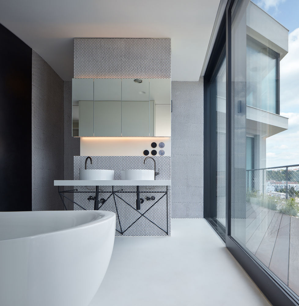
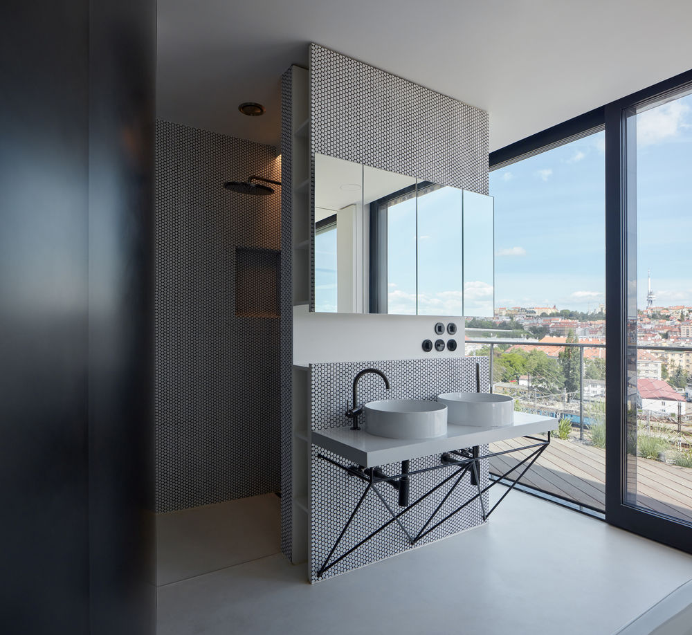
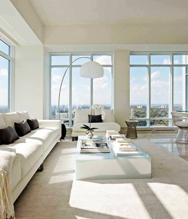
is to blur the boundaries of the apartment and emotionally draw the city into its interior. The space of the apartment is not limited within the physical layout, the city surrounding the building becomes part of it and the added facade glazing only maintains the comfort of the indoor climate, connecting the city into an extended peripheral perception. The original apartment was rebuilt into a penthouse: a house on a house.
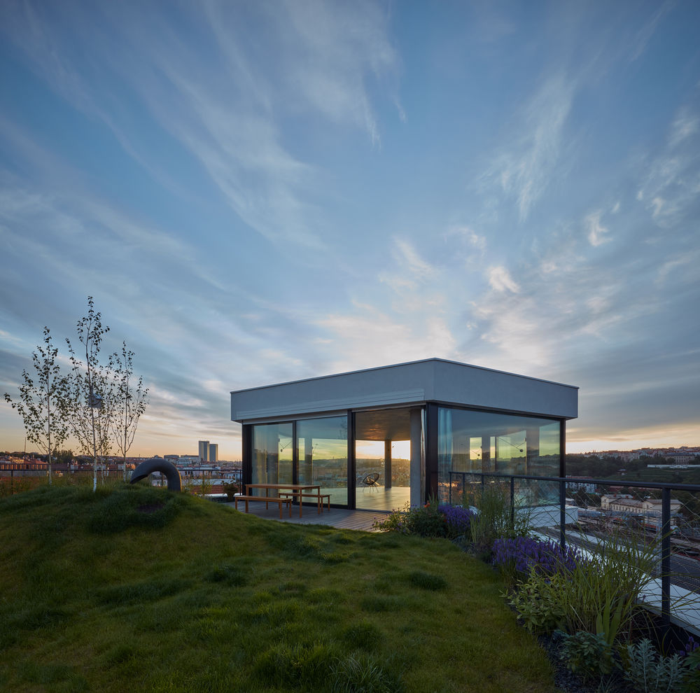
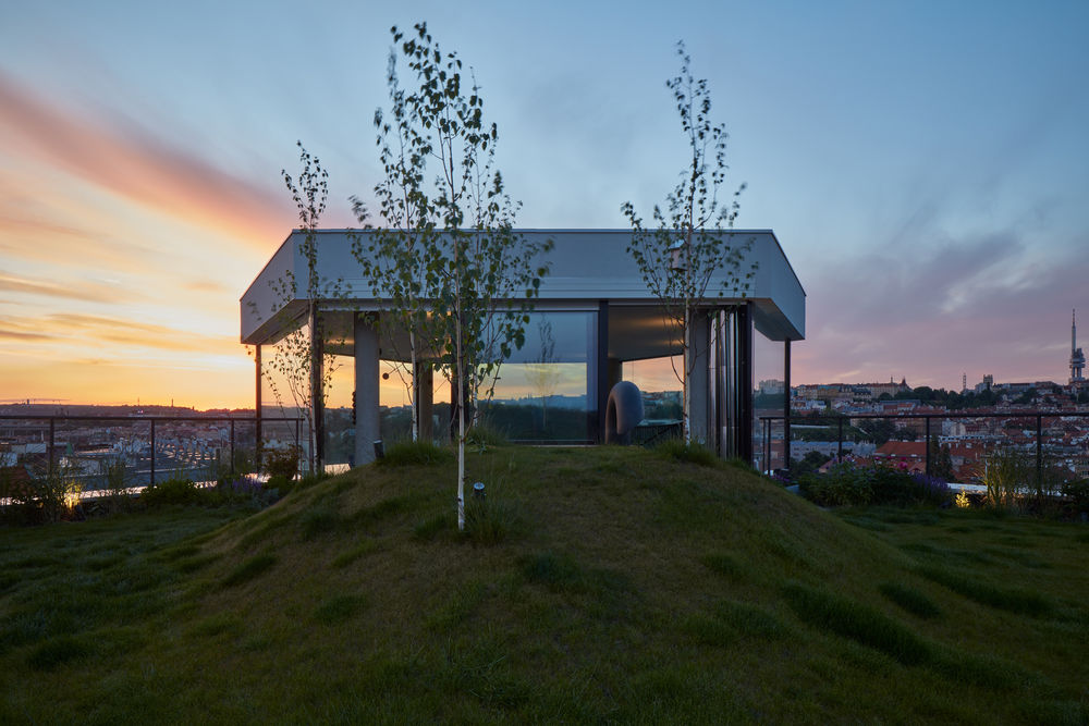
concept is based on the character and potential of the "site"; in this case, two roof-top floors in a corner house on the border of a built-up area that opens across the valley into the extensive context of distant views.
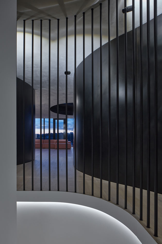
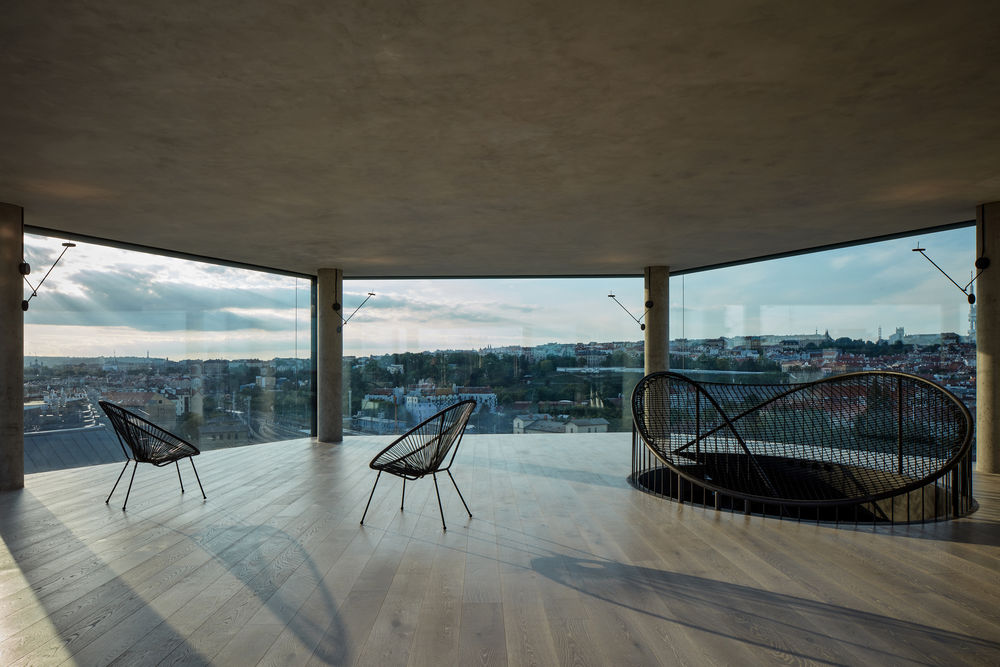
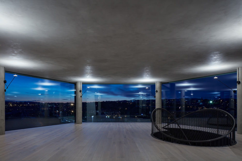
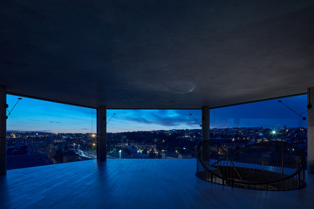
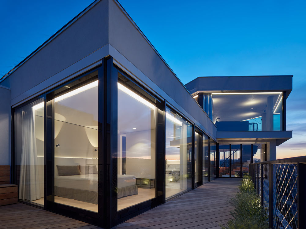
draws on the unique superposition of the penthouse above all surrounding buildings and takes advantage of the panoramic view. It revises the impact of the compromising reconstruction done by a developer towards the original genius loci of the building, clarifying all the detailed relationships between the exterior elements, especially in the large-area glazing in the upper floor of the tower, allowing a spectacular view from all windows with minimal division of individual glazed areas. As it is not possible to work with the historical connotation in the part of the building we designed (it is a superstructure, partially re-created corner tower of the original water reservoir with added wings) and it is a reconversion for typologically different use (housing), we do not work with the debatable "industrial" character of the building or with aestheticism with clear loft features. The leitmotif is the free and continuous flow of the interior throughout the space and its endless optical continuation into the surrounding city.
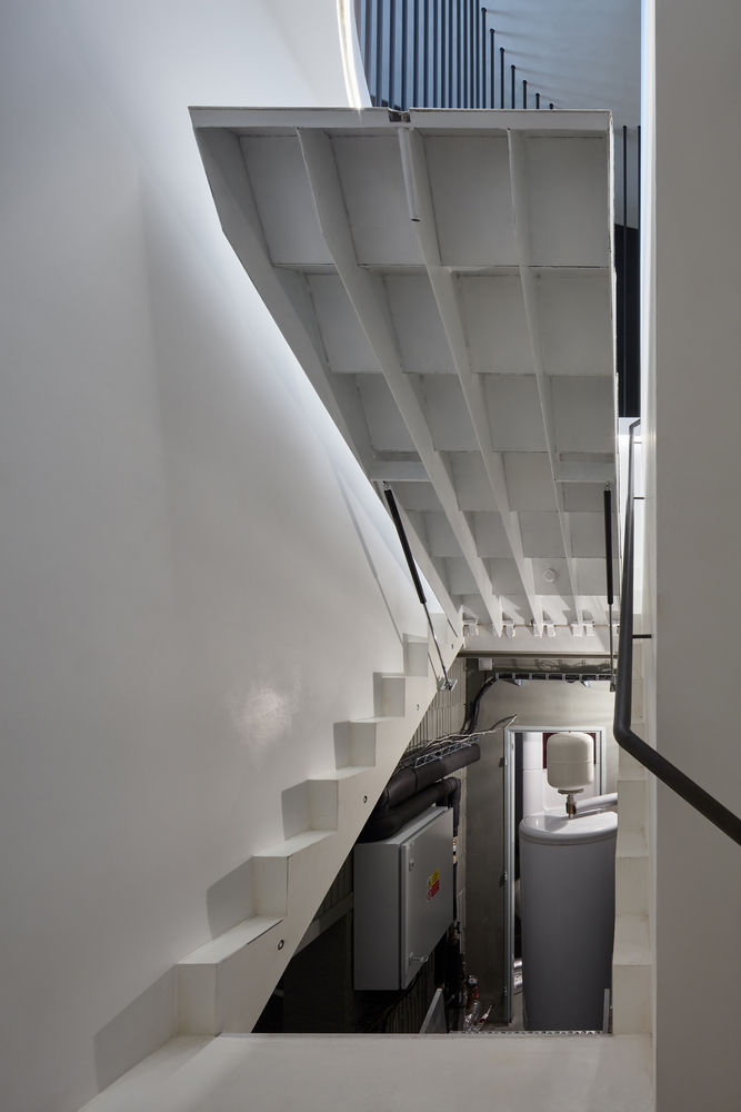
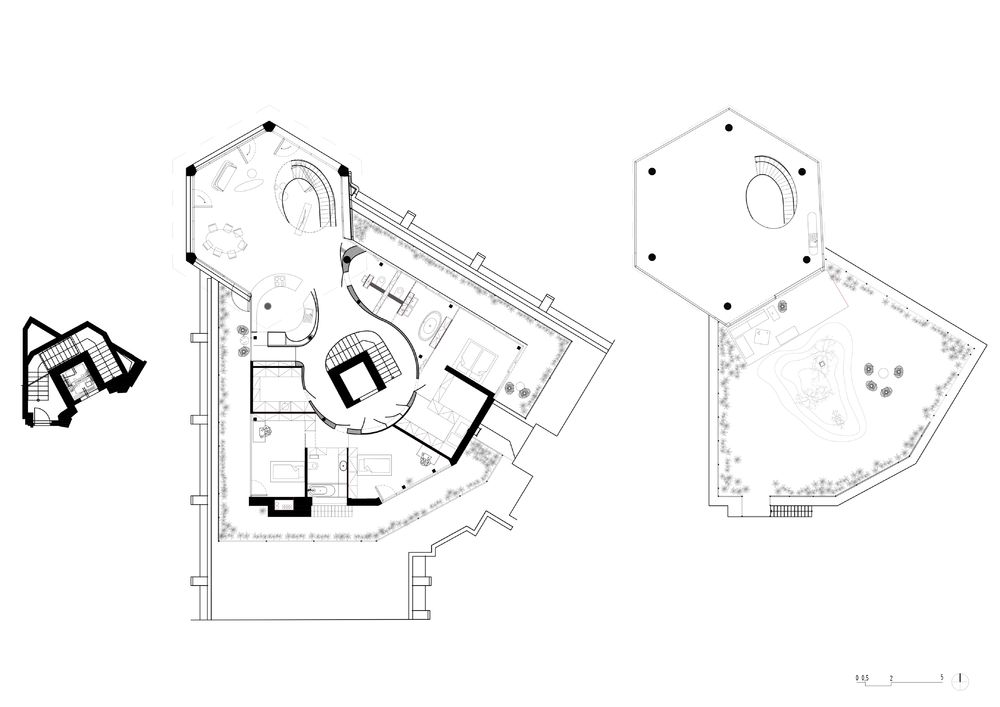
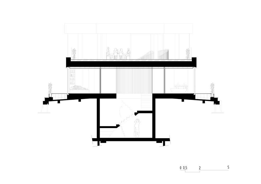
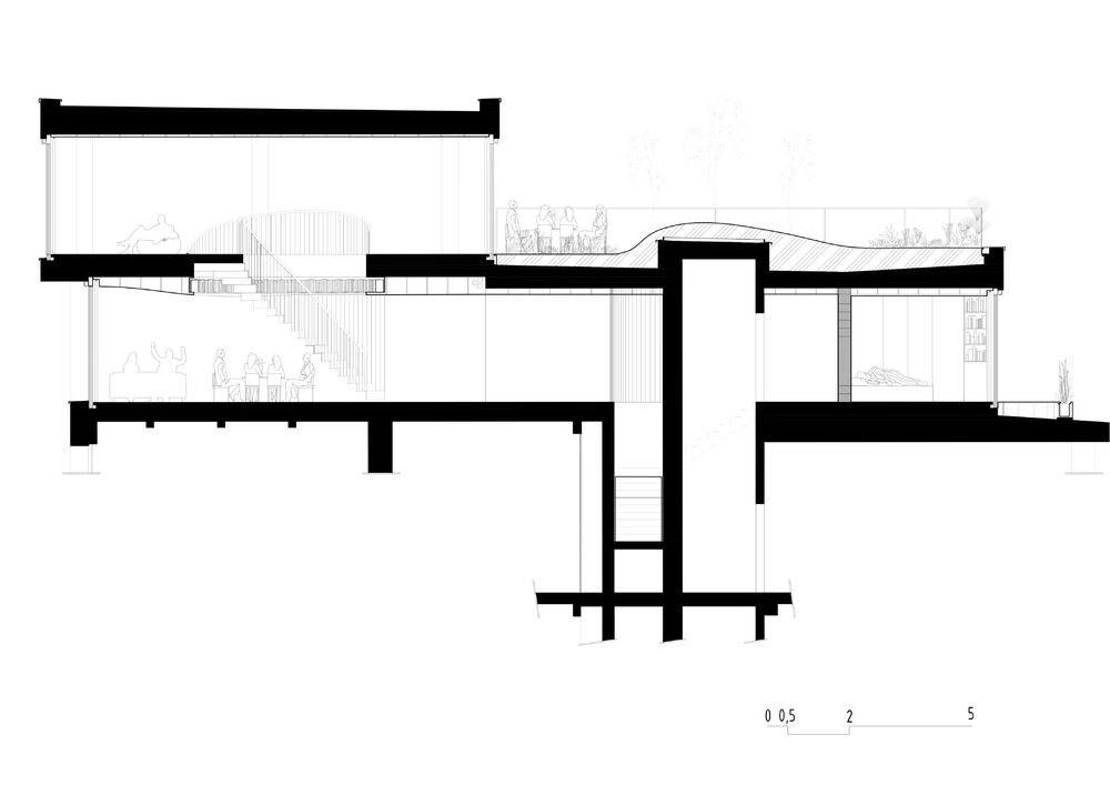
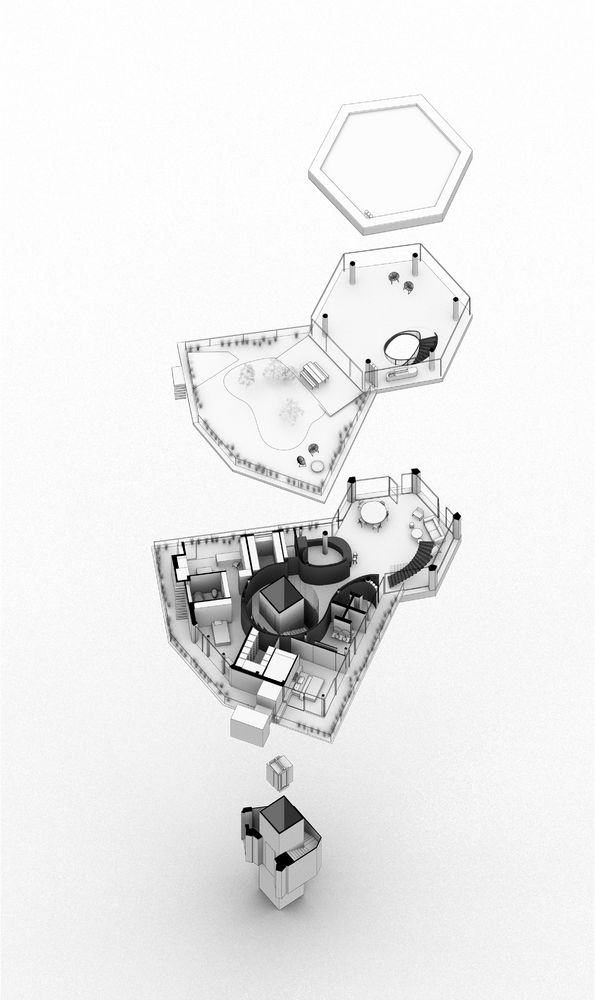
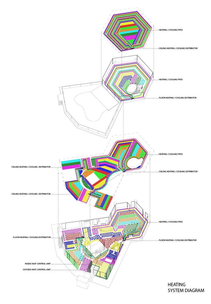
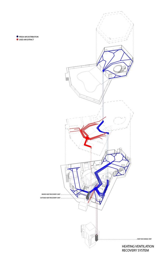
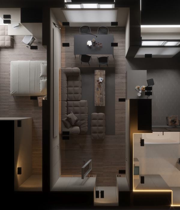
Structurally, it is a client reconstruction of the rough structure by means of major reconstruction, including significant interventions in the layers handed over in the shell-and-core state. As part of the intervention, the perimeter cladding done by the developer was completely removed and replaced with atypical large-format glazing using structural four-pane glazing with corresponding shading by large screen blinds, optimizing heat gains and losses and ensuring maximum user comfort, together with the indoor climate control system. All partitions were removed to create a continuous layout. As it was taken over during the building process, the design respects the existing load-bearing structures (with the exception of one column, which was replaced) and integrates them into the layout, simplifying the installation cores by merging and leading them in the floor and ceiling using the residual spaces (below the entrance staircase) as a technical base.
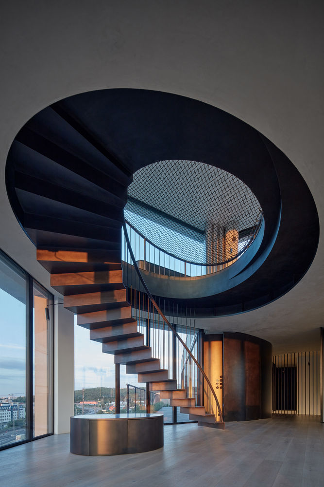
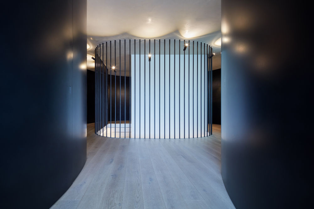
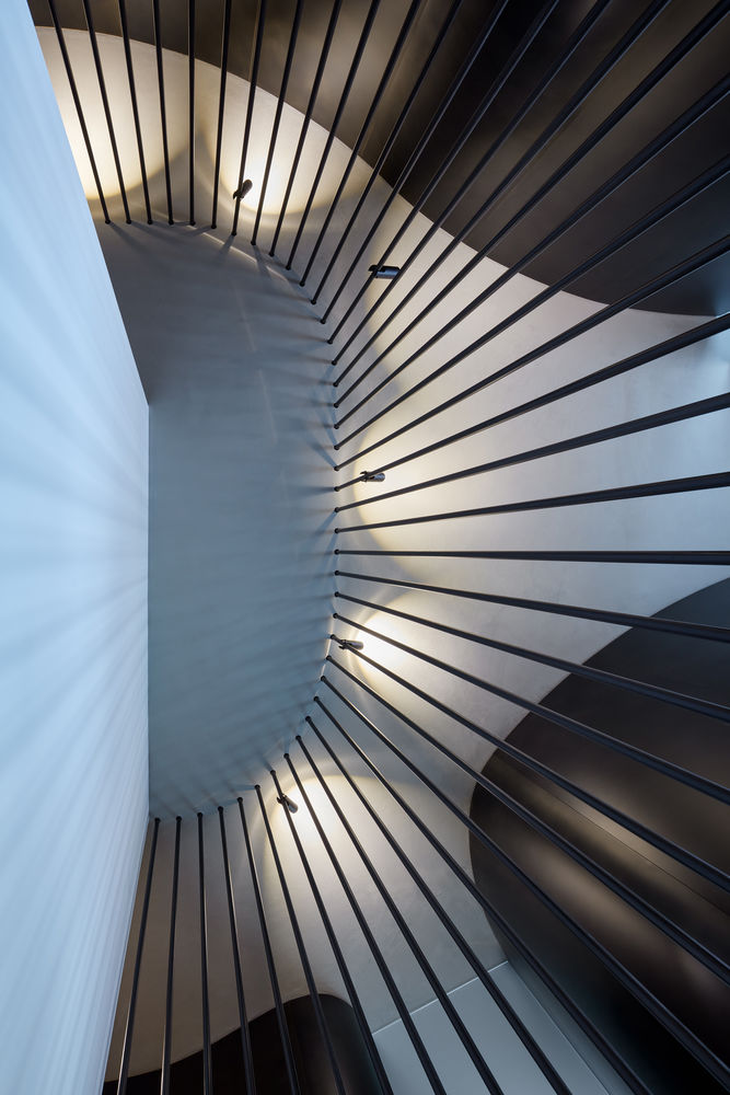
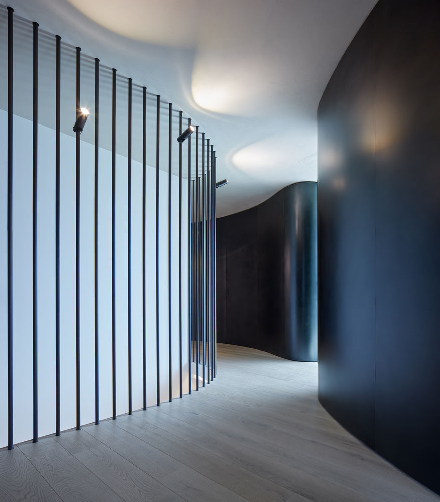
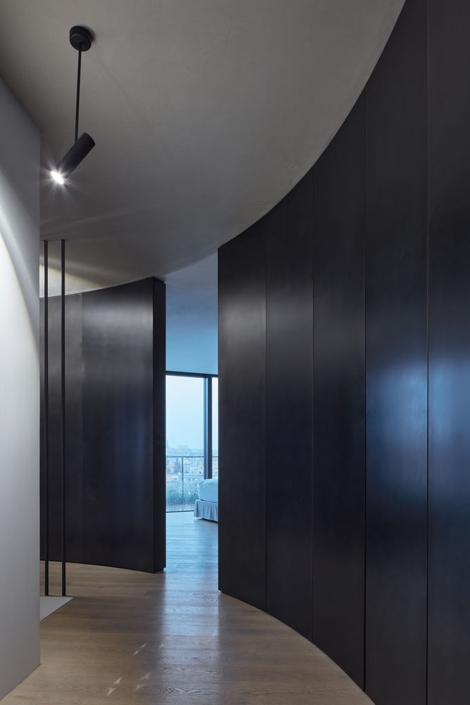
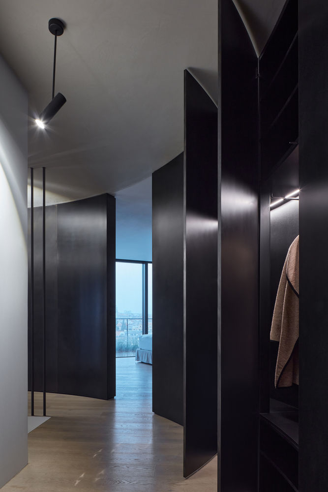
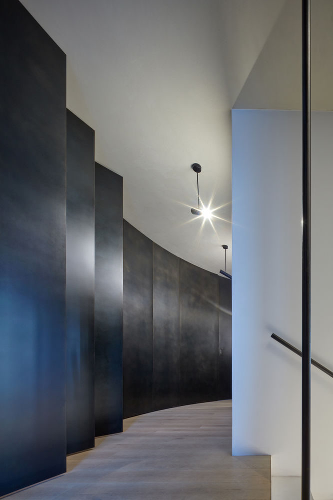
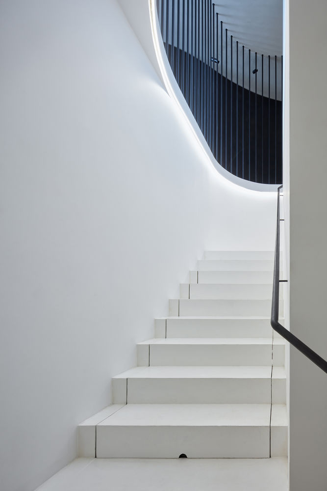
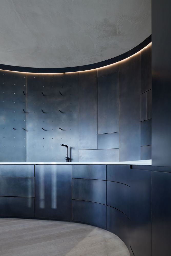
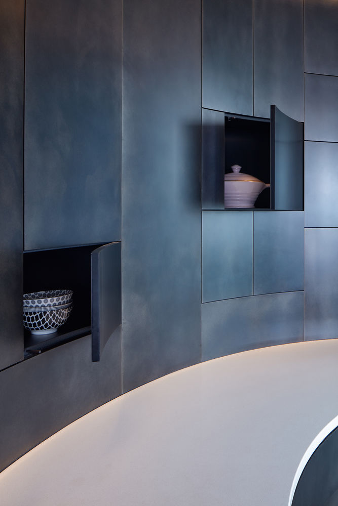
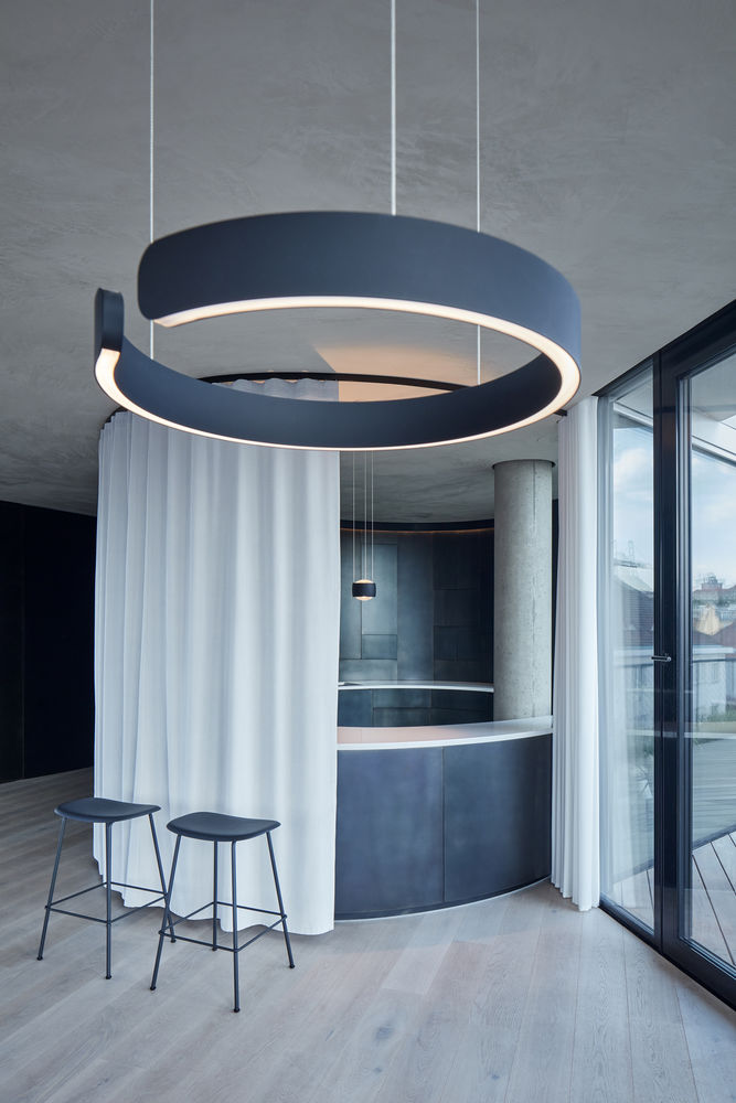
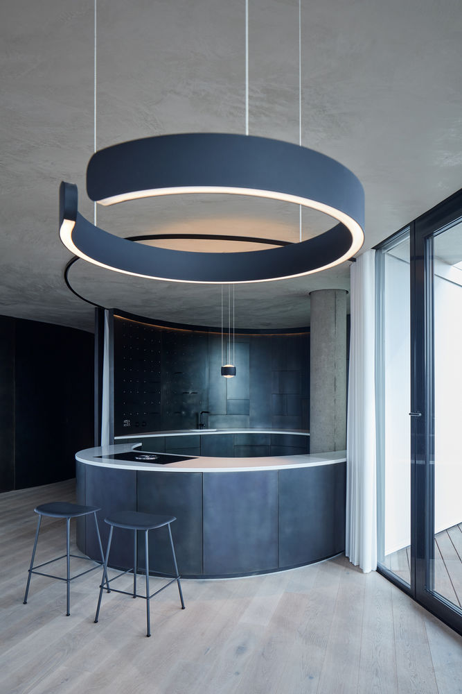
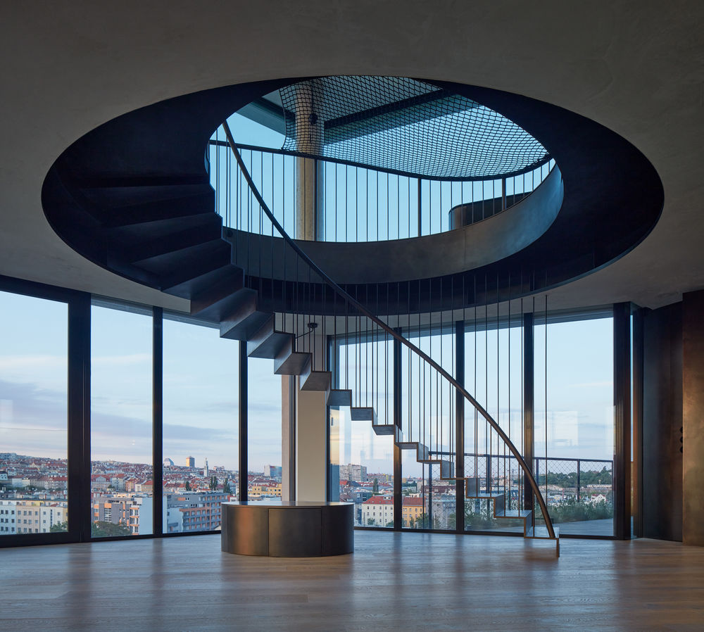
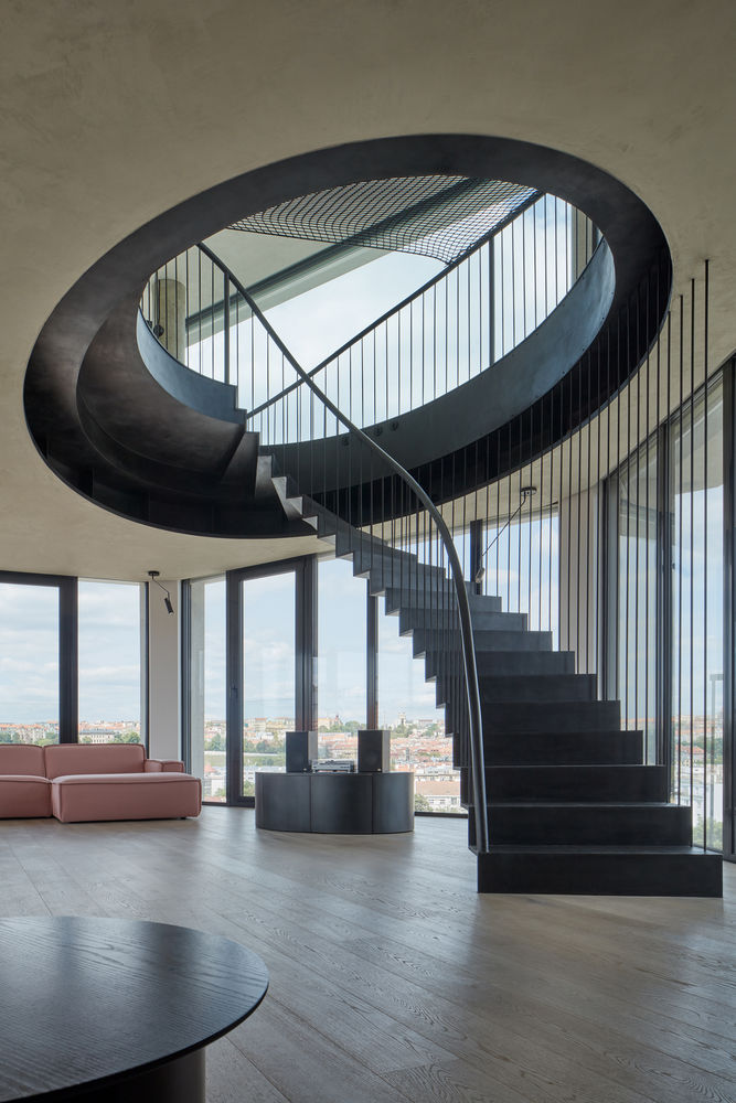
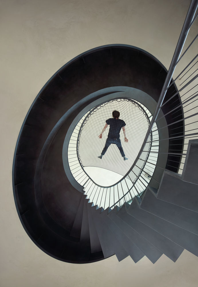
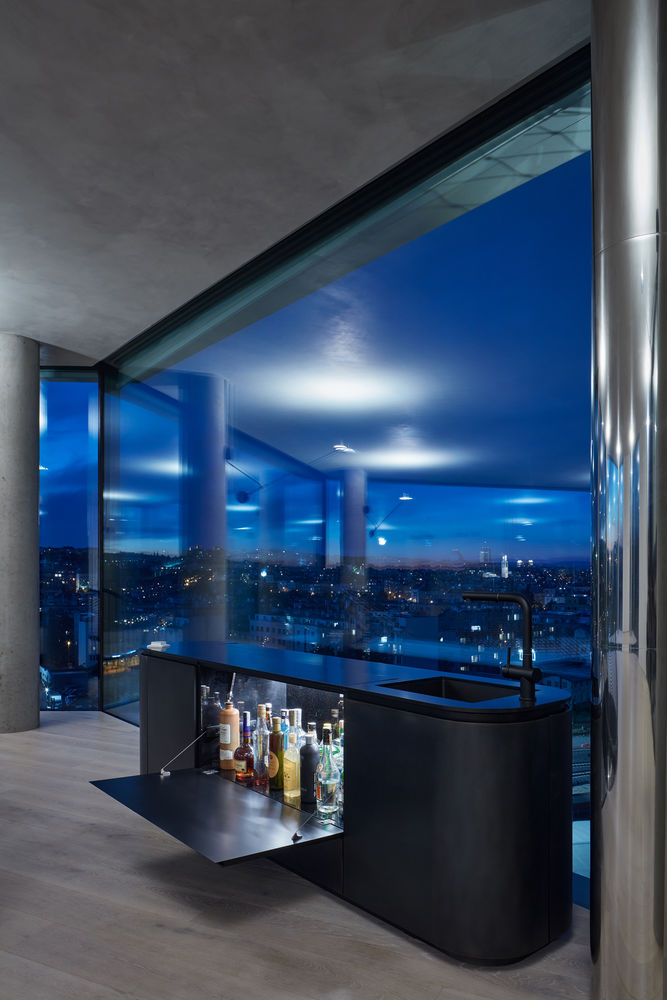
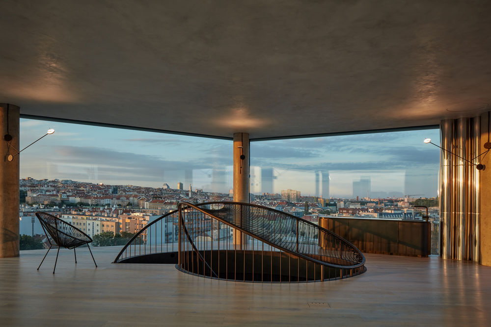
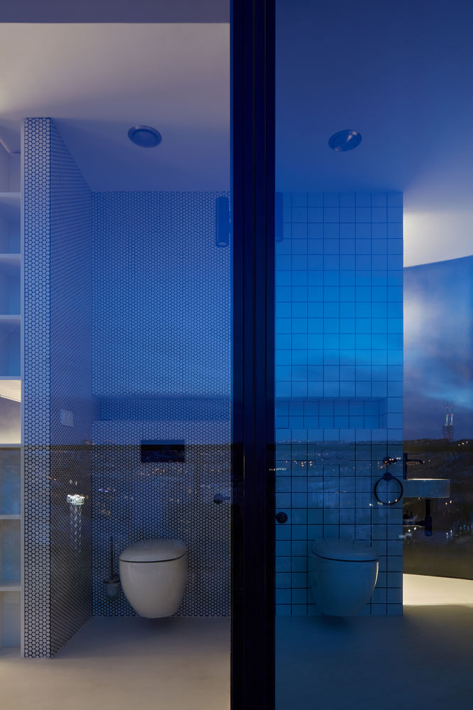
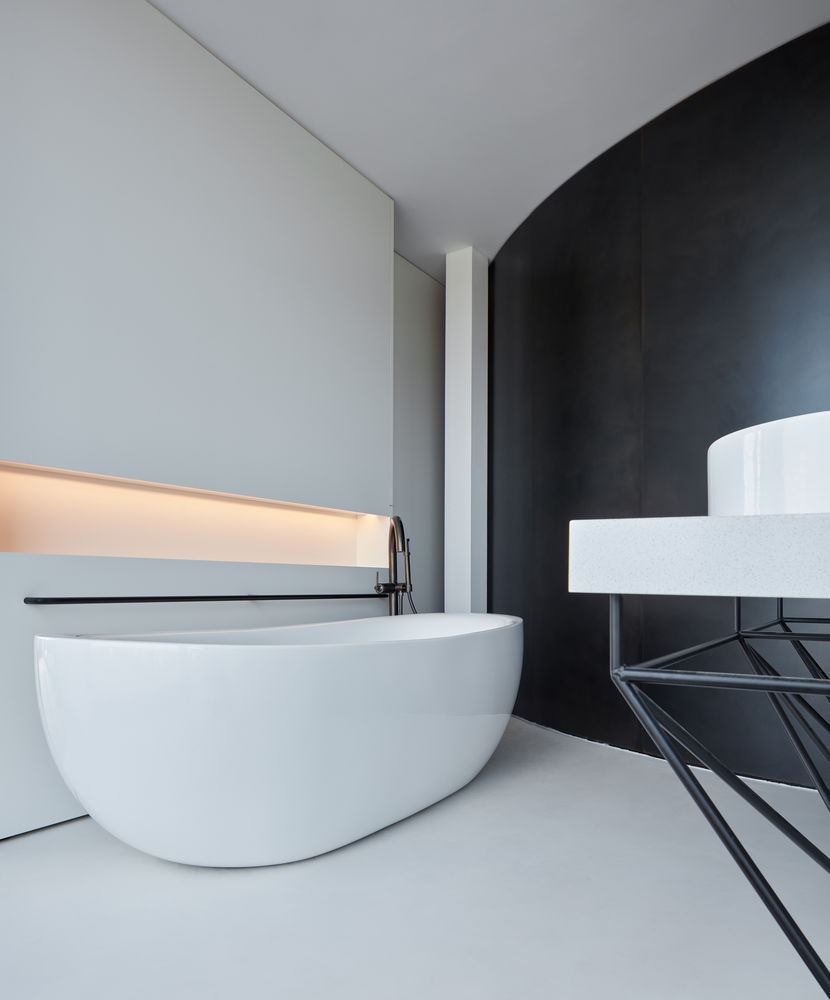
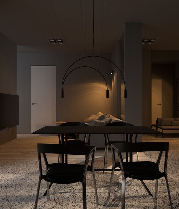
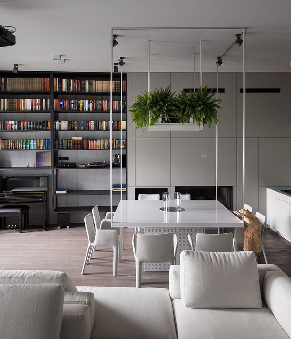
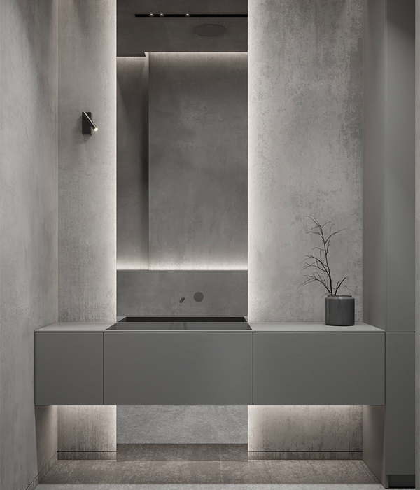
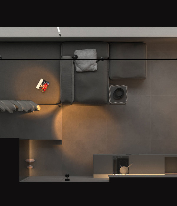
used correspond to the light and mostly white space and its division into two "worlds" by a dominant dark steel partition. Its surface is treated from both sides using etching, sanding and polishing on a hot-rolled black steel sheet sandwiched on a wood-fibre board. All of the doors and openings are frameless, cut into the continuous surface of this partition. The floor is made of wide planks running perpendicular to the main facade through the entire apartment and continuing to the planks on the terraces. The ceilings are finished with a fine texture, including the recessed parts of the lights and air conditioning and integrated covers for hanging swings and other elements on the upper floor. The railing of the interior staircase creates a rising and descending curve so as to interrupt the panoramic view as little as possible and equipped with a hammock with access to the place where the handrail touches the floor. The space is lit using diffused reflected light and hidden lines lining the curves of the partitions.
