位于阿姆斯特丹的国立博物馆是由荷兰建筑师Pieter Cuypers在19世纪末期设计的。该建筑有着双重的身份:国家博物馆,以及进入阿姆斯特丹南部的大门。博物馆的修建花费了高昂的成本,它连接了北部的老城区以及南部的新区。一条南北向的走道将建筑分为两个部分,因此也就有了两个入口(皆朝向北方)和两座主楼梯;这意味着博物馆只有二层空间相互连接,而首层和地下室均相互分离。
The Rijksmuseum in Amsterdam was designed in the late nineteenth century by Dutch architect Pieter Cuypers. The function of the building was twofold: one part was the national museum, the other the gateway to the south of Amsterdam. The museum use has paid an overly high price for its urban role as a connecting element between what was then the existing city – to the North – and the newer developments towards the South. A walkway – virtually a street – runs through the building from North to South splitting it in two parts, necessitating two entrances –both towards the North– and two main staircases; this means that only on the first floor are the Eastern and Western parts of the building are joined, while the ground floor and basement are divided.
▼博物馆外观,exterior view
该建筑在上个世纪曾经历过多次改造:出于对展览空间的需要,一些庭院中修建了新的展厅,这使得建筑内的自然光越来越少,也令空间变得更加错综复杂,不易辨认正确的方向。在那个年代,博物馆常有功能不全的情况出现,例如主厅无法为大量的参观者提供充足的空间,并且缺乏信息站、商店、咖啡厅、礼堂等现代博物馆常见的服务空间。此外,庭院和画廊空间也缺乏合理的尺寸和布局。
The building has suffered many interventions over the last century: the need for exhibition space has meant building within the courtyards which led to a lack of natural light. This also brought to a kind of labyrinth in which the visitor is given no information concerning their whereabouts. In summary, the museum suffered the usual lacks of museums of that period, i.e. a main hall unable to offer the proper capacity to the high number of visits and the need for essential services today such as information areas, shops, cafés, auditorium etc. In addition, the courtyards and galleries spaces lost their original size and shape.
▼南北向的入口路径将建筑分为两个部分,the museum passageway runs through the building from North to South splitting it in two parts
▼从入口路径望向两个庭院之一,one of the courtyards seen from the passageway
项目最初的目的是在通向博物馆主厅的路径上开辟一个独特的新入口,其次是修复庭院和展览空间,使其恢复原有的尺寸和状态。出于骑自行车者的强烈反对,第一个目标未能实现,但可以改为建造一个宽阔的中央大厅,使位于入口路径下方的东西侧庭院相互连接。彼此相连的开放式庭院提供了必要的服务空间,并且为建筑赋予了宏伟的尺度。游客从入口路径进入主厅之后,便可通过主楼梯到达各层空间。
The intervention on the building was, initially, meant to open up a new and unique entrance to the museum admission in the central passage hall, and secondly, to recover the courtyards and exhibition spaces, regaining somewhat their original state, or at least their dimensions. The first of these purposes could not be achieved due to the radical opposition of the cyclists, but it was possible to generate a large central hall to link the east and west courtyards of the building under the passage. The large space generated by opening and connecting courtyards houses all essential uses for visitors, and offers a suitable space on the scale that the grandeur of the building deserves. You enter this hall from the passageway, and the tours to the exhibition areas start at this point, linking with the original grand stairs.
▼庭院内部提供了必要的服务空间,the large space generated by opening and connecting courtyards houses all essential uses for visitors
▼庭院顶部装置着能够满足声学与采光需要的“枝形吊灯”结构,on each of the structure with an acoustic and lighting mission has been suspended, ‘chandeliers’
▼庭院连接了商店所在的地下室,the courtyard links to the basement including the museum shop
▼新建的空间使用了有别于其他区域的天然石灰石,in the new space created, natural limestone has been used as a basic material
新建的空间使用了有别于其他区域的天然石灰石,通过对照和反衬的方式将建筑的新旧部分统一为一个整体。花园中新修的两个小型建筑也使用了相同的材料。位于入口路径下方的两处庭院通过微微倾斜的地面相连,其顶部均装置着能够满足声学与采光需要的“枝形吊灯”结构。
In the new space created, natural limestone has been used as a basic material, a stone of a type not present in other areas of the building, but which allows us to unite the old and the new without complacency in the juxtaposition or contrast. This same material was used in the two new small interventions carried out in the garden. The courtyards, with a slightly sloping ground, are connected under the passage, and on each of the structure with an acoustic and lighting mission has been suspended, ‘chandeliers’.
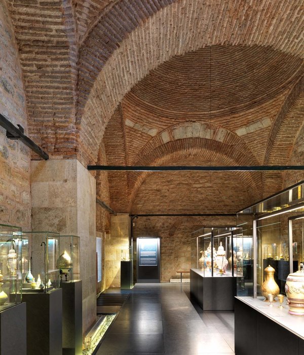
▼展厅内部,interior views
▼模型,model
▼场地平面图,site plan
▼地下一层平面图,basement plan
▼夹层平面图,ground floor plan
▼一层平面图,first floor plan
▼二层平面图,second floor plan
▼三层平面图,second floor plan
▼屋顶平面图,roof plan
▼立面图,elevation
▼剖面图,sections
MAIN DATA Client: Programmadirectie Het Nieuwe Rijksmuseum Address: Museumstraat, 1. 1071 Amsterdam, Netherlands Typology: Museums & Galleries, Transformation Status: Built TECHNICAL TEAM Collaborators: Alicia López, Ana Vila, Carlos Arévalo, Clara Hernández, Iko Mennenga, Jan Kolle, Joaquín Pérez-Goicoechea, José Luís Mayén, Juan Carlos Mulero, Luis Gutiérrez, Marije Ter Steege, Marta Pelegrín, Mercedes Pérez, Miguel Velasco, Muriel Huisman, Óscar García de la Cámara, Rocío Peinado, Rosa Melero, Sara Gutiérrez, Thomas Offermans, Tirma Reventós, Víctor Breña, Victoria Bernícola Arquitecto local: ADP architecten Restauración: Van Hoogevest Architecten Infography: Cruz y Ortiz Arquitectos, Indigo Model: Jacinto Gómez Fotografía: Arie de Leeuw, Eran Oppenheimer, Erik Smits, Iwan Baan, Jannes Linders, Jose Manuel Ballester, Luuk Kramer, Pedro Pegenaute Ingeniería de estructuras: Arcadis Ingeniería de clima: DGMR, OVE Arup Survey: Cruz y Ortiz Arquitectos Control de Obra: Rijksvastgoedbediÿf Constructoras: BAM, Hömy, JP van Eesteren, Kuipers, Unica, Woudenberg
{{item.text_origin}}


