Architect:CF taller de arquitectura
Location:Punto Sur, Guadalajara Jalisco, Mexico; | ;View Map
Project Year:2023
Category:Offices
In response to the diverse needs of its clients, Santander has developed different types of banking services to meet each demand. These range from the most traditional to the most exclusive, while maintaining the same quality and attention to detail across all of them. The purpose of this project was to create an image for the type of branch that brings them all together, along with the bank's offices, in one space.
The challenge was how to maintain the identity of each variant while also making them feel like a single element. The solution is a flexible and comfortable branch that invites users to explore the different options offered by the bank and manage their various accounts in one open space.
As you walk past the branch located within the Punto Sur shopping center in Guadalajara, Jalisco, Mexico, the space opens up, prompting you to wonder what it's all about. It's not a traditional branch, and that's exactly what was intended from the outset.
Upon entering from the plaza, the branch is isolated, with the predominant color on walls and ceilings being absolute black.
The first stop is the lobby, a double-height area that provides access to the ATM zone, the reception, or directly upstairs to the mezzanine where the private banking is located, either via the rear stairs or the elevator. This maintains the dynamic and open space while making a distinction for premium clients who visit the branch.
A few steps forward isthe "work-coffee" bar, which resembles a café with small round tables, inviting you to enjoy a drink before or during your transaction at the teller windows.
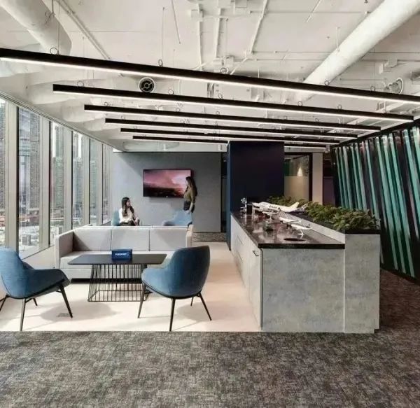
The next double-height area corresponds to the central space, the heart of the project, where the two metal bays – private banking and office area – frame the oak wood steps and a bridge made of Irving grating that connects them.
In this space, all types of clients from different banking services can be attended to, whether at the tables or on the wooden steps, where Santander employees also receive group training sessions.
Underneath the office bay is the area for medium-sized businesses, which connects with the double-height space, seamlessly blending with it. This area also features meeting rooms at the back – more private or enclosed – that can be used by clients.
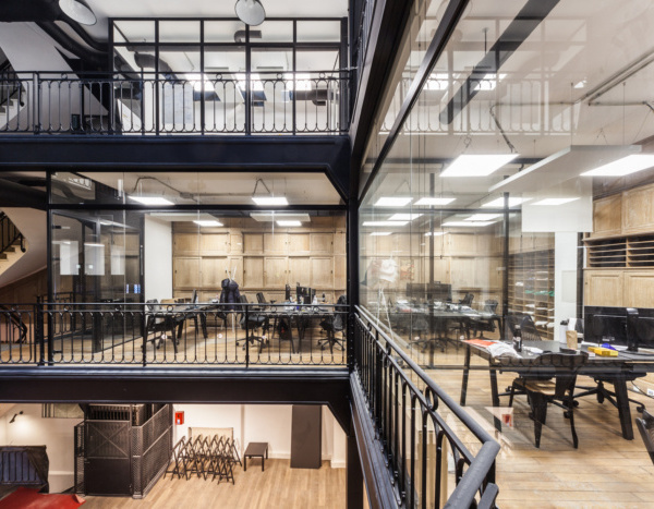
The base tone of the place gains texture thanks to steel plate louvers on the windows of the private areas in the upper bays, the beams supporting these mezzanines, and the Irving grating metal structures on bridges and elevators.
It's in the furniture, the wooden steps, and some wall accents with oak marimbas that these spaces acquire character, giving the sensation of independence between them while also feeling integrated as they emerge from the absolute black.
This is supported by the lighting design conceived by ILWT, which proposes pinpoint spots that reinforce the segregation of zones, with ceiling fixtures illuminating the tables and work areas, while the rest bathe the walls emerging from the ceiling or floor, highlighting the textures in the materials without overpowering to ensure that, despite being such an open space, the areas are revealed gradually as one moves through them.
Multibanca Santander is an innovative concept that lays the groundwork for future branches, both in terms of the designed materials and lighting, as well as the distribution of the different banking services and offices, which convey independence and specific use but also form part of an integral concept.
Architecture: CF taller de arquitectura
Collaborators: Shary Ramírez, Ricardo García, Yoselín Haro
Construction: gsarch
Photography: Lorena Darquea
1. Illumination: ILWT
2. Carpets: Interface
3. Furniture: Herman Miller and DVO
▼项目更多图片
{{item.text_origin}}

