挪威 Ny Krohnborg 学校 | 社区活力中心的重生
- 项目名称:Ny Krohnborg School
- 项目规模:3860平方米
- 设计方:Arkitektgruppe Cubus AS + Rambøll Norge
- 摄影师:Hundven-Clements Photography
Ny Krohnborg School
设计方:Arkitektgruppen Cubus AS + Rambøll Norge
位置:挪威
分类:教育建筑
内容:实景照片
景观设计师:Eva Louise Korsøen, landscape architect MNLA Ingvild Nesse (landscape architect MNLA), Line Ramstad
设计团队:Trude Ellingsen (architect MNAL), Lena Beate Keilegavlen (architect MNAL), Ingrid Melvær (architect
承包人:Brødrene Ulveseth AS
项目规模:3860平方米
图片:30张
摄影师:Hundven-Clements Photography
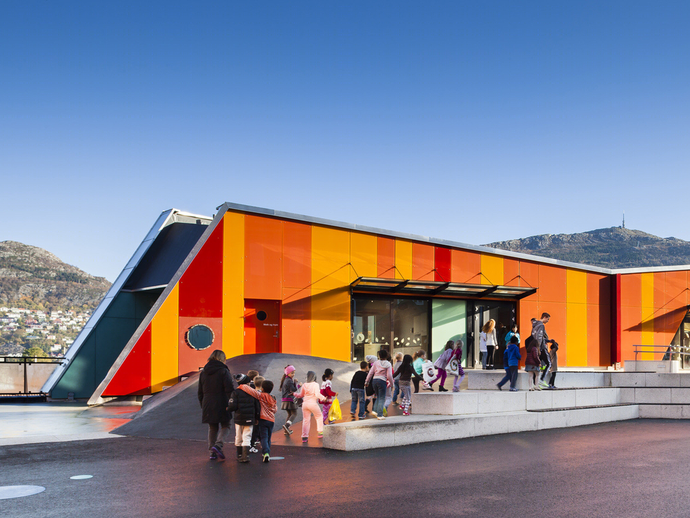
这是由Arkitektgruppen Cubus AS 与 Rambøll Norge联合设计的Ny Krohnborg学校。该项目将当地一所破败的学校重建,成为当地社区的活力中心。
设计团队于2005年开始实地考察,认为这破败的街区社会交往不足的现状,是由于当地缺乏安全感,缺乏有吸引力的聚会场所及活动场所,邻里关系消极。因此,该设计旨在创造一个新的活跃焦点,激活整个地区,加强社会结构以及邻里关系。
现状学校位于Løvstakksiden街区的中心位置,靠近滨海区,周边有许多住宅,其中包括政府福利房。场地交通便利,与轻轨、公交通行方便。因此,这些条件促成了这个将运动馆、文化舞台与现状学校结合的方案。
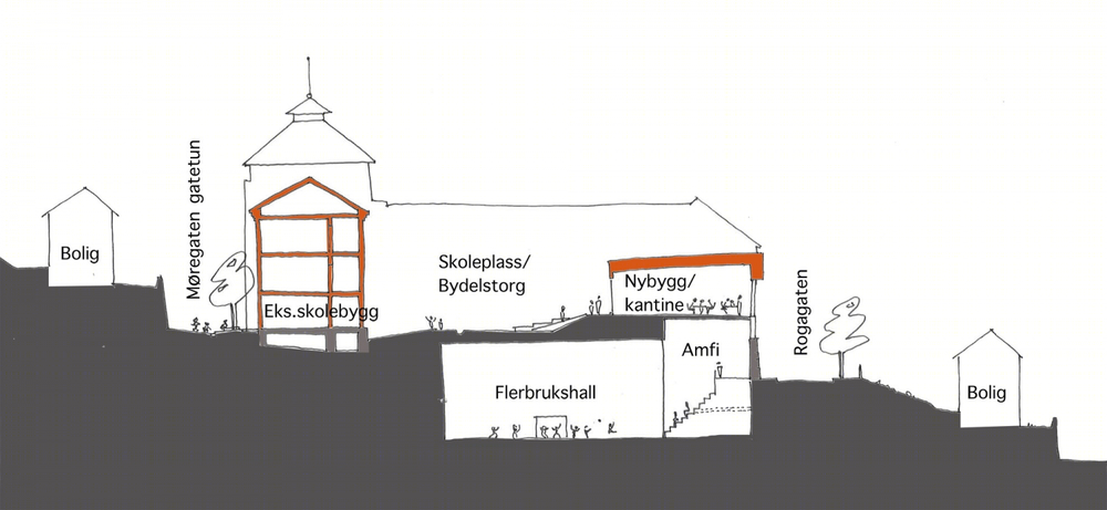
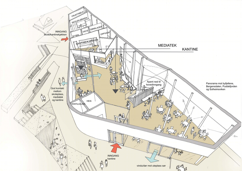
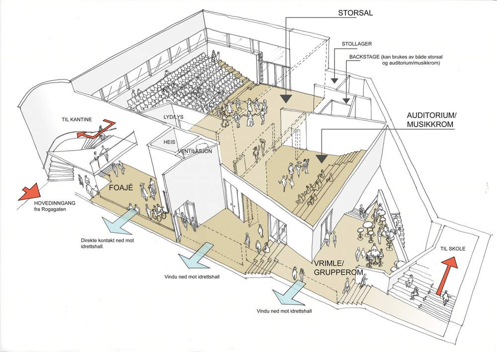
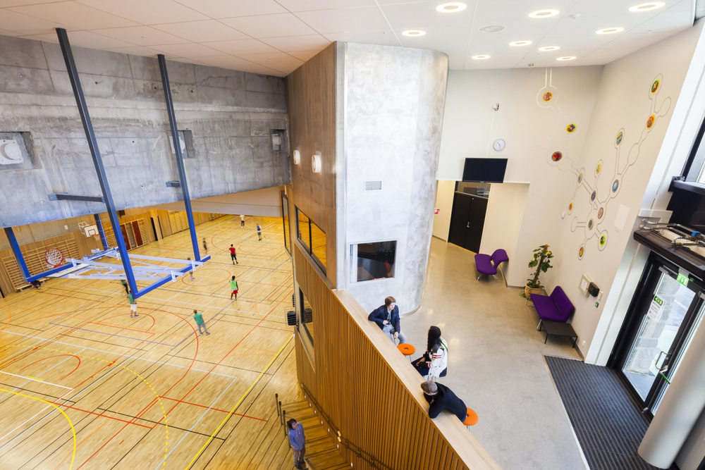
现状学校位于一个紧密而倾斜的场地,被两条街道夹着:下方的Rogagaten街以及上方的Møregaten街。新建的运动馆满足国际标准,并提供舞台及音乐设施、社区咖啡厅。而社区服务区布置在底层,对着Rogagaten街开放;而学校相关功能区与上方的庭院形成直接联系。建筑夹层布置了健身室及技术用房。
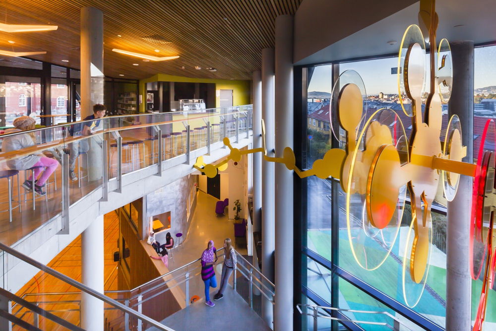
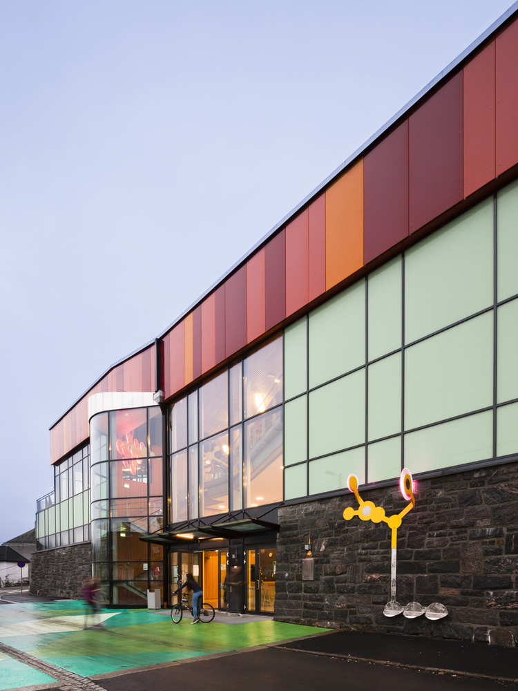
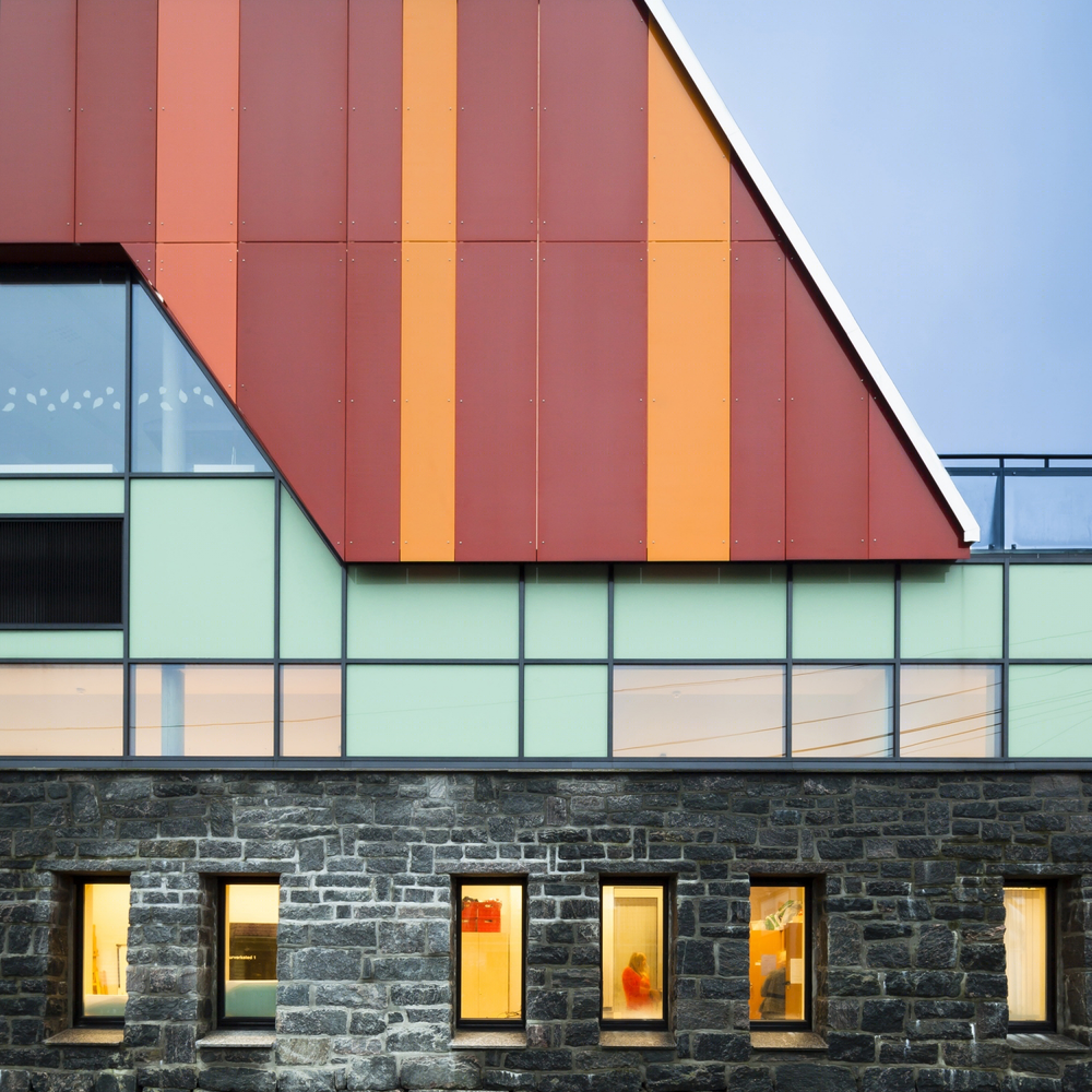
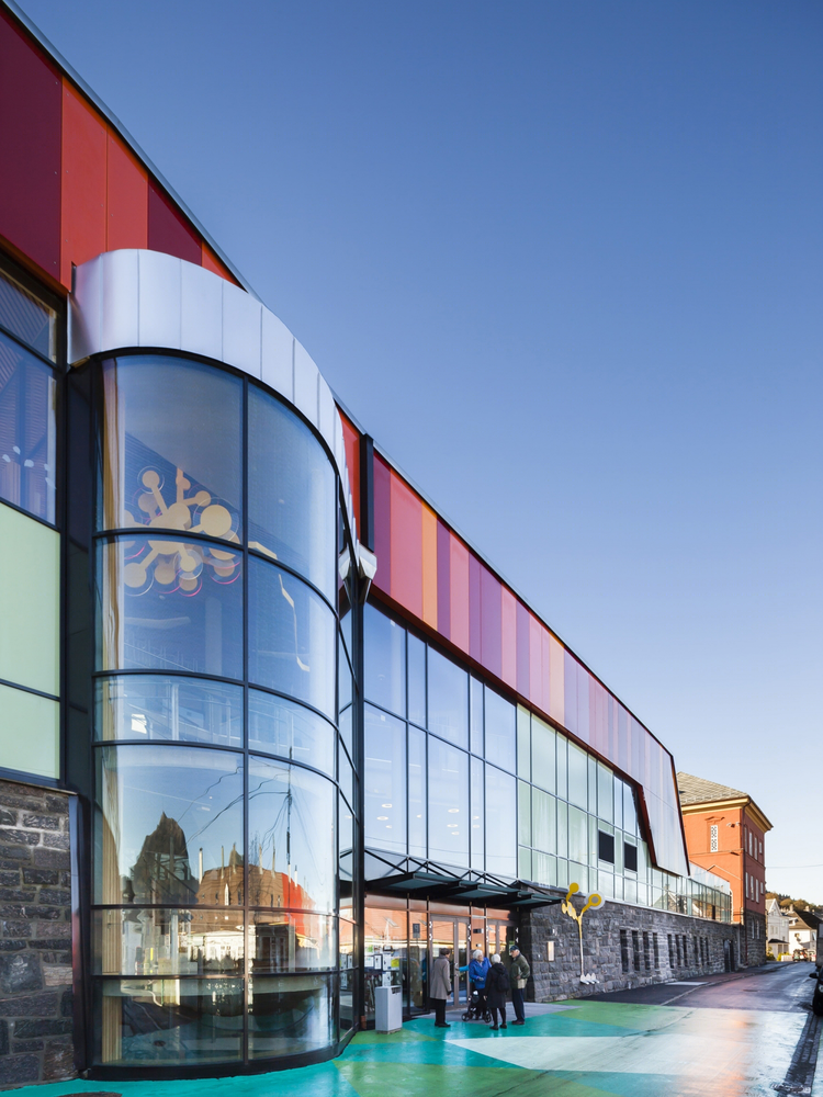
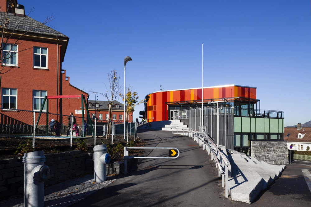
建筑外观采用了天然石材、石瓦片、小窗格窗户、铸铁及镶板门等材料,而室内则主要采用了耐用美观的材料,如石板地板、护壁砖等。新建建筑采用了轻盈、现代的设计,利用大面积的玻璃窗引入周边的风景。现状墙壁是赤土色,通过玻璃幕墙的重复运用以及橙色、紫红色的对比色形成丰富、生动的立面色彩。
译者: 艾比
Ny Krohnborg – The rehabilitation of a run-down local school becomes a vehicle for neighborhood regeneration. The rehabilitated Ny Krohnborg school and nursery is the beating heart in a renewed neighborhood.
From site study to urban renewal process.
In 2005 the architects in Arkitektgruppen Cubus AS were asked to present a proposal for the conversion of a wartime bunker in a run down neighborhood to a local sports arena.
The bunker proved insufficient in size, and a search for alternative sites began. This quickly lead to the realisation that this run-down neighbourhood had very little social interaction and very low self esteem, largely due to the lack of safe and attractive meeting and activity places and a negative community identity.
An urban analysis was undertaken in order to map the area’s qualities and challenges. The process ended with an integration of the new sport arena as well as some neighbourhood functions into the existing school, thereby creating a new and lively focal point for the whole area. This proved to strengthen both the social structure and the identity of the neighbourhood.
The existing school.
The existing school come nursery has a central location in the neighbourhood of Løvstakksiden, close to the urban renewal seafront site by Damsgård and surrounded by housing areas, of which many are council flats. The area has easy access by lightrail and bus. The idea to co-locate the sports and culture arena with the existing school proved to have many advantages, and became the start of an exciting project that infused the neighbourhood with new energy and optimism. The school became the beating heart in the neighbourhood.
The project is a good example of how the closely interweaved design process between landscape architects (Arkitektgruppen Cubus) and architects (Arkitektgruppen Cubus AS and Rambøll) allows for developing a more coherent project, where architecture, landscape and urbanity merge to create unexpected synergies and potential for both form and function.
Parameters.
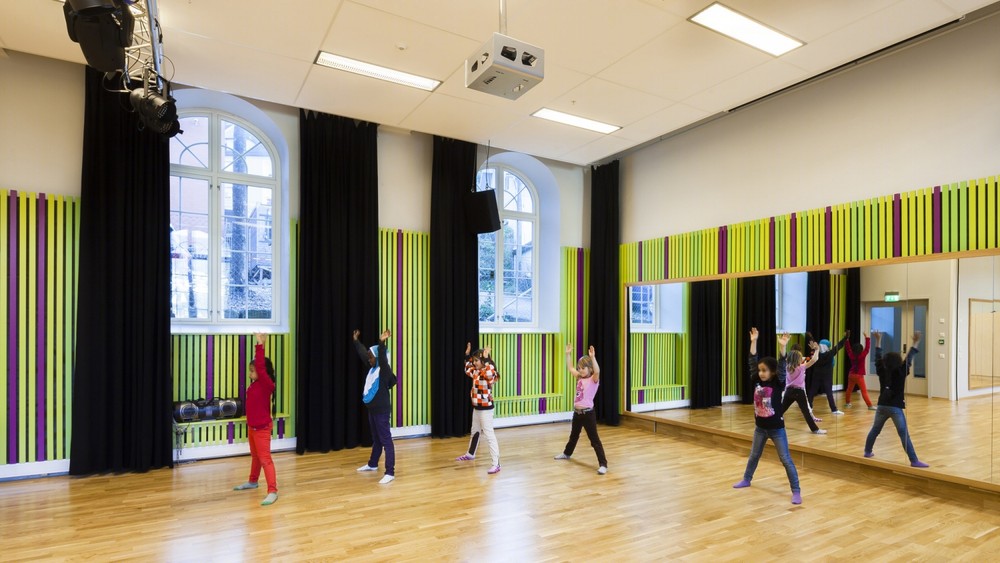
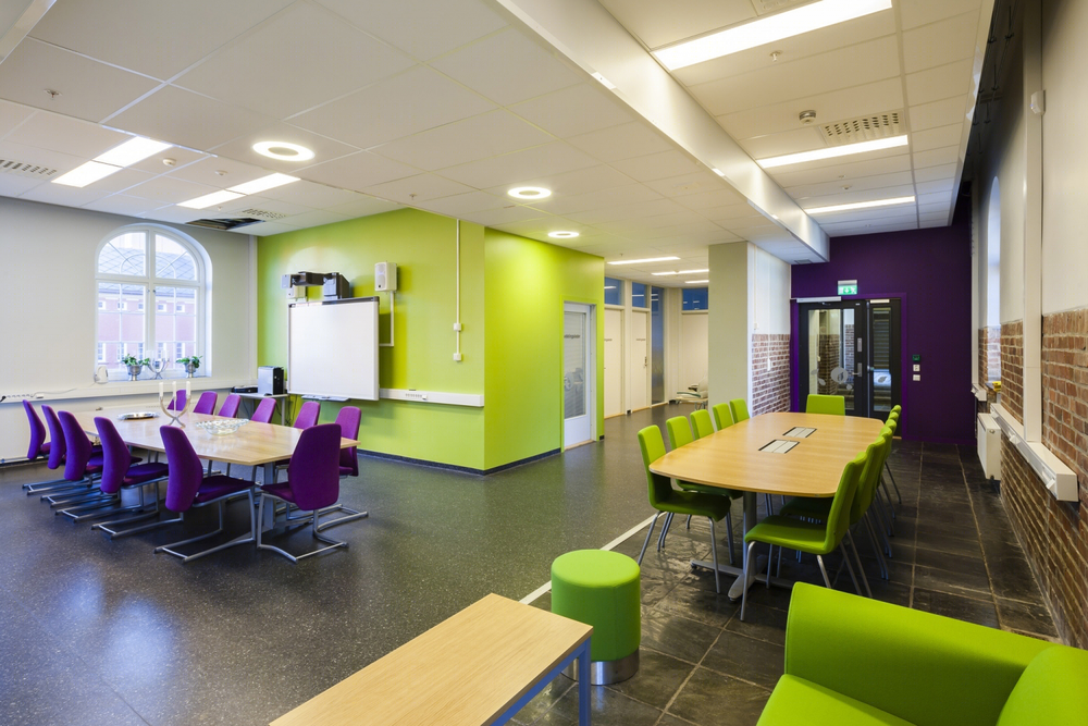
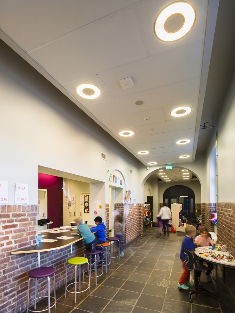
The existing school was a listed building and close cooperation between designers and the heritage office was necessary in order to find a good balance between preservation and redesign. The original expression of the external facades, such as natural stone work, slate roof tiles, small pane windows, cast iron details and panelled doors has largely been maintained. Interior details and materials that were durable and aesthetically pleasing such as flagstone flooring and dado brickwork have also been preserved. Some subtle alterations have been made to allow for better use of daylight and increased functionality, new doors and internal windows between the corridor and the classrooms, two new bay windows on the north facade allow both a view out and let daylight in to the previously dark spaces.
The existing school was designed by the municipal architect Kaspar Hassel in 1924. The existing school has a massive and majestic expression. The new building has a contrasting expression of lightness and modernity, utilizing large areas of glazing allowing the surrounding distant landscape to be visible through it. The existing walls are terracotta red, a colour that is repeated in the new glazed facade with the addition of some contrasting shades of orange and mauve to create a more lively expression.
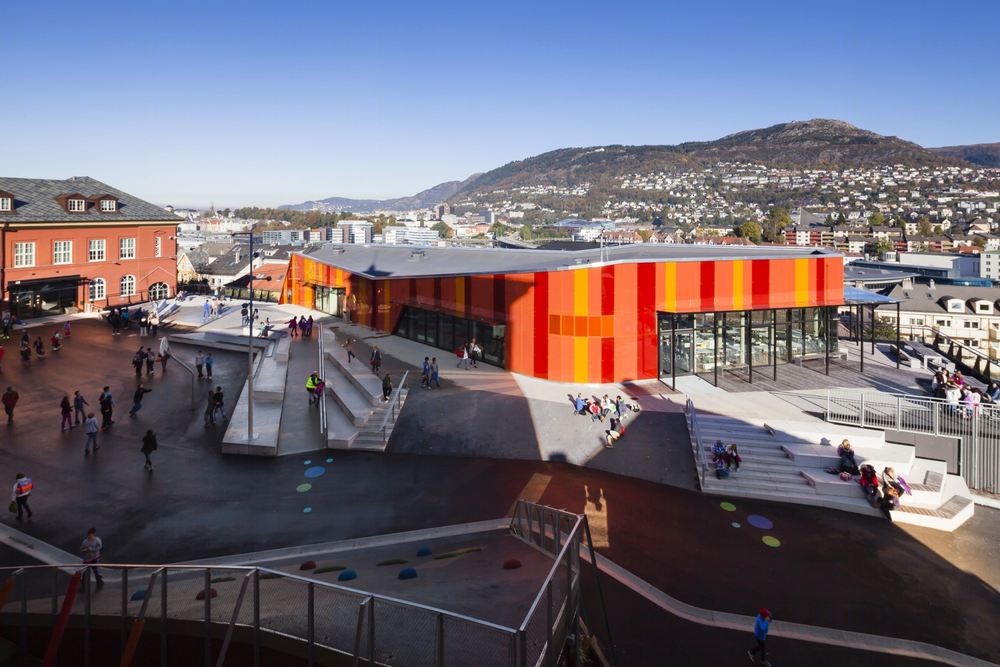
In addition to being environmentally beneficial, re-use of an existing building can also have exciting synergy effects; the co-location of and old school and new sports and culture facilities gives a wider range of use than any of the projects would have been able to provide apart. The sports hall is an integral part of the school and nursery during day time, whereas it is open to the public after hours. The schoolyard landscape is likewise a popular arena for outdoor sports and activities in the evening. The central location of the school in the domestic neighbourhood reduces need of transport.
Landscaping.
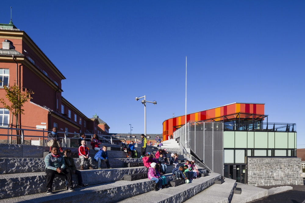
The schoolyard is created on the roof of the sports hall. Elements that invite play and activity are designed as an integral part of the form and materials, such as surfaces for skating, running and cycling, ramps for skating and sledging, walls for climbing or acrobatics and a small amphitheatre. The seamless coherency of architecture and landscape offers a safe, varied and inviting environment. Along the edges of the old school wall the roofscape is chamfered to allow for the authentic stonework to be visible.
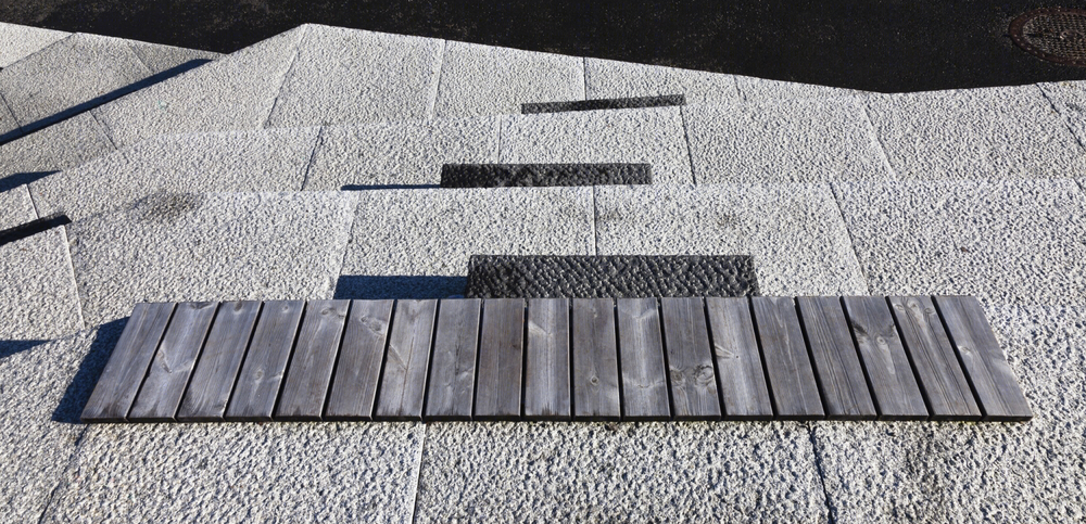
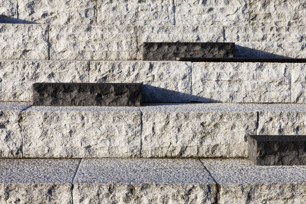
The schoolyard is accessed from Rogagaten below by a natural stone amphitheatre with seating. This space provides a focal point for the whole neighbourhood and can be use for social gatherings and ceremonies.
Climbing plants add a touch of green to the buildings and this bright grass ”rug” marks the main entrance to the neighbourhood programme in Rogagaten, so as to encourage vehicle speed reduction. The cast iron fences, flagstones and existing vegetation has been carefully repaired and this has acted as an inspiration to the rest of the project so that high quality materials are utilised in the new elementsas well, so as to create a coherent whole and continuity between the different spaces and levels.
Universal design.
The original school gave access via narrow flights of dark stairs both externally and internally. The rehabilitation has established new infrastructure to give universal access to all levels of the main part by both lifts and ramps, as well as improved interior lighting and better visual signage including colour coding. The new part has its own lift connecting all 3 levels: U-1, U and level 1.
Also the external landscape is designed to give universal access via sloping planes and ramps to all areas whereas before there was a multitude of levels interconnected with stairs due to the topography of the steep site.
Møregaten pedestrian street
Møregaten is a pedestrian thoroughfare route as well as neighbourhood play area. The nursery has it’s own designated play-area but the youngest school children have direct access to the street from each classroom.
The design brief was to transform a rather dark and dank street into a bright and inviting activity area that is coherent despite the necessary railing and fencing. A variety of robust, high quality materials like paving brick, recycled cobbles, wood, impact flooring and vegetation creates a varied, inviting space in the street along the terracotta-red school walls.
Benches, new lighting, existing Linden trees, new climbers, flowering bushes and beach stones gives the street a luscious and comfortable atmosphere. Edges, planes and small terrain modulations creates a microspace with a variety of possibilities for play and enjoyment.
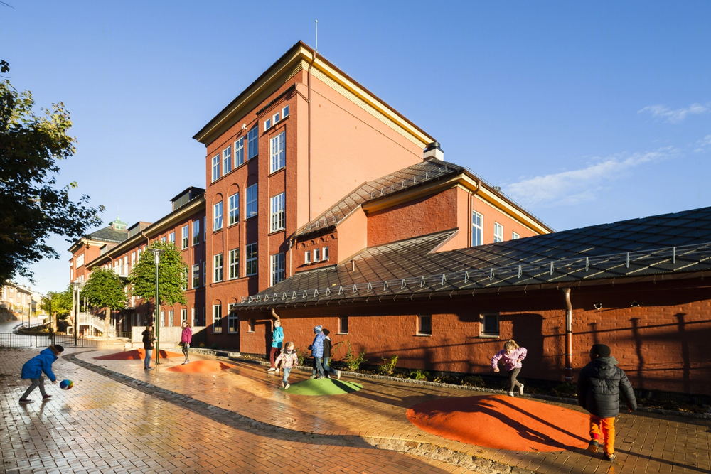
挪威Ny Krohnborg学校外观图
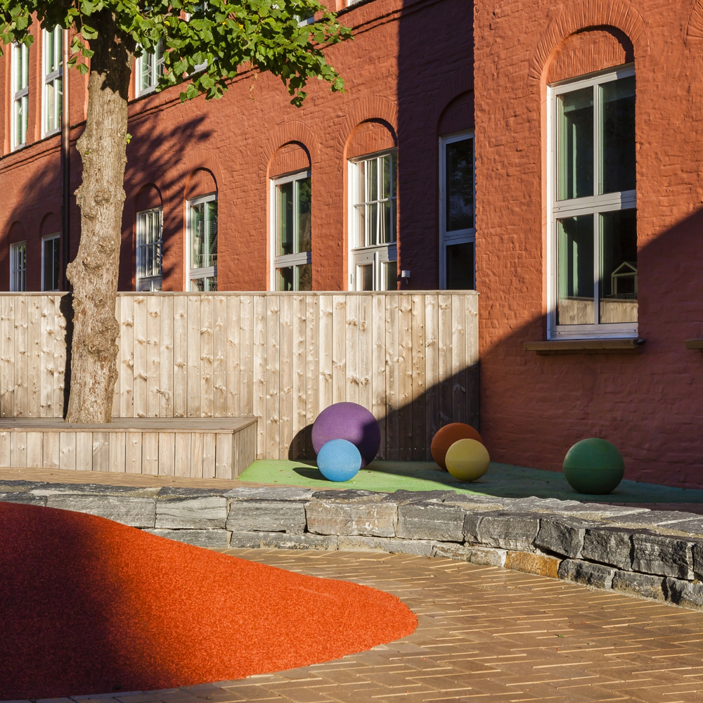
挪威Ny Krohnborg学校外部局部图
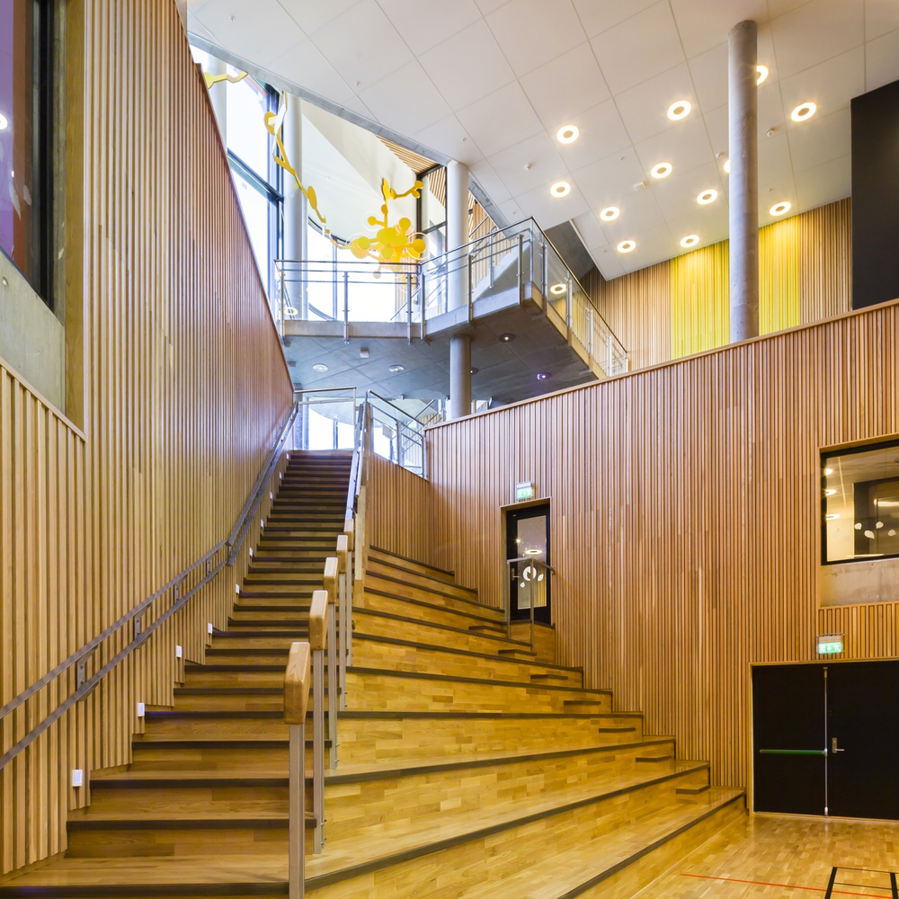
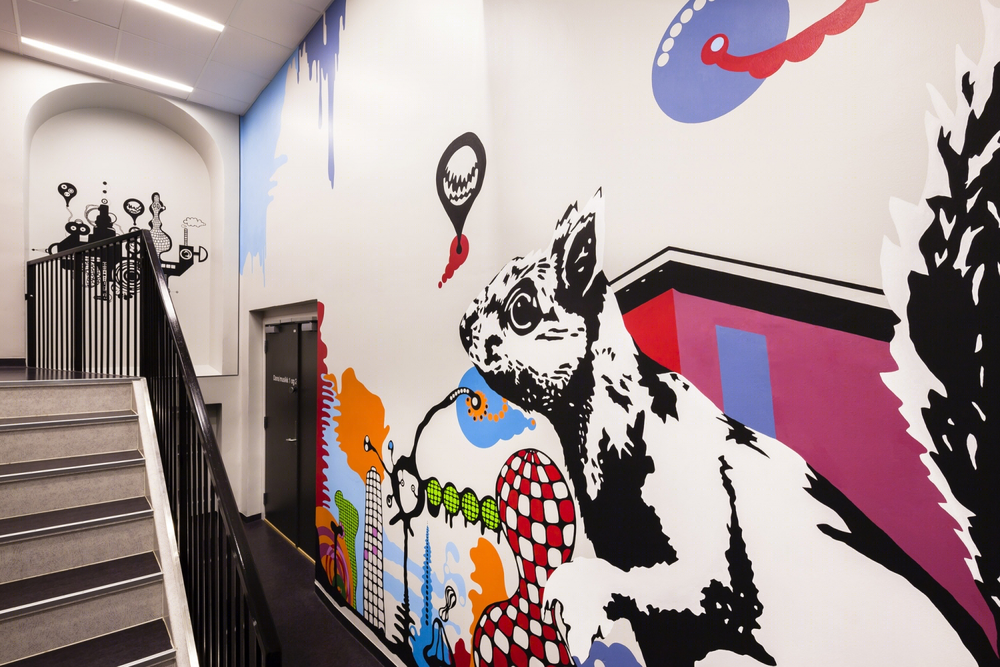
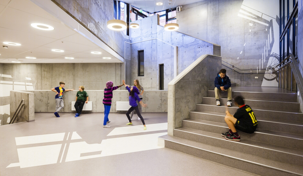
挪威Ny Krohnborg学校内部楼梯图
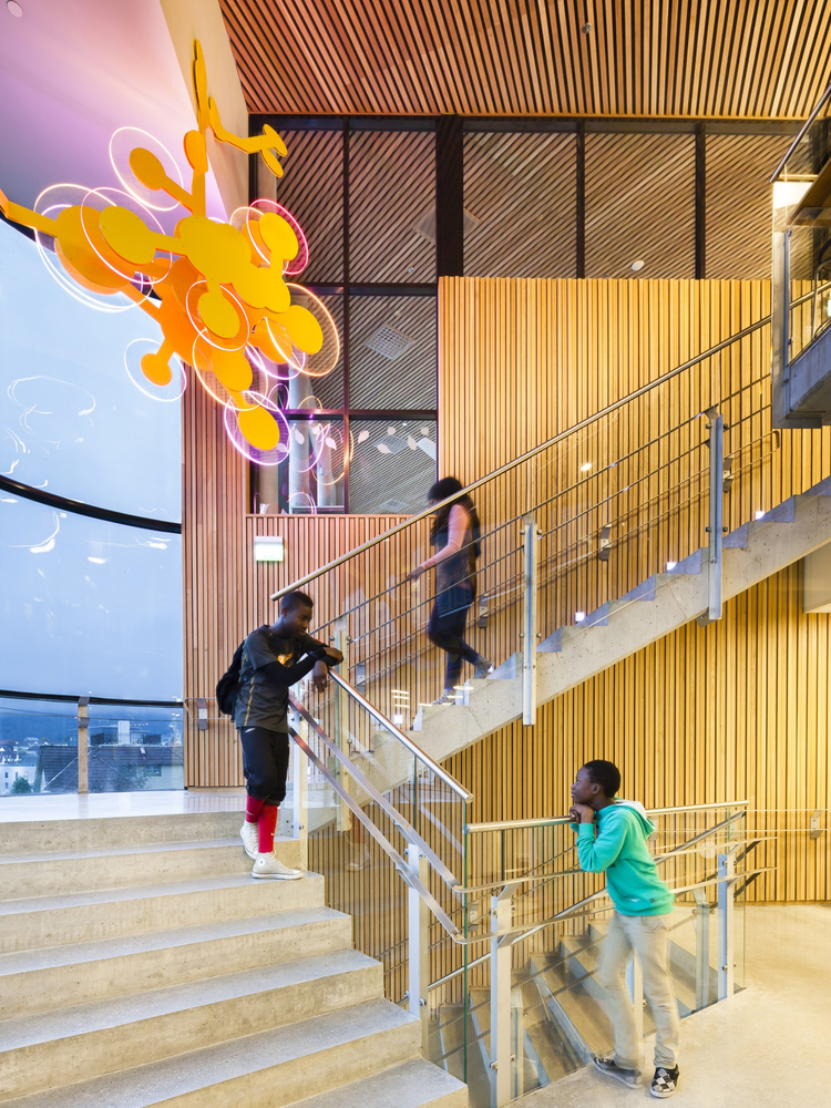
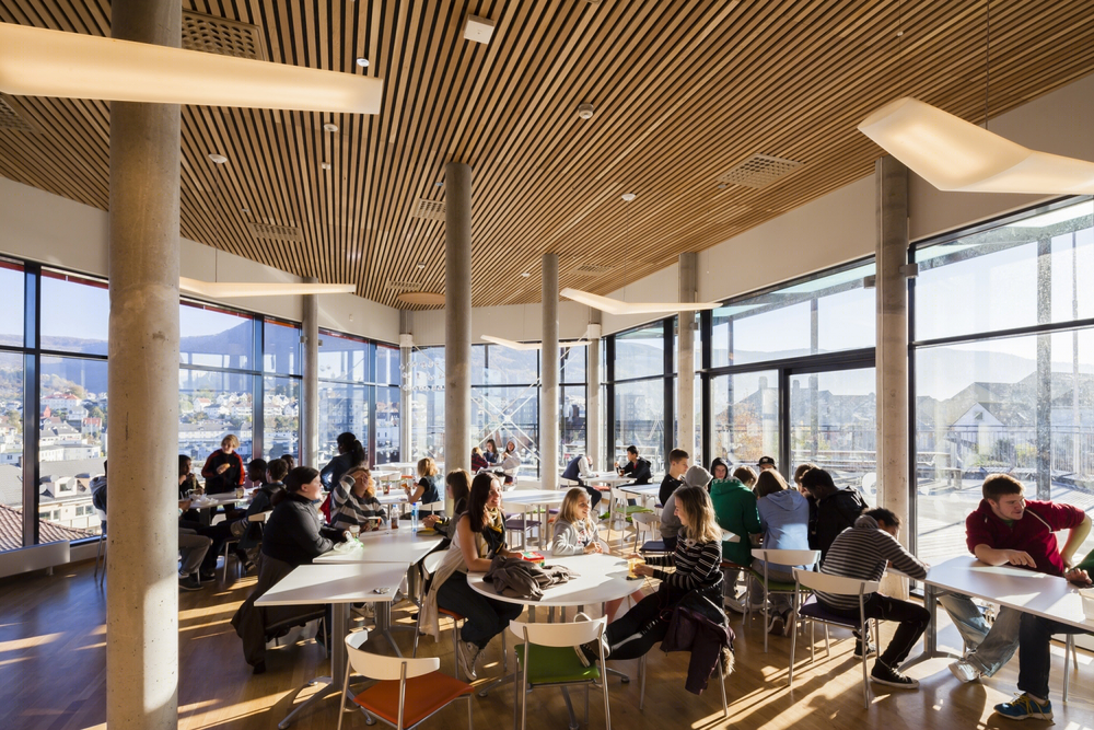
挪威Ny Krohnborg学校内部餐厅图
挪威Ny Krohnborg学校

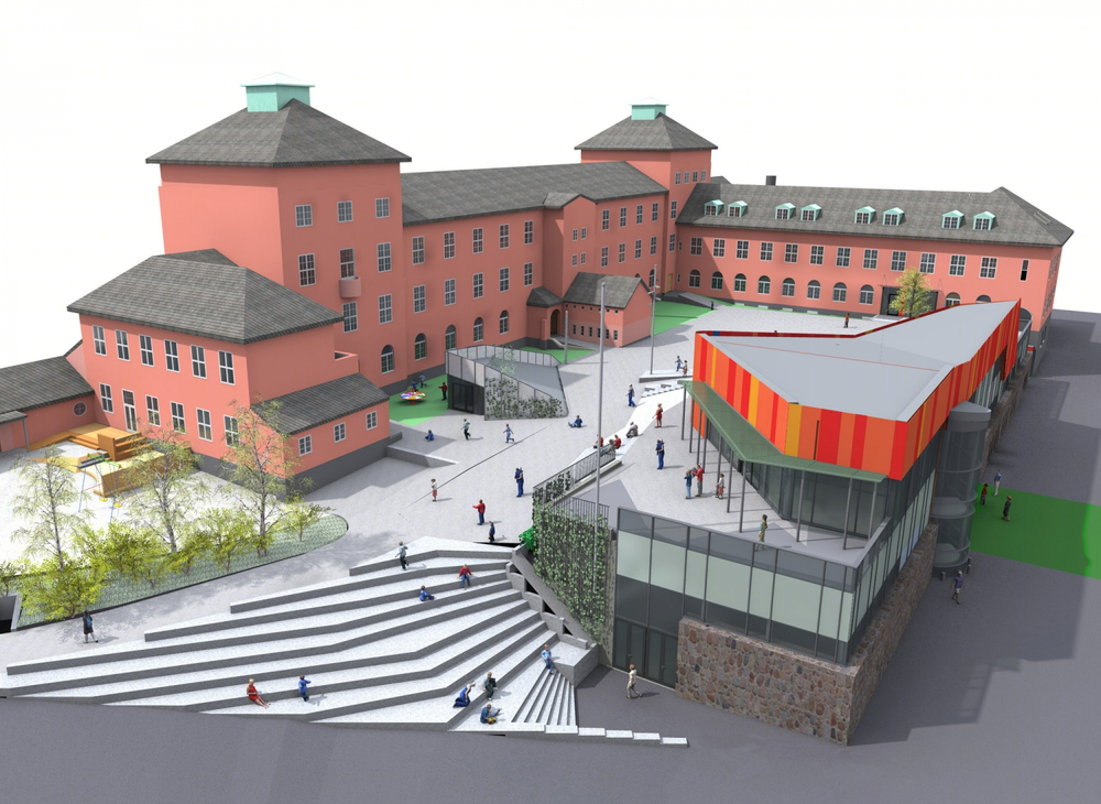
挪威Ny Krohnborg学校图解
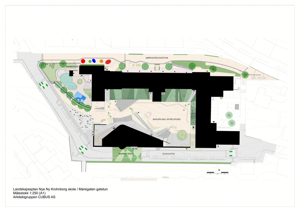
挪威Ny Krohnborg学校景观规划图
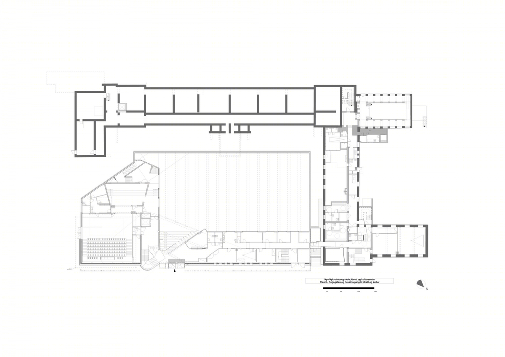
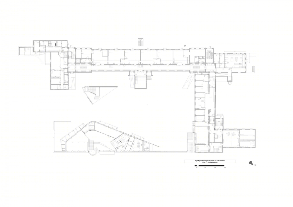
挪威Ny Krohnborg学校平面图
