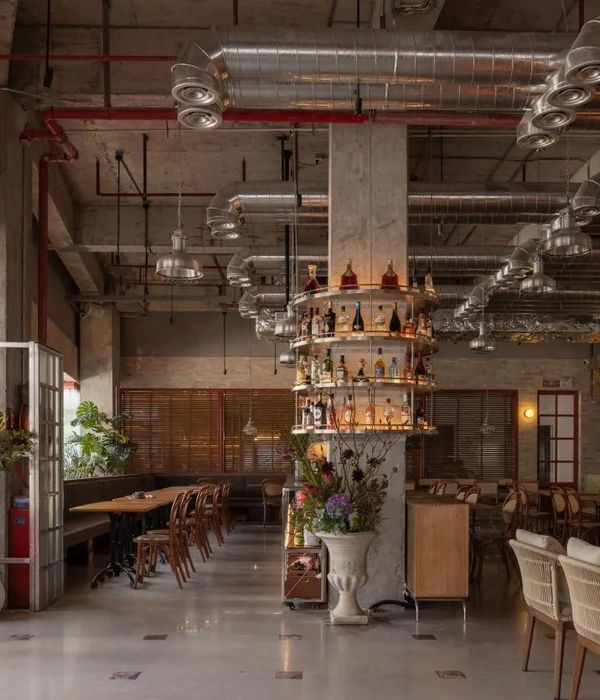
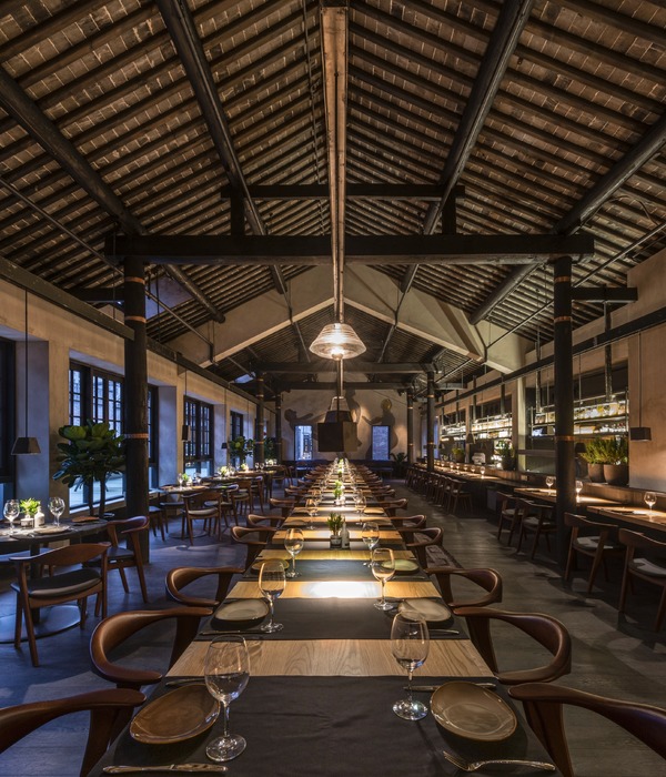
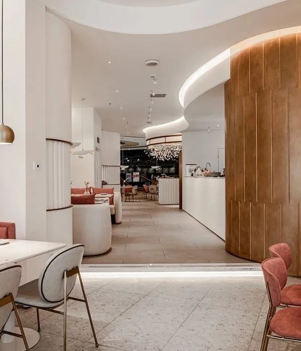
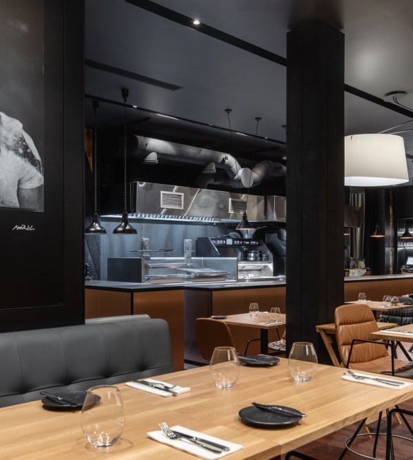
Following the first Ted which is located in Prati neighborhood in Rome, the new space in Ostiense area is more oriented to the nightlife. The interior has a different spacial layout and new custom design but keeps a sense of continuity between the first restaurant. The main theme is the layering of different materials and constructive systems which all tie in harmoniously. The purpose was to enhance the historicity of the site avoiding a vintage effect. The entrance is characterised by a golden aluminium counter with a big neon signage, all surrounded by thick velvet curtains which welcome the customer in a muffled atmosphere. Upon entering through the drapes the restaurant is a big open space with refined wooden floor in contrast with the rough walls and ceiling, all covered in a dark grey paint. Tables are all oriented to the center of the room thanks to a long banquette seating made in black leather which follows the perimeters of the space. Bespoke tabletops are made of natural oak with the exception of round tables and social tables, lacquered in orange and green. The wood and marble bar counter and the high social table are on a higher level, a concrete-made platform step at the back of the room. A big mural upon the kitchen window is the backdrop of the restaurant, painted in bright colors by London artist Nella Scott. The whole interior features the contrast between materials and colours, rawness and preciousness. The concrete pillars with the textured acoustic ceiling with the exposed piping, the dark oak floor and the lacquered tables, the painted brickwork and the shiny ceramic cladding of the walls. The lamps, classic “linestra” redesigned to be used as suspended lamp and as wall lamp, create a soft diffuse light, which gets darker and more intimate as the day goes by to enhance the overall experience.
{{item.text_origin}}

