Project: RJA Apartment Architectural designer: Dash Marshall General Contractor: Structure NYC Location: Brooklyn, United States Year 2018 Photography: Mark Wickens
项目:RJA公寓建筑设计师:Dash Marshall General Contractors:Structure NYC位置:美国布鲁克林2018年摄影:马克·韦肯斯
Description by Dash Marshall: With apologies to Robert Frost, if good fences make good neighbors, do good walls make good relatives? That’s the question we set out to explore with this family of five interventions, each a meditation on the qualities and role of walls.
达什·马歇尔描述:向罗伯特·弗罗斯特道歉,如果好的篱笆能成为好邻居,那么好的墙就能成为好的亲戚吗?这就是我们要探讨的问题,我们用这五种干预措施,每一种都是思考墙壁的性质和作用。
PERFORATED In the entry hallway we wrapped an existing wall with new wooden fins that are perforated into an oversized pegboard, allowing it to function as storage (seen below on the left).
在入口处的走廊上,我们用新的木鳍包裹了一堵现有的墙,这些新的木鳍被穿孔成一个超大尺寸的石板,使它可以作为储藏室(见左图)。
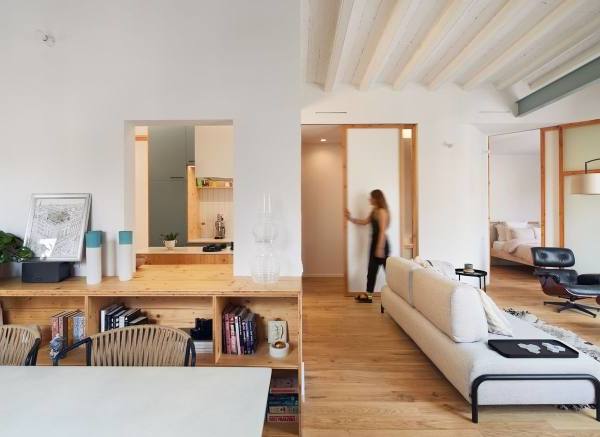
DISSOLVED At the end of the entry hallway is a new ‘flex’ space. It was created by replacing a drywall partition with highly transparent millwork that lets light deep into the center of the home. One oversized operable panel acts as a door, connecting the space to the entry.
在入口走廊末端溶解的是一个新的“弯曲”空间。它是用高度透明的木制品代替干墙隔板来制造的,它让光线深入到家庭的中心。一个超大的可操作面板用作门,将空间连接到入口。
A second oversized panel functions as a window that connects the flex space to the kitchen. Operating the two panels together allows the occupants to modulate the environment from a defined space to something that feels more like a nook.
第二个超大面板的功能是将弹性空间与厨房连接起来的窗口。操作这两个面板可以让居住者将环境从一个特定的空间调整到更像是一个角落的东西。
THICKENED The existing interior walls of the office are thickened with a new partition of walnut and opaque glass. This thickened wall allowed us to insert new lighting that helps the room feel more comfortable despite the lack of windows.
加厚后,办公室现有的内墙用核桃和不透明玻璃的新隔板加厚。这堵加厚的墙使我们可以插入新的照明,使房间感觉更舒适,尽管没有窗户。
The thickened wall curls in on itself to create a daybed, allowing for multiple modalities of work (or napping) in a very small space.
加厚的墙壁自身卷曲形成一张白昼床,允许在很小的空间内进行多种形式的工作(或打盹)。
FOLDED Between the bedrooms of two siblings a portion of the wall was replaced with millwork folded into an S-curve in plan. This creates back to back workspaces and bookshelves for each child. Due to the fold, each workspace is half in one room and half in the other.
折叠在两个兄弟姐妹的卧室之间,墙壁的一部分被折合成S曲线的图案所取代。这为每个孩子创建了背靠背的工作区和书架。由于折叠,每个工作区是一半在一个房间,一半在另一个。
{{item.text_origin}}

