The location. The construction of the Corvin Promenade is Central Europe's largest downtown urban renewal investment, an internationally recognized and award-winning development project. The real estate developmental concept slices out a specific area of the dilapidated building of the district and replaces it with a completely renewed city fabric, which houses commercial, residential, and office buildings. The Corvin Technology Park (C5) is located at the end of this stripe, thus it has a prominent role in closing the central promenade running through the area. Complementing the opposite building, the office building was placed perpendicular to the axis, creating more space between the buildings, while being a definite endpoint of the promenade.
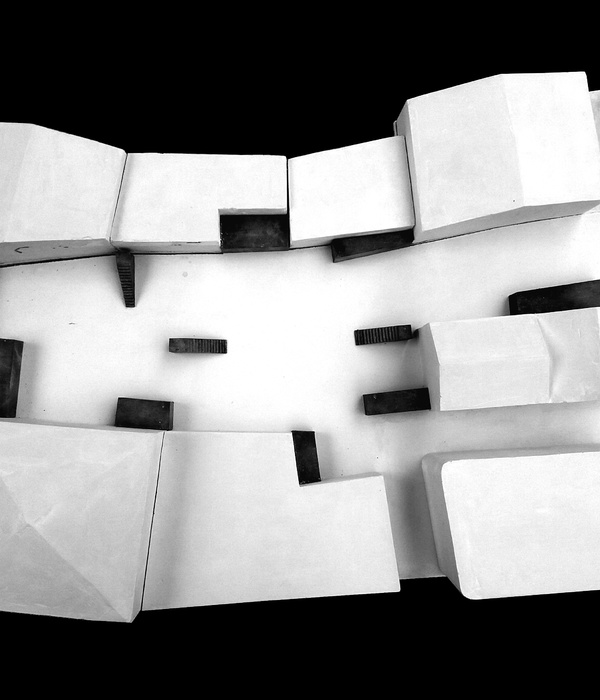
The volume of the building. While developing the concept of the volumes, we adapted them to the already existing spatial situation. The C5 office and the opposite building are parts of two neighboring urban blocks, the façades and walls facing the space between the office buildings form the framework of the enclosed urban piazza. The two office buildings are similar regarding the height values, which is important for the formation of the urban space. Such is the two-story lower part of the buildings, hosting the commercial and service zone of the promenade. The walk-through passages serve the transition between the building and the square continuing the square garland that began with the piazza.
The main difficulty was the change of scale. The height of the buildings permitted by the authority has an overpowering impact on the immediate surroundings. To counterbalance this, we gradually lowered the height of the volume, minimizing the issues arising when connecting the new block to the existing urban fabric. By splitting the building into smaller parts, its size and proportion got closer to that of the neighboring residential buildings.
The office building is based on the interplay of volumes. The elements’ additive construction shows a certain spontaneity resulting in interesting spatial situations. The slightly displaced units seem to reduce their dimensions. The volume-based formulation is reinforced by the articulation of the façade. The depth of the openings is intentionally greater than usual, each element strengthens the massive appearance of the building. By lifting the middle section of the building, an unobstructed view and passage can be ensured along with the main flow of pedestrians. This suspended part, defined as a bridge, becomes flatter, the surface dominates here.
Façades. The façades of the building show subtle differences on each side. Smaller nuances within the overall picture are given by the size and depth of the openings. The size of the openings varies according to the orientation of the given façade. A hidden exterior shading is installed on each side, except for the north side. The overall concept is based on a uniform use of façade materials. The precast concrete wall finishes of the plinth, the slight changes of the planes, and the finishing of the plaster rendering of the upper floors result in a uniform, but at the same time varied design of the façade.
▼项目更多图片
{{item.text_origin}}

