Sam Yan Gym / Looklen Architects
Architects:Looklen Architects
Area:860m²
Year:2016
Photographs:Thanut Sakdanaraseth
Manufacturers:Floorament,TOA,WDC
Construction:800tub5 Decoration Co., Ltd.
Structural Engineer:Ittipon Konjaisue
Architect In Charge:Nuttapol Techopitch
Design Team:Win Rojanastien, Nutthapat Thanapoonyanan
Client:Samyangym Silom Group
System Information Engineer:Thanakrit Vimolskulpak
City:Khet Bang Rak
Country:Thailand
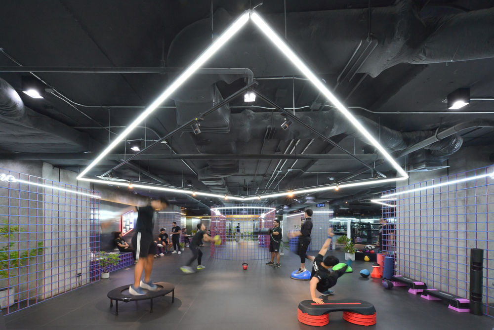
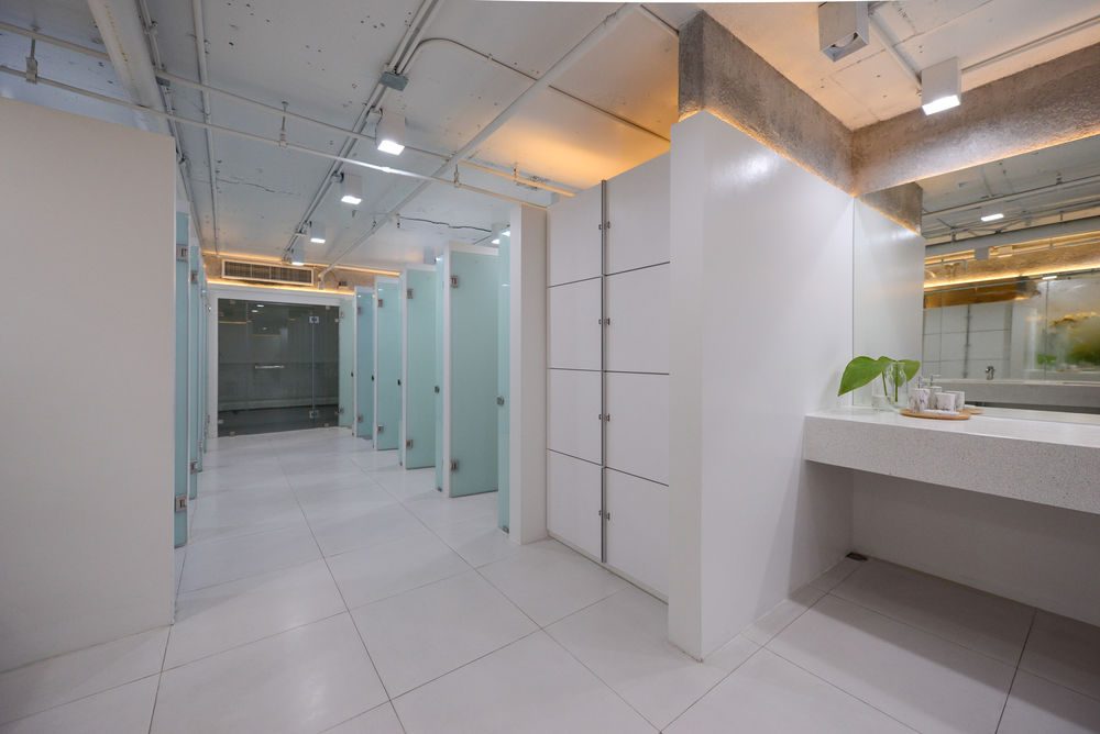
Text description provided by the architects. This third branch of Sam Yan Gym is a renovation of old office space. It has a total area of 860 square meters and is located on the 3rd floor of Liberty Square Building. The location of the Sam Yan Gym is considered as the central business district that is surrounded by many office buildings. Also, there are many people passing by all day long.
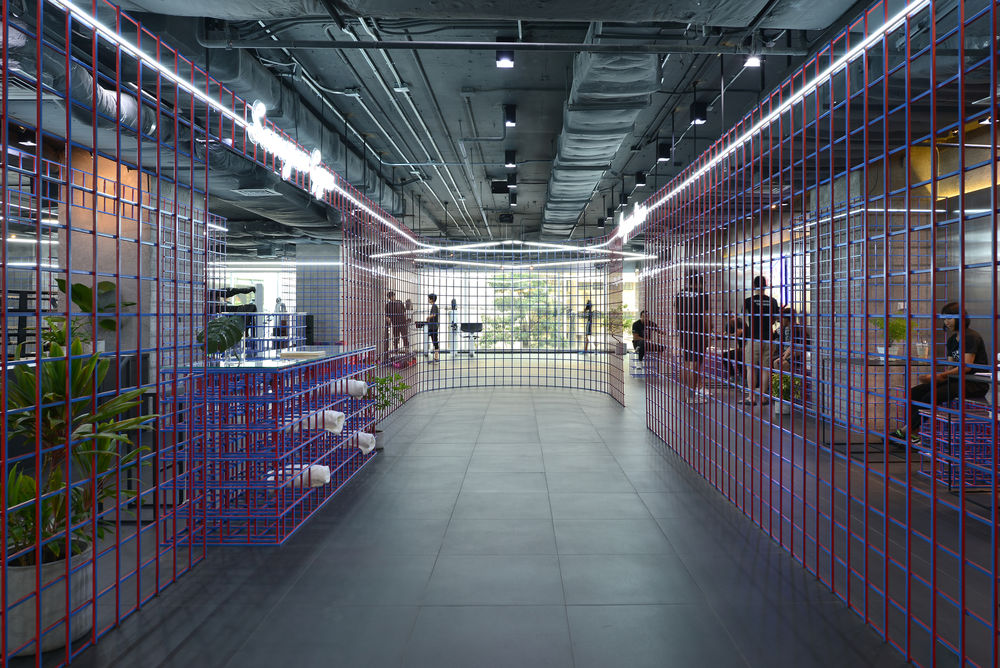
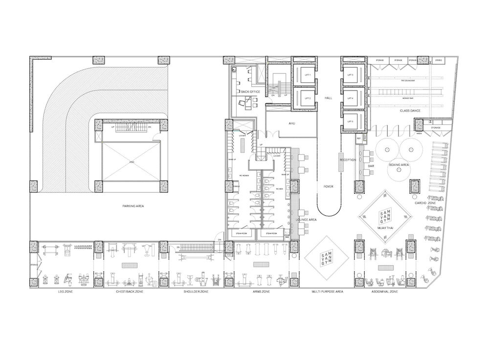
An owner’s desire was to build a modern fitness with completed functions for users. He also wanted to differentiate this gym to the other gyms that he has been founded. This gym identity is a healthy spot for everyone during night time.There was a construction constraint when designing the Gym as the area has many building’s column (size 1.00 x 1.50 meter) and the floor’s height (floor-to-floor) is only 3 meters.
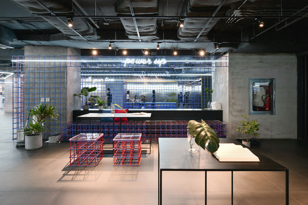
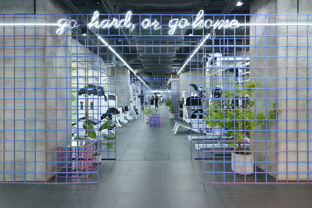
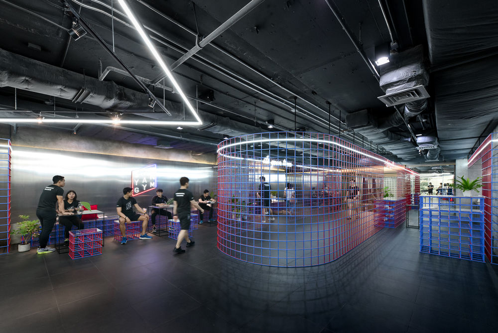
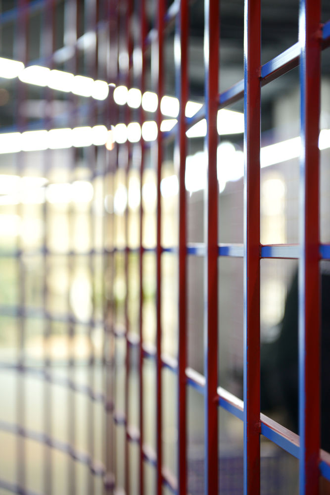
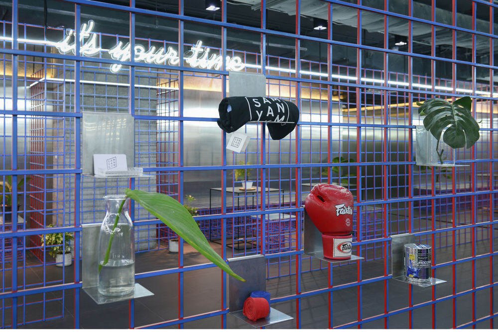
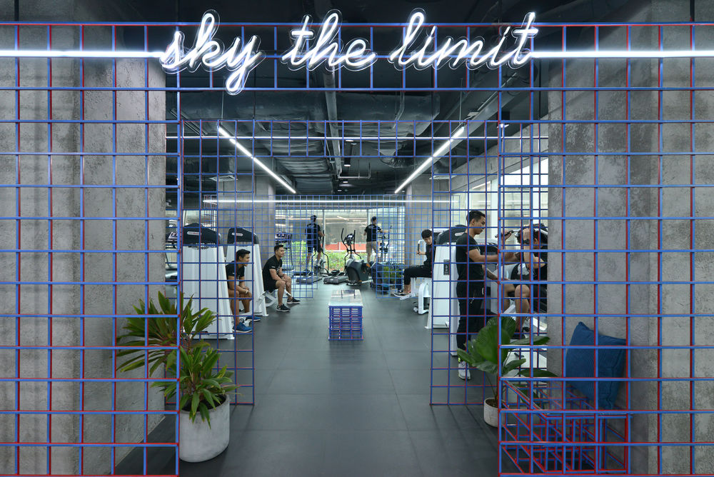
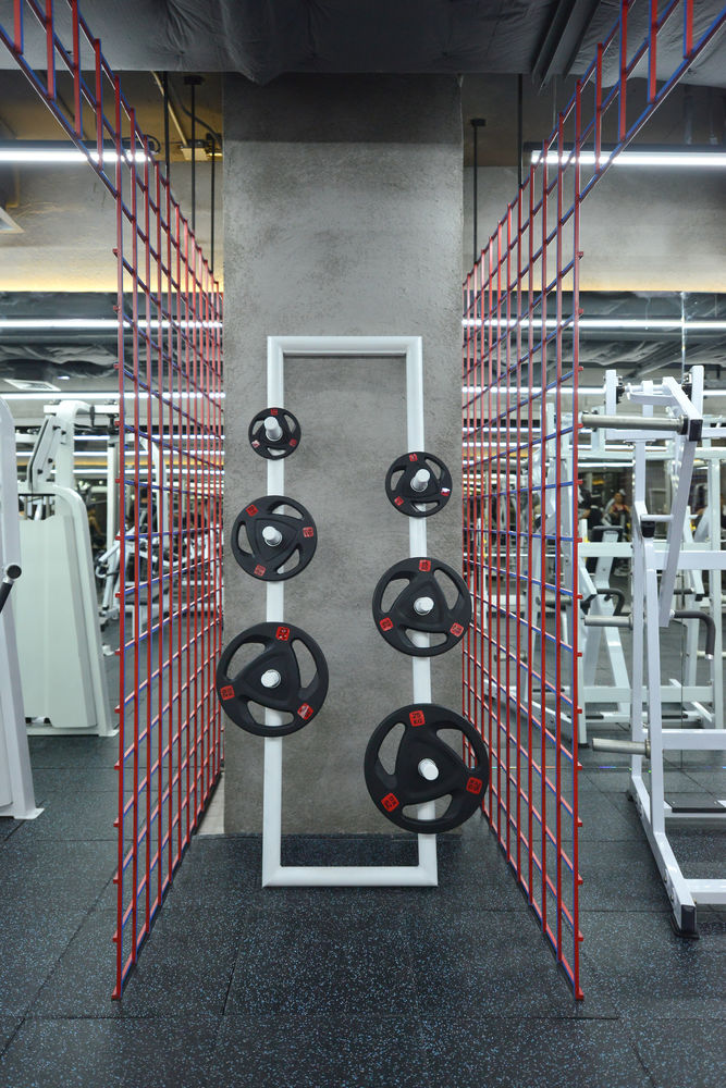
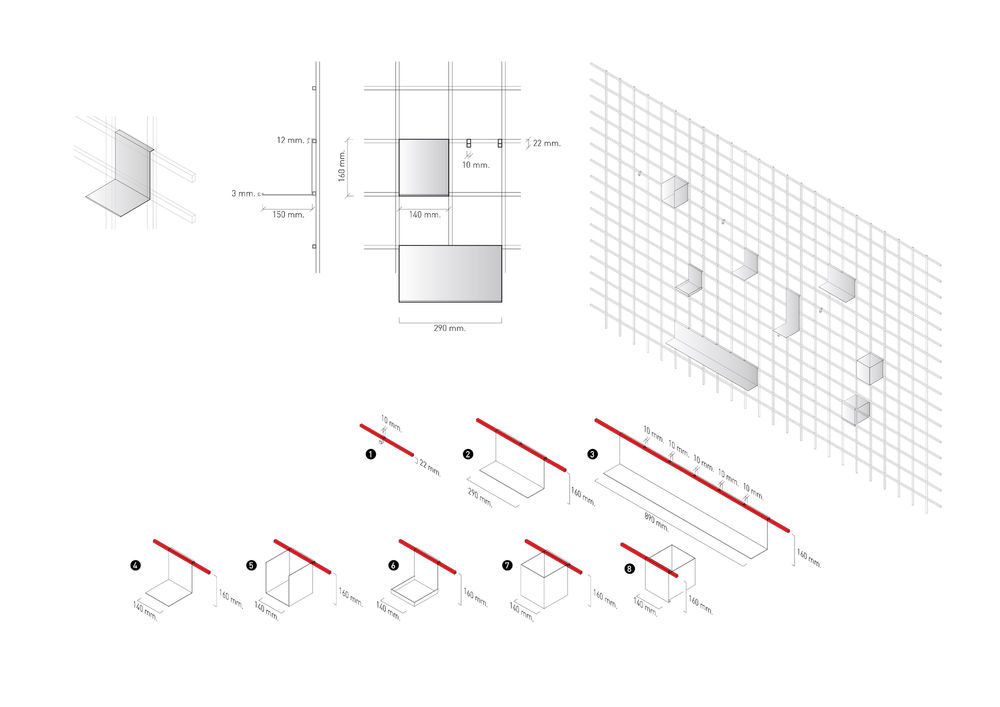
An architect proposed the design solution to get rid of those pillars by creating a partition, to be outstanding points for the Gym. The architect installed a grid system to be displayed on each column. The grid was made of 1 x 1 cm steel, in which it was weaved and distanced by 15 cm. The grid was prefabricated in a square shape with precise modular on each column.
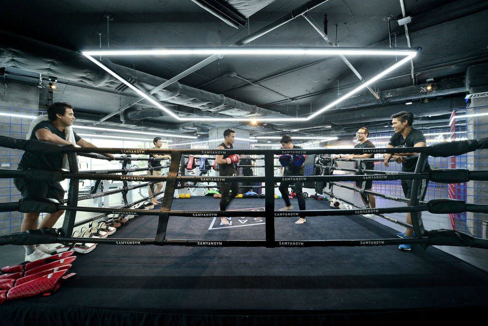
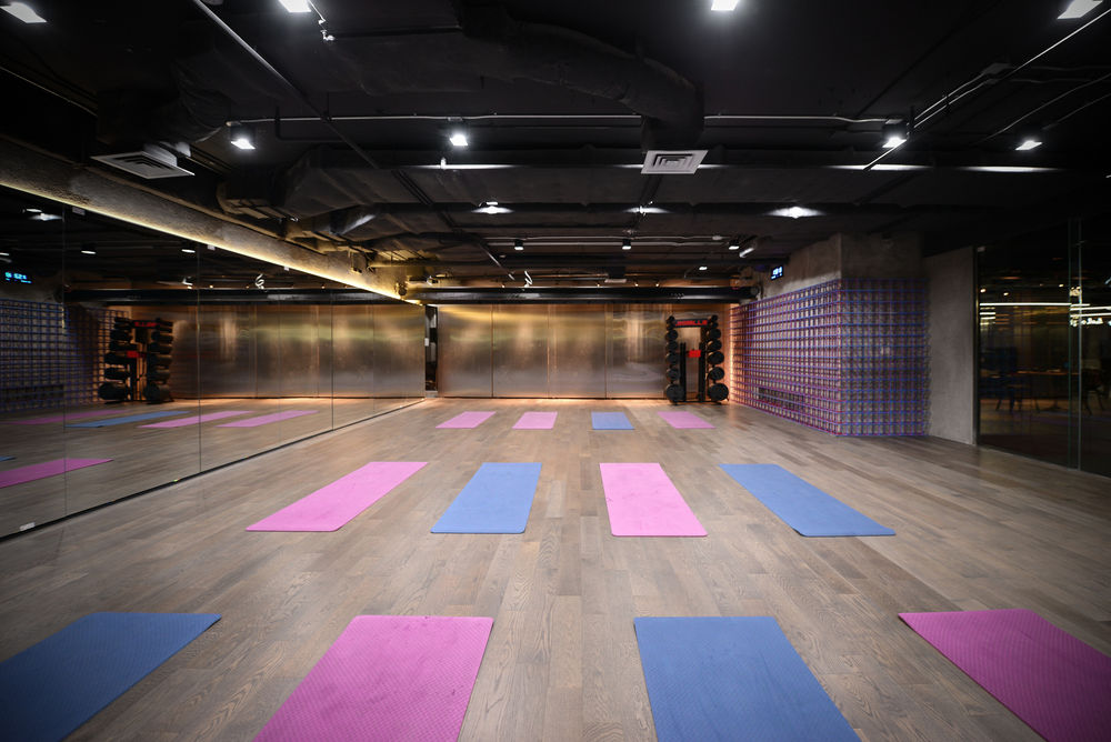
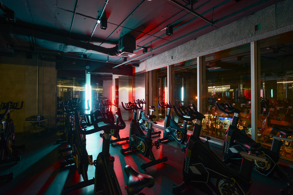
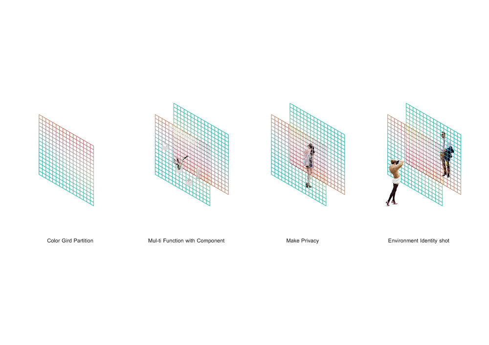
Moreover, to overcome the low floor-to-floor height, the architect designed the Gym’s ceiling to be the bare ceiling. Besides he intended to color the horizon plane of floor and ceiling into black color, not only to make them disappear but also make them be a background of the vertical plane partition. Hence, enhancing the uniqueness of the partition.The architect wanted to make a partition as the Gym’s signature by choosing opposite colors of red (warm tone) and blue (cool tone). Additionally, this opposite matching help creates an energetic atmosphere.
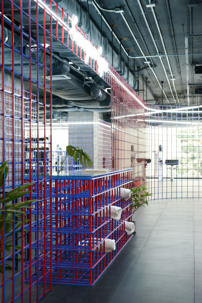
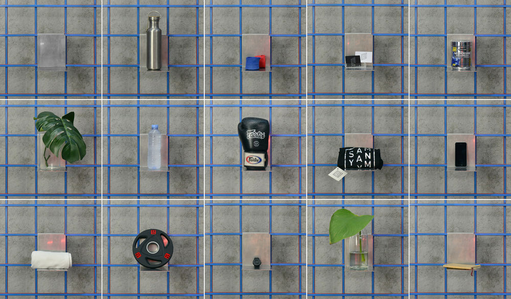
The architect also used this opposite coloring on each piece of steel, thus, creating a color effect of gradient that changes through various perspectives. Furthermore, the partition also serves as a multi-function display that is able to adjust according to usage.
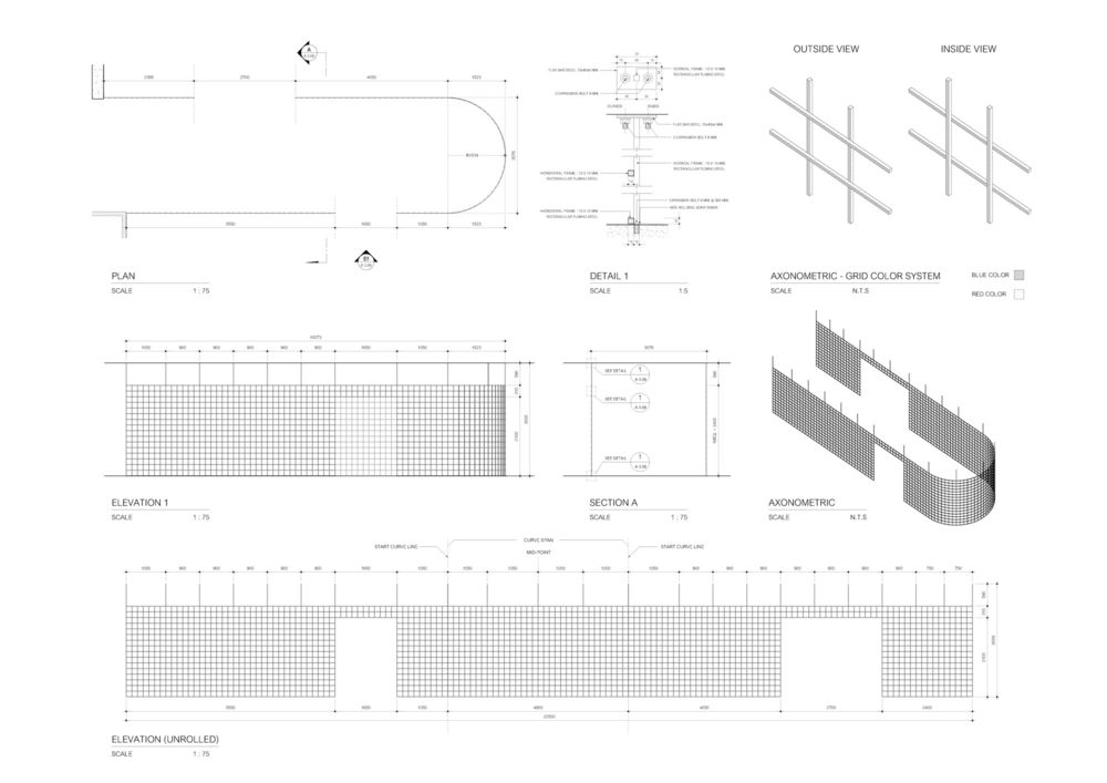
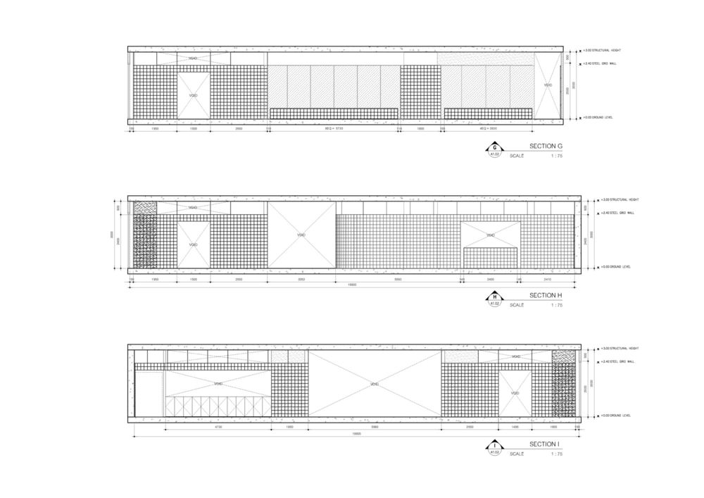
When allocating the area, the architect wanted to create an open plan that allows more space for exercising. The exercise area also connects to the resting area, common area, and a bar as one whole space. The grid partition divides the area into zones according to the span space of old column. The Gym’s furniture styles also intended to be compatible with the design of grid partition.

To allow people to get into the Gym easily, therefore, the Gym entrance has no door. However, there is a partition that leads to the Gym center. It also allows people to see all the activities that happen in the Gym. Thus, creating attention to people who pass by. The bent neon signage also bring attention as they are bent into quotes that are placed onto walls in several Gym’s areas.
Project gallery

Project location
Address:287 Si Lom, Khwaeng Silom, Khet Bang Rak, Krung Thep Maha Nakhon 10500, Thailand


